flex
flex를 사용하기 위해서는 일단 플렉스를 사용할 부분을 컨테이너로 묶어줘야 된다. 배치하려는 요소들은 아이템이라고 한다.
부모 컨테이너에 설정할 수 있는 속성
display: flex
- container에
display: flex;값을 준다. - float와는 다르게 container의 높이 값이 없는 상태에서 수평으로 정렬이 되어도 높이 값이 빠지지 않는다.
- 하위 요소들은 기본으로 수평 정렬이 된다.
- 속성을 이용해서 축을 지정할 수 있다. 정렬되는 축이 메인축(주축), 교차되는 축이 교차축
display: inline-flex
- 부모 컨테이너를 인라인 레벨 요소로 정의
- 인라인 요소와 같은 성향(수평 쌓임)을 가진다.
- items가 수평으로 쌓인다는 것이 아닌 container를 의미함!
flex-direction
- 메인축을 바꿔주는 속성
- 주축과 교차축은 이 속성에 따라서 변한다.
flex-direction: row: 기본값flex-direction: column;flex-direction: row-reverse: row방향을 거꾸로flex-direction: column-reverse: column방향을 거꾸로
flex-wrap
- item이 container보다 클 때 wrap을 할 것인가 설정하는 속성이다.
- 여러 줄 묶음을 설정
flex-wrap: nowrap: 기본값flex-wrap: wrap: flex-item을 여러 줄로 묶음flex-wrap: wrap-reverse: wrap에서 역방향으로 묶음
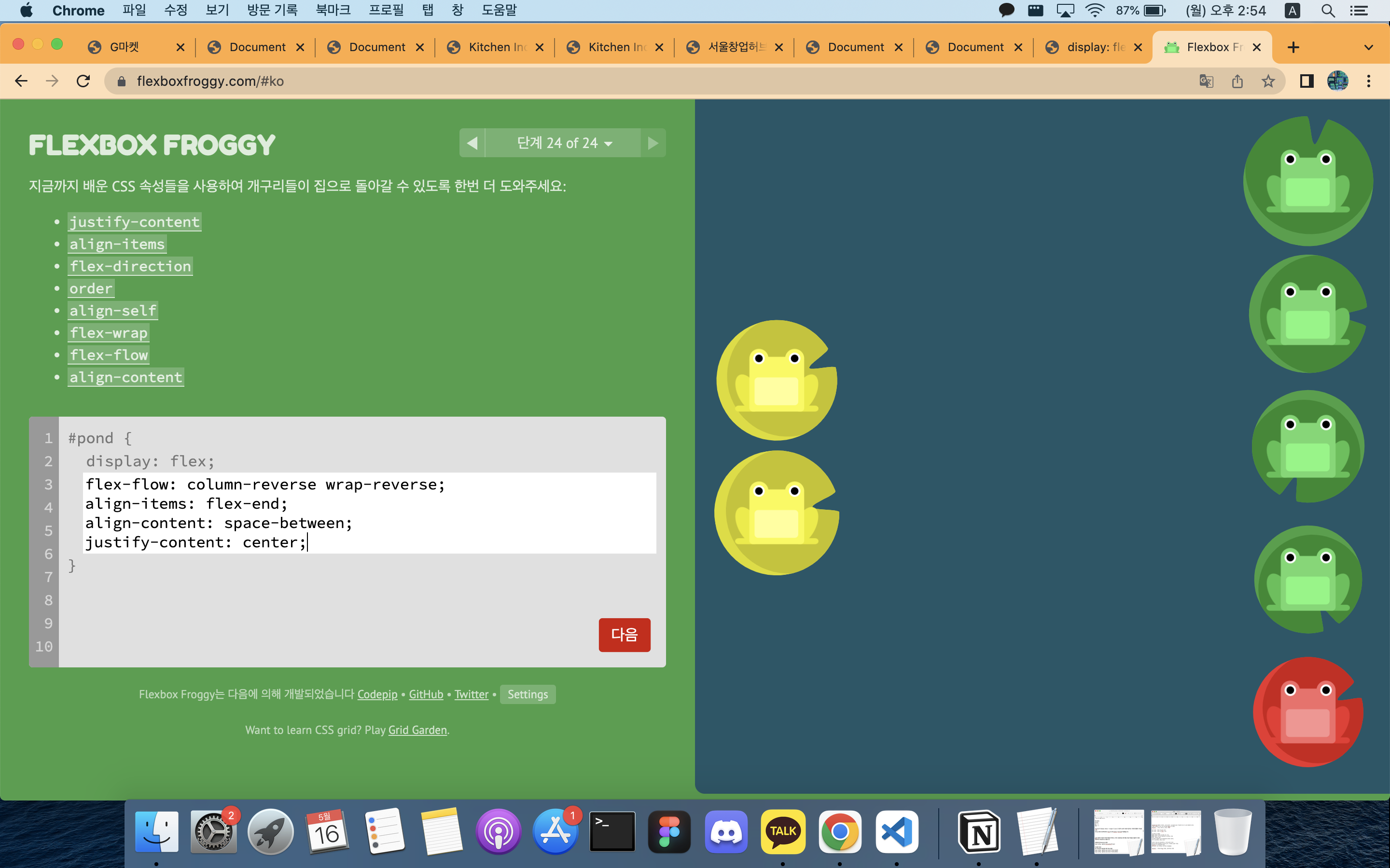
flexbox froggy 게임을 해보던 중 24 단계에서 문제를 못 풀었다.
flex-wrap: wrap-reverse를 적용해야 됐던 문제였다. 흑흑...
왜 wrap-reverse에 대해서 몰랐을까.
justify-content
- 주 축을 기준으로 배치 방법을 지정
- flex-direction에 따라서 주 축이 달라진다.
justify-content: flex-start: 기본값justify-content: flex-end: item을 주 축을 기준으로 끝점으로 정렬justify-content: center: item을 주 축을 기준으로 가운데 정렬justify-content: space-between: 시작 item과 마지막 item은 양 끝에 정렬되고, 나머지는 사이에 고르게 정렬justify-content: space-around: 균등한 여백을 포함해서 정렬
align-items
- 교차 축을 기준으로 배치 방법을 지정
- single line, 한 줄인 경우 사용
- 기본 값인 stretch는 height 값이 있을 경우에는 적용되지 않는다.
align-items: stretch: 기본값, 교차축을 채우기 위해 item을 늘림align-items: flex-start: 각 줄의 시작점 정렬align-items: flex-end: 각 줄의 끝점 정렬align-items: center: 가운데 정렬align-items: baseline: 문자 기준선 정렬
align-content
- align-items와 똑같으나 여러 줄일 경우의 사용한다.
- !! flex-wrap 속성을 통해서 items가 여러 줄이고 여백이 있을 경우만 사용 가능하다.
align-self
- 개별적으로 배치할 수 있는 속성
자식 item에 설정할 수 있는 속성
order
- item의 순서를 바꾸는 속성
- 기본값 숫자는 0이다. (음수로도 지정할 수 있다)
- item 요소에 직접 적용하면 된다.
- HTML 구조와 상관없이 순서를 배치할 수 있기 때문에 유용하다.
flex-grow
- 기본값은 0
- item의 증가 너비 비율을 설정한다.
flex-shrink
- 기본값은 1
- item의 감소 너비 비율을 설정한다.
flex-basis
- 기본값은 auto
- item(공간 배분 전)의 기본 너비 설정
- 컨텐츠의 크기만큼 잡히게 되어 있다.
- 단축 속성인 flex에서 값을 생략할 경우에는 0이 적용됨. (주의!)
flex
- grow, shrink, basis를 축약하는 속성
- flex-grow를 제외한 나머지 개별 속성은 생략이 가능하다.
flex: flex-grow flex-shrink flex-basis;
flex: 1 1 50px;
flex: 1  => 1 1 0 (basis는 auto가 아닌 0이 들어간다)
flex: none => 0 0 auto;
flex: 1 50px; => 1 1 50px로 shrink는 default 값이 들어간다.
flex: 1 2 => 1 2 0;  => flex-basis는 값을 생략할 경우에는 0이 적용된다.
align-self
- 교차 축에서 개별 item의 정렬 방법을 설정
- 일부 item의 정렬 방법을 바꾸고 싶을 때, 사용한다.
- align-items 속성보다 우선함!!!
align-self: auto: 기본값align-self: stretchalign-self: flex-startalign-self: flex-endalign-self: centeralign-self: baseline
flex의 주축은 항상 row라고 생각했었는데, flex-direction을 통해서 주 축은 변할 수 있는 것이라는 걸 알게 되었다.
float를 이용해서 배치를 해주다가 flex를 이용하니까 간편하기도 하면서, 한편으로는 flex를 염두에 두고 구조를 짜는 게 아직 익숙치 않고, 어렵다.
그리고 flex 축약 속성은 진짜... 너무 어렵다...

경험한 것을 기록