Til
이번 프로젝트 참여하면서 시각화에 대해서 공부를 많이 한거 같습니다 !_!
#### 그래프
plt.xlabel('Channel')
plt.ylabel('Usage Percentage (%)')
plt.title('Channel Usage Percentage by Week (Offer Completed Only)')
plt.legend()
plt.tight_layout()
plt.show()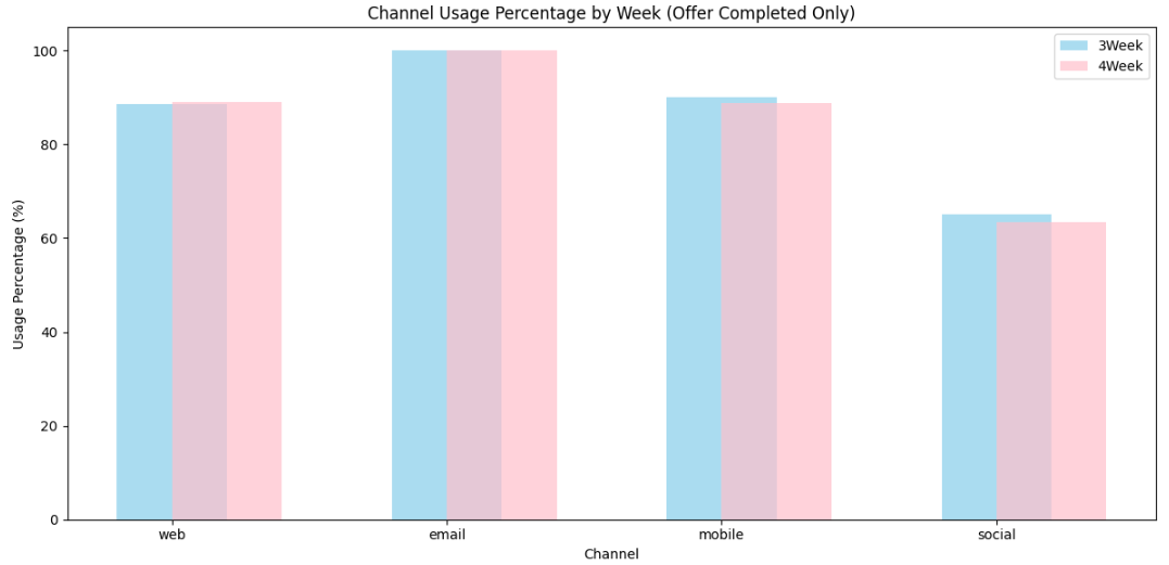
파이차트 !!
x = [1, 2, 3, 4]
y = [10, 20, 25, 30]

plt.plot(x, y)
plt.show()
fig, ax = plt.subplots() # Figure와 Axes 객체 생성
x = [1, 2, 3, 4]
y = [10, 20, 25, 30]
ax.plot(x, y)
plt.show()