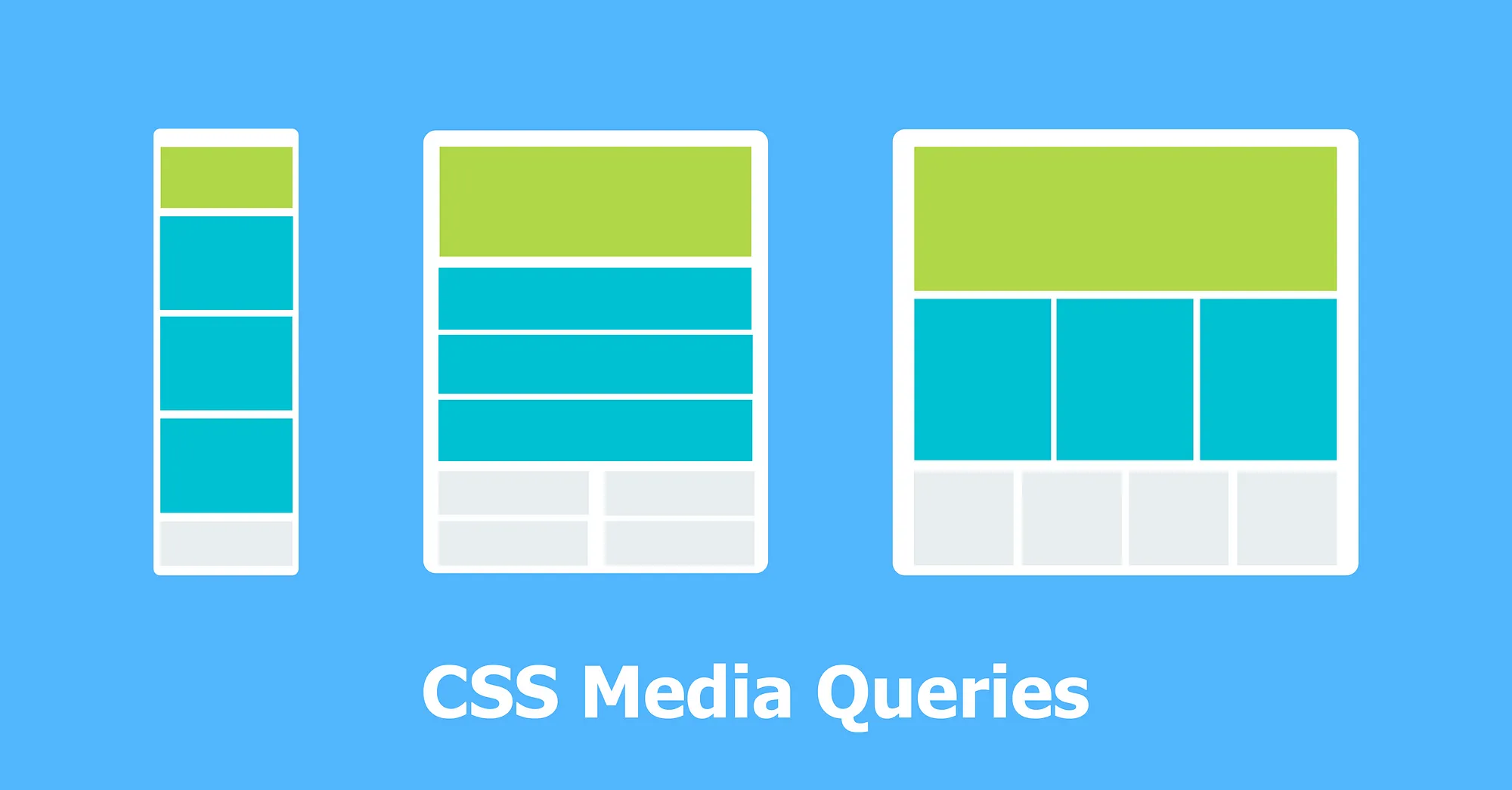
/* 초소형 장치 (휴대폰, 600px 이하) */
@media only screen and (max-width: 600px) {...}

/* 소형 장치 (세로 모드 태블릿과 큰 휴대폰, 600px 이상) */
@media only screen and (min-width: 600px) {...}

/* 중간 장치 (가로 모드 태블릿, 768px 이상) */
@media only screen and (min-width: 768px) {...}

/* 큰 장치 (노트북/데스크톱, 992px 이상) */
@media only screen and (min-width: 992px) {...}

/* 초대형 장치 (큰 노트북과 데스크톱, 1200px 이상) */
@media only screen and (min-width: 1200px) {...}

/* 가로 길이가 더 길 경우 */
@media (orientation: landscape) {...}

/* 세로 길이가 더 길 경우 */
@media (orientation: portrait) {...}

/* 화면을 프린트할 때 */
@media print {...}
코딩공부