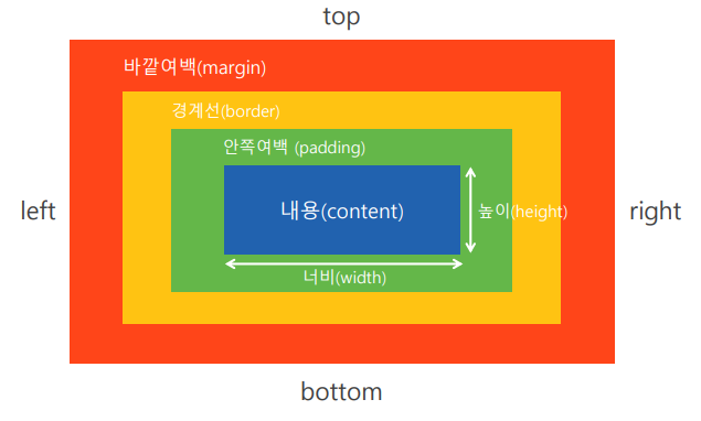
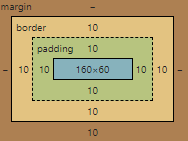
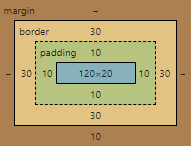
○박스모델(Box Model)
요소에 부피감을 결정하는 개념
웹 페이지의 레이아웃 및 디자인 설계 시
○박스모델 구조
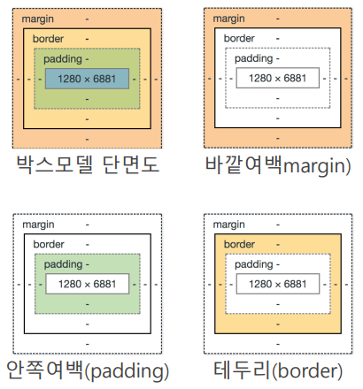
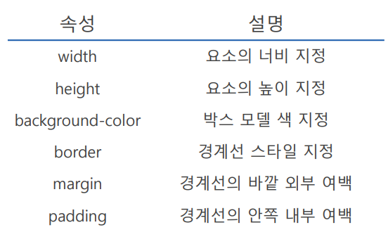
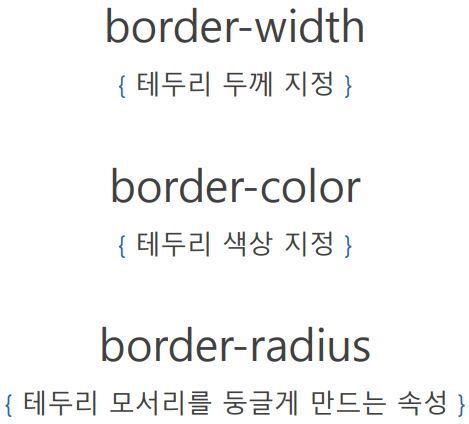
○박스모델 속성
<!DOCTYPE html>
<html lang="en">
<head>
    <meta charset="UTF-8">
    <meta http-equiv="X-UA-Compatible" content="IE=edge">
    <meta name="viewport" content="width=device-width, initial-scale=1.0">
    <title>Document</title>
    <style>
        /* margin : 바깥여백, 요소와 요소 사이의 공간 */
        /* border : 경계선 */
        /* padding : 안쪽여백, border와 content사이의 공간 */
        /* margin : auto(가운데정렬) -> block속성/너비, 높이 지정해야 돌아감 */
        #a{
            background-color: tomato;
            display: block;
            width: 200px;
            margin:  auto;
            border: 5px solid black;
            padding: 10px;

        }
        #b{
            background-color: orange;

            margin-top: 20px;
            border-width: 5px;
            border-style: solid;
            border-color: black;
            padding: 20px;
        }

    </style>
</head>
<body>
    <div id = "a"> 스마트인재개발원 </div>
    <div id = "b"> 스마트인재개발원 </div>
</body>
</html>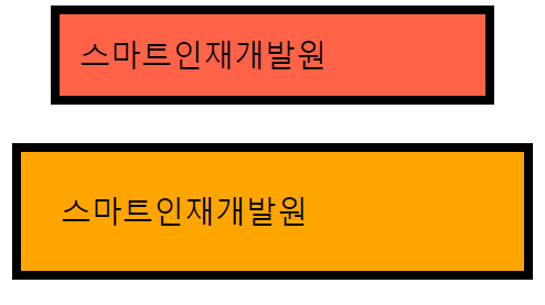
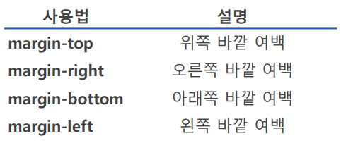
○margin
테두리를 기준으로 요소의 바깥여백 지정
<!DOCTYPE html>
<html lang="en">
<head>
    <meta charset="UTF-8">
    <meta http-equiv="X-UA-Compatible" content="IE=edge">
    <meta name="viewport" content="width=device-width, initial-scale=1.0">
    <title>Document</title>
    <style>
        div{
            height: 200px;
            width: 200px;
        }

        #a{
            background-color: red;
        }
        #b{
            background-color:blueviolet;
            margin-left: 200px;
        }
        #c{
            background-color:green;
            margin-left: 400px;
        }
        #d{
            background-color:gray;
            margin-left: 600px;
        }
    </style>
</head>
<body>
    <div id ="a"></div>
    <div id ="b"></div>
    <div id ="c"></div>
    <div id ="d"></div>
</body>
</html>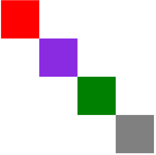
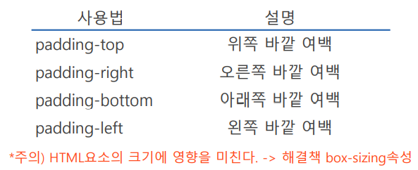
○padding
테두리를 기준으로 요소의 안쪽여백 지정
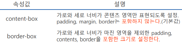
○box-sizing
요소의 크기를 화면에 표시하는 방식
<!DOCTYPE html>
<html lang="en">
<head>
    <meta charset="UTF-8">
    <meta http-equiv="X-UA-Compatible" content="IE=edge">
    <meta name="viewport" content="width=device-width, initial-scale=1.0">
    <title>Document</title>
    <style>
        /* box-sizing : 요소의 크기를 화면에 표시하는 방법 */
        /* 1. content-box : 크기를 지정했을 때, content영역의 크기를 지정(기본값)
                            width, height 200px로 지정하면
                            content의 크기가 200px로 지정된다.
                            content(200px)+a(border+padding) */
        /* 2. border-box : 크기를 지정했을 때, border영역까지 포함하여 크기를 지정
                           width, height 200px로 지정하면
                           border까지의 크기가 200px로 지정된다.
                           border+padding+content = 200px */
        div{
            width: 200px;
            height: 100px;
            margin-bottom: 10px;
            box-sizing: border-box;
            padding: 10px;
        }

        #small{
            border: 10px solid salmon;
        }
        #large{
            border: solid salmon 30px;
        }


    </style>
</head>
<body>
    <div id = "small"></div>
    <div id = "large"></div>
</body>
</html>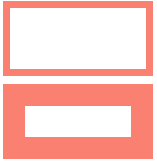
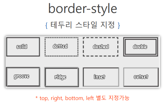
○border
테두리를 기준으로 요소의 바깥여백 지정
border : 선두께 선종류 선색깔;
<!DOCTYPE html>
<html lang="en">
<head>
    <meta charset="UTF-8">
    <meta http-equiv="X-UA-Compatible" content="IE=edge">
    <meta name="viewport" content="width=device-width, initial-scale=1.0">
    <title>Document</title>
    <style>
        #tomato{
            width: 200px;
            height: 200px;
            background-color: tomato;
            /* border-radius : 모서리를 둥글게 */
            /* 200px * 10%만큼 둥글게(가로) */
            /* 200px * 10%만큼 둥글게(세로) */
            /* 모양이 안이쁘기때문에 px로 지정하는게 나음 */
            /* 원으로 만들려면 50% or 100px */
            border-radius: 50%;

        }
    </style>
</head>
<body>
    <div id="tomato"></div>
</body>
</html>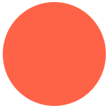
<!DOCTYPE html>
<html lang="en">
<head>
    <meta charset="UTF-8">
    <meta http-equiv="X-UA-Compatible" content="IE=edge">
    <meta name="viewport" content="width=device-width, initial-scale=1.0">
    <title>Document</title>
    <style>
        #naruto{
            width: 100px;
            height: 100px;
            background-color: green;
            border-top-left-radius: 50px;
            border-bottom-right-radius: 50px;
        }
    </style>
</head>
<body>
    <div id="naruto"></div>
</body>
</html>
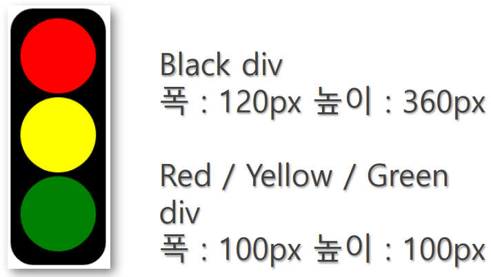
○border 실습 - 신호등만들기
<!DOCTYPE html>
<html lang="en">

<head>
    <meta charset="UTF-8">
    <meta http-equiv="X-UA-Compatible" content="IE=edge">
    <meta name="viewport" content="width=device-width, initial-scale=1.0">
    <title>Document</title>
    <style>
        #black {
            width: 120px;
            height: 360px;
            background-color: black;
            border-radius: 20px;
            padding: 10px;
            box-sizing: border-box;
        }

        .color {
            width: 100px;
            height: 100px;
            border-radius: 50%;
            margin: auto;
        }

        #red {
            background-color: red;
            margin-top: 10px;
            margin-bottom: 10px;
        }

        #yellow {
            background-color: yellow;
            margin-bottom: 10px;
        }

        #green {
            background-color: green;

        }
    </style>
</head>

<body>
    <div id="black">
        <div class=color id="red"></div>
        <div class=color id="yellow"></div>
        <div class=color id="green"></div>
    </div>


</body>

</html>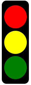

코딩공부