styled-components는 최근 5년간 가장 인기있는 라이브러리다.
styled-components 의 특징
-
PascalCase를 사용해야한다
-
컴포넌트를 만들듯이 이름을 선언한다
const [컴포넌트명] = styled.[html태그]
[부여하고자 하는 css속성];
위와 같은 형태이다. Tagged Template Literal
-
prop를 사용하여 동적 스타일링이 가능하다.
const [changeColor, setChangeColor] = useState(false);
const handleChanageColor = () => {
setChangeColor(!changeColor);
};
  <Button onClick={handleChanageColor} primary={changeColor}>
    Button
  </Button>
const Button = styled.button`
padding: 20px;
margin: 10px;
border: none;
border-radius: ${(props) => (props.Color? "100%" : "20%")}; // 1
background-color: ${(props)=>(props.Color? "purple" : "red")}
`;
이렇게 조건을 주면
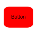
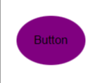
빨간 사각이 20%둥근 버튼이 생성되고 클릭시에
보라색의 100% 둥근 버튼으로 변경된다.
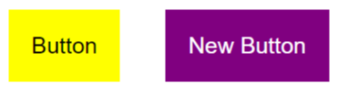
4.상속 스타일링 가능
const Button = styled.button margin: 20px; padding: 20px; border: none; background-color: yellow; font-size: 20px;;
선언후 같은 틀이지만 다른 스타일을 추가한것을 만들려면
const NewButton = styled(Button) color: white; background-color: purple;;
먼저 선언했던것을 호출하여 추가하고싶은 스타일 속성을 추가하면 된다.
- 네스팅이 가능하다.
추천하지않지만 외부 라이브러리를 사용할때에는 정해진 틀이 있기때문에 네스팅 하여 사용한다.
5.common.css / reset.css(npm install styled-reset 필요)를 import 해주어서 사용가능하다
import { createGlobalStyle } from 'styled-components'
const GlobalStyle = createGlobalStyle`
- {
box-sizing: border-box;
font-family: 'Noto Sans KR', sans-serif;
}
`
<ThemeProvider
<GlobalStyle /
<Router /
</ThemeProvider
- 매번 import할 필요가 없는 ThemeProvider
import { ThemeProvider } from 'styled-components';
const theme = { black: '#000000', white: '#FFFFFF', lightGrey: '#B0B0B0', middleGrey: '#717171', deepGrey: '#222222', hoverGrey: '#DBDBDB', };export default theme;
const App = () => {
return <Container title</Container
};
const Container = styled.div background-color: ${props => props.theme.lightGrey};
-
mixin 사용
const variables = {
flex: (direction = 'row', justify = 'center', align = 'center') =>display: flex; flex-direction: ${direction}; justify-content: ${justify}; align-items: ${align};,absoluteCenter: css
position: absolute; top: 50%; left: 50%; transform: translate(-50%, -50%);,
};<ThemeProvider theme={{ style: theme, variables }}>
const Container = styled.div`${(props) => props.theme.variables.flexSet()}
flexset()괄호 안에는
’column’,’space-between’,’center’
이런식으로 속성을 설정해 줄 수 있다.
8.GlobalStyle.js의 body안에 font-family를 웹 폰트 명으로 지정해주어야 합니다.
const GlobalStyle = createGlobalStyle`${reset}
body{
font-family: 'Do Hyeon', sans-serif;
}
웹 폰트 사용할 때는 웹 폰트 사이트에서 제공하는 embedding(임베드) 코드를
복사하여 html 파일에 코드를 추가해야 합니다.
<link
href="https://fonts.googleapis.com/css2?family=Do+Hyeon&display=swap"
rel="stylesheet"
/>
폰트파일
- styles 폴더 안에 폰트파일을 저장할 폴더를 생성하여 폰트파일을 넣어줍니다.
src
└── styles
├── fonts
│ └── DoHyeon-Regular.ttf
2.스타일드 컴포넌트의 createGlobalStyle을 통해 글로벌 스타일을 생성해줍니다
import { createGlobalStyle } from 'styled-components';


const GlobalFont = createGlobalStyle`
  @font-face {
  font-family: 'Do Hyeon';
  src: url(${DoHyeon}) format('woff');
}
`;
3.전역에서 사용하기 위해서는 아래와 같이 적용해서 사용합니다.
import GlobalFont from './styles/GlobalFont';


<GlobalFont />
2차 프로젝트에서는 스타일드 컴포넌트를 사용할것인데 생각했던것 보다 복잡해서 난항이 예상된다.