4.29
- 오늘 수강한 분량: EDA 기초 다지기 TIME, CCTV 1-3
[주피터 노트북 실행]
1. anaconda 실행
2. conda activate ds_study 입력
3. cd Documents 입력
4. cd ds_study 입력
5. jupyter notebook 입력
[예시 알고 싶을 때]
shift + tap
[Pandas 기초]
- python에서 R 만큼의 강력한 데이터 핸들링 성능을 제공하는 모듈
- 단일 프로세스에서는 최대 효율
- 코딩 가능하고 응용 가능한 엑셀로 받아들여도 됨
- 누군가 스테로이드를 맞은 엑셀로 표현함
[pandas in jupyter notebook]
-
판다스 열기
import pandas as pd
CCTV_Seoul = pd.read_csv("..\data\01. Seoul_CCTV.csv") -
제목설정
앞에 # 넣고 제목 쓴 다음 esc키 누른 후 "m" 누르면 파란색으로 바뀜, 그 이후 shift + enter 누르면 제목 설정 됨
#이 많아질수록 제목의 크기가 작아짐 -
행 위로 추가
추가할 행 누르고 esc키 누른 후 "a" 누르기
-
앞에서부터 자료 열기(괄호에 숫자 입력하면 앞에서부터 n번째 자료)
CCTV_Seoul.head()
-
뒤에서부터 자료 열기(괄호에 숫자 입력하면 뒤에서부터 n번째 자료)
CCTV_Seoul.tail()
-
이름변경
CCTV_Seoul.rename(columns={CCTV_Seoul.columns[0]: "구별"}
-
index, column, values: 행(가로), 열(세로), 자료들
- 원본 이름까지 바꾸고 싶을 때
: inplace=True를 뒤에 작성!CCTV_Seoul.rename(columns={CCTV_Seoul.columns[0]: "구별"}, inplace=True)
<판다스 엑셀 읽기에 관한 설명들>
https://pandas.pydata.org/docs/reference/api/pandas.read_excel.html
[Series]
- 판다스의 데이터형 구성하는 기본
- index와 value로 이루어져 있습니다
- 한 가지 데이터 타입만 가질 수 있습니다
<날짜 데이터>
- 날짜(시간)를 이용할 수 있음
dates = pd.date_range("20240101", periods=6)
실행하면 '2024-01-01', ~~ 6일까지 출력 됨
[DataFrame]
-
가장 많이 사용되는 데이터형
-
pd.Series()
- index, value
-
pd.DataFrame()
- index, value, column
cf. 표준정규분포에서 샘플링한 난수 생성data = np.random.randn(6,4)
data -
데이터 프레임 만들기
df= pd.DataFrame(data, index=dates, columns=["A", "B", "C", "D"])
df
cf. 아예 내가 처음으로 데이터를 만들 때
ex
left = pd.DataFrame({
"key": ["K0", "K4", "K2", "K3"],
"A" : ["A0", "A1", "A2", "A3"],
"B" : ["B0", "B1", "B2", "B3"]
})
left
리스트 안의 딕셔너리 형태
right = pd.DataFrame([
{"key" : "K0", "C" : "C0", "D" : "D0"},
{"key" : "K1", "C" : "C1", "D" : "D1"},
{"key" : "K2", "C" : "C2", "D" : "D2"},
{"key" : "K3", "C" : "C3", "D" : "D3"}
])
right
-
DataFrame 기본정보 확인(각 컬럼 크기, 데이터 형태 확인할 수 있음)
df.info()
-
DataFrame의 기술통계적 정보 확인
df.describe()
[데이터 정렬]
- sort_values()
- 특정 컬럼(열)을 기준으로 데이터를 정렬합니다
df.sort_values(by="정렬기준", ascending=True/False)
[특정 컬럼만 읽기]
- 컬럼명이 영어일 경우 df.A 로도 불러올 수 있음(숫자는 불가)
df["특정 컬럼"] : 특정 컬럼만 읽음
[offset index]
- df[n:m]: n부터 m-1까지
- 인덱스나 컬럼의 이름으로 slice 하는 경우는 끝을 포함합니다
인덱스나 컬럼의 이름으로 slice하는 경우는 끝을 포함!!!
df.loc(:,["A", "B"]]: 모든 행 & A열 & B열 읽음)
[loc]
- loc : location
- index 이름으로 특정 행, 열을 선택합니다
ex. df.loc[:,["A","B"]] / df.loc["20210102": "20210104", ["A", "B"]]
[iloc]
- iloc : inter location
- 컴퓨터가 인식하는 인덱스 값으로 선택(df.iloc(행, 열))
ex. df.iloc[3] / df.iloc[3,2]
[condition]
- df[condition]과 같이 사용하는 것이 일반적
ex. df[df["A"] > 0]: 출력하면 0보다 큰 A 값이 있는 행들만 출력 됨
ex1. df[df > 0]: 출력하면 0보다 작은 값들은 NaN으로 출력
ex2. df["E"].isin(["two", "four"]): E열에 "two" 또는 "four" 가 있으면 True, 아니면 False
ex3. df[df["E"].isin(["two", "four"])]: E열에 "two" 또는 "four" 가 들어간 행만 선택 됨
[컬럼 추가]
- 기존 컬럼이 없으면 추가
- 기존 컬럼이 있으면 수정
ex. df["E"] = ["one", "one","two","three","four","seven"]
[isin]
- 특정 요소가 있는지 확인
ex. df["E"].isin(["two"]) : 결과는 T/F
[특정 컬럼 제거]
-
del
del df["특정 컬럼"]: 특정 컬럼 제거됨
-
drop
df.drop(["특정 컬럼"], axis=1) # axis=0 가로, axis=1 세로
[apply]
- sum, mean, min, max 등 사용 가능
ex. df["A"].apply("sum")
df["A"].apply("min"), df["A"].apply("max")
df["A"].apply(np.sum)
[데이터 합치기]
pd.concat()
pd.merge()
pd.join()
[pd.merge()]
-
두 데이터 프레임에서 컬럼이나 인덱스를 기준으로 잡고 병합하는 방법
-
기준이 되는 컬럼이나 인덱스를 키값이라고 합니다
-
기준이 되는 키값은 두 데이터 프레임에 모두 포함되어 있어야 합니다
-
교집합
pd.merge(left, right, how = "inner", on = "key")
how = "inner" 는 안써도 됨(안쓰면 생략) -
한쪽 기준
pd.merge(left, right, how = "left" ,on = "key")
pd.merge(left, right, how = "right", on = "key") -
양쪽 합집합
pd.merge(left, right, how="outer", on = "key")
[인덱스 변경]
- set_index()
- 선택한 컬럼을 데이터 프레임의 인덱스로 지정
- ex. 구별을 인덱스로 지정하고 싶을 때
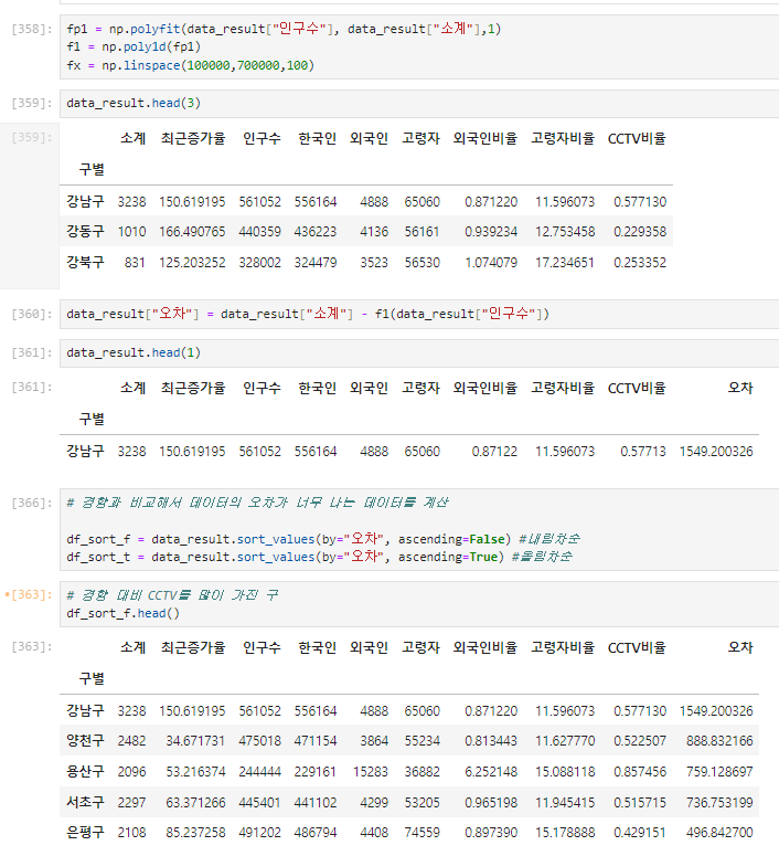
data_result.set_index("구별", inplace=True)
[상관계수]
- corr()
- correlation의 약자입니다
- 상관계수가 0.2 이상인 데이터를 비교
data_result.corr()
5.3
- 오늘 수강한 분량: CCTV4-5
[matplotlib 기초]
import matplotlib.pyplot as plt
from matplotlib import rc
rc("font", family="Malgun Gothic")
get_ipython().run_line_magic("matplotlib", "inline")
- pyplot: MATLAB에서 사용하는 시각화 기능들을 담아둔 것
- get_ipython().run_line_magic("matplotlib", "inline"): 주피터 노트북 안에 그래프를 그리면 바로 나타날 수 있게 설정
[matplotlib 그래프 기본 형태]
plt.figure(figsize=(10,6))
plt.plot([0, 1, 2, 3, 4, 5, 6, 7, 8, 9], [1, 1, 2, 3, 4, 2, 3, 5, -1, 3])
plt.show()
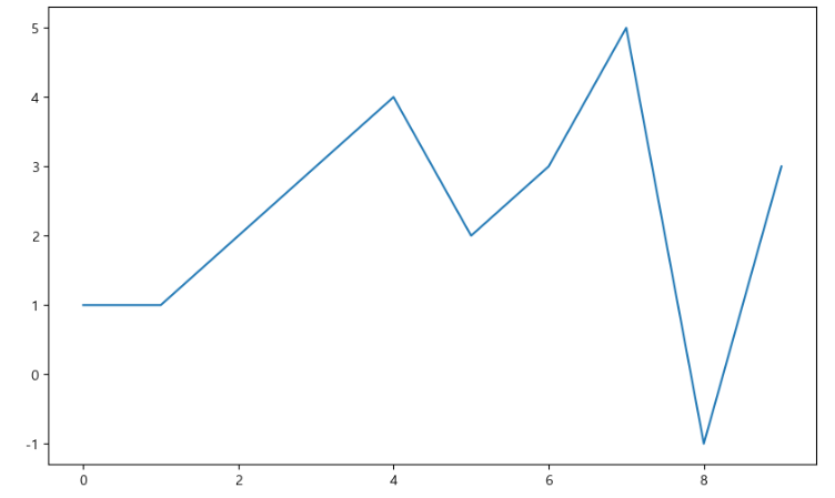
- figsize=(10,6): 가로 10, 세로 6 사이즈의 그래프를 설정해준 것
- plt.plot([],[]): [x축 값], [y축 값]
[예제1. 그래프 기초]
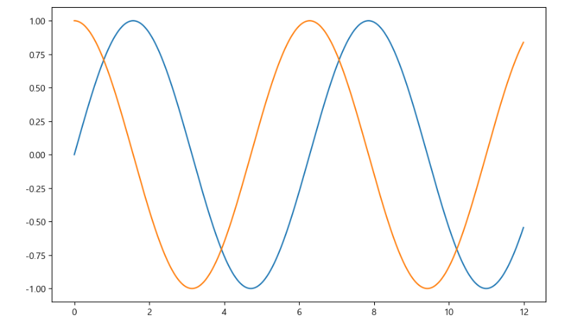
<삼각함수 그리기>
np.arange(a, b, s): a부터 b까지 s의 간격
np.sin(value)
예시
import numpy as np
t = np.arange(0, 12, 0.01)
y= np.sin(t)
plt.figure(figsize=(10,6))
plt.plot(t, np.sin(t))
plt.plot(t, np.cos(t))
plt.show()
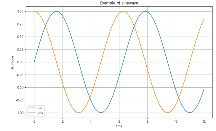
- 격자무늬 추가
plt.grid(True) #False면 격자 없음
- 그래프 제목 추가
plt.title("제목")
- x축, y축 제목 추가
plt.xlabel("x축 제목")
plt.ylabel("y축 제목") - 주황색, 파란색 선 데이터 의미 구분
plt.plot(t, np.sin(t), label="데이터 의미")
plt.plot(t, np.cos(t), label= "데이터 의미")
예시
plt.figure(figsize=(10,6))
plt.plot(t, np.sin(t), label="sin")
plt.plot(t, np.cos(t), label= "cos")
plt.grid(True)
plt.legend(loc="lower left") #범례
plt.title("Example of sinewave")
plt.xlabel("time")
plt.ylabel("Amlitude") #진폭
plt.show()
cf. 함수로 선언
맨위에 def 함수명 쓰고 그래프 선언한거 드래그 후 tap 눌러 들여쓰기 해주기
[예제2. 그래프 커스텀]
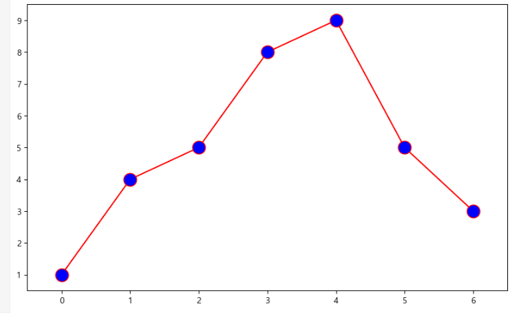
예시1. 그래프 1개일 때
t = [0, 1, 2, 3, 4, 5, 6]
t= list(range(0, 7))
y = [1, 4, 5, 8, 9, 5, 3]
def drawGraph():
plt.figure(figsize=(10,6))
plt.plot(
t,
y,
color="red",
linestyle="-",
marker="o",
markerfacecolor="blue",
markersize=15,
plt.xlim([-0.5, 6.5])
plt.ylim([0.5, 9.5])
plt.show
drawGraph()
- color = 빨강 / green, blue, yellow 등 가능
- linestyle = "-": 실선 / "--": 점선
- marder = "o" : o 모양의 마크
- markerfacecolor="blue": 파란 마크
- markersize=15: 마크 크기 15
예시2. 그래프 3개일 때
t = np.arange(0,5,0.5)
t
plt.figure(figsize=(10,6))
plt.plot(t, t, "r--")
plt.plot(t, t2, "bs")
plt.plot(t, t3, "g^")
plt.show()
- plot 하나하나가 그래프임!
- "r--": 빨간색 점선으로 표시
- "bs": 파란 네모 마크로 표시
- "g^": 초록 세모로 표시
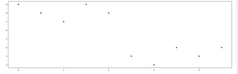
[예제3. scatter plot]
t = np.array(range(0,10))
y = np.array([9,8,7,9,8,3,2,4,3,4])
def drawGraph():
plt.figure(figsize=(20,6))
plt.scatter(t,y)
plt.show()
drawGraph()
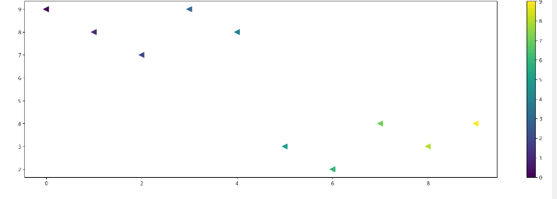
colormap = t
def drawGraph():
plt.figure(figsize=(20,6))
plt.scatter(t,y,s=100, c=colormap, marker="<")
plt.colorbar()
plt.show()
drawGraph()
[예제4.pandas에서 plot 그리기]
-
matplotlib을 가져와서 사용합니다
data_result["인구수"].plot(kind="bar", figsize=(10,10))
-
구별 기준으로 인구수를 표시
-
kind="bar"는 바 그래프를 사용한다는 뜻
cf. kind="barh"를 사용하면 가로로 눕혀진 그래프로 바뀜
- 데이터 시각화
그래프 그리기 전 기본적으로 설정해줘야 할 것
import matplotlib.pyplot as plt
from matplotlib import rc
rc("font", family = "Malgun Gothic")
get_ipython().run_line_magic("matplotlib", "inline")
- 데이터의 경향 표시
Numpy를 이용한 1차 직선 만들기
- np.polyfit(): 직선을 구성하기 위한 계수를 계산
- np.poly1d(): polyfit으로 찾은 계수로 파이썬에서 사용할 수 있는 함수로 만들어주는 기능
예시
import numpy as np
fp1 = np.polyfit(data_result["인구수"], data_result["소계"], 1)
fp1
f1 = np.poly1d(fp1)
f1
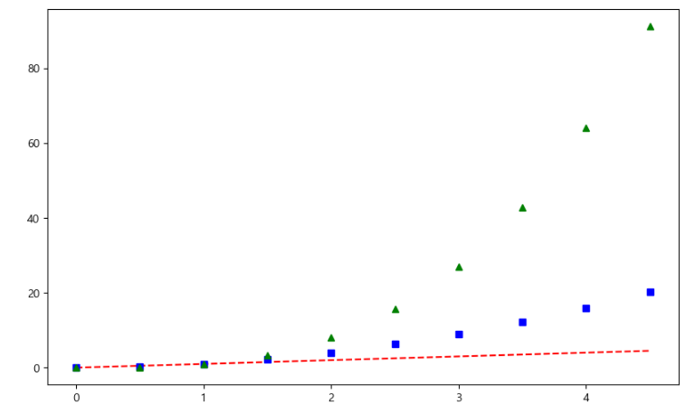
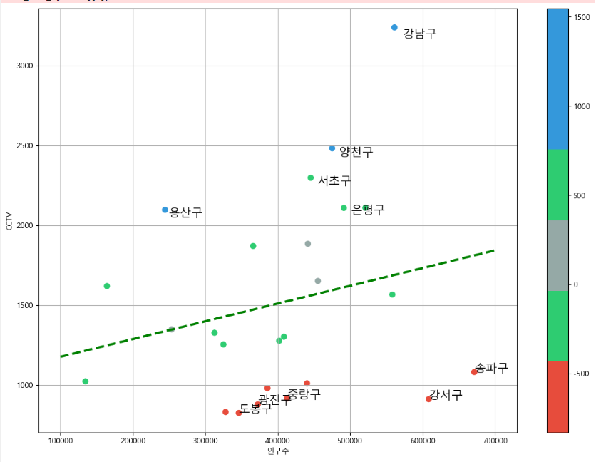
인구가 40만인 구에서 서울시의 전체 경향에 맞는 적당한 CCTV 수는?
fx = np.linspace(100000, 700000,100)
- 경향선을 그리기 위한 x 데이터 생성
- np.linspace(a,b,n): a부터 b까지 n개의 등간격 데이터 생성
def drawGraph():
plt.figure(figsize=(14,10))
plt.scatter(data_result["인구수"], data_result["소계"], s=50)
plt.plot(fx, f1(fx), ls="dashed", lw=3, color="g")
plt.xlabel("인구수")
plt.ylabel("CCTV")
plt.grid(True)
plt.show()
drawGraph()
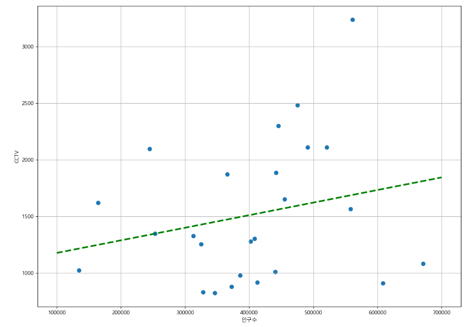
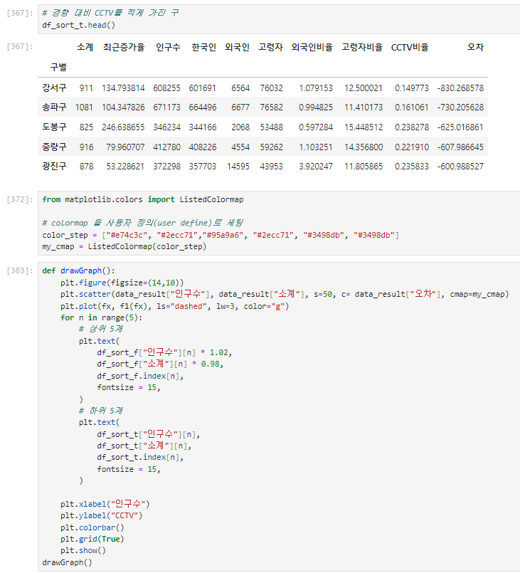
- 강조하고 싶은 데이터 시각화
그래프 다듬기
경향과의 오차 만들기
- 경향(trend)과의 오차를 만들자
- 경향은 f1 함수에 해당 인구를 입력
- f1(data_result["인구수"])
5.4
- 오늘 수강한 분량: 범죄1
[pip 명령]
- python의 공식 모듈 관리자
- pip list: 현재 설치된 모듈 리스트 반환
- pip install module_name: 모듈 설치
- pip uninstall module_name: 설치된 모듈 제거
[conda 명령]
: pip를 사용하면 conda 환경에서 dependency 관리가 정확하지 않을 수 있다.
: 아나콘다에서는 가급적 conda 명령으로 모듈 관리하는 것이 좋음!
: 모든 모듈이 conda로 설치되는 것은 아님!
- conda list: 설치된 모듈 list
- conda install module_name: 모듈 설치
- conda uninstall nodule_name: 모듈 제거
- conda install -c channel_name module_name: 지정된 배포 채널에서 모듈 설치
[googleMaps]
- 실행
import googlemaps
- 구글맵에 key 넣는 법
gmaps_key = 'AIzaSyC8pBZnXPfrh4ZxSR_N9M0ajdNLmGUSVQw'
gmaps = googlemaps.Client(key=gmaps_key) - 사용 예시
gmaps.geocode("서울영등포경찰서", language="ko")
5.5
- 오늘 수강한 분량: 범죄 2~3
[Pandas에 잘 맞춰진 반복문용 명령 iterrows()] - Pandas 데이터 프레임은 대부분 2차원
- 이럴 때 for문을 사용하면, n번째라는 지정을 반복해서 가독률이 떨어짐
- Pandas 데이터 프레임으로 반복문을 만들때 iterrows() 옵션을 사용하면 편함
- 받을 때, 인덱스와 내용으로 나누어 받는 것만 주의