학습내용
1. margin, padding
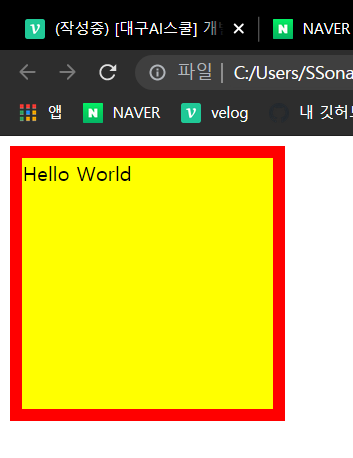
<div class="box-model">
	Hello World
</div>
css↓
.box-model {
	width: 200px;
	height: 200px;
	background-color: yellow;
	border: solid 10px red;

	margin-left: 100px;
	padding-left: 100px;
}
margin - border - padding - content 순으로 구성되어 있다.
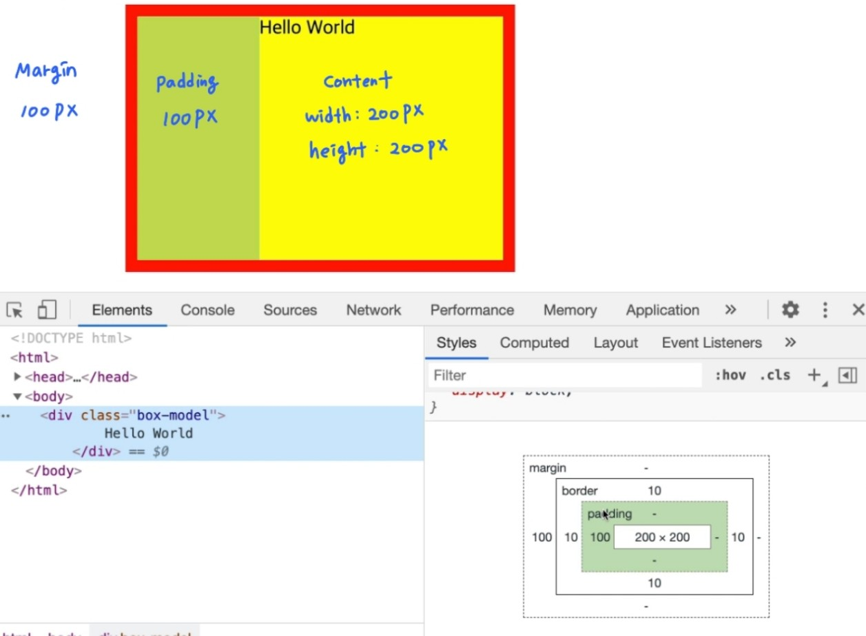
margin과 padding은 특정 오브젝트를 옮기려고 할 때 좌표를 나타내는 css속성이다.
- margin : border의 바깥쪽
- padding : border와 content의 사이
margin과 padding은 각각 top-right-bottom-left의 순으로 값을 입력하면 된다. (12시부터 시계방향으로)
margin: 100px 0 0 100px;
padding: 100px 0 0 100px;

/* css에서 숫자 0은 단위를 생략해서 입력할 수 있다.*/

margin-top: 100px;
margin-right: 0;
margin-botton: 0;
margin-left: 100px;

padding-top: 100px;
padding-right: 0;
padding-bottom: 0;
padding-left: 100px;
css의 코드가 길어질 수록 브라우저의 로딩속도가 길어진다. 짧게 쓰는것을 연습해두면 좋다.
margin과 padding 아무것도 입력하지 않았을때도, 기본적으로 적용이 된다. 아예 아무 공백도 두고싶지 않다면,
html, body {
	margin: 0;
	padding: 0;
}

/* 숫자 하나만 적는 것은 모든 방향의 값을 동일하게 준다는 의미이다. */
.box-model {
	width: 200px;
	height: 200px;
	background-color: yellow;
	border: solid 10px red;

	padding: 100px 0 0 100px;
}
위와같은 css를 입력하였을땐, padding과 content 부분이 가로세로 320px이 된다. (red로 색을 지정한 borderbox의 크기가 320x320 이 되는 것. *border의 굵기도 포함)
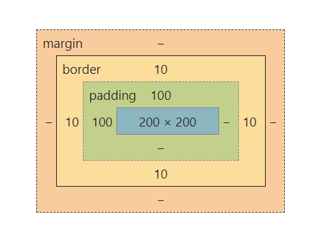

padding값을 넣어도 borderbox의 크기가 변경되지 않게 하려면,
box-sizing: border-box;라는 속성을 width와 height앞에 넣어 준다..box-model { box-sizing: border-box; width: 200px; height: 200px; background-color: yellow; border: solid 10px red; padding: 100px 0 0 100px; }
200x200 사이즈에 맞게 content의 크기가 조절된다.


2. margin 병합현상
1) 형제태그간의 margin병합현상
<div class="margin-one"></div>
<div class="margin-two"></div>
css↓
html, body {
	margin: 0;
	padding: 0;
}


.margin-one {
	width: 100%;
	height: 100px;
	background-color: yellow;

	margin-bottom: 100px;
}

.margin-two {
	width: 100%;
	height: 100px;
	background-color: blue;

	margin-top: 50px;
}
형제태그간에 마진 공백을 공유한 상황에서는, 값이 큰 것이 우선순위가 높다.
- 현재의 코딩에서는 margin-one과 margin-two사이의 공백은 100px이다.

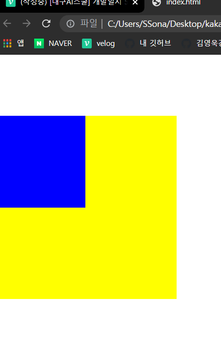
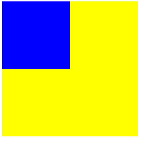
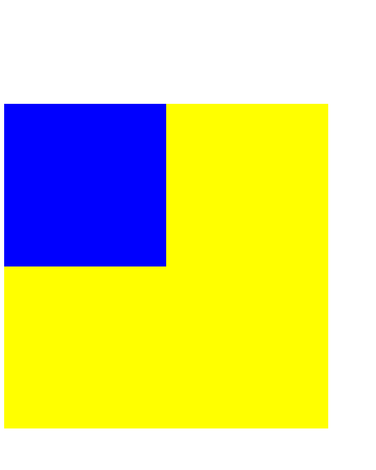
2) 부모 자식 태그간의 margin병합현상
html, css코딩을 하면서 가장 많이 접하게 되는 margin병합 현상이므로 꼭 알아두도록 하자.
<div class="margin-parent">
	<div class="margin-child"></div>
</div>
css↓
html, body {
	margin: 0;
	padding: 0;
}


.margin-parent {
	width: 300px;
	height: 300px;
	background-color: yellow;
}

.margin-child {
	width: 150px;
	height: 150px;
	background-color: blue;

	margin-top: 100px;
}
자식태그에 적용된 margin값이 부모태그에도 그대로 적용이 된다.
부모태그의 색상인 노란색도 함께 이동
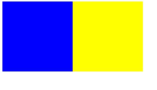
자식태그만 이동시키고 싶다면? position속성을 걸어주면 된다.
position은 뒤에서 자세히html, body { margin: 0; padding: 0; } .margin-parent { width: 300px; height: 300px; background-color: yellow; } .margin-child { position: absolute; width: 150px; height: 150px; background-color: blue; margin-top: 100px; }

3. html의 block, inline요소에 따른 css
1) display
html은 크게 두가지의 요소로 나뉜다.
영역지정을 할 수 있고 연속된 같은 태그를 사용했을 때 줄바꿈 현상이 일어나는 block요소와, 영역 공간을 지정할 수 없고 연속된 같은 태그를 사용했을 때 x축(가로)로 나열되는 inline요소 두 가지이다.
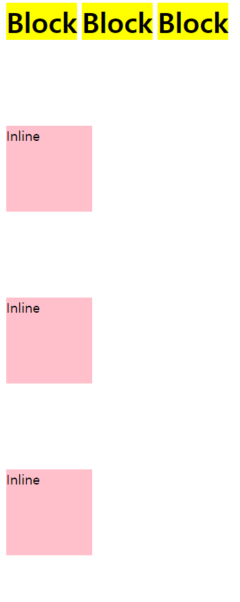
<h1>Block</h1>
	<h1>Block</h1>
	<h1>Block</h1>

	<span>Inline</span>
	<span>Inline</span>
	<span>Inline</span>
css↓
h1 {
	width: 100px;
	height: 100px;
	background-color: yellow;

	margin-top: 100px;
}

span {
	width: 100px;
	height: 100px;
	background-color: pink;

	margin-top: 100px;
}
위의 css코드를 작성하여 웹 실행을 시키면, block요소들은 width, height, margin-top 등의 공간이 적용되었지만, inline 요소들은 공간이 적용되지 않는다. 배경색상 핑크만 적용되어 있는 것을 알 수 있다.
여기에서 display 속성을 넣으면 block, inline요소를 변경할 수 있다.
h1 {
	display: inline;

	width: 100px;
	height: 100px;
	background-color: yellow;

	margin-top: 100px;
}

span {
	display: block;

	width: 100px;
	height: 100px;
	background-color: pink;

	margin-top: 100px;
}
display: inline-block으로 작성하면 inline과 block요소를 둘 다 적용된다.h1 { display: inline-block; width: 100px; height: 100px; background-color: yellow; margin-top: 100px; } span { display: inline-block; width: 100px; height: 100px; background-color: pink; margin-top: 100px; }
- h1과 span태그 모두 margin-top: 10px; 적용되었고, 100x100의 공간이 만들어져 있음.
- block과 Inline 박스 위치가 조금 다른것은, 각각 h1, span태그에서 기본 설정된 폰트 크기가 다르기 때문이다.
다음 2)에서 나올 vertical-align을 이용하여 가지런하게 정렬할 수 있다.h1, span { vertical-align: top; }


2) vertical-align
<span class="inline">Inline</span>
<span class="inline-block">Inline-Block</span>
<img src="https://via.placeholder.com/200">
css↓
.inline-block {
	display: inline-block;

	width: 100px;
	height: 100px;
	background-color: yellow;
}
위와 같은 코드를 입력했을 때, 아래와 같이 태그들이 정렬되지 않은 채 웹페이지가 실행된다.

vertical-align은 이렇게 가로축이 정렬되지 않았을 때, 이를 정렬해주기 위한 속성이다.
- vertical-align: top; : 가장 크기가 큰 개체의 윗부분을 기준으로 정렬된다.
- vertical-align: bottom; : 가장 크가가 큰 개체의 아래부분을 기준으로 정렬된다.
- vertical-align: middle; 가장 크기가 큰 개체의 중간선을 기준으로 정렬된다.
★ vertical-align은 inline요소에서만 사용할 수 있다.★
h1태그 등의 block 요소의 태그에서는 적용되지 않는다.
2) 처음에 작성되었던 css코드의 아래부분에 다음의 코드를 추가한다.
★ 정렬시키려는 오브젝트 각각에 모두 작성해야 한다. ★
.inline, .inline-block, img {

	vertical-align: middle;
}
4. position 속성
position 속성을 이해하기 위해서는 먼저 차원에 대해서 알아야 한다.
- 1차원 : 선
- 2차원 : 평면
- 3차원 : z축이 등장
웹사이트의 코딩은 2차원과 3차원을 적절하게 섞어서 작성하게 된다.
position은 내가 만드는 웹사이트를 2차원으로 만들것인지, 3차원으로 만들것인지를 결정짓는 속성값이다.
★ position 속성을 사용할 때, 기억해야할 3가지
1. margin-top 사용시, 부모 자식 지간에 발생하는 margin병합 현상이 일어나는지
2. top, right, bottom, left 속성을 사용할 수 있는지
3. 자식의 높이값이 부모에게 영향을 주는지

- margin-top/right/bottom/left : 공백을 넣음으로써 밀려서 이동이 되는 것.
- top/right/bottom/left : 오브젝트가 주체가 되어서 움직이는 속성. 브라우저 왼쪽, 상단을 기준으로 움직인다.
1) static
<div class="static-parent">
	<div class="static-child"></div>
</div>
css↓
.static-parent {
	width: 300px;
	height: 300px;
	background-color: yellow;
}

.static-child {
	width: 150px;
	height: 150px;
	background-color: blue;
}
먼저 위의 코드를 입력한다.
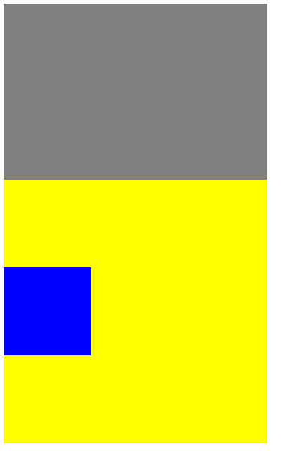
① 마진병합현상이 일어나는지 확인한다.
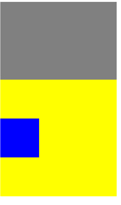
자식태그에 position과 margin-top을 설정 해 본다.
.static-child {
	position: static;

	width: 150px;
	height: 150px;
	background-color: blue;

	margin-top: 100px;
}
자식태그에서 작성한 margin-top이 부모태그에도 적용되는 마진 병합현상이 일어남
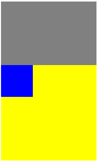
② margin-top을 지우고 top을 입력해 본다.
.static-child {
	position: static;

	width: 150px;
	height: 150px;
	background-color: blue;

	top: 100px;
}
top은 적용되지 않는다.
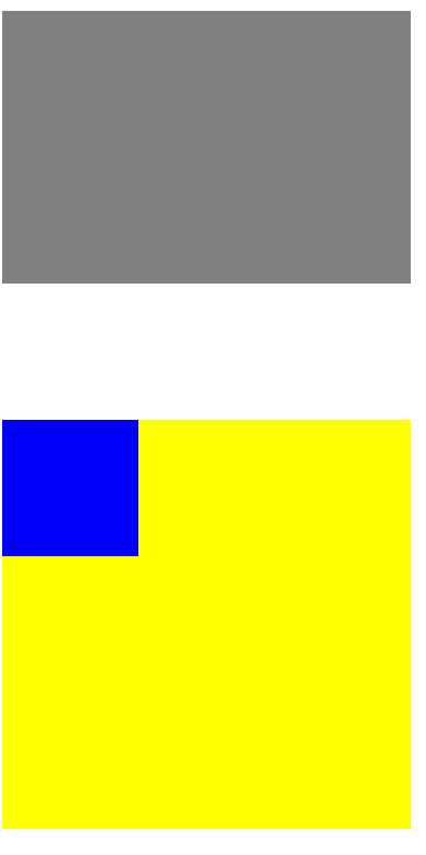
③ 부모태그의 height를 지워본다.
자식태그에서 적용된 높이값이 적용되었다.
position: static;
- 마진 병합 현상 (○)
- top, right, bottom, left (X)
- 자식의 높이값이 부모의 높이값에 영향 (○)
→ 2차원의 특징
static속성은 모든 html이 가지고 있는 기본 속성이다.
따로 position이 작성되어 있지 않다면 모두 static(2차원)이다.
2) fixed
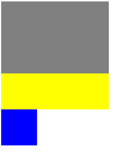
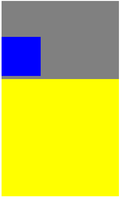
div class="box1"></div>

<div class="fixed-parent">
	<div class="fixed-child"></div>
</div>

<div class="box2"></div>
css↓
.box1 {
	width: 300px;
	height: 200px;
	background-color: gray;

}

.fixed-parent {
	width: 300px;
	height: 300px;
	background-color: yellow;

}

.fixed-child {
	width: 100px;
	height: 100px;
	background-color: blue;

}

.box2 {
	width: 300px;
	height: 200px;
	background-color: green;

}
먼저 위의 코드를 입력한다.
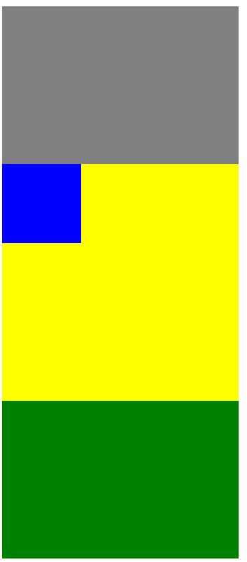
① 마진병합현상이 일어나는지 확인한다.
자식태그에 position과 margin-top을 설정 해 본다.
.fixed-child {
	position: fixed;

	width: 100px;
	height: 100px;
	background-color: blue;

	margin-top: 100px;
}
마진 병합현상이 일어나지 않을 뿐 아니라, 스크롤을 내려도 파란색은 그 자리에 있다. *position: fixed:의 특징 (배너광고에 많이 쓰인다.)
② margin-top을 지우고 top을 입력해 본다.
.fixed-child {
	position: fixed;

	width: 100px;
	height: 100px;
	background-color: blue;

	top: 100px;
}
top이 적용되었다.
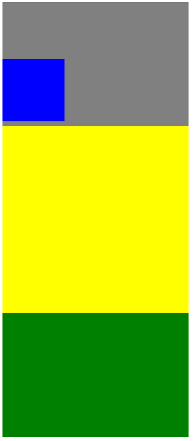
③ 부모태그의 height를 지워본다.
.fixed-parent {

	width: 300px;
	background-color: yellow;

}
자식의 높이값이 부모태그에 적용되지 않는다
position: fixed;
- 마진 병합 현상 (X)
- top, right, bottom, left (○)
- 자식의 높이값이 부모의 높이값에 영향 (X)
- position; fixed; : 스크롤을 내려도 그 자리에 있다. 배너광고에 많이 쓰임
→ 3차원의 특징
3) relative
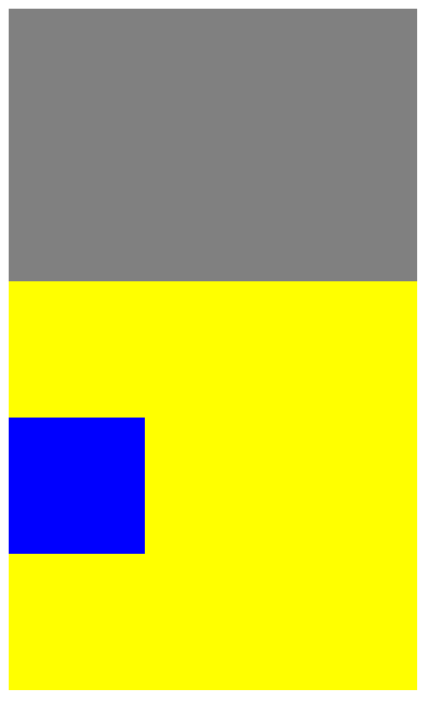
<div class="box1"></div>

<div class="relative-parent">
	<div class="relative-child"></div>
</div>
css↓
.box1 {
	width: 300px;
	height: 200px;
	background-color: gray;

}

.relative-parent {
	width: 300px;
	height: 300px;
	background-color: yellow;

}

.relative-child {
	width: 100px;
	height: 100px;
	background-color: blue;
}
먼저 위의 코드를 입력한다
① 마진병합현상이 일어나는지 확인한다.
자식태그에 position과 margin-top을 설정 해 본다.
.relative-child {
	position: relative;

	width: 100px;
	height: 100px;
	background-color: blue;

	margin-top: 100px;
}
마진 병합현상이 일어난다.
② margin-top을 지우고 top을 입력해 본다.
.relative-child {
	position: relative;

	width: 100px;
	height: 100px;
	background-color: blue;

	top: 100px;
}
부모태그를 기준으로 top이 적용된다.
③ 부모태그의 height를 지워본다.
.relative-parent {
	width: 300px;
	background-color: yellow;

}
자식의 태그의 높이가 부모태그에 적용된다.
position: relative;
- 마진 병합 현상 (○)
- top, right, bottom, left (○) 부모태그를 기준으로 top 적용
- 자식의 높이값이 부모의 높이값에 영향 (○)
→ 2차원, 3차원의 특징을 모두 갖고 있다.
4) absolute
<div class="box1"></div>

<div class="absolute-parent">
	<div class="absolute-child"></div>
</div>
css↓
.box1 {
	width: 300px;
	height: 200px;
	background-color: gray;

}

.absolute-parent {
	width: 300px;
	height: 300px;
	background-color: yellow;
}

.absolute-child {
	width: 100px;
	height: 100px;
	background-color: blue;
}
먼저 위의 코드를 입력한다

① 마진병합현상이 일어나는지 확인한다.
자식태그에 position과 margin-top을 설정 해 본다.
.absolute-child {
	position: absolute;

	width: 100px;
	height: 100px;
	background-color: blue;

	margin-top: 100px;
}
마진 병합현상이 일어나지 않는다.
② margin-top을 지우고 top을 입력해 본다.
.absolute-child {
	position: absolute;

	width: 100px;
	height: 100px;
	background-color: blue;

	top: 100px;
★ 부모태그에 아무런 position이 작성되어있지 않은 경우(기본값으로 static 2차원),
브라우저를 기준으로 top이 적용된다.
★ 부모태그의 position 속성이 3차원인 경우
부모태그를 기준으로 top이 적용된다.
③ 부모태그의 height를 지워본다.
.absolute-parent {
	width: 300px;
	background-color: yellow;
}
자식태그의 높이값이 부모태그에 적용되지 않는다.
position: absolute;
- 마진 병합 현상 (x)
- top, right, bottom, left (○)
-부모태그의 position 속성이 2차원인 경우 : 브라우저를 기준으로 이동
-부모태그의 position 속성이 3차원인 경우 : 부모태그를 기준으로 이동- 자식의 높이값이 부모의 높이값에 영향 (x)
→ 3차원의 특징
어려웠던 점과 해결
그냥 강의를 한번 쭉 볼때는 이해도 되고 괜찮았는데, 개발일지 작성할때 position부분 갑자기 너무 헷갈려서 수정을 많이했다....
중간에 궁금했던 점은 inline-block을 설정해서 동일한 크기의 영역을 6개 만들었는데 살짝씩 수평이 맞지않고 삐뚤빼뚤하게 출력이 되었다.
추측으로는 h1태그와 span태그의 폰트 크기가 달라서 글자의 높이에 따라서 background-color가 지정되어서 그렇다고 생각했다.
혹시나 하는 마음에 바로 다음에 나오는 vertical-align: top;을 적용해 보았더니 깔끔하게 정렬되었다.
