
Figma 화면
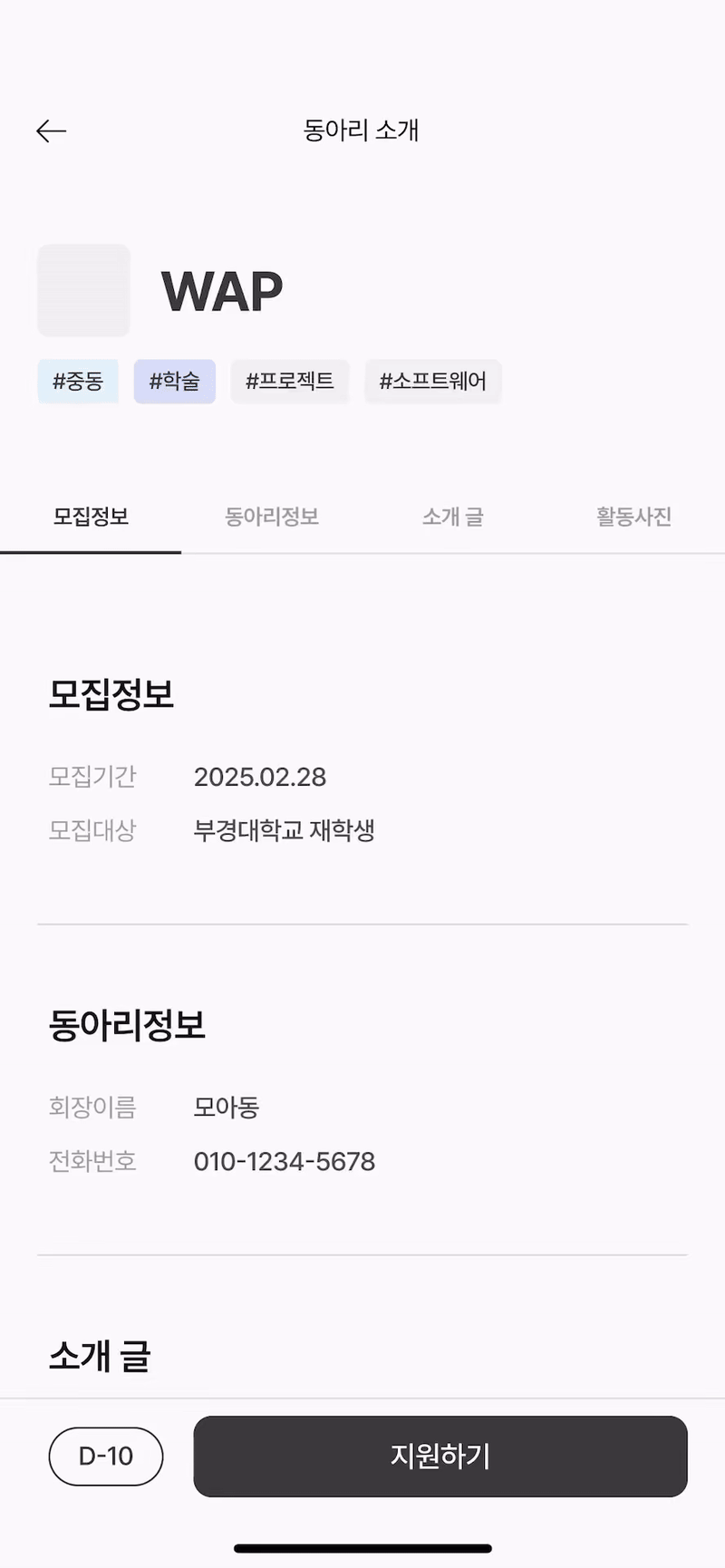
지금 만들고 있는 동아리 지원 플랫폼에서 디자이너분이 주신 피그마 영상입니다. 이 페이지는 동아리 상세보기 페이지입니다. 개발하려고 하는 것은 모집정보, 동아리정보, 소개글, 활동사진이 있는 탭과 자동 스크롤입니다.
-
탭 클릭 시 클릭된 메뉴의 아래 테두리가 검게 칠해진다.
-
탭을 클릭할 시 해당 컨텐츠로 자동 스크롤된다.
이것이 구현할 때 필요한 기능입니다.
메뉴Tab
모바일 화면이기 때문에 500px보다 클 때는 탭이 보이지 않도록 설정합니다. 총 4개의 버튼이 필요하기 때문에 width는 25%로 해 두었습니다.
InfoTab.styles.ts
import styled from 'styled-components';

export const InfoTabWrapper = styled.div`
  display: none;
  position: fixed;
  margin-top: -40px;

  @media (max-width: 500px) {
    display: flex;
    flex-direction: row;
    width: 100%;
    height: 45px;
    background-color: white;
  }
`;

export const InfoTabButton = styled.button`
  width: 25%;
  border: none;
  border-bottom: 2px solid #cdcdcd;
  background-color: transparent;
  cursor: pointer;
  font-size: 14px;
  transition: border-bottom 0.3s ease;

  &.active {
    border-bottom: 2px solid black;
  }
`;
active로 클릭할 시에만 border-bottom을 black으로 설정할 겁니다.
active 클래스를 사용하려면 현재 선택된 탭이 무엇인지 알아야 합니다. 그러기 위해선 Tab의 상태를 관리하는 로직이 필요합니다.
InfoTab.tsx
import React, { useState } from 'react';
import * as Styled from './InfoTabs.styles';

const tabLabels = ['모집정보', '동아리정보', '소개글', '활동사진'];

const InfoTabs = ({ onTabClick }: { onTabClick: (index: number) => void }) => {
  const [activeTab, setActiveTab] = useState(0);

  const handleTabClick = (index: number) => {
    setActiveTab(index);
    onTabClick(index);
  };

  return (
    <Styled.InfoTabWrapper>
      {tabLabels.map((label, index) => (
        <Styled.InfoTabButton
          key={label}
          className={activeTab === index ? 'active' : ''}
          onClick={() => handleTabClick(index)}>
          {label}
        </Styled.InfoTabButton>
      ))}
    </Styled.InfoTabWrapper>
  );
};

export default InfoTabs;useState로 클릭한 버튼만 active상태가 되고, 다른 버튼은 비활성화되도록 하였습니다.
자동 스크롤
useAutoScroll.ts
import { useRef } from 'react';

const useAutoScroll = () => {
  const sectionRefs = useRef<(HTMLDivElement | null)[]>(
    new Array(4).fill(null),
  );

  const scrollToSection = (index: number) => {
    if (sectionRefs.current[index]) {
      const element = sectionRefs.current[index];
      const yOffset = -100;

      window.scrollTo({
        top: element.getBoundingClientRect().top + window.scrollY + yOffset,
        behavior: 'smooth',
      });
    }
  };

  return { sectionRefs, scrollToSection };
};

export default useAutoScroll;
📌 useAutoScroll 훅 설명
useRef로 스크롤할 섹션들을 참조할 배열을 만듭니다. 배열 요소는 위에 만들어 두었던 탭의 메뉴들에 해당합니다.scrollToSection는 index를 받아서 해당 인덱스 섹션으로 스크롤되도록 합니다.- yOffset은 스크롤 위치를 조정하기 위해 추가했습니다.
element.getBoundingClientRect().top는 현재 뷰포트 내에서 해당 요소의 상대적인 위치를 가져오는데,여기에window.scrollY와 yOffset을 더하면 절대적인 화면 위치로 스크롤됩니다.
InfoBox.tsx
import React from 'react';
import * as Styled from './InfoBox.styles';
import { InfoList } from '@/types/Info';

const infoData: InfoList[] = [
  {
    title: '모집정보',
    descriptions: [
      { label: '모집기간', value: '2025.02.28' },
      { label: '모집대상', value: '재학생' },
    ],
  },
  {
    title: '동아리정보',
    descriptions: [
      { label: '회장이름', value: 'xxx' },
      { label: '전화번호', value: '010-1234-5678' },
    ],
  },
];

const InfoBox = ({
  sectionRefs,
}: {
  sectionRefs: React.RefObject<(HTMLDivElement | null)[]>;
}) => {
  return (
    <Styled.InfoBoxWrapper>
      {infoData.map((info, index) => (
        <Styled.InfoBox
          key={index}
          ref={(el) => {
            sectionRefs.current[index] = el;
          }}>
          <Styled.Title>{info.title}</Styled.Title>
          <Styled.DescriptionContainer>
            {info.descriptions.map((desc, idx) => (
              <Styled.DescriptionWrapper key={idx}>
                <Styled.LeftText>{desc.label}</Styled.LeftText>
                <Styled.RightText>{desc.value}</Styled.RightText>
              </Styled.DescriptionWrapper>
            ))}
          </Styled.DescriptionContainer>
        </Styled.InfoBox>
      ))}
    </Styled.InfoBoxWrapper>
  );
};

export default InfoBox;- 반환값 타입을
React.RefObject로 하면 DOM요소에 접근할 수 있습니다. 특징은 current가readonly라 직접 변경할 수 없다는 점입니다. - 배열에
ref를 동적으로 할당하면 클릭 시 해당 div로 이동합니다.
ClubDetailPage.tsx
const ClubDetailPage = () => {
  const { sectionRefs, scrollToSection } = useAutoScroll();

  return (
    <>
      <Header />
      <InfoTabs onTabClick={scrollToSection} />
      <Styled.PageContainer>
        <InfoBox sectionRefs={sectionRefs} />
        <IntroduceBox sectionRefs={sectionRefs} />
      </Styled.PageContainer>
      <Footer />
    </>
  );
};
export default ClubDetailPage;
이제 상세페이지로 돌아가서 useAutoScroll훅에서 sectionRefs를 가져옵니다. 스크롤되어야 하는 컴포넌트에 sectionRefs를 전달하면 완성입니다.
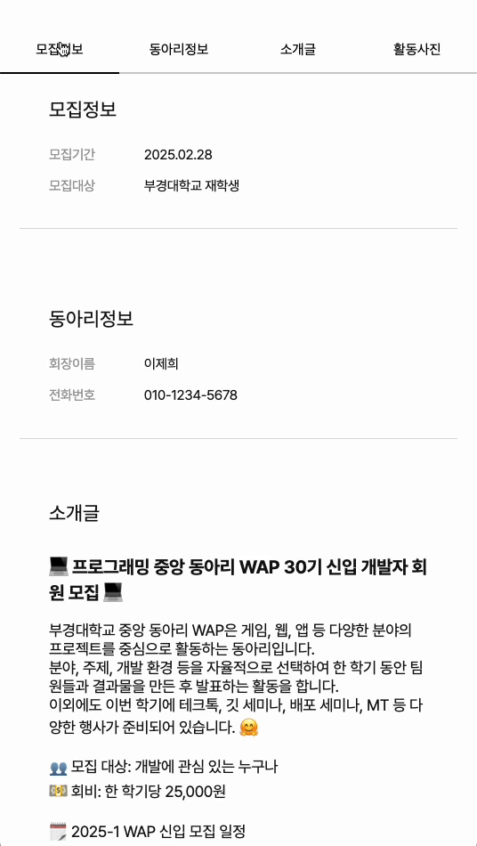
최종화면

FrontEnd Developer
Chrome에서는 AdBlock을 껐는데도 이미지? 영상? 이 안나오네요.