How to Create Neon Text With CSS
css 속성으로 네온사인 만들기
네온사인 글자를 웹사이트에 추가해서 웹페이지를 꾸며볼 수 있다
반짝이는 효과를 준 문자를 만들고 애니메이션을 추가해서 네온사인의 느낌을 줄 수 있다
1. 반짝이는 효과를 문자에 넣기
-
'text-shadow'로 문자의 반짝이는 효과를 만든다.
-
text-shadow - 띄어쓰기로 구분하고 추가를 할때 ,(쉼표)로 구분한다.
-
text-shadow: [x-offset][y-offset] [blur-radius][color];
- 1번째값은 가로선의 위치, 세로선의 위치, 그림자의 반경, 색상
-
1,2번째 값은 기본인 0값으로 설정 blur 값과 원하는 컬러와 화이트 색상이 필요하다.
-
글자의 blur는 오름차순 순으로 추가를 하고 1~3번째는 화이트 4~10번째는 원하는 색상.

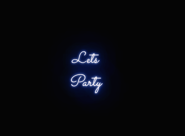
<!DOCTYPE html>
<html lang="en">
<head>
   <meta charset="UTF-8">
   <meta http-equiv="X-UA-Compatible" content="IE=edge">
   <meta name="viewport" content="width=device-width, initial-scale=1.0">
   <link rel="preconnect" href="https://fonts.googleapis.com">
   <link rel="preconnect" href="https://fonts.gstatic.com" crossorigin>
   <link href="https://fonts.googleapis.com/css2?family=Sacramento&display=swap" rel="stylesheet">
   <title>neon</title>
   <style>
       body {
           background-color: rgb(5, 5, 5);
       }
       div {
           font-family: 'Sacramento', cursive;
           display: flex;
           flex-direction: column;
           height: 100vh;
           align-items: center;
           justify-content: center;
           font-style: italic;
       }
      .text p {
           font-size: 54px;
           font-weight: 400;
           text-align: center;
           color: #fff;
           margin: 0;
     		text-shadow:
               0 0 7px #fff,
               0 0 10px #fff,
               0 0 21px #fff,
               0 0 42px rgb(207, 51, 147),
               0 0 82px rgb(207, 51, 147),
               0 0 92px rgb(207, 51, 147),
               0 0 102px rgb(207, 51, 147),
               0 0 151px rgb(207, 51, 147);
       }
</style>
</head>
<body>
   <div class="text">
       <p>Lets </p>
       <p>Party</p>
   </div>
</body>
</html>
- 5가지 미만의 그림자로 만들 수 있다면 좋겠지만, 더 현실적으로 보이게 할려면 다양한 시도를
해봐야 한다. 블러의 크기 조절과 애니메이션 추가로 다양하게 시도를 해보자.
2. 깜빡거리는 효과 만들어보기
- 네온사인은 빛이 밝아지고 어두워지는게 반복된다. 애니메이션으로 만들어보자

   @keyframes flicker {
            0%, 16%, 26%, 30%, 58%, 64%, 100% {
                text-shadow:
                0 0 7px #fff,
                0 0 10px rgb(207, 51, 147),
                0 0 21px rgb(207, 51, 147),
                0 0 42px rgb(207, 51, 147),
                0 0 82px rgb(207, 51, 147),
                0 0 92px rgb(207, 51, 147),
                0 0 102px rgb(207, 51, 147),
                0 0 151px rgb(207, 51, 147);
            }


            22%, 28%, 60% {
                text-shadow: none;
            }
        }

 .text p {
	 animation: flicker 1.5s infinite alternate;
  	 color: #fff;
}
- text-shadow를 애니메이션으로 넣고 처음보다 더 사실적으로 느껴지게 효과를 주었다.
- 빛이 깜빡이길 원하는 곳에 그림자를 제거하고 간격을 많이 주면 텀이 길어져 사실적인 느낌이
떨어진다 사이 간격을 적게 준다.
3. 반복적으로 움직이는 효과 만들기
- 애니메이션의 시작과 끝에만 그림자를 지정한다.
- 끝에 더 큰 그림자를 넣어준다.
- 애니메이션 시간을 짧게 줘서 많이 깜빡거릴 수 있도록 해준다.

        @keyframes flicker {

            100% {

                text-shadow:
                0 0 4px  rgb(0, 72, 255),
                0 0 11px rgb(0 54 196),
                0 0 18px rgb(0 54 196),
                0 0 40px rgb(0 54 196),
                0 0 80px rgb(0 54 196),
                0 0 90px rgb(0 54 196),
                0 0 100px rgb(0 54 196),
                0 0 150px rgb(0 54 196);

            }

            0% {

                text-shadow:
                0 0 4px  rgb(0, 72, 255),
                0 0 12px rgb(0 54 196),
                0 0 15px rgb(0 54 196),
                0 0 38px rgb(0 54 196),
                0 0 73px rgb(0 54 196),
                0 0 80px rgb(0 54 196),
                0 0 94px rgb(0 54 196),
                0 0 160px rgb(0 54 196);

            }
        }

         .text p {
            font-size: 72px;
            text-align: center;
            color: rgb(255, 248, 252);
            margin: 0;
            animation: flicker 0.13s ease-in infinite alternate;
            text-shadow:
                0 0 7px rgb(255, 248, 252),
                0 0 10px rgb(255, 248, 252),
                0 0 21px rgb(255, 248, 252),
                0 0 42px rgb(0 54 196),
                0 0 82px rgb(0 54 196),
                0 0 92px rgb(0 54 196),
                0 0 102px rgb(0 54 196),
                0 0 151px rgb(0 54 196);
  		}
🔨 마치며...
참고 문서를 보고 만들며 텍스트 1,2,3번째 text-shadow에 화이트에 가깝지만
내가 원하는 색상이 조금 섞인 색을 넣고 애니메이션 text-shadow에는 원하는 색상값만 넣고
첫번째 애니메이션 text-shadow는 조금 더 밝은 색상을 넣었다
네온사인과 비슷하게 만들어볼려고 시도했는데 괜찮게 나와서 재밌는 경험을 해볼 수 있었다.
크롬 개발자도구로 블러를 조절하면서 다양한 시도를 할 수 있었다.