재사용 가능한 UI component를 만들어보자!
Button
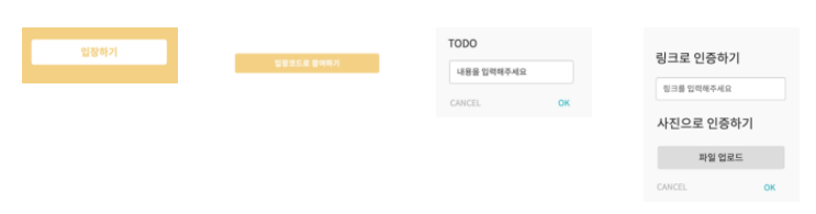
처음 UI대로 생각을 해보자면, outlined, fill, text 이렇게 3가지의 유형이 필요할 것 같았다.
각각의 size와 color는 optional로!
import React from "react";

type Variant = "outlined" | "fill" | "ghost";
type Size = "xs" | "sm" | "md" | "lg";

export default function Button({
  children,
  onClick,
  variant = "fill",
  size = "md",
}: {
  children: React.ReactNode;
  onClick?: () => {};
  variant?: Variant;
  size?: Size;
}) {
  const getVariantStyle = (variant: Variant) => {
    if (variant === "outlined") {
      return "btn-outlined";
    } else if (variant === "fill") {
      return "btn-primary";
    } else if (variant === "ghost") {
      return "btn-ghost";
    }
  };

  const getSizeStyle = (size: Size) => {
    if (size === "xs") {
      return "btn-xs";
    } else if (size === "sm") {
      return "btn-sm";
    } else if (size === "md") {
      return "btn-md";
    } else if (size === "lg") {
      return "btn-lg";
    }
  };

  return (
    <button
      className={`${getVariantStyle(variant)} ${getSizeStyle(size)}`}
      onClick={onClick}
    >
      {children}
    </button>
  );
}
💡 return 문이 많은것은 전형적인 안티패턴이다……
그렇다면 변수를 선언해서 바꿔보자!
import React from "react";

type Variant = "outlined" | "fill" | "ghost";
type Size = "xs" | "sm" | "md" | "lg";

export default function Button({
  children,
  onClick,
  variant = "fill",
  size = "md",
}: {
  children: React.ReactNode;
  onClick?: () => {};
  variant?: Variant;
  size?: Size;
}) {
  const getVariantStyle = (variant: Variant) => {
    let style;
    if (variant === "outlined") {
      style = "btn-outlined";
    } else if (variant === "fill") {
      style = "btn-primary";
    } else if (variant === "ghost") {
      style = "btn-ghost";
    }
    return style;
  };

  const getSizeStyle = (size: Size) => `btn-${size}`;

  return (
    <button
      className={`${getVariantStyle(variant)} ${getSizeStyle(size)}`}
      onClick={onClick}
    >
      {children}
    </button>
  );
}
한단계 더 나아가서 Map 자료구조를 이용해보자
import React, { useMemo } from "react";

type Variant = "outlined" | "contained" | "text";
type Size = "xs" | "sm" | "md" | "lg";

export default function Button({
  children,
  onClick,
  variant = "contained",
  size = "md",
}: {
  children: React.ReactNode;
  onClick?: React.MouseEventHandler<HTMLButtonElement>;
  variant?: Variant;
  size?: Size;
}) {
  const getVariantStyle = (variant: Variant) => {
    const styleObj = {
      outlined: "btn-outlined",
      contained: "btn-primary",
      text: "btn-text",
    };
    const styleMap = new Map(Object.entries(styleObj));
    return styleMap.get(variant);
  };
  const getSizeStyle = (size: Size) => `btn-${size}`;
  const _style = useMemo(() => getVariantStyle(variant), [variant]);
  return (
    <button
      className={`${getVariantStyle(variant)} ${getSizeStyle(size)}`}
      onClick={onClick}
    >
      {children}
    </button>
  );
}
- 먼저
styleObj객체를 선언하고, new Map을 해준다.- Map의 value부분을 get 한 값을 return 해주면 깔끔!
하지만 이보다도 더 쉽게 한번 더 리팩토링을 해보자!
import { CSSProperties, MouseEventHandler, ReactNode } from 'react';

type Variant = 'outlined' | 'contained' | 'text';
const styleObj = {
  outlined: 'btn-outlined',
  contained: 'btn-primary',
  text: 'btn-text',
};

const Button = ({
  children,
  onClick,
  variant = 'contained',
  size = 'md',
  style,
}: {
  children: ReactNode;
  onClick?: MouseEventHandler<HTMLButtonElement>;
  variant?: Variant;
  size?: Size;
  style?: CSSProperties;
}) => (
  <button
    className={`${styleObj[variant]} btn-${size}`}
    onClick={onClick}
    style={style}
  >
    {children}
  </button>
);

export default Button;
함수를 또 만드는것은 렌더될 때마다 새로운 함수를 만들게 되니 차라리 간단하게할 수 있는것은 이렇게....!!!
Text
title, content 두가지 유형의 Text가 필요할 것으로 생각되었다.
각각의 size와 color는 optional로!
import React, { CSSProperties } from "react";
type TextVariant = "title" | "content";

interface Props {
  children: React.ReactNode;
  style?: CSSProperties;
  type?: TextVariant;
  size?: Size;
  color?: Color;
}

export default function Text({
  children,
  type = "content",
  size = "md",
  color = "white",
  style,
}: Props) {
  const getTextSize = (type: TextVariant, size: Size) => {
    let textsize;
    if (type === "title") {
      const textTitleSizeObj = {
        sm: "text-title-14",
        md: "text-title-16",
        lg: "text-title-18",
        xl: "text-title-24",
        xxl: "text-title-40",
      };
      const textTitleSizeMap = new Map(Object.entries(textTitleSizeObj));
      textsize = textTitleSizeMap.get(size);
    } else {
      const textContentSizeObj = {
        sm: "text-content-14",
        md: "text-content-16",
        lg: "text-content-18",
        xl: "text-content-24",
        xxl: "text-content-40",
      };
      const textContentSizeMap = new Map(Object.entries(textContentSizeObj));
      textsize = textContentSizeMap.get(size);
    }
    return textsize;
  };
  const getTextColor = (color: Color) => {
    const textColorObj = {
      primary: "text-color-primary",
      primaryLight: "text-color-primaryLight",
      blue: "text-color-blue",
      black: "text-color-black",
      background: "text-color-background",
      gray: "text-color-gray",
      grayDark: "text-color-grayDark",
      line: "text-color-line",
      lineLight: "text-color-lineLight",
      white: "text-color-white",
      red: "text-color-red",
      redLight: "text-color-redLight",
    };
    const textColorMap = new Map(Object.entries(textColorObj));
    return textColorMap.get(color);
  };
  return type === "title" ? (
    <h1
      className={`${getTextSize(type, size)} ${getTextColor(color)}`}
      style={style}
    >
      {children}
    </h1>
  ) : (
    <p
      className={`${getTextSize(type, size)} ${getTextColor(color)}`}
      style={style}
    >
      {children}
    </p>
  );
}
먼저 size와 color는 지정해준 대로 변경되어야하지만, 이또한 아무값이나 들어오면 재사용 컴포넌트의 의미가 떨어짐으로, 미리 정의를 해주었다. 또한, Button에서 사용했던 Map 자료구조를 통해 value값을 return 받는 부분으로 코드를 깔끔하게 작성할 수 있었다!
inline으로 style을 준이유는, Sass에서 inline style을 최대한 지양해야한다는것을 알지만, 그럼에도 어쩔수 없는 경우 스타일만 주기위해 의미없는 div로 depth를 깊게하는 것 보단 inline으로 style을 적용하는것이 좋다고 생각되었다.
버튼과 같은 방식으로 한번 더 리팩토링!!
import { CSSProperties } from 'react';
type TextVariant = 'title' | 'content';

interface Props {
  children: React.ReactNode;
  style?: CSSProperties;
  type?: TextVariant;
  size?: Size;
  color?: Color;
}

const getTextSize = (type: TextVariant, size: Size) => {
  return {
    sm: `text-${type}-14`,
    md: `text-${type}-16`,
    lg: `text-${type}-18`,
    xs: `text-${type}-12`,
    xl: `text-${type}-24`,
    xxl: `text-${type}-40`,
  }[size];
};

const textColorObj: Record<Color, string> = {
  primary: 'text-color-primary',
  primaryLight: 'text-color-primaryLight',
  blue: 'text-color-blue',
  black: 'text-color-black',
  background: 'text-color-background',
  gray: 'text-color-gray',
  grayDark: 'text-color-grayDark',
  line: 'text-color-line',
  lineLight: 'text-color-lineLight',
  white: 'text-color-white',
  red: 'text-color-red',
  redLight: 'text-color-redLight',
  grayLight: 'text-color-grayLight',
};

export default function Text({
  children,
  type = 'content',
  size = 'md',
  color = 'white',
  style,
}: Props) {
  return type === 'title' ? (
    <h1
      className={`${getTextSize(type, size)} ${textColorObj[color]}`}
      style={style}
    >
      {children}
    </h1>
  ) : (
    <p
      className={`${getTextSize(type, size)} ${textColorObj[color]}`}
      style={style}
    >
      {children}
    </p>
  );
}

프론트엔드 개발자 항상 뭘 하고있는 슬킹(seulki + ing)