웹 기초와 HTML/CSS
1주차 학습
아래의 사이트를 참고하여 강의를 수강하시면 됩니다.
같이 들으면 좋은 강의(선택사항)
1주차 과제
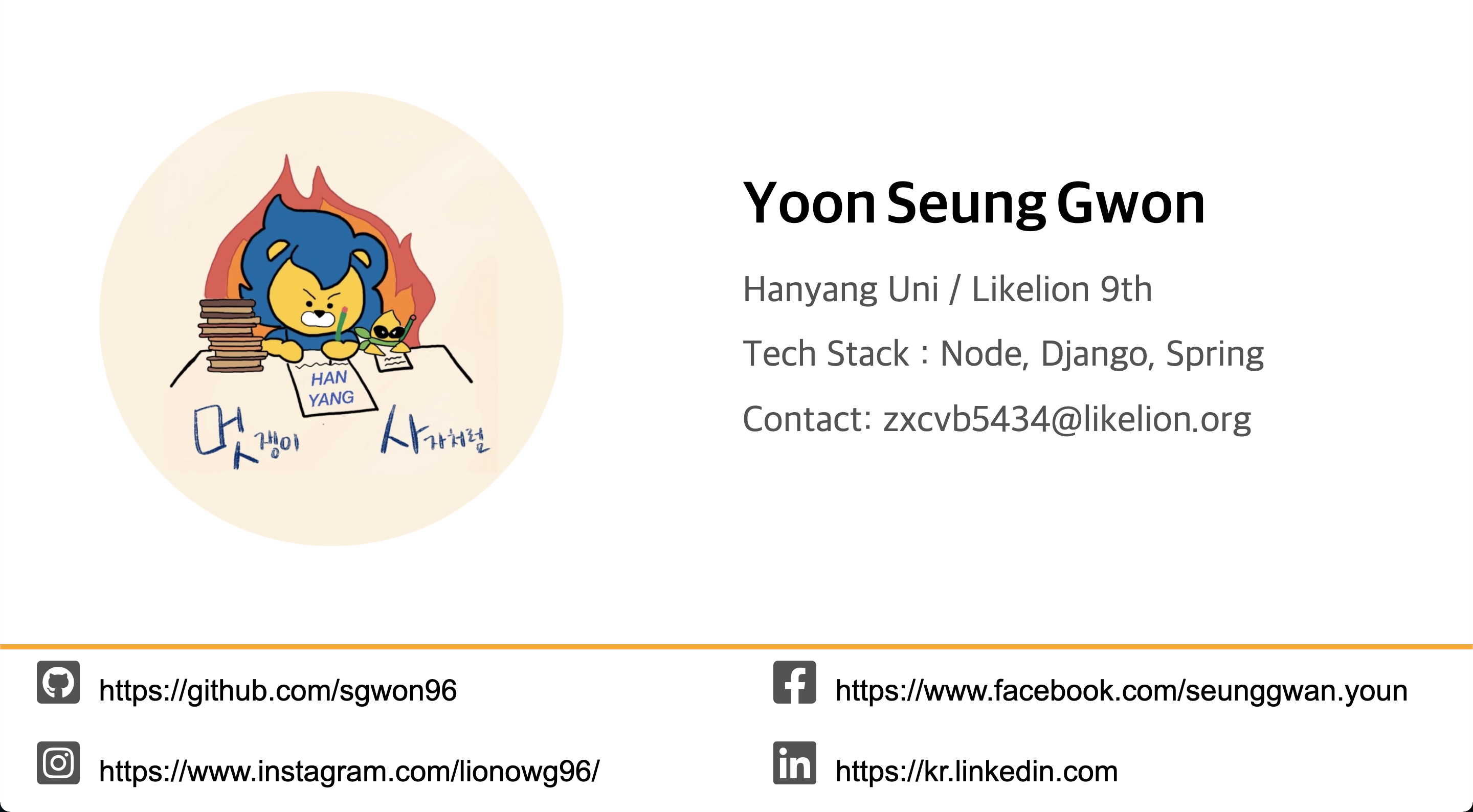
자기만의 명함을 만들어봅시다. 이미지 태그를 사용하여 사진도 넣어보고, a tag로 페이스북, 인스타그램 등 본인의 sns 링크도 연결해봅시다. 처음 배우는 HTML, CSS지만 직접 사용하다보면 금방 익숙해 질 수 있습니다. '나는 프론트 개발자 안할껀데;;' 라는 생각은 접어두시고 웹의 기초를 맛본다고 생각해주세요!
완성본
풀이과정
개인적인 풀이과정이고 완벽하지 않으며 훨씬 좋은 방법들이 많습니다.
틀린점이 있을 수도 있으니 참고만 해주세요.
1. HTML/CSS 기본 구조
index.html
<!DOCTYPE html>
<html lang="en">
<head>
    <meta charset="UTF-8">
    <meta http-equiv="X-UA-Compatible" content="IE=edge">
    <meta name="viewport" content="width=device-width, initial-scale=1.0">
    <link rel="stylesheet" type="text/css" href="style.css" >
  <script src="https://kit.fontawesome.com/49db3ebd1b.js" crossorigin="anonymous"></script>
    <title>Document</title>
</head>
<body>

</body>
</html>
link 스타일로 style.css 를 연결하고 html 기본 구조를 작성했습니다.
Fontawesome를 사용하기위해 Link스타일로 연결했습니다.
style.css
* {
    margin: 0;
    padding: 0;
}

html,body {
    height: 100%;
    width:  100%;
}
모든 태그(*)의 margin 속성과 padding 속성을 0으로 지정합니다.
html,body 태그의 길이, 높이를 설정해 줍니다.
2. 구역 나누기
index.html
<body>
    <div class="container">
        <div class="left"></div>
        <div class="rigth"></div>
        <div class="down"></div>
    </div>
</body>
구역을 크게 3가지 구역으로 나누었습니다. 프로필 사진이 들어갈 left, 설명이 들어갈 right, sns 주소가 들어갈 down을 만들었습니다.
style.css
div {
    border : 1px solid black;
}

.container {
    display: flex;
    flex-wrap: wrap;
    width: 100%;
    height: 100%;
}

.left {
    width : 45%;
    height: 80%;
    background-color: blanchedalmond;
}

.right {
    width : 54%;
    height: 80%;
    background-color: blue;
}

.down {
    width: 100%;
    height: 20%;
    background-color: brown;
}
css가 적용된 index.html
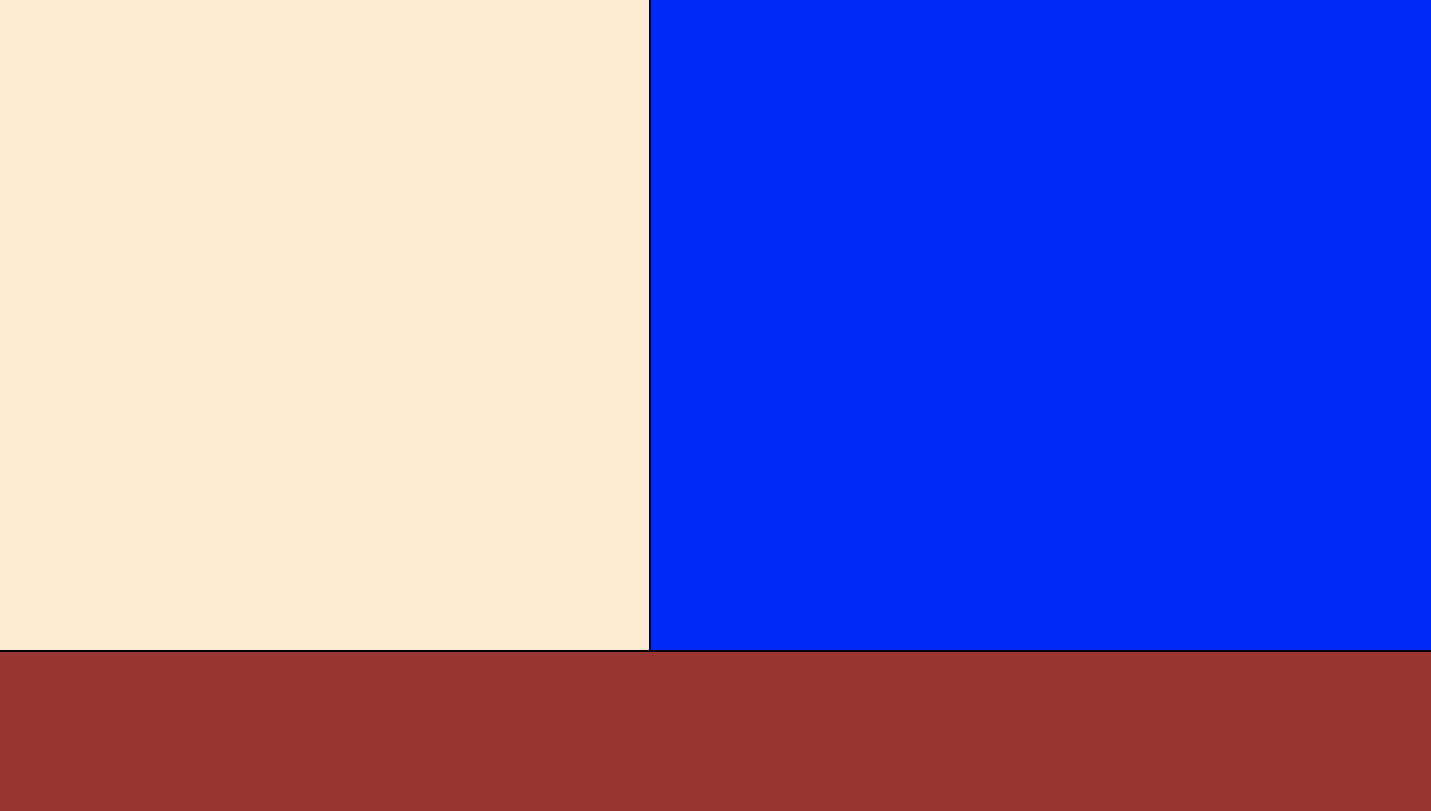
구역을 확실하게 보여드리기 위해 배경색을 설정했습니다. 원래 혼자 개발을 할때는 div에 border 속성을 넣는것만으로도 충분합니다.
flex-wrap
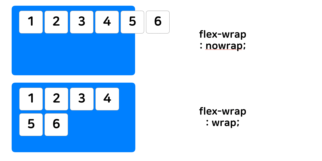
flex-wrap은 flex item이 flex container를 벗어 났을 때 줄바꿈 여부를 결정하는 속성입니다. 속성을 주지 않으면 기본적으로 nowrap으로 값이 지정되어 있습니다.
3. left div에 프로필 사진 넣기
index.html
	<div class="left">
            <div class="left__img">
                <img src="images/me.JPG" alt="">
            </div>
        </div>
보통 img의 크기, 위치를 조정할때는 img 태그에 직접적으로 css를 적용하기보다는 div태그로 감싸준 후 div태그에 css를 적용해줍니다.
style.css
.left {
    width : 45%;
    height: 80%;
    display: flex;
    justify-content: center;
    align-items: center;
}

.left__img {
    width : 70%;
    height : 70%;
    border-radius: 70%;
    overflow: hidden;
}

.left__img img {
    width: 100%;
    height: 100%;
    object-fit: cover;
}
justify-content: center - 정렬 방식을 결정하는 속성
align-items - 정해진 방향의 수직방향 정렬 방식을 결정하는 속성
border-radius - 테두리를 둥글게 만드는 속성
overflow - 안에 있는 컨텐츠가 클때 그것을 어떻게 보여줄지 결정하는 속성
object-fit - 콘텐츠 크기를 어떤 방식으로 조절할지 결정하는 속성
css가 적용된 index.html
.png)
4. rigth div에 설명 넣기
index.html
<div class="right">
            <div class="right__bio right__bio--Beirut right__bio--black right__bio--big">Yoon Seung Gwon</div>
            <div class="right__bio">Hanyang Uni / Likelion 9th</div>
            <div class="right__bio">Tech Stack : Node, Django, Spring</div>
            <div class="right__bio">Contact: zxcvb5434@likelion.org </div>
        </div>
right__bio 블럭 4개를 만들고 이름을 넣는 block에 BEM 방식을 적용해 색깔,글씨체,높이를 수정하기위해 3가지 class를 추가로 만들었습니다.
태그에 여러가지 클래스를 적용할때 뒤에 나오는 클래스의 속성이 우선 적용됩니다.
style.css
.right {
    width : 54%;
    height: 80%;
    display: flex;
    flex-direction: column;
    justify-content: center;
    align-items: center;
}

.right__bio {
    width: 80%;
    height: 10%;
    font: normal 2.5vw NanumSquare;
    color: #535353
}

.right__bio--black {
    color: #000000;
}

.right__bio--Beirut {
    font: bold 4vw Beirut;
}

.right__bio--big {
    height: 15%;
}
flex-direction : flex 컨테이너 안의 flex 아이템들의 기본 방향을 정해줍니다
font : font-style font-weight font-size font-height font-family
css가 적용된 index.html
.png)
5. down div에 SNS 주소 넣기
index.html

코드블럭으로 넣으면 가독성이 너무 안좋아서 사진으로 대체했습니다.
down__social 블럭을 4개 만들고 fontawesome을 활용해 아이콘을 넣었습니다.
style.css
.down {
    border-top: 5px solid orange;
    width: 100%;
    height: 20%;
    display: flex;
    flex-wrap: wrap;
    justify-content: space-around;
    align-items: center;
    flex-direction: column;
}

.down__social {
    width: 45%;
    height: 40%;
}

.down__social a {
    margin-left: 0.5em;
    font: normal 2vw Arial;
    color: black;
    text-decoration:none
}

.down__social--gray {
    color: #535353;
}

.fa--3vw {
    font-size: 3vw;
}
border-top : 테두리 윗부분 설정
justify-content: space-around; - flex-direction 기준, 고르게 정렬
css가 적용된 index.html
.png)
5. 완성
.png)
나눠진 구역을 보기 위해 추가했던 div의 border 속성을 지우면 완성 !
보충자료
- BEM - https://nykim.work/15
- Fontawesome - https://uxgjs.tistory.com/186
- GitHub 사용법 - https://velog.io/@jaeeunxo1/Gitbasic
- flex를 활용한 10가지 레이아웃 - https://d2.naver.com/helloworld/8540176
