커스텀 테마
MUI 공식 문서에선 임의의 테마를 사용하기 위해선 내장된 Context인 createTheme(), Provider인 ThemeProvider와 Consumer 훅인 useTheme()를 쓰면 된다고 알려준다.
https://mui.com/material-ui/customization/theming
ThemeProviderrelies on the context feature of React to pass the theme down to the components, so you need to make surethat ThemeProvideris a parent of the components you are trying to customize. You can learn more about this in the API section.
ThemeProvider는 리액트의 Context 기능에 의존하여 테마를 컴포넌트들에게 전달합니다, 그러므로ThemeProvider가 그 컴포넌트들의 부모인지 확인해야 합니다. 자세한 내용은 API 문단에서 확인할 수 있습니다.
하지만 이 방법은 테마의 수정이 불가능하다. 훅으로 얻은 theme의 속성을 수정해봐도 애초에 앱 전체의 스타일링을 바꾸기 위해 통째로 재랜더링해야 하므로 힘들다. 나중에 다시 언급되지만 심지어 이 테마는 readonly다.
아무튼 이런 이유로 인해 theme를 제어할 임의의 Context가 더 필요하다.
import * as Colors from '@mui/material/colors';

type ColorPalette = Exclude<keyof typeof Colors, 'common'>;
interface ThemeController {
  toggleColorMode(): void,
  setColorPalette(value: ColorPalette): void,
  currentColors: (typeof Colors)[ColorPalette],
  palette: ColorPalette
}
const ControllerContext = React.createContext<ThemeController>(undefined as any);
다크, 라이트 모드 외에 색 팔레트도 바꿀 계획이라 팔레트 관련 속성을 더 추가했다.
MUI는 Color 팔레트를 모듈로 제공하지만 전부 다 named export라서 일관된 타입을 쉽게 얻을 수 없었다, 아니 그냥 커스텀 타입 자체가 없었다. 그래서 먼저 namespace로 가져오고 그 타입의 key들(== 맴버, 속성 이름)의 타입을 따냈다.
(typeof Colors)[ColorPalette]는 단순화하자면 (typeof Colors)[keyof typeof Colors], 즉 ValueOf<Colors>가 된다. 그런데 이때 주의할 점은 색 팔레트 중 오직 'common'만이 다른 색 팔레트들과 다른 속성들을 가진단 점이다. 그래서 ColorPalette타입을 선언할 때 Exclude로 미리 제거해두었다.
undefined as any는 마치 정신나간 짓처럼 보인다. 하지만 Provider에 value를 집어넣을텐데 기본값을 굳이 억지로 만들 필요가 있을까? 라는 의문이 들어 undefined를 넣었다.
2022.10.18 수정
Provider의 default value의 목적은 value의 생략에 따른 기본값이 아닌 구독할 Provider가 부모에 없을 때 반환할 기본값이다.
defaultValue매개변수는 트리 안에서 적절한 Provider를 찾지 못했을 때만 쓰이는 값입니다. 이 기본값은 컴포넌트를 독립적으로 테스트할 때 유용한 값입니다. Provider를 통해undefined을 값으로 보낸다고 해도 구독 컴포넌트들이defaultValue를 읽지는 않는다는 점에 유의하세요.
https://ko.reactjs.org/docs/context.html#reactcreatecontext
자바스크립트에선 비워도 상관없으나 타입스크립트에선 오버로드가 마련되지 않은 것 같다. 직접 declare하거나 이처럼 <value> as any 를 넣어야겠다.
const getDesignTokens = (mode: PaletteMode, palette: ColorPalette) => ({
  palette: {
    mode,
    primary: {
      main: Colors[palette][300]
    },
    text: {
      ...(mode === 'light'
        ? {
            primary: Colors.grey[900],
            secondary: Colors.grey[500],
          }
        : {
            primary: '#fff',
            secondary: Colors.grey[500],
          }
      ),
    },
  }
} as Theme);

const MainThemeProvider: React.FC<PropsWithChildren> = ({ children }) => {
  const [mode, setMode] = React.useState<PaletteMode>('light');
  const [palette, setPalette] = React.useState<ColorPalette>('blue');

  const defaultControllerContext: ThemeController = {
    toggleColorMode() {
      setMode(prev => prev === 'light' ? 'dark' : 'light');
    },
    setColorPalette(value: ColorPalette) {
      setPalette(value);
    },
    currentColors: Colors[palette],
    palette
  };

  // Update the theme only if the mode changes
  const theme = React.useMemo(() => createTheme(getDesignTokens(mode, palette)), [mode, palette])

  return (
    <ControllerContext.Provider value={defaultControllerContext}>
      <ThemeProvider theme={theme}>
        {children}
      </ThemeProvider>
    </ControllerContext.Provider>
  )
}ThemeProvider를 거치고 theme.palette.mode를 가져오는게 더 안전하기 때문에 context에 담아두지 않고 setter만 담아두었다.
setColorPalette와 currentColors, palette는 모두 색 팔레트 관련이다. 좀 더 쉬운 접근성을 위해 속성들을 더 추가했다.
처음 ControllerContext를 설계할 때 theme를 state로 두고 제어하면 된다고 생각했다. 하지만 이것은 완전 틀린 설계였다. 공식 문서에서 for read-to-use 라 말한대로 setState를 해도 자식들에게 바뀐 테마가 반영되지 않았다.
2022.10.18 수정
for read to use는 그저 용도 명시일 뿐이지, 실제 효력은 없었다. 사실 테마가 반영되지 않은게 아니라 변경 부분인 Header만 바뀌었다. 그땐 이유를 잘 몰라서 MUI ThemeProvider의 내부 로직에 의한 것이라 생각했었는데 오늘 리액트 Context를 보다가 그 이유를 깨달았다.
Provider 하위에서 context를 구독하는 모든 컴포넌트는 Provider의
valueprop가 바뀔 때마다 다시 렌더링 됩니다.
https://ko.reactjs.org/docs/context.html#contextprovider
헤더 테마가 바뀐 이유는 테마를 바꾸기 위해 테마 context를 구독한 것 때문이였으며 나머지 컴포넌트들의 테마가 안바뀐 이유는 context를 구독하지 않아서였다.
공식 문서를 더 찾아보니 예제에서 아에 상태가 바뀔때마다 테마를 통째로 새로 생성한다는 점을 발견했다. 아마 쉬이 상태관리로 할 수 없는 복잡한 과정이 내포되었나보다.
공식 문서에 따라 getDesignTokens를 컴포넌트 밖으로 내보내뒀지만 안으로 들여보내도 상관은 없을듯하다..?
ControllerContext provider로 ThemeProvider를 감싸고, 이어서 자식을 감싼다. 이걸 _app.tsx에서 ThemeProvider 대신 넣을 생각이다.
const MyApp: React.FC<{
  Component: NextPage;
  pageProps: any;
}> = ({
  Component,
  pageProps: { ...pageProps },
}) => {
    return (
      <MainThemeProvider>
        <CssBaseline />
        <Component {...pageProps} />
      </MainThemeProvider>
    )
}
이제 테마 색을 제어하는 ThemeSelection 컴포넌트를 만든다.
import React from 'react'
import Typography from '@mui/material/Typography'
import IconButton from '@mui/material/IconButton'
import Divider from '@mui/material/Divider'
import Menu from '@mui/material/Menu'
import Box from '@mui/system/Box'

import LightModeIcon from '@mui/icons-material/LightMode'
import DarkModeIcon from '@mui/icons-material/DarkMode'

import { useThemeController } from './MainThemeProvider'
import useTheme from '@mui/material/styles/useTheme'

import * as Colors from '@mui/material/colors';

const colors: Array<Exclude<keyof typeof Colors, 'common'>> = ["amber", "blue", "blueGrey", "brown", "cyan", "deepOrange", "deepPurple", "green", "grey", "indigo", "lightBlue", "lightGreen", "lime", "orange", "pink", "purple", "red", "teal", "yellow"];

const ThemeSelection: React.FC = () => {
  const { toggleColorMode, setColorPalette } = useThemeController();
  const theme = useTheme();
  const timeout = React.useRef<NodeJS.Timeout>();
  const [ anchorEl, setAnchorEL ] = React.useState<Element | null>(null);

  return (
    <div>
      <IconButton
        onClick={toggleColorMode}
        onMouseDown={({currentTarget})=>{
          timeout.current = setTimeout(() => {
            setAnchorEL(currentTarget);
          }, 1 * 1000);
        }}
        onMouseUp={()=>{
          if(timeout.current) clearTimeout(timeout.current);
        }}
      >
        {theme.palette.mode == 'light' ? <LightModeIcon /> : <DarkModeIcon /> }
      </IconButton>
      <Menu open={Boolean(anchorEl)} anchorEl={anchorEl} onClose={()=>setAnchorEL(null)}>
        <div style={{ margin: '8px' }}>
          <Typography fontSize={15} fontWeight={500}>Theme Selection</Typography>
          <Divider />
          <Box sx={{
            display: 'flex',
            flexWrap: 'wrap',
            width: '300px',
            "& div": {
              width: '20px',
              height: '20px',
              borderRadius: '10px',
              margin: '5px'
            }
          }}>
            {colors.map(color => <div style={{ backgroundColor: Colors[color][300] }} onClick={()=>setColorPalette(color)} />)}
          </Box>
        </div>
      </Menu>
    </div>
  )
}

export default ThemeSelection;
https://mui.com/material-ui/guides/minimizing-bundle-size/#development-environment
MUI 공식문서는 번들링 최소화를 위해 named import 대신 default import 하기를 권장한다. named import를 하면 개발 환경에서 모든 export를 가져와서 named 변수를 선언하기 때문에 스타트업 속도가 많이 느려질 수 있다. 특히 그게 svg덩어리인 material-icons라면? 더욱이 default import를 해야 한다.
테마 제어를 위해 controller context를 가져오고 다크/라이트 모드에 따른 아이콘 변경을 위해 theme context를 가져왔다. div에 꾹 누르기 이벤트리스너가 없어서 직접 구현을 했는데, 상태가 변해도 1초 내에 마우스를 때면 타이머를 취소시켜야 하므로 ref를 이용했다. MUI Menu 컴포넌트의 앵커를 위해 state 훅도 사용했다.
그냥 누르면 다크/라이트가 바뀌고,
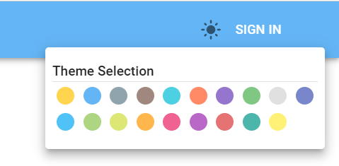
아이콘을 꾹 누르면 선택창이 뜬다.

선택창에서 각 색들을 누르면 onClick -> setColorPalette -> setPalette -> 재랜더링 -> 테마 재생성 -> 바뀐 색 팔레트에 맞춰 색 변경 단계를 거쳐 바뀐 색이 테마에 반영되어 파랑이였던게 주황으로 바뀐걸 볼 수 있다.
이제 임의로 색을 지정했던 부분들을 전부 다 테마에 맞춰 바꾸면 색체 테밍은 끝이다.