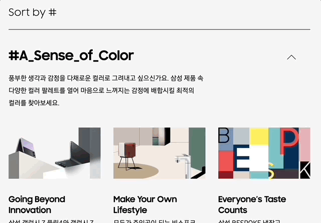
BRAND : DESIGN SAMSUNG

#DESIGN SAMSUNG #반응형 #4일 #swiper #jquery #javascript #gsap #클론코딩
📌 PROJECT KET POINTS
- 공통 레이아웃 scss 처리.
position: sticky;활용한 스크롤 픽스 레이아웃.@keyframes animation을 활용한 클릭&스크롤 이벤트.- 반응형 (in case of mobile)
4-1) 메뉴 클릭 이벤트.
4-2) swiper 적용.
1. 공통 레이아웃 scss 처리
- 전체 레이아웃에서 중복되는 레이아웃은 scss폴더를 따로 만들어 처리.
- scss
.group-contents{
  .desc{
    margin-top: 12px;
    width: 65%;
  }
  .contents-list{
    display: flex;
    flex-wrap: wrap;
    margin-top: 42px;
    gap: 30px;
    .contents-item{
      width: calc((100% - 60px) / 3);

      .thumb-box{
        padding-top: 55.92105%;
        position: relative;
        overflow: hidden;

        img{
          position: absolute;
          top: 0;
          left: 0;
          width: 100%;
          height: 100%;
          object-fit: cover;

        }
      }
      .sub-tit{
        overflow: hidden;
        text-overflow: ellipsis;
        display: -webkit-box;
        -webkit-line-clamp: 4;
        -webkit-box-orient: vertical;
      }
    }
  }
}
2. position: sticky; 를 활용한 스크롤 픽스 레이아웃.
position: sticky;란?
최초 relative속성과 같이 동작하다가 , 스크롤시 지정 지점에서 요소를 고정시킨다.
- 사용 시 주의할 점.
- sticky속성을 갖는 요소들은 자신의 부모 요소안에서만 적용된다.
- 부모 태그에 무조건 height 높이 값이 들어가 있어야 한다. 부모 height 높이 값만큼 sticky가 고정된다.
- sticky 박스는 top, right, bottom, left 속성이 필수다.
- 부모 요소중에 overflow: hidden, auto, scroll 속성이 적용되어 있으면 안된다.
- scss
   .fix-area{
      width: 50%;
      padding-right: 30px;
      position: sticky;
      bottom: 30px;
     }
- 출력 화면
설정해 둔 위치에 도달했을 때 fix된다.

3. @keyframes animation을 활용한 클릭&스크롤 이벤트.
❓ 왜 gsap 대신 css로 작업했냐면...
- gsap을 사용할 경우 일회성 이벤트는 부드럽게 작동되지만 스크롤&클릭이벤트 작동 시 초기화 된 후 재실행 될 때 부드럽지 않은 감이 있어서 css와 script로 animation을 시도했다.
- scss
1. 모션 생성.
@keyframes imgBgMotion {
  0% {
      top: 100%;
      opacity: 0
  }

  100% {
      top: 0%;
      opacity: 1
  }
}

@keyframes txtMotion {
  0% {
      opacity: 0;
      transform: translate(0, 50px)
  }

  100% {
      opacity: 1;
      transform: translate(0, 0)
  }
}
2. 모션 설정.
  .accordion-list{
    .accordion-item{
      padding: 75px 0;
      cursor: pointer;
      border-bottom: 1px solid #000;

      &.effect-motion{
        .desc{
          &.effect{
            animation: txtMotion .5s linear forwards;
          }
        }

        .effect{
          .contents-item{
            img{
              animation: imgBgMotion 1s cubic-bezier(0.175, 0.885, 0.32, 1) forwards;
            }
            &:nth-child(1){
              img{
                animation-delay: .1s;
              }
            }
            &:nth-child(2){
              img{
                animation-delay: .2s;
              }
            }
            &:nth-child(3){
              img{
                animation-delay: .3s;
              }
            }
            &:nth-child(4){
              img{
                animation-delay: .4s;
              }
            }
            &:nth-child(5){
              img{
                animation-delay: .5s;
              }
            }
          }
        }
}- js
3,4. 스크롤 이벤트 및 클릭 이벤트 생성.
// 7) sc-sort 스크롤 & 클릭 이벤트 작동 후 초기화 & 재실행
    $(window).scroll(function(){
      curr = $(this).scrollTop();
      sortPatent = $('.sc-sort').offset().top;

      $('.accordion-item').each(function(i,el){
        sortOffset = $(this).offset().top;

        if(curr >= sortOffset-(window.innerHeight/2) && $(this).find('.group-contents').hasClass('on')){
          $(this).addClass('effect-motion');
        }
      })

      if(curr < sortPatent-window.innerHeight){
        $('.accordion-item').removeClass('effect-motion')
      }

    })


    $('.accordion-item').click(function(){
      if($(this).hasClass('effect-motion')){
        $(this).removeClass('effect-motion')
        $(this).find('.group-contents').removeClass('on')
        $(this).find('.desc').removeClass('effect')
        $(this).find('.contents-list').removeClass('effect')
      }else{
        $(this).addClass('effect-motion')
        $(this).find('.group-contents').addClass('on')
        $(this).find('.desc').addClass('effect')
        $(this).find('.contents-list').addClass('effect')
      }

      if($(this).find('.group-contents').hasClass('on')){
        $(this).find('.group-flex span').addClass('active')
      }else{
        $(this).find('.group-flex span').removeClass('active')
      }

    })

  })
🖋 code review
1. 모션 생성 :@keyframes animation을 이용하여 이미지와 텍스트에 걸 모션을 각각 만들어둔다.
2. 모션 설정 : 모션을 걸 파트에.effect-motion이라는 클래스명을 주었을 때 각각 애니메이션이 실행되도록 설정한다.
3. 스크롤 이벤트
if(curr >= sortOffset-(window.innerHeight/2) && $(this).find('.group-contents').hasClass('on')){ $(this).addClass('effect-motion'); }: 현재 스크롤 값이 sortOffset값에서 전체 화면의 절반 높이를 뺀 값보다 크거나 같고, .group-contents가 클래스 on을 가지고 있으면 .accordion-item에 클래스 effect-motion을 붙여라.
4. 클릭 이벤트
if문과hasClass를 이용해 조건을 걸고addClass와removeClass를 적절히 이용하여 각 모션들을 컨트롤했다.
즉, 타겟으로 하는 스크롤 위치에 도달하면 모션이 실행되었다가 위치값을 도로 벗어날 경우 초기화 진행되고, 클릭해도 모션이 초기화되고 재실행된다.
- 출력 화면
1. 스크롤 이벤트 작동 시 초기화 후 재실행
2. 클릭 이벤트 작동 시 모션 초기화 후 재실행

4. 반응형
4-1) 메뉴 클릭 이벤트.
-scss
    .menu-area-m{
      overflow-y: auto;
      position: fixed;
      width: 100%;
      height: 100%;
      min-height: 100vh;
      top: 0;
      background-color: #fff;
      padding-top: 20vw;
      left: 100%;
      transition: left 0.2s linear;
      z-index: 10;
      padding: 100px 50px;
      @include mobile{
        padding: 15vw 8%;

      }
      &.active{
        left: 0;
      }
-js
    $('.util-area-m .btn-area-m .btn-menu').click(function(){
      $('.menu-area-m').addClass('active');
      $('.btn-menu').addClass('hide');
      $('.btn-close').addClass('show');
    })
    $('.header-wrap-m .btn-area-m .btn-close').click(function(){
      $('.menu-area-m').removeClass('active');
      $('.btn-menu').removeClass('hide');
      $('.btn-close').removeClass('show');
    })
🖋 code review
$('.util-area-m .btn-area-m .btn-menu').click(function(){ $('.menu-area-m').addClass('active');: .btn-menu를 클릭하면.menu-area-m에 클래스 active를 붙여라.&.active{ left: 0; }: 클래스active가 붙으면left:0;가 실행된다.
- 출력 화면
4-2) swiper 적용.
- js
// 3. 반응형 스와이퍼 (only mobile), sc-story & sc-news

    var ww = $(window).width();
    var storySwiper = undefined;
    var newsSwiper = undefined;

    function initSwiper() {
      if (ww < 768 && storySwiper == undefined) {
        storySwiper = new Swiper(".sc-more-story .m-story", {
          slidesPerView: 1.5,
        });

      } else if (ww >= 768 && storySwiper!= undefined) {
        storySwiper.destroy();
        storySwiper == undefined;
      }

      if (ww < 768 && newsSwiper == undefined) {
        newsSwiper = new Swiper(".sc-news .m-news", {
          slidesPerView: 1.5,
        });

      } else if (ww >= 768 && newsSwiper!= undefined) {
        newsSwiper.destroy();
        newsSwiper == undefined;
      }

    }
    initSwiper(); // 함수 실행


    $(window).on("resize", function () {
      ww = $(window).width(); // 윈도우 너비 변경 인식
      initSwiper();
    });
🖋 code review
1.var ww = $(window).width();: 윈도우 창의 너비값 선언.
2. 호출되지 않은 swiper의 타입은 undefined이고, 호출된 swiper의 타입은 object이므로 스와이퍼의 타입을 고려하여 조건문을 작성했다.
if (ww < 768 && storySwiper == undefined) { storySwiper = new Swiper(".sc-more-story .m-story", { slidesPerView: 1.5, }); }: 해상도 너비값이 768px보다 작고 스와이퍼의 타입이 undefined이면 (호출되기 전이면) storySwiper를 실행하고, 아닐 경우 : storySwiper의 작동을 중지시켜라. (storySwiper.destroy();)
- resize()는 윈도우 크기가 바뀔 때 어떤 작업을 할 수 있게 한다.
$(window).on("resize", function () { ww = $(window).width(); // 윈도우 너비 변경 인식 initSwiper(); });: 윈도우 크기가 바뀔 때initSwiper();을 실행해라.
- 출력 화면
1. pc, tablet ver.

2. mobile ver.

