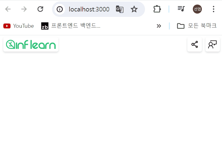
1. 완성된 Header UI 미리보기
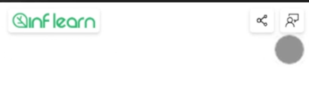
- next/link를 통해 페이지 이동
- next/image API를 이용해서 인프런 이미지 불러오기
- 스타일을 입히기 위해 scss 사용
2. Header 컴포넌트 작성하기
import React from "react";
import Link from "next/link";
import styles from '@/styles/header.module.scss';

interface Props {
    rightElements?: React.ReactElement[];
}

const HeaderComponent = ({ rightElements } : Props) => {
    return (
        <header className = {styles.header}>
            <div className = {styles.flexItem}>
                <Link href="/" className = {styles.box}>
                    <img
                        src="/inflearn.png"
                        width={110}
                        height={20}
                        alt="인프런 로고"
                    />
                </Link>
            </div>
        </header>
    );
};


export default HeaderComponent
img 태그를 이용하여 외부 이미지를 다운로드 후 렌더링하는 방식
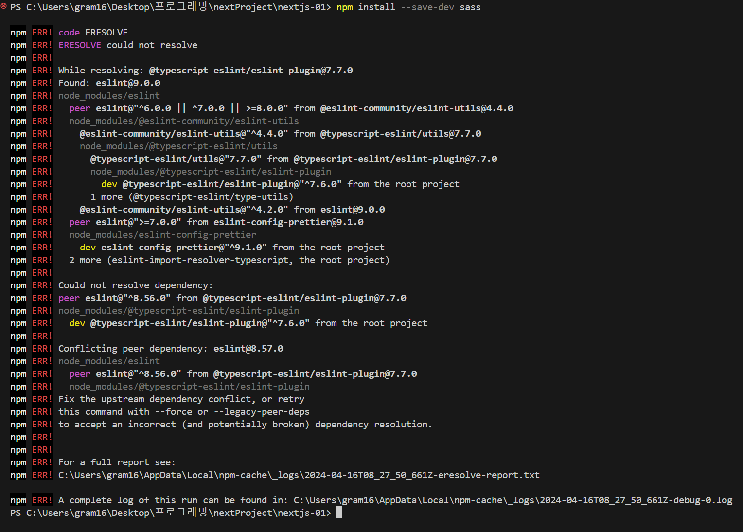
yarn add sass위의 명령어를 통해 sass 설치
.header {
    position: absolute; // 로고가 상단에 위치해야 하기 때문에 absolute로 위치를 잡아줌
    top: 0;
    left: 0;

    width: 100%;
    height: 40px;
    padding: 0 8px 0 12px;

    display: flex;
    justify-content: space-between; // 화면 양쪽에 버튼이 위치하도록
    align-items: center;

    z-index: 100;
    pointer-events: none;   // 화면 가운데는 클릭이 되야함
}

.flexItem {
    display: flex;
    pointer-events: auto;   // click 이벤트가 작동해야하기 때문에
}

.box {
    padding: 6px;
    border: none;
    border-radius: 4px;
    box-shadow: 0 2px 4px 0 rgb(136 136 136 / 30%);

    display: flex;
    align-items: center;
    justify-content: center;

    background-color: #fff;
    &:active {
        background-color: #40a6fd;
        color: white;
    }
    transition: background-color 200mx ease;
    // 클릭시 배경색이 자연스럽게 변하도록 설정
}
위와 같이 스타일링이 된다.
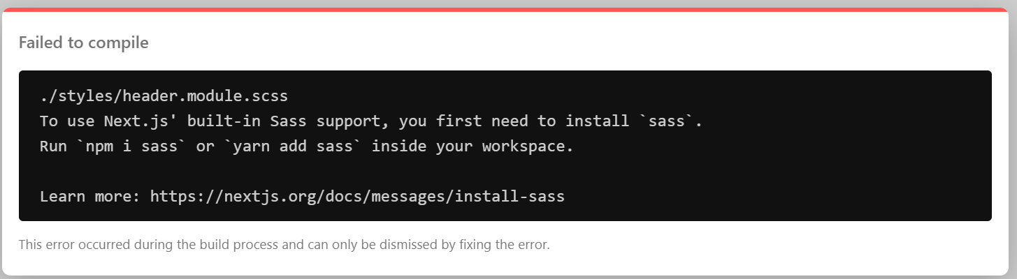
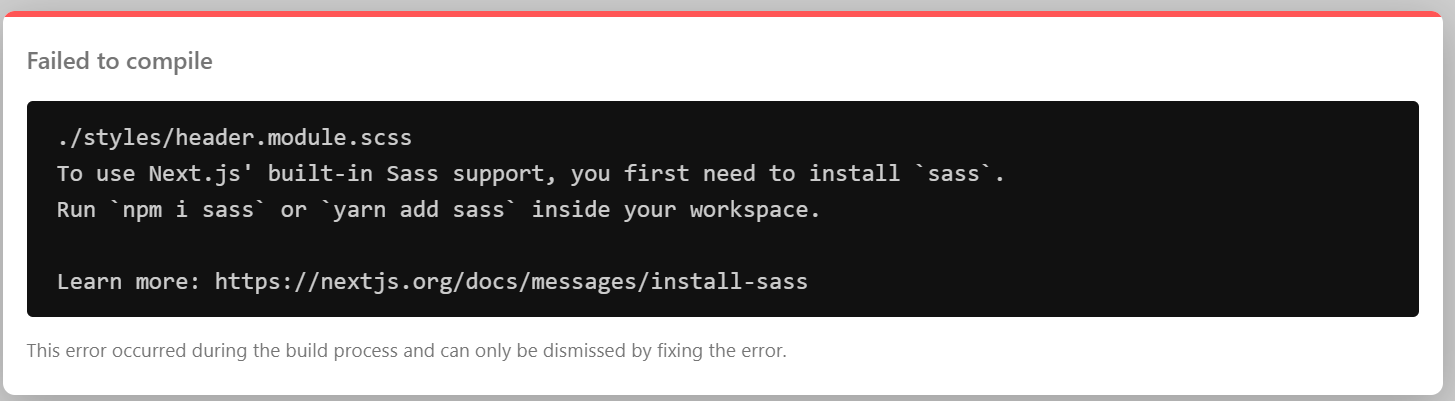
하지만, 위처럼 html의 img태그를 이용할시 eslint 경고문이 뜨면서 next/image의 옵션을 사용할 수 없다.
3. next/image
image 렌더링 방식
1) image 태그에서 이미지 파일을 static하게 import
import example from '/public/example.jpg';

      <figure>
        <Image
          src={example}
          alt="v13 image"
          width={500}
          height={100}
          placeholder="blur"
         />
        <figcaption>v13 image</figcaption>
        </figure>
2) 외부에서 링크 가져오기
<figure>
        <Image
          src="https://inflearn-nextjs.vercel.app/example.jpg"
          alt="v13 image"
        />
        <figcaption>v13 image</figcaption>
      </figure>
위의 방식으로 작성하면 에러 발생, 크기를 지정해줘야함.
width={500}
height={100}	// 코드 추가
next/image의 장점
-
이미지 용량 최적화


이미지 파일을 webp 형식으로 불러와 용량 최적화를 할 수 있다. -
lazy 로딩 자동 적용
이미지 파일이 있는 위치에 접근할때 lazy하게 네트워크를 다운로드하는 lazy 로딩을 자동으로 제공한다. -
placholder = "blur"
blur 명령어를 통해 사진을 불러오는 동안 자동으로 블러처리를 도와준다.
만약, 외부 이미지를 불러올때 크기를 알 수 없을때는 fill 속성을 이용한다. fill 속성은 부모의 크기에 맞춰 이미지의 크기를 조정한다.
<figure style={{ position: 'relative', width: '500px', height: '100px' }}>	// 부모 태그의 크기 조정
fill
이전 버전의 next/legacy/image API는 img 태그 생성시 레이아웃을 스타일링 하기 위해 span 태그를 생성한다. next/image는 이러한 네트워크의 비효율성을 줄이기 위해 업데이트 되었다.
4. Header 컴포넌트 완성하기
Header 컴포넌트
import React from "react";
import Link from "next/link";
import styles from '@/styles/header.module.scss';
import Image from "next/image";

interface Props {
    rightElements?: React.ReactElement[];	//rightElements Props 추가
}

const HeaderComponent = ({ rightElements } : Props) => {
    return (
        <header className = {styles.header}>
            <div className = {styles.flexItem}>
                <Link href="/" className = {styles.box}>
                    <Image
                        src="/inflearn.png"
                        width={110}
                        height={20}
                        alt="인프런 로고"
                    />
                </Link>
            </div>
            {rightElements && <div className={styles.flexItem}>{rightElements}</div>}	// logo 우측에 div 추가
        </header>
    );
};


export default HeaderComponent;
index.tsx
import { Fragment } from "react";
import Header from '@/components/common/Header';
import styles from '@/styles/header.module.scss';
import Link from "next/link";
import { AiOutlineShareAlt } from "react-icons/ai"; // next-icon 설치 후 마음에 드는(?) 아이콘 선택
import { VscFeedback } from "react-icons/vsc";

export default function Home() {
  return (
    <Fragment>
      <Header rightElements={[
        <button
          onClick={() => {	// 클릭 이벤트 발생시 '복사!' 텍스트 출력
            alert('복사!');
          }}
          className={styles.box}
          style={{marginRight: 8}}
          key="button"
        >
          <AiOutlineShareAlt size={20} />
        </button>,
        <Link href="/feedback" className={styles.box} key="Link">
          <VscFeedback size={20} />
        </Link>
      ]}
      />

      <main></main>
    </Fragment>
  );
}

기록하는 프론트엔드 개발자