Flexbox
flexbox란?
인터페이스 내의 아이템 간 공간 배분과 강력한 정렬 기능을 제공하기 위한 1차원 레이아웃 모델
(출처:https://developer.mozilla.org/ko/docs/Web/CSS/CSS_flexible_box_layout/Basic_concepts_of_flexbox)
1. Flexbox의 구성
- flex-container : 정렬이 필요한 요소를 감싸는 요소 (부모)
- item: 정렬을 적용할 요소 (자식)
(flex-container와 item에 사용되는 flex 관련 css 속성이 따로 나누어져 있음.)
2. Flexbox의 두개의 축
- 중심축
- 교차축, 반대축
display:flex;
flex 속성은 부모에게만 부여하고 item(내부 요소)를 감싸는 요소의 형식을 flex로 변경한다.
->flex 속성 부여 시 item에 자동으로 지정된 margin 요소가 모두 사라지고 content 영역만큼의 크기만 가지게 됨
->inline이 된다
flex-direction(부모 전용 속성)
메인 축(중심축)의 방향과 시작 위치를 지정하는 속성
flex-direction: row;
행 방향(가로 정렬, 기본값임)
flex-direction: row-reverse;
행 방향(가로 정렬) + 순서는 반대로 정렬
flex-direction: column;
열 방향(세로 정렬)
flex-direction: column-reverse;
열 방향(세로정렬) + 순서는 반대로 정렬
flex-wrap(부모 전용 속성)
내부 item(자식)들을 포장하는 속성
item들이 강제로 한줄에 배치할 지/한 줄을 벗어나 여러 줄로 배치할 것인지 지정함
flex-wrap:nowrap;
item을 한 줄로 배치(기본값)
flex-wrap:wrap;
item을 여러 줄로 배치함
flex-wrap: wrap-reverse;
item을 여러줄로 배치하고, 순서가 역순
justify content(부모 전용 속성)
메인축 방향으로 item의 정렬 방법을 조정함
justify-content: flex-start;
메인축 방향으로 앞에서부터 정렬(기본값)
justify-content: flex-end;
메인축 방향으로 뒤에서부터 정렬
justify-content: center;
메인축 방향으로 가운데 정렬
justify-content: space-around;
item 주위에 메인축 방향 양쪽으로 일정한 크기의 공간을 추가
-> 양끝은 조금, item 중간은 넓게 떨어져있음
-> 브라우저 크기에 따라 변함
justify-content: space-evenly;
item이 메인축 내에서 동일한 간격을 가진다
justify-content: space-between;
양끝쪽을 붙인 상태에서 item들의 간격을 일정하게 정렬시킨다.
-justify-content는 메인축 방향을 기본으로 한다!!-
align items
/item들을 교차축 방향으로 정렬하는 방법을 지정하는 속성/
align-items: flex-end;
교차축 기준 앞에서 정렬
align-items: flex-start;
교차축 기준 앞에서 정렬
align-items: center;
교차축 기준 중간 정렬
flexbox를 이용한 요소를 정가운데에 배치하기
#con {
width:400px;
height:400px;
display:flex;
justify-content: center;
align-items: center;
}
#center {
width:80px;
height:80px;
background-color: red;
}
flex-basis
item(자식)에게 주는 flex 속성
<div class="flex-container">
    <div class="item item1 basis-20">item1</div>
    <div class="item item2 basis-30">item2</div>
    <div class="item item3 basis-50">item3</div>
</div>
.basis-20 {flex-basis:20%;}
.basis-30 {flex-basis:30%;}
.basis-50 {flex-basis:50%;}
order의 기본값==0
내용 변경 없이 출력 순서를 바꿀 수 있다.
자기 원래 위치(기본값)을 0이라고 생각하고 요소들의 숫자가 적은 순서대로 나열된다.
.obj:nth-child(1){
	order : 2;
}
.obj:nth-child(2){
	order : 3;
}
.obj:nth-child(3){
	order : 1;
}
order이 1, 2, 3 인 순서대로 호출되게 된다.
글자 관련 스타일
color : 글자 색을 지정하는 속성
선택자 {
     color : 색상명(영문) | 16진수 숫자 RGB(#fff, #ffffff)
      | rgb(255, 255, 255) | rgba(255, 255, 255, a)
      | hsl(360, 100, 100) | hsla(360, 100, 100, 1)
}
- rgba에서 a(네번째 요소)는 투명도 (0 : 투명 , 1 : 불투명)
- hsl(색상, 채도, 명도)
- 6개의 색상 지정 방법은 색과 관련된 모든 css 속성에서 사용 가능
/*색상 지정 방법*/
#color-ul >li:nth-child(1){
    color: red;
}
#color-ul >li:nth-child(2){
    color: #2317f5;
}
#color-ul >li:nth-child(3){
    color: rgb(50, 150, 150); /*0~255 사이 값들 입력*/
}
#color-ul >li:nth-child(4){
    color: rgba(50, 100, 150, 0.3);
    /*0~255 사이 값들 입력, alpha는 투명도*/
}
#color-ul >li:nth-child(5){
    color:hsl(360, 100%, 50%);/*색상, 채도, 명도를 가리킴*/
}
#color-ul >li:nth-child(6){
    color:hsla(360, 100, 50, 0.5);/*색상, 채도, 명도, 투명도*/
}
text-decoration : 텍스트에 줄을 긋는 속성
1) text-decoration:underline;
밑줄 긋기
#deco-ul >li:nth-child(1){
    text-decoration:underline;
}
2) text-decoration:line-through;
중간줄 긋기
#deco-ul >li:nth-child(2){
    text-decoration:line-through;
}
3)text-decoration:overline;
윗줄 긋기
#deco-ul >li:nth-child(3){
    text-decoration:overline;
}
4) text-decoration:none;
줄 없애기
#deco-ul >li:nth-child(4) > a{
    text-decoration:none;
}
text-align : 글자(+inline)를 정렬하는 속성(왼쪽, 가운데, 오른쪽, 양쪽)
1) text-align:left;
기본값(왼쪽 정렬)
#align-test > p:nth-child(1){
    text-align:left; /*기본값*/
}
2) text-align:right
오른쪽 정렬
#align-test > p:nth-child(2){
    text-align:right
}
3) text-align:center;
중앙정렬
#align-test > p:nth-child(3){
    text-align:center;
}
4) text-align:justify;
양쪽 정렬(여백 알아서 계산)
오른쪽 여백 이상하게 남는거 정리해줌
#align-test > p:nth-child(4){
    text-align:justify;
}
- text요소 가운데 정렬하기
<div id="div1">
            <div>inline-block</div>
        </div>
#div1 >div {
    width : 50px;
    height :50px;
    background-color: red;
    display: inline-block;
}
div1에서 텍스트를 가운데정렬 해줘야 같이 이동함
#div1{
    text-align: center;
}
line-height : 줄 간격(장평)을 지정하는 속성
줄 사이 간격을 지정한 만큼 벌리는게 아니라 한 줄의 높이를 지정하는 속성
→텍스트 라인에 위아래 마진을 주는 느낌
#line-test >p:last-child{
    line-height: 30px;
}
- 글자를 요소 정중앙에 배치하기
<div id="center-test">
    <span>정중앙</span>
</div>
#center-test{
    width:200px;
    height:200px;
    border:1px solid black;
    text-align:center; /*중간 맨 위에 위치하게됨*/
}
#center-test>span{
    background-color: pink;
    line-height: 200px; /*장간을 바깥 상자의 높이만큼 주면 된다.*/
}
- letter-spacing : 글자 사이 간격(자간) 지정 속성
#letter-test {
    letter-spacing: 10px;
}
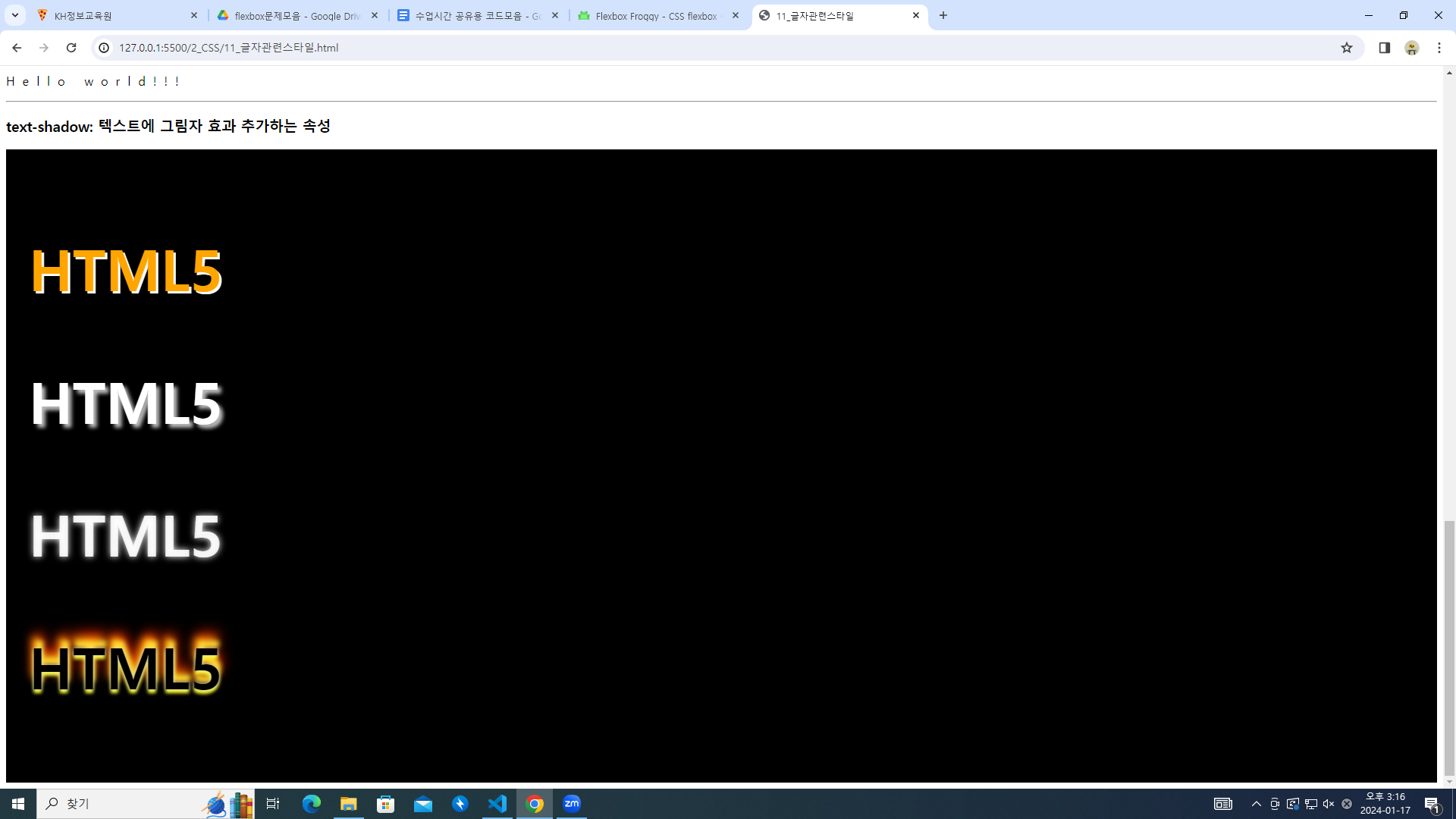
- text-shadow: 텍스트에 그림자 효과 추가하는 속성
자주 쓰이지는 않는 속성이다.
#shadow-test{
    background-color: black;
    padding:30px;
}
#shadow-test>p{
    font-size: 75px;
    font-weight: bold;
}
#shadow-test>p:nth-child(1){
    color:orange;
    text-shadow:3px 3px white;
}
#shadow-test>p:nth-child(2){
    color:white;
    text-shadow:5px 5px 5px #bbb;
}
#shadow-test>p:nth-child(3){
    color:rgba(255, 255, 255, 0.9); /*네온사인 같은 효과*/
    text-shadow:0px 0px 10px white;
}
#shadow-test>p:nth-child(4){
    text-shadow:0px 0px 4px #ccc,
    0px 5px 4px #ff3,
    2px -10px 6px #fd3,
    -2px -15px 11px #f80,
    2px -20px 18px #f20;
}
2차원 변형
css속성 작성 시 크로스 브라우저(브라우저가 달라지는 경우) 처리 방법
-ms- : 마이크로 소프트(익스플로어, 엣지)
-webkit- : 크롬, 사파리
-o- : 오페라
-moz- : 파이어폭스
transform : 변형과 관련된 속성
- 좌우로 움직이기
ms-transform: translateX(100px);
.trans-x-2d:hover{
-webkit-transform: translateX(100px);
-ms-transform: translateX(100px);
transform:translateX(100px); /*os별 속성 안써도 기능한다*/
}- 상하로 움직이기
-transform: translateY(100px);
/*상하이동*/
.trans-y-2d:hover{
    transform: translateY(100px);
}
- 대각선으로 움직이기
transform: translate(100px,-100px);
/*대각선이동*/
.trans-xy-2d:hover{
    transform: translate(100px,-100px);
/*x축, y축을 같이 적는다*/
/*y축은 음수일 때 위로 이동한다*/
}
- 가로방향 확대/축소
transform:scaleX(2); 두배 확대
- 세로방향 확대/축소
/*세로방향 확대/축소*/
.trans-x-scale-2d{
    transform:scaleY(2);
    margin: 200px;
}
- 요소 회전 시키기
/*요소 회전*/
.trans-rotate{
    transform:rotate(180deg); /*180deg :180도 회전*/
}
3차원 변형
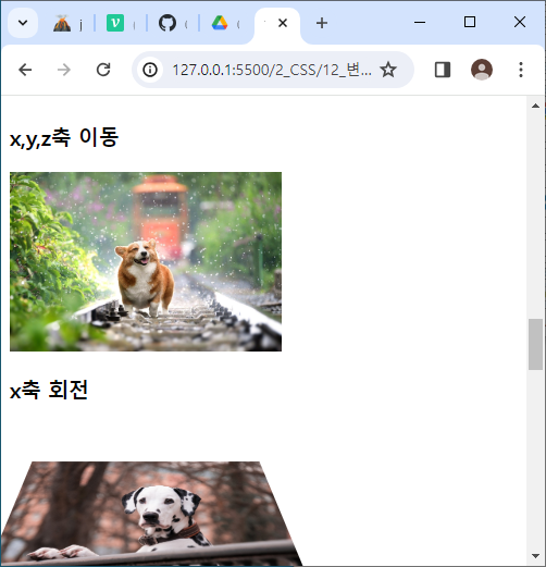
- x,y,z축 이동
transform: perspective(300px) translate3d(50px, 50px, 100px);
perspective(길이); : z축의 길이를 지정해줌(원근법 적용)
호버 전
호버 후
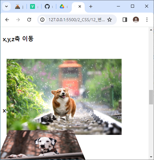
.trans-3d:hover{
    transform: perspective(300px) translate3d(50px, 50px, 100px);
}
/*마우스 호버 시 각 축이 50px, 50px, 100px 씩 이동함*/
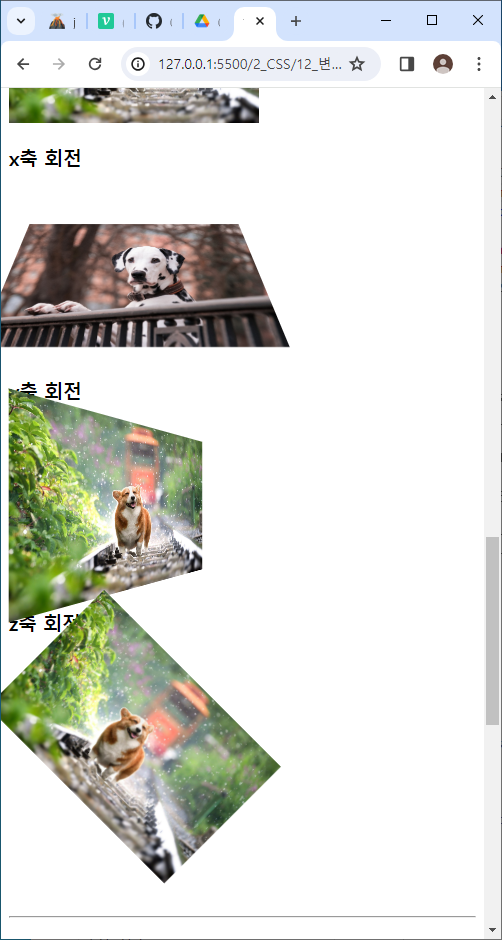
- x축 회전
rotateX(Ndeg)
/*x축 회전*/
.trans-rotate-x-3d{
    transform: perspective(300px) rotateX(45deg);
}
- y축 회전
rotateY(Ndeg)
/*y축 회전*/
.trans-rotate-y-3d{
    transform: perspective(300px) rotateY(45deg);
}
결과는 아래와 같이 나온다.(
변형 사이에 지연 시간 추가하기(transition)
- 마우스 호버 시 배경 색이 노란색으로 바뀜
<div class="box test1"></div>
.box{
    width:150px;
    height: 150px;
    background-color: red;
    border:1px solid black;
}
.test1:hover{
    background-color: yellow;
    transition-duration: 1s;
}
/*마우스 호버 시 배경 색이 노란색으로 바뀜*/
/*변경되는데 걸리는 시간 1초*/
/*1초동안 배경색이 노란색으로 바뀜*/
- 호버 시 배경 색 변경, 원으로 모양 변경
<div class="box test2">여기가 위쪽</div>
 /*호버 시 배경 색 변경, 원으로 모양 변경*/
.test2:hover{
		/*요소가 360도 돌아감*/
    transform: rotate(360deg);
    background-color: skyblue;
    /*테두리 모서리 곡률 속성(px,%)*/
    border-radius:50%;
}
.test2{
/*3초동안 변경됨*/
transition-duration:3s;
}
/*마우스가 들어올 때, 나갈 때 둘 다 변경됨.
hover속성에 넣게 되면 나갈 때는 적용되지 않는다.
*/
/*호버 시 360도로 돌아가며 요소가 원으로 바뀐다. 배경색 또한 하늘색으로 서서히 수정된다.*/
- 스타일 변형 진행 속도 조정(transition-timing-function)
.test3{
    transition-duration: 3s;
    transition-timing-function: ease-in-out; /*변형속도 변경*/
    /*ease:(기본값), ease-in, ease-out, linear(등속)*/
}
.test3:hover{
    background-color: springgreen;
    transform: rotate(720deg);
}/*호버 시 속도가 빨라지면서 720도 돌고 요소의 배경색이 springreen으로 바뀐다*/
/*호버한 마우스를 떼면 다시 거꾸로 720도 돌아가며 색이 바뀐다.*/
- 스타일 변형 딜레이(transition-delay)
/*스타일 변형 딜레이*/
.test4:hover{
    transform: translateX(100px); /*오른쪽으로 이동*/
}
.test4{
    transition-delay: 2s; /*몇 초 지연 후 변화시킬지 지정*/
} /*2초 지나고 오른쪽으로 100px 이동하고, 2초 또 지나고 원상복귀한다(hover 밖에 지정했기 때문).*/