스켈레톤 UI 적용해보기
https://github.com/Central-MakeUs/PreviewInsure-Web/pull/154
필요성
기존 로딩 화면 시 다소 딱딱한 느낌이 들어 UX 개선이 필요하다고 느낌
데이터 처리 시간에 대한 시각적인 피드백이 있어야함
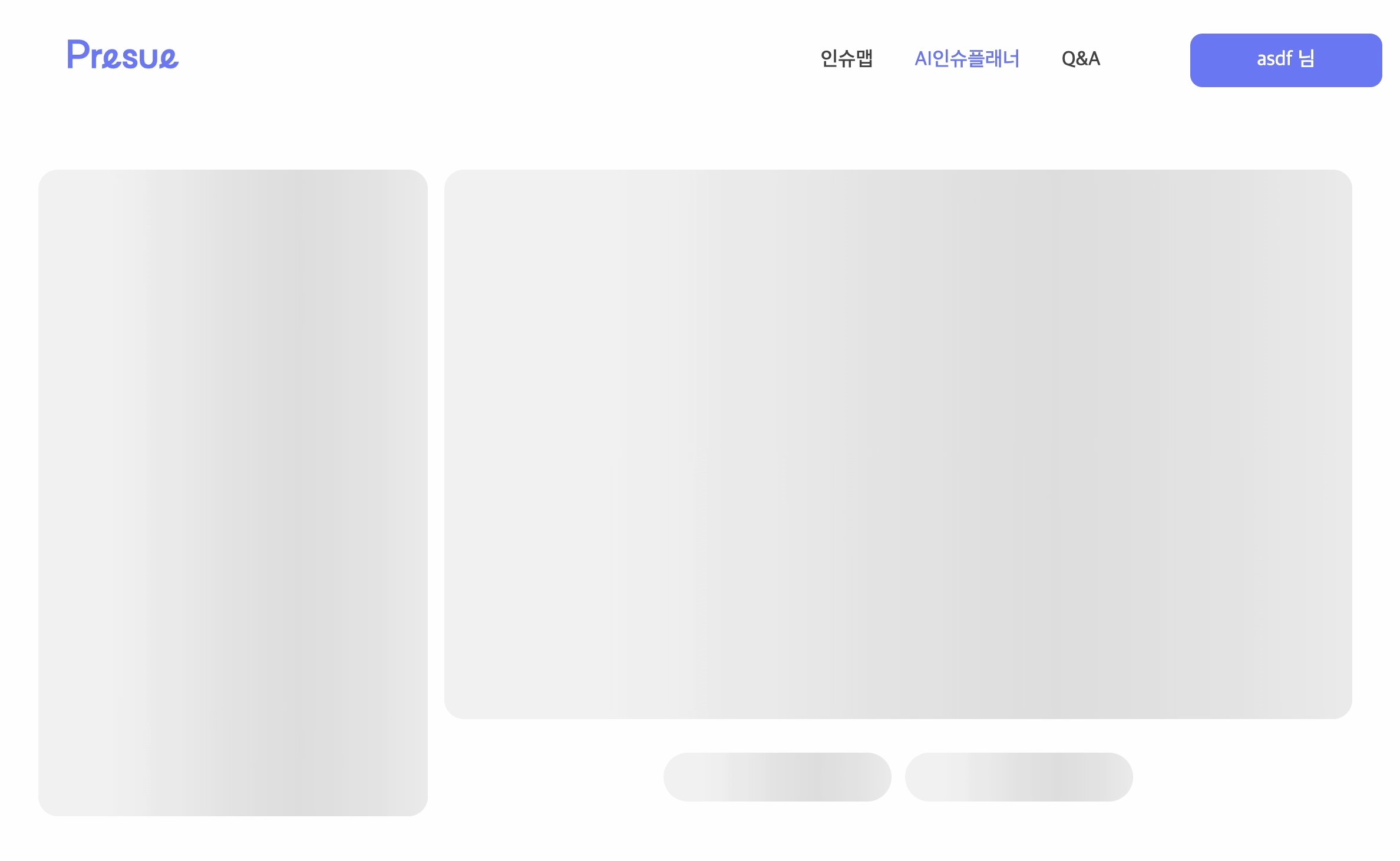
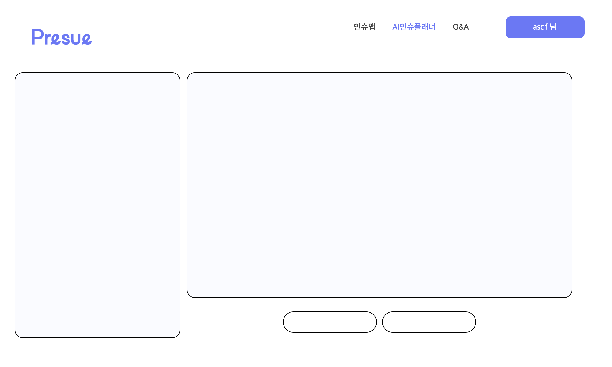
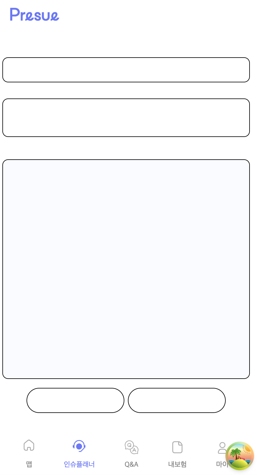
구현
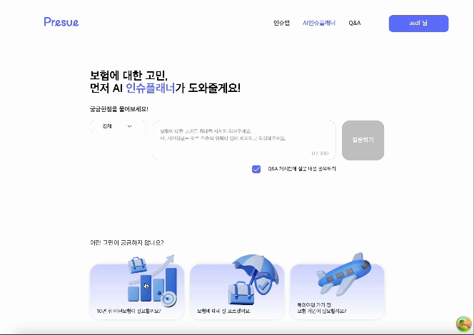
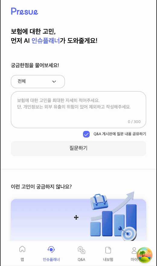
가능한 한 로딩 후의 컨텐츠와 같아야하기 때문에 기존 Answer 화면에 맞게 똑같이 레이아웃을 구성한다.
이때 글자크기 기반으로 사이즈가 설정되어있을 때는 더미 Text를 삽입한 후 투명도를 활용해 크기를 구한다.
코드 ( 스켈레톤 요소 하나 예시 )
const loading = keyframes`
  0% {
    transform: translateX(0);
  }
  50%,
  100% {
    transform: translateX(100%);
  }
`;

const TextWrapperSkeleton = styled.div`
  position: relative;
  background: #f2f2f2;
  overflow: hidden;

  width: 100%;
  border-radius: 2.4rem;
  height: 85%;
  margin-bottom: 2rem;
  padding: 5rem 1.8rem 2rem 1.8rem;

  &::before {
    content: '';
    position: absolute;
    top: 0;
    left: 0;
    width: 100%;
    height: 100%;
    background: linear-gradient(to right, #f2f2f2, #ddd, #f2f2f2);
    animation: ${loading} 1.5s infinite ease-in-out;
  }
`;
적용결과
참고자료

음.. 한줄로는 부족하다