CSS
- CSS
상속
- 상속(inherit)
-
부모 태그와 자식 태그가 존재하기 때문에 HTML도 상속이 존재
-
상속되는 속성 : font 관련, color, text-~, letter-spacing, opacity
<!DOCTYPE html>
<html lang="ko">
<head>
    <meta charset="UTF-8">
    <meta http-equiv="X-UA-Compatible" content="IE=edge">
    <meta name="viewport" content="width=device-width, initial-scale=1.0">
    <title>Document</title>
    <style>
        .eco{
            color : red;
            font-size : 30px;
        }
        /* 상속 확인
            div의 eco클래스에 폰트에 대한 설정을 넣었는데 자식 태그들 모두 폰트 적용됨
           */

        .eco .plant{
            font-size : 15px;
        }
        /* eco클래스에 plant 클래스 모두 폰트 설정 변경
            자바 상속과 같이 부모의 기능을 포함하지만 자식에서는 기능을 바꿀 수 있음 */
    </style>
</head>
<body>
    <div class="eco">
        <div class="animal">동물</div>
        <div class="plant">식물
            <div>해바라기</div>
            <div>튤립</div>
            <div>소나무</div>
        </div>
    </div>
</body>
</html>
-
우선순위
-
우선순위
- HTML요소에 동일한 속성이 적용될 경우 어떠한 것을 우선 적용하는지에 대한 내용
- 규칙
1. 명시도 점수가 높은 선언이 우선
2. 점수가 같은 경우 가장 마지막에 해석되는 선언이 우선
3. 명시도 점수는 상속보다 우선
4. !important가 적용된 선언방식이 다른것보다 우선- 명시도 점수 1. !important : 무한대 2. inline 스타일 : 1000점 3. id 선택자 : 100점 4. class 선택자 : 10점 5. tag 선택자 : 1점 6. 전체 선택자 : 0점 - 우선순위 계산 연습 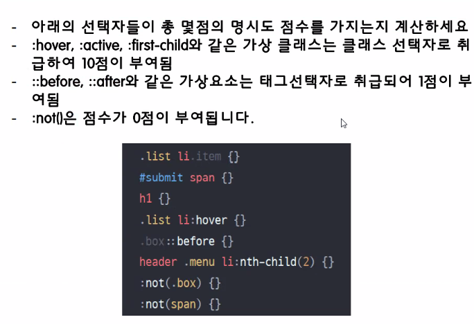 - 정답 : 21, 101, 1, 21, 11, 22, 0, 0 ```html <!DOCTYPE html> <html lang="ko"> <head> <meta charset="UTF-8"> <meta http-equiv="X-UA-Compatible" content="IE=edge"> <meta name="viewport" content="width=device-width, initial-scale=1.0"> <title>Document</title> <style> div{ font-size: 30px; color : red !important; } .c-green{ font-size: 35px; color:green; } #i-yellow{ font-size:45px; color:yellow; } /* id를 스타일에서 지정할 때 #을 사용 */ </style> </head> <body> <div id="i-yellow" class="c-green" style="color:orange" >Hello</div> <!-- tag -> class -> id -> inline -> !important 순으로 페이지에서 스타일이 적용되는 것을 확인 --> </body> </html> ```
%
- %
-
%는 부모의 px를 기준으로 진행
<!DOCTYPE html>
<html lang="ko">
<head>
    <meta charset="UTF-8">
    <meta http-equiv="X-UA-Compatible" content="IE=edge">
    <meta name="viewport" content="width=device-width, initial-scale=1.0">
    <title>Document</title>
    <style>
        body * {
            border:2px solid black;
        }
        /*  body태그안에 모든 것들에 대해 구분선을 작성
            div는 블록 요소라서 각각 블록형태로 구분된 것을 확인 */

        .container{
            width : 1200px;
        }
        .parent {
            width : 50%;
        }
        /*  container의 pixel 기준으로 50% 줄여주는 것(부모요소 기준) width도 %형태로 표현할 수 있음
            contatiner의 px 기준으로 50%인 600px */

        .container .parent .child {
            width : 30%;
        }
        /* container클래스 안에 parent 안에 child 모든 것
           child의 width의 기준은 parent기준으로 지정함으로 180px정도 됨
           %는 부모의 px를 기준으로 진행 */
    </style>>
</head>
<body>
    <div class="container">Container
        <div class="parent">Parent
            <div class="child">child1</div>
            <div class="child">child1</div>
        </div>
    </div>
</body>
</html>
-
em, rem
- em, rem
-
em : 변동적 단위
-
rem : em보다 고정적 단위
-
pixel의 크기를 맞춰주기 위해 em과 rem을 사용
-
em과 rem은 비율을 사용함으로 비율에 맞게 조정됨으로 많은 수정이 필요하지 않을듯?
<!DOCTYPE html>
<html lang="ko">
<head>
    <meta charset="UTF-8">
    <meta http-equiv="X-UA-Compatible" content="IE=edge">
    <meta name="viewport" content="width=device-width, initial-scale=1.0">
    <title>Document</title>
    <style>

        html {
            font-size:10px;
        }

         body * {
            border:2px solid black;
        }

        .container{
            width : 60em;
            font-size: 20px;
        }
        /* 60em이 960px이므로 1em은 16px이고 em은 자기 자신의 폰트 사이즈를 따라감 */
        /* 폰트 사이즈를 바꾸니 1em이 16px가 아니고 20px가 된 것을 확인할 수 있음 */

        .parent {
            width : 50%;
            font-size : 2em;
        }
        /* parent글씨는 40px의 크기를 가짐 */

        .container .parent .child {
            width : 30%;
            font-size : 3rem;
        }
        /* rem : html의 기본 pixel인 16을 지정하여 배수를 통해 폰트 크기를 조절할 수 있음 */
        /* style에서 html의 fontsize를 바꾸면 rem의 값도 바뀜 */

    </style>
</head>
<body>
    <div class="container">Container
        <div class="parent">Parent
            <div class="child">child1</div>

            <div class="child">child1</div>
        </div>
    </div>
</body>
</html>
-
vw, vh
- vw, vh
-
viewport : 사용자가 보는 화면의 전체 크기, vw : viewportwidth, vh : viewportheight
-
사용자가 사용하는 화면을 기준으로 비율을 통해 지정하기 때문에 vw와 vh가 범용적으로 적용하기에 좋음
-
어떤 환경에서도 개발자가 설정한 의도와 동일하게 적용할 수 있음
<!DOCTYPE html>
<html lang="ko">
<head>
    <meta charset="UTF-8">
    <meta http-equiv="X-UA-Compatible" content="IE=edge">
    <meta name="viewport" content="width=device-width, initial-scale=1.0">
    <title>Document</title>
    <style>
        body{
            margin : 0;
            padding : 0;
        }

        .container {
            width:50vw;
            height:100vh;
            background: blue;
        }
        /* viewport : 화면의 전체 크기, vw : viewportwidth, vh : viewportheight 의미
            사용자가 사용하는 화면을 기준으로 비율을 통해 지정하기 때문에 vw와 vh가 범용적으로 적용하기에 좋음
            비율이므로 0~100까지 줄 수 있음*/

    </style>
</head>
<body>
    <div class="container"></div>

</body>
</html>
-
- width & height
- width의 dafault값은 100이고 height의 dafault값은 0
- heigth에 값을 주지 않으면(0) Box가 표시되지 않음
Max & Min
-
Max & Min
<!DOCTYPE html> <html lang="ko"> <head> <meta charset="UTF-8"> <meta http-equiv="X-UA-Compatible" content="IE=edge"> <meta name="viewport" content="width=device-width, initial-scale=1.0"> <title>Document</title> <style> .parent{ width : 1000px; height: 300px; border : 4px solid blue; margin : 20px; } /* margin : 상하좌우 여백을 주는 기능 */ .child{ background: orange; max-width: 400px; min-height: 200px; } /* 최대 400px의 너비를 가질 수 있고 최소 200px의 높이를 보장 */ </style> </head> <body> <div class="parent"> <div class="child"></div> </div> </body> </html>- 최대, 최소를 보장하기 위해서 Max와 Min을 활용
- 최대, 최소를 보장하기 위해서 Max와 Min을 활용
Margin
-
Margin
- 공간 밖의 여백을 주기 위해 사용하는 기능
- 요소와 요소 간 거리를 벌려주기 위해 사용
- margin : 위 오른쪽 아래 왼쪽 -> 값 4개
- margin : 위 (좌우) 아래 -> 값 3개
- margin : (상하) (좌우) -> 값 2개
- margin : (상하좌우) -> 값 1개
   <!DOCTYPE html>
   <html lang="ko">
   <head>
       <meta charset="UTF-8">
       <meta http-equiv="X-UA-Compatible" content="IE=edge">
       <meta name="viewport" content="width=device-width, initial-scale=1.0">
       <title>Document</title>
       <style>

           .outer {
               background: blue;
               height: 100px;
           }

           .inner{
               width : 70%;
               height: 100px;
               background: darkcyan;
               /* margin-top : 50px; */
               /* 위의 50px정도의 여백이 생긴것을 확인 */

               /* margin : 100px 200px; */
               /* 상하에는 100px이고 좌우는 200px로 구성된 것을 확인 */

               /*
               단축 속성 사용 시
               margin : 위 오른쪽 아래 왼쪽 -> 값 4개
               margin : 위 (좌우) 아래 -> 값 3개
               margin : (상하) (좌우) -> 값 2개
               margin : (상하좌우) -> 값 1개
               */

               /* 가운데 정렬을 하고 싶을떄 */
               margin : 0 auto;
           }
           /* inner는 outer의 70%를 차지하고 있다고 생각 */
           /* margin : 위, 아래, 좌, 우에 대한 여백을 주는 기능  */

           .container {
               width: 400px;
               height: 200px;
               border : 4px solid blue;
               margin-left : 200px;
               margin-top: 100px;
               /* 왼쪽과 위쪽 여백을 줌 */
           }

           .container > .box1 {
               width: 100px;
               height: 100px;
               border: 4px solid darkcyan;
               /* margin-top: 20px;
               margin-left: 50%; */
               /* 부모의 width인 400px을 기준으로 50% */
               margin : 0 auto;
   						/* 수평 정렬 가능 */
           }

           .container > .box2{
               width: 100px;
               height: 100px;
               border: 4px solid black;
               /* margin-top: 20px; */
               margin : 0 auto;
           }

           /* margin을 이용해 박스의 레이아웃을 조정할 수 있음 */

       </style>
   </head>
   <body>
       <div class="outer">
           <div class="inner"></div>
       </div>

       <!-- .container>.box$*2 -->
       <div class="container">
           <div class="box1"></div>
           <div class="box2"></div>
       </div>
   </body>
   </html>
Padding
- Padding
- 내부 요소 간 거리를 벌려주기 위해 사용```html <!DOCTYPE html> <html lang="ko"> <head> <meta charset="UTF-8"> <meta http-equiv="X-UA-Compatible" content="IE=edge"> <meta name="viewport" content="width=device-width, initial-scale=1.0"> <title>Document</title> <style> .box { width : 100px; height : 100px; background: tomato; border : 10px solid #000; padding: 50px; box-sizing: border-box; /* box의 size를 기준으로 border-box를 기준으로 하겠다는 뜻이며 box의 크기가 고정되어 있어 padding을 해도 box 크기가 커지지 않음*/ /* 박스의 크기를 어떤 것을 기준으로 계산할지를 결정. border-box는 테두리(경계선)를 기준으로 크기를 정하고, content-box(default)는 내부 요소를 기준으로 크기를 정함 padding은 내부 요소와 경계선과의 거리를 벌리는 속성이기 때문에 그만큼 박스 크기가 증가*/ } /* 내부 요소와 border 사이가 padding이며 padding을 주면 box의 크기가 커질 수 있음 */ </style> </head> <body> <div class="box">Hello World!</div> </body> </html> ```
Display
- Display
- block과 inline 요소를 변경할 수 있음```html <!DOCTYPE html> <html lang="ko"> <head> <meta charset="UTF-8"> <meta http-equiv="X-UA-Compatible" content="IE=edge"> <meta name="viewport" content="width=device-width, initial-scale=1.0"> <title>Document</title> <style> span{ display:block; width : 100px; height: 100px; background: red; } /* inline 요소인 span은 width와 height가 적용이 안됨 하지만 display:block; 이렇게 지정하면 inline요소가 block요소로 변경됨*/ a{ display:inline-block; width:50px; height: 100px; background: green; color: orange; } /* a도 inline요소이므로 block요소로 변경 하지만 block요소라서 배치가 세로로 지정되어 있음 가로로 지정하고 싶을때에는 inline-block을 통해 가로 지정 가능 */ .box{ height: 100px; background: deepskyblue; margin-top: 40px; } /* .box > input:nth-child(2){ display:none; } */ /* 2번째 박스를 display에서 안보이게 만듬 */ .hide{ /* display: none; */ opacity: 0; } </style> </head> <body> <span>display 속성 공부!</span> <a href="#">게시판</a> <a href="#">방명록</a> <div class="box"> <input type="text" value = "1"> <input type="text" value = "2"> <input type="text" value = "3"> <input type="text" value = "4"> <input type="text" value = "5"> <input type="text" value = "6"> </div> <button class="btn">클릭!</button> <script> const $box = document.querySelector(".box"); const $btn = document.querySelector('.btn'); $btn.onclick = () => { $box.classList.toggle('hide') } // 사용자가 버튼을 클릭하게 된다면 hide라는 클래스를 만들어 디스플레이에서 박스영역이 사라짐 </script> </body> </html> ```
Overflow
- Overflow
- Overflow되는 부분을 scroll을 통해 지정할 수 있음```html <!DOCTYPE html> <html lang="ko"> <head> <meta charset="UTF-8"> <meta http-equiv="X-UA-Compatible" content="IE=edge"> <meta name="viewport" content="width=device-width, initial-scale=1.0"> <title>Document</title> <style> .parent{ width : 300px; height : 250px; border : 4px solid black; overflow: auto; /* 자식태그들이 부모태그의 width와 height보다 크면 overflow를 통해서 조정가능 scroll을 통해서 부모태그에서 overflow된 부분을 모두 확인 가능 가장 좋은건 auto를 통해서 조건에 맞게 자동으로 조정*/ } .child { width: 100px; height: 200px; background: blue; border: 4px solid orange; font-size: 40px; } </style> </head> <body> <!-- .parent>.child*2{$} --> <div class="parent"> <div class="child">1</div> <div class="child">2</div> </div> </body> </html> ```
Practice
-
실습
-
공부한 것을 바탕으로 화면 구성
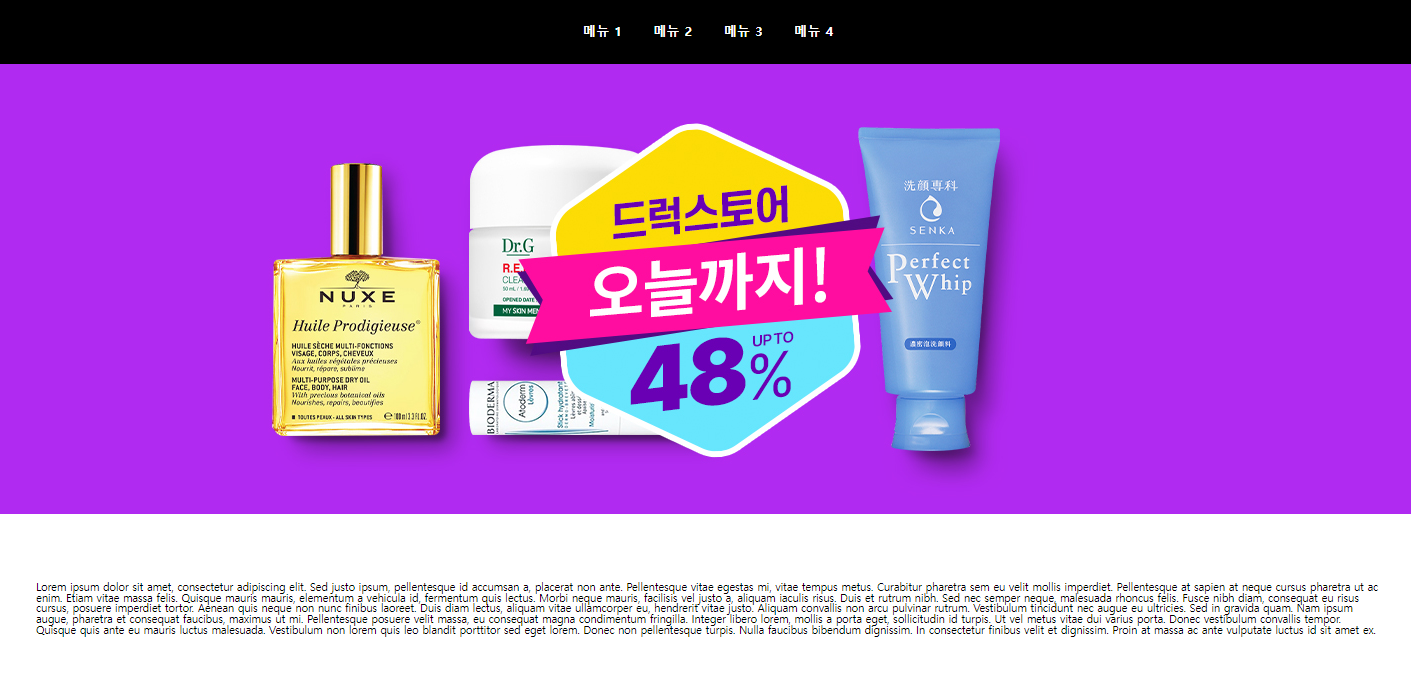
<!DOCTYPE html>
<html lang="ko">
<head>
    <meta charset="UTF-8">
    <meta http-equiv="X-UA-Compatible" content="IE=edge">
    <meta name="viewport" content="width=device-width, initial-scale=1.0">
    <title>Document</title>
    <link rel="stylesheet" href="https://cdn.jsdelivr.net/npm/reset-css@5.0.1/reset.min.css">
              <style>
        .box{
            background: black;
            text-align: center;
        }

        .menu li{
            display: inline-block;
            /* 가로로 만들기 위해서 inline처럼 만들지만 결국은 block */
            width: 100px;
            height: 100px;
            line-height: 100px;
            /* height와 line-height를 같게 하면 가운데로 맞춰짐 */
        }

        .menu li a{
            color: white;
            font-size: 20px;
            font-weight: 900;
            text-decoration: none;
        }
        img{
            width: 100%;
        }
        /* 사진의 크기를 화면에 맞도록 조정  */
        .inner {
            width : 70%;
            margin : 100px auto;
        }
        /* 글에 대한 레이아웃 설정 */

    </style>
</head>
<body>

    <nav class="box">
        <ul class="menu">
            <li><a href="#">메뉴 1</a></li>
            <li><a href="#">메뉴 2</a></li>
            <li><a href="#">메뉴 3</a></li>
            <li><a href="#">메뉴 4</a></li>
        </ul>
    </nav>

    <section>
        <img src="./img/img1.jpg" alt="sorry~">
        <div class="inner">
            Lorem ipsum dolor sit amet, consectetur adipiscing elit. Sed justo ipsum, pellentesque id accumsan a, placerat non ante. Pellentesque vitae egestas mi, vitae tempus metus. Curabitur pharetra sem eu velit mollis imperdiet. Pellentesque at sapien at neque cursus pharetra ut ac enim. Etiam vitae massa felis. Quisque mauris mauris, elementum a vehicula id, fermentum quis lectus. Morbi neque mauris, facilisis vel justo a, aliquam iaculis risus. Duis et rutrum nibh. Sed nec semper neque, malesuada rhoncus felis. Fusce nibh diam, consequat eu risus cursus, posuere imperdiet tortor. Aenean quis neque non nunc finibus laoreet. Duis diam lectus, aliquam vitae ullamcorper eu, hendrerit vitae justo. Aliquam convallis non arcu pulvinar rutrum. Vestibulum tincidunt nec augue eu ultricies. Sed in gravida quam.

Nam ipsum augue, pharetra et consequat faucibus, maximus ut mi. Pellentesque posuere velit massa, eu consequat magna condimentum fringilla. Integer libero lorem, mollis a porta eget, sollicitudin id turpis. Ut vel metus vitae dui varius porta. Donec vestibulum convallis tempor. Quisque quis ante eu mauris luctus malesuada. Vestibulum non lorem quis leo blandit porttitor sed eget lorem. Donec non pellentesque turpis. Nulla faucibus bibendum dignissim. In consectetur finibus velit et dignissim. Proin at massa ac ante vulputate luctus id sit amet ex.
        </div>
    </section>
</body>
</html>
-

안녕하세요! 공부한 내용을 기록하는 공간입니다.