1분 코딩 및 네이버 부스트캠프 강의 관련 정리해봅니다. HTML과 CSS에서 놓치기 쉬운 포인트들을 복습하고 나아가 SCSS, 관련 애니메이션 등 확장적인 기능에 대하여 학습하고자 합니다.
Grid 컨테이너에 적용하는 설정
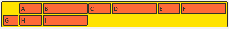
Grid-auto-columns & grid-auto-rows (그리드 형태를 자동으로 정의)
grid-template-columns & rows의 통제를 벗어난 위치에 있는 트랙의 크기를 지정하는 속성입니다.
예를 들어 grid-template-rows를 사용하여 값으로 repeat(3, minmax(100px, auto)) 주었을 때는 repeat 횟수를 3으로 지정하여 이를 한정시켜줬습니다.
그런데 row 개수를 미리 알 수 없는 경우, grid-auto-rows를 써주면, 굳이 횟수를 지정해서 반복할 필요 없이 “알아서” 처리됩니다.
“통제를 벗어난”의 의미는 바로 이겁니다. grid-template-rows로 미리 세팅해 둔 것이 없이 때문에 여기있는 모든 row들은 grid-template-rows의 통제를 벗어난 row가 되는 것이고, 바로 grid-auto-rows가 처리를 합니다!
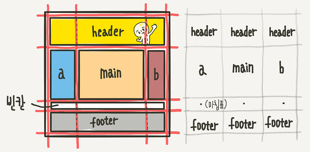
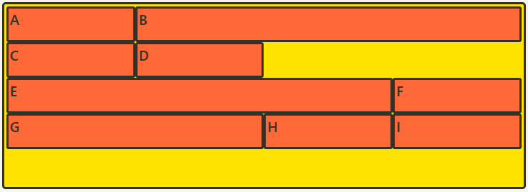
Grid-template-areas (영역 이름으로 그리드 정의)
.container {
	grid-template-areas:
		"header header header"
		"   a    main    b   "
		"   .     .      .   "
		"footer footer footer";
}
직관적인 방법으로 각 영역(Grid Area)에 이름을 붙이고, 그 이름을 이용해서 배치하는 방법입니다. 각자 차지하는 셀의 개수만큼 해당 위치에 셀마다 공백을 하나씩 넣어서 구분하여 이름을 써주면 됩니다. 빈칸은 마침표 또는 “none”을 사용합니다.
각 영역의 이름은 어떻게 매칭할까요? 해당 아이템 요소에 grid-area 속성으로 이름을 지정해주면 됩니다!
.header { grid-area: header; }
.sidebar-a { grid-area: a; }
.main-content { grid-area: main; }
.sidebar-b { grid-area: b; }
.footer { grid-area: footer; }
/* 이름 값에 따옴표가 없는 것에 주의하세요 */
각 셀의 영역 지정
- grid-column-start
- grid-column-end
grid-column- grid-row-start
- grid-row-end
grid-row
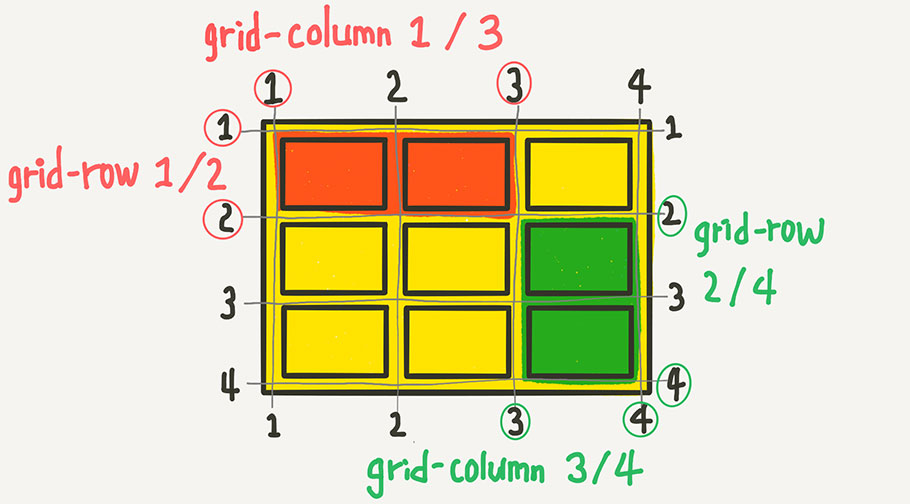
Grid 라인 번호가 매겨져 있는데요, 바로 그 번호를 이용해서 column과 row의 범위를 결정합니다. 시작번호 / 끝번호를 지정하는 방법 외에, 몇 개의 셀을 차지하게 할 것인지를 지정하는 것도 가능합니다.
.item:nth-child(1) {
	grid-column: 1 / 3;
	grid-row: 1 / 2;
}
.item:nth-child(1) { /* 1번 라인에서 2칸 */ grid-column: 1 / span 2; /* 1번 라인에서 3칸 */ grid-row: 1 / span 3; }
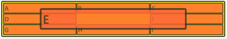
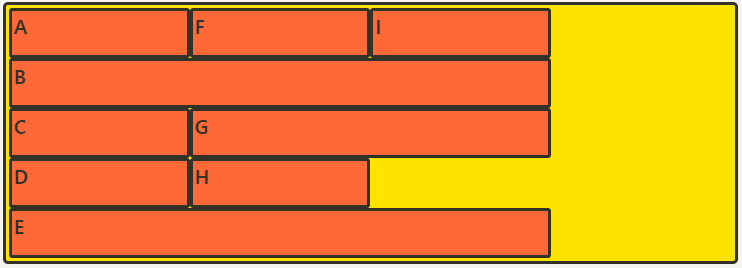
grid-column/row을 이용해 ‘통제받지 않는’ column들을 만들 수 있습니다.
.container {
	grid-template-columns: 50px;
	grid-auto-columns: 1fr 2fr;
}
.item:nth-child(1) { grid-column: 2; }
.item:nth-child(2) { grid-column: 3; }
.item:nth-child(3) { grid-column: 4; }
.item:nth-child(4) { grid-column: 5; }
.item:nth-child(5) { grid-column: 6; }
.item:nth-child(6) { grid-column: 7; }
/* end를 생략하면 그냥 한 칸임 */
첫번째 column(G)만 grid-template-columns의 통제를 받아 50px로 되고, 나머지 column들은 grid-auto-columns의 규칙에 따라 1:2의 비율이 반복됩니다.
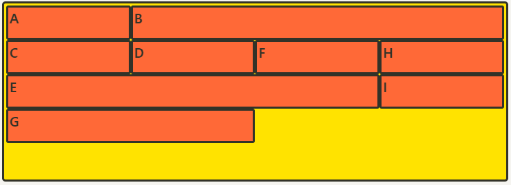
Grid-auto-flow (자동 배치)
아이템이 자동 배치되는 흐름을 결정하는 속성입니다.
.container {
	display: grid;
	grid-template-columns: repeat(auto-fill, minmax(25%, auto));
	grid-template-rows: repeat(5, minmax(50px,auto));
	grid-auto-flow: dense;
}
item:nth-child(2) { grid-column: auto / span 3; }
item:nth-child(5) { grid-column: auto / span 3; }
item:nth-child(7) { grid-column: auto / span 2; }
크기가 다른 셀을 설정하면서 들어갈 자리가 없어서 빈 셀들이 생깁니다. Grid 배치의 기본 설정은 아이템이 row를 기준으로 순서대로 배치가 되다가 들어갈 자리가 없으면 그 칸은 비워두고 아래로 배치가 됩니다.
dense는 기본적으로 빈 셀을 채우는 알고리즘이며, row와 column에 따라 기준이 달라집니다.
- row
- column
- dense
Grid 컨테이너에 적용하는 정렬
Align-items (세로 방향 정렬)
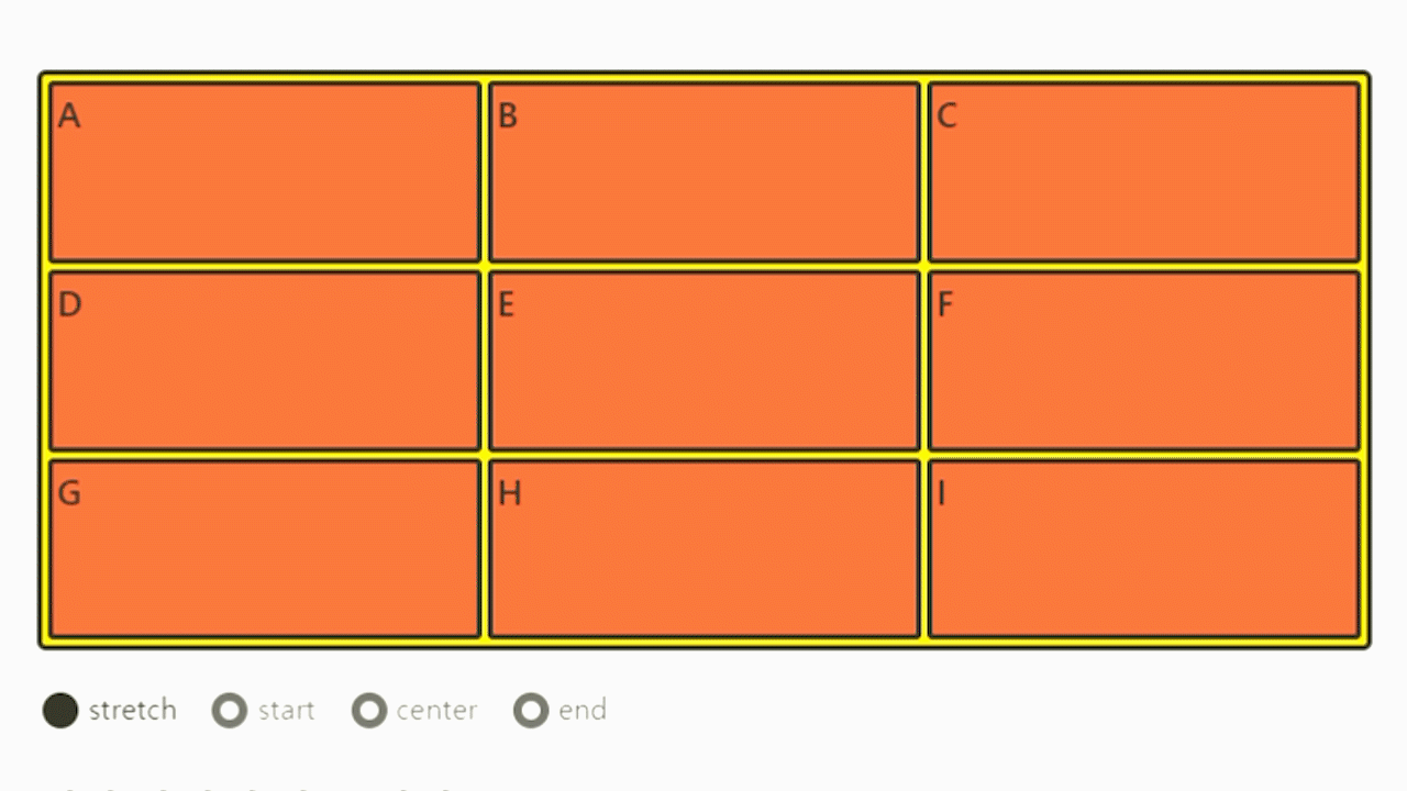
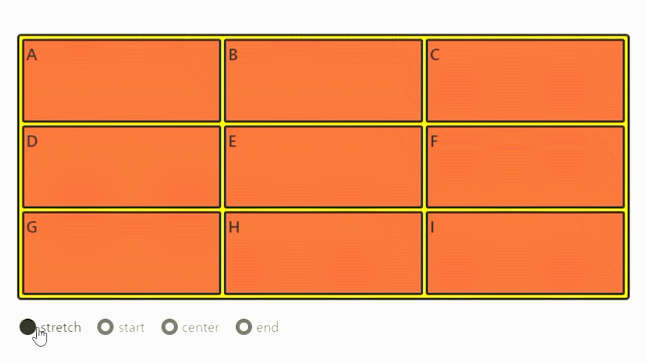
.container {
	align-items: stretch;
	/* align-items: start; */
	/* align-items: center; */
	/* align-items: end; */
}
Justify-items (가로 방향 정렬)
.container {
	justify-items: stretch;
	/* justify-items: start; */
	/* justify-items: center; */
	/* justify-items: end; */
}
Place-items
align-items와 justify-items를 같이 쓸 수 있는 축약형 속성입니다. align-items, justify-items의 순서로 작성하고, 하나의 값만 쓰면 두 속성 모두에 적용됩니다.
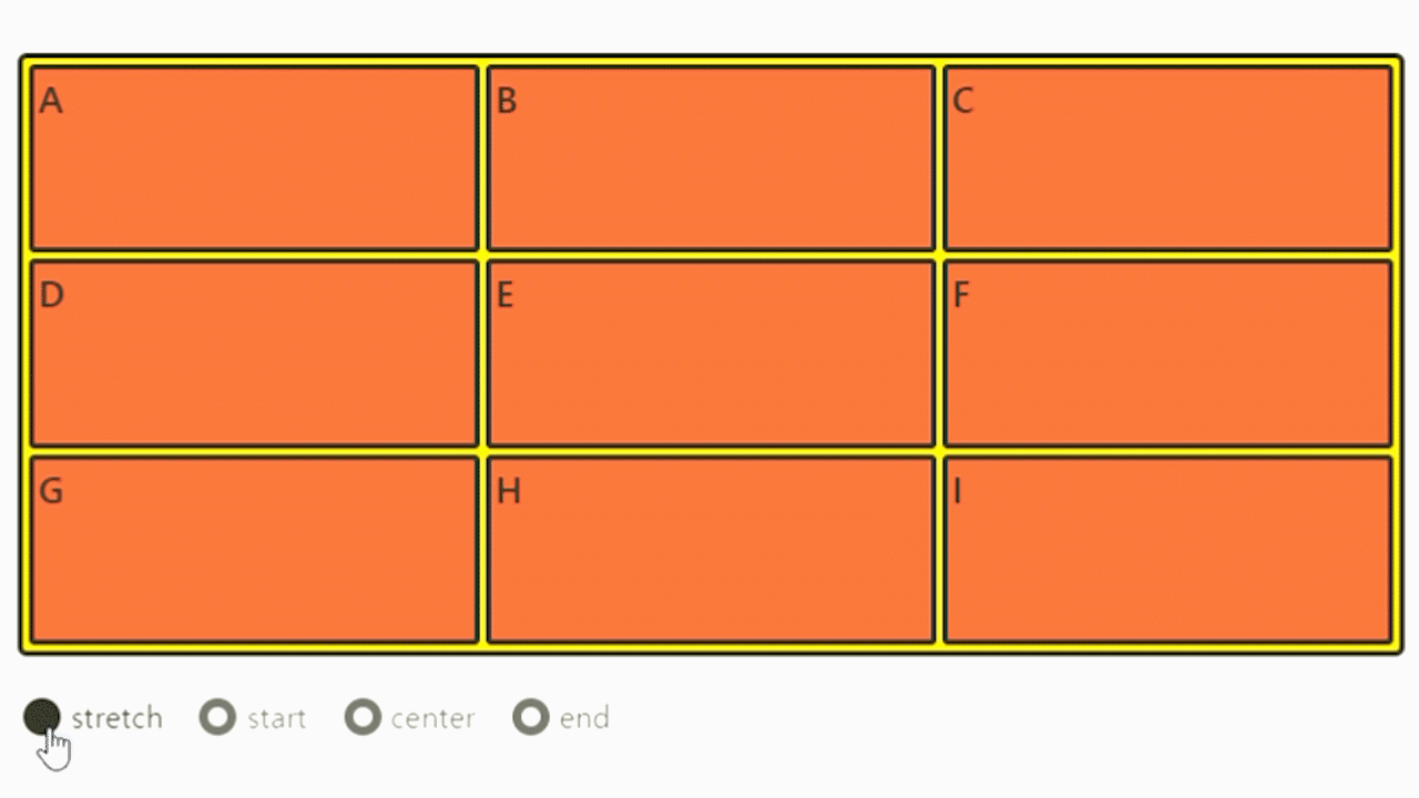
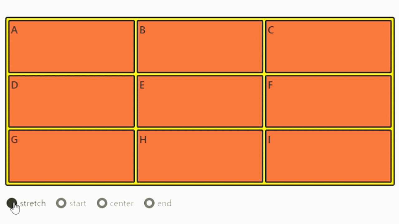
Align-content (아이템 그룹 세로 정렬)
.container {
	align-content: stretch;
	/* align-content: start; */
	/* align-content: center; */
	/* align-content: end; */
	/* align-content: space-between; */
	/* align-content: space-around; */
	/* align-content: space-evenly; */
}
Grid 아이템들의 높이를 모두 합한 값이 Grid 컨테이너의 높이보다 작을 때 Grid 아이템들을 통째로 정렬합니다.
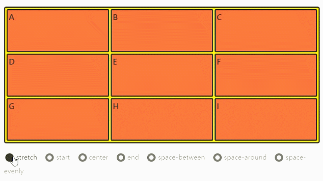
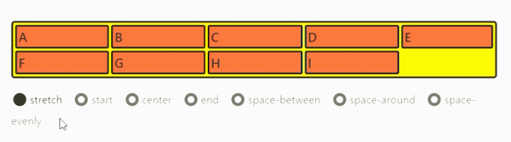
Justify-content (아이템 그룹 가로 정렬)
.container {
	justify-content: stretch;
	/* justify-content: start; */
	/* justify-content: center; */
	/* justify-content: end; */
	/* justify-content: space-between; */
	/* justify-content: space-around; */
	/* justify-content: space-evenly; */
}
Grid 아이템들의 너비를 모두 합한 값이 Grid 컨테이너의 너비보다 작을 때 Grid 아이템들을 통째로 정렬합니다.
Place-content
align-content와 justify-content를 같이 쓸 수 있는 단축 속성입니다. align-content, justify-content의 순서로 작성하고, 하나의 값만 쓰면 두 속성 모두에 적용됩니다.
Grid 아이템에 적용하는 정렬
Align-self (개별 아이템 세로 정렬)
.item {
	align-self: stretch;
	/* align-self: start; */
	/* align-self: center; */
	/* align-self: end; */
}
해당 아이템을 세로(column축) 방향으로 정렬합니다.
Justify-self (개별 아이템 가로 정렬)
.item {
	justify-self: stretch;
	/* justify-self: start; */
	/* justify-self: center; */
	/* justify-self: end; */
}
해당 아이템을 가로(row축) 방향으로 정렬합니다.
Place-self
.item {
	place-self: start center;
}
align-self와 justify-self를 같이 쓸 수 있는 단축 속성입니다. align-self, justify-self의 순서로 작성하고, 하나의 값만 쓰면 두 속성 모두에 적용됩니다.
Order (배치 순서)
.item:nth-child(1) { order: 3; } /* A */
.item:nth-child(2) { order: 1; } /* B */
.item:nth-child(3) { order: 2; } /* C */
각 아이템들의 시각적 나열 순서를 결정하는 속성입니다..
작은 숫자일 수록 먼저 배치됩니다. "시각적" 순서일 뿐, HTML 구조를 바꾸는 것은 아니므로 접근성 측면에서 사용에 주의해야 합니다.

Z-index
z-index로 Z축 정렬을 할 수 있어요. 숫자가 클 수록 위로 올라옵니다. (position에서의 z-index랑 똑같습니다.)