2021년 7월 12일 11일차
학습한 내용
html
<div class="z-one"></div>
<div class="z-two"></div>


<div class="left-1"></div>
<div class="right-1"></div>


<header></header>

<section>
<div class="left"></div>
<div class="center"></div>
<div class="right"></div>

</section>

<footer></footer>

<section>
<div class="left-2"></div>
<div class="right-2"></div>
</section>

<div calss="clearfix"></div>
<footer></footer>


<div class="over-box">
<p>Nice to meet you Nice to meet you Nice to meet youNice to meet you Nice to meet youNice to meet you Nice to meet you
Nice to meet you Nice to meet you Nice to meet youNice to meet you Nice to meet youNice to meet you Nice to meet you
Nice to meet you Nice to meet you Nice to meet youNice to meet you Nice to meet youNice to meet you Nice to meet you
Nice to meet you Nice to meet you Nice to meet youNice to meet you Nice to meet youNice to meet you Nice to meet you
Nice to meet you Nice to meet you Nice to meet youNice to meet you Nice to meet youNice to meet you Nice to meet you</p>

</div>


<div class="container">
	<div class="item one"></div>
	<div class="item two"></div>
	<div class="item three"></div>
</div>


<!-- 실무에서 자주사용하는 중앙정렬 -->
<div class="center-1"></div>
<div class="center-2"></div>
css
.z-one {
position: absolue;
width: 200px	;
height:  200px;
background-color: yellow;

z-index:  10;
/*z-index:  단위 생략 가능, 숫자 입력 안하면 0으로 적용됨, z축의 위치 조정을 함,
z축에 있다->3차원영역에서만 사용 가능(position : absoule, fixed, relative속성에서만 사용 가능)*/
}
/첫번째의 형제의 position(2차원, 3차원)에 따라서 서로의 layout이 겹칠지 안겹칠지 정해진다.
보통 큰 공간을 만들 때는 2차원을 만들어준다(서로가 겹치지 않게 하기 위해서)/
.z-two {
position: absolute;
width: 200px;
height: 300px;
background-color: blue;
z-index: 20;
}
.left-1 {
float: left;
width: 100px;
height: 150px;
background-color: blue;
}
.right-1 {
float: right;
width: 100px;
height: 150px;
background-color: green;
}
/left,right 두 태그를 folat: left, right로 하니 같은 x축 선상에서 놓여지게되고, 브라우저를 줄여도 왼쪽과 오른쪽끝에 위치하게 된다./
header {
width: 100%;
height: 100px;
background-color: yellow;
}
.left {
float: left;
/float의 성격은 공중에 띄우는 것이다. 그래서 다음 태그에서 float을 설정해주지 않게 되면,
float태그를 사용한 태그는 다음 태그의 위에 떠있게 됨/
width: 100px;
height: 200px;
background-color: pink;
}
.center {
float: left;
width: 300px;
height: 200px;
background-color: blue;
}
.right {
float: right;
width: 100px;
height: 200px;
background-color: green;
}
footer {
clear: both;
/clear: both : float을 사용했을 때 따라오는 기능 clear는 float을 사용하고 마지막에 끄는 기능 이다.
float를 사용하고 그 다음 태그에 clear태그를 사용하면 됨./
width: 100%;
height: 100px;
background-color: black;
}
section {
width :1400px;
height: 200px;
background-color: orange;
}
/공간을 만들 때 사용되는 태그들은 block요소들이다.
줄바꿈이 생겨나면서 y축 정렬이 되는것이다./
/*float을 사용할 때 주의점
브라우저 폭을 줄이면 레이어들이 틀어지게 됨
그것을 방지하기 위해서는 부모가 고정값이여야 한다.
그래서 section을 통해서 고정값으로 만들어 주면 된다.
하지만 화면에서는 section부분이 보일 수 있으니
계산을 해서 값을 딱 맞춰주게 하면 안보이게 된다.
float을 사용한 영역은 그 영역의 높이값이 부모에게 영향을 주지 않는다.
float을 사용할때는 position의 상태는 static과 relative상태여야만 한다.*/
.left-2 {
float: left;
width: 100px;
height: 150px;
background-color: yellow;
}
.right-2 {
float: right;
width: 100px;
height: 150px;
background-color: blue;
}
footer {
width: 100%;
height: 100px;
background-color: black;
}
.clearfix {
clear: both;
}
/개발자들은 clearfix라는 태그를 사용해서 float 기능을 끈 스위치를 만들었는지 확인한다./
section {
overflow: hidden;
width: 800px;
background-color: orange;
/overflow와 float를 같이 사용하게 되면 자식의 높이값을 부모가 인식할 수 있도록 만들 수 있다./
}
.over-box {
overflow: hidden;
/overflow-y: scroll;
overflow-x: scroll;/
/*overflow:  hidden : 내가 만든 상자안에 text가 상자를 벗어난경우 안보이게 해줌
overflow-y:  scroll : 내가 만든 상자안에 text가 상자를 벗어나면 세로축으로 스크롤이 생겨서 박스안에 모든 text가 담길 수 있게 해줌
overflow-x:  scroll : 내가 만든 상자안에 text가 상자를 벗어나면 가로축으로 스크롤이 생겨 박스안에 모든 text가 담ㅣㄹ 수 있게 해줌*/

width: 200px;
height: 200px;
background-color: yellow;
}
.container {
display: flex;
/display는 inline을 block으로 block을 inline으로 바꾸는 기능도 있고
flex라는 기능도 있다./
flex-direction: row;
/flex-direction: row : 정렬을 x축(가로축) 정렬 (기본 값 정렬)
flex-direction: column : 정렬을 y축(세로축) 정렬
flex-direction: row-reverse : 정렬을 x축 역순으로 정렬
flex-direction: column-reverse : 정렬을 y축 역순으로 정렬/
flex-wrap: nowrap;
/부모영역을 벗어나지 않고 부모영역안에서 사이즈를 다시 맞춰주게 된다./
flex-wrap: wrap;
/자식 영역이 부모영역보다 높게 된다면 틀어짐/
flex-flow: row wrap;
/direction과 wrap을 한번에 정렬/
justify-content: flex-start;
/*flex-start : 왼쪽에서 부터 정렬*/
justify-content: flex-end;
/*flex-end : 오른쪽에서 부터 정렬*/
justify-content: center;
/*center : 가운데 정렬*/
justify-content: space-between;
/*space-between : 공간안에 있는 박스를 같은 간격을 두고 띄우고 싶을 때 사용*/
justify-content: space-around;
/*space-around : 공간안에 있는 박스를 같은 간격을 두고 띄우고 싶을 때 사용 그리고 양끝에 있는 박스와 공간 사이에도 간격을 */

align-items: flex-start;
/*align-itens : y축(세로축) 정렬, flex-start : 가장 위쪽에 배치*/
align-items: flex-end;
/*align-itens : y축(세로축) 정렬, flex-endt : 가장 아래에 배치*/
align-items: center;
/*align-itens : y축(세로축) 정렬, center : 가운데에 배치*/
align-items: baseline;
/*align-itens : y축(세로축) 정렬, baseline : 박스의 가장 밑에 라인들을 맞춰줌*/


width: 1000px;
border: solid 10px red;
}
.item {
width: 200px;
height: 300px;
}
.one {
height: 100px;
background-color: yellow;
}
.two {
height: 200px;
background-color: blue;
}
.three {
height: 300px;
background-color: orange;
}
.center-1 {
width: 300px;
height: 300px;
background-color: yellow;
margin: 0 auto;
/*하나의 margin값에 두개의 값을 입력하면 앞에 값은 상하값, 뒤에 값은 좌우값
margin은 block일 때 사용해주면 됨*/
}
.center-2 {
position: relative;
width: 300px;
height: 300px;
background-color: blue;

left: 50%;
/*relative를 사용했기 때문에 left를 사용가능
left:  50% : 왼쪽면 기준으로 50%(중앙 값)에 위치하게 */
margin-left: -150%;
/*margin-left:  -150% : 상자의 위치를 가운데로 옮겨줌(width 기준)
그래서 width의 값이 바뀌면 margin-left의 값도 움직여줘야 하는 2중 작업이 생김*/
}
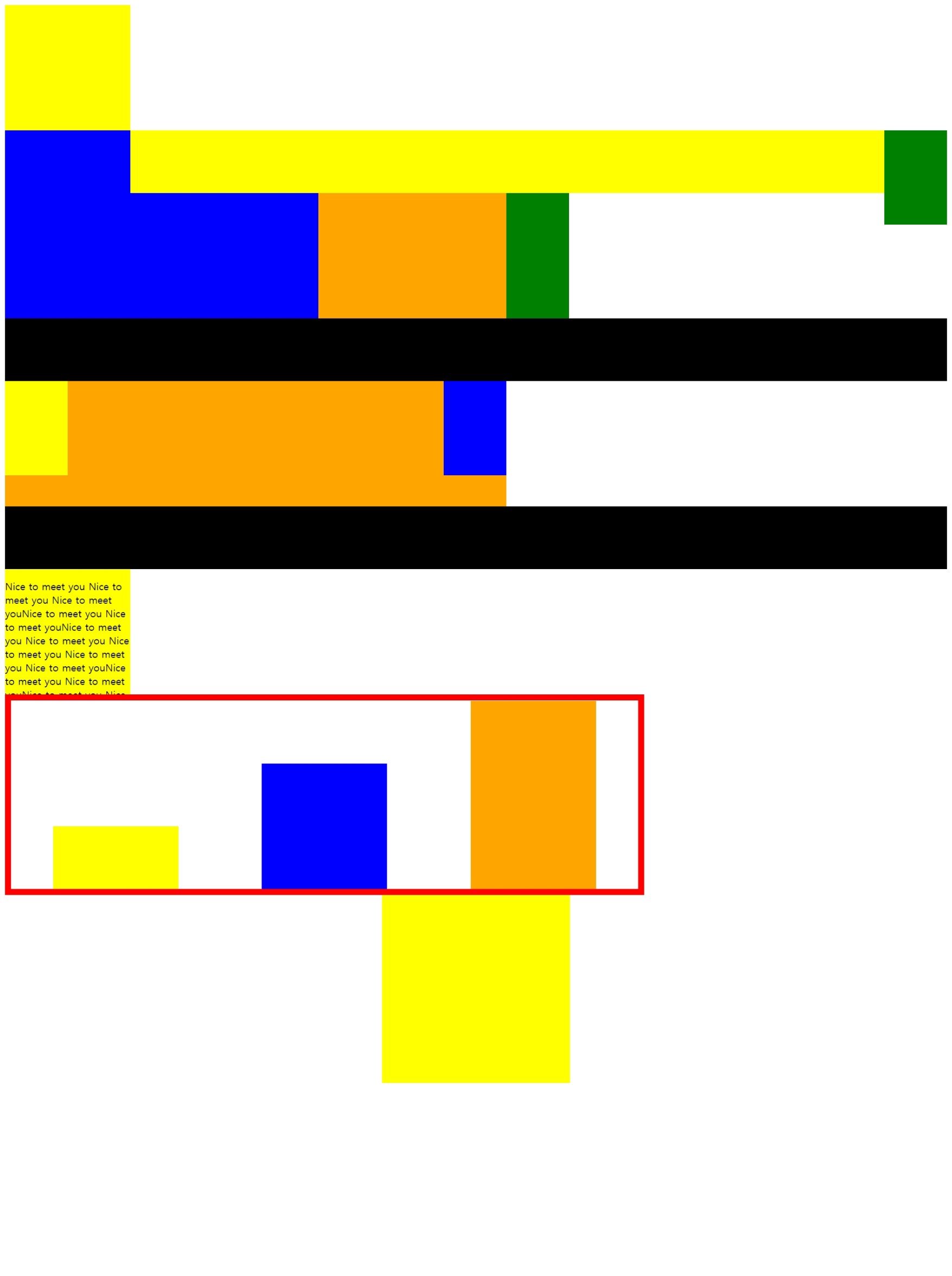
결과
미디어쿼리2
학습내용 중 어려웠던 점
많은 내용들이 쏟아져 나와 헷갈리고 이것을 어느 상황에 어느 태그를 사용해야할지 감이 잡히지 않았다.
해결방법
반복적인 학습을 통해서 태그에 대해 이해하고 습득하려고 노력했지만 아직까지는 부족한 것 같다.
학습소감
짧은 내용의 강의였지만 아주 응축시켜서 수업을 하셔서 강의를 멈추고 다시 그 말을 이해하고 필기하느라 시간을 많이 잡아먹었다. 반복적인 학습을 통해 태그에 대해 더 알아보고 익혀야겠다.
