Seaborn
!conda install -y seabornimport numpy as np
import pandas as pd
import matplotlib.pyplot as plt
import seaborn as sns
from matplotlib import rc
plt.rcParams["axes.unicode_minus"] = False #마이너스 부호 때문에 한글이 깨지는 경우 방지
rc("font", family= "Malgun Gothic")
%matplotlib inline예제1. Seaborn 기초
np.linspace(0,14, 100) #0~14 까지 100개의 데이터array([ 0. , 0.14141414, 0.28282828, 0.42424242, 0.56565657,
0.70707071, 0.84848485, 0.98989899, 1.13131313, 1.27272727,
1.41414141, 1.55555556, 1.6969697 , 1.83838384, 1.97979798,
2.12121212, 2.26262626, 2.4040404 , 2.54545455, 2.68686869,
2.82828283, 2.96969697, 3.11111111, 3.25252525, 3.39393939,
3.53535354, 3.67676768, 3.81818182, 3.95959596, 4.1010101 ,
4.24242424, 4.38383838, 4.52525253, 4.66666667, 4.80808081,
4.94949495, 5.09090909, 5.23232323, 5.37373737, 5.51515152,
5.65656566, 5.7979798 , 5.93939394, 6.08080808, 6.22222222,
6.36363636, 6.50505051, 6.64646465, 6.78787879, 6.92929293,
7.07070707, 7.21212121, 7.35353535, 7.49494949, 7.63636364,
7.77777778, 7.91919192, 8.06060606, 8.2020202 , 8.34343434,
8.48484848, 8.62626263, 8.76767677, 8.90909091, 9.05050505,
9.19191919, 9.33333333, 9.47474747, 9.61616162, 9.75757576,
9.8989899 , 10.04040404, 10.18181818, 10.32323232, 10.46464646,
10.60606061, 10.74747475, 10.88888889, 11.03030303, 11.17171717,
11.31313131, 11.45454545, 11.5959596 , 11.73737374, 11.87878788,
12.02020202, 12.16161616, 12.3030303 , 12.44444444, 12.58585859,
12.72727273, 12.86868687, 13.01010101, 13.15151515, 13.29292929,
13.43434343, 13.57575758, 13.71717172, 13.85858586, 14. ])x = np.linspace(0, 14, 100)
y1 = np.sin(x)
y2 = 2 * np.sin(x + 0.5)
y3 = 3 * np.sin(x + 1.0)
y4 = 4 * np.sin(x + 1.5)plt.figure(figsize=(10,6))
plt.plot(x, y1, x, y2, x, y3, x, y4)
plt.show()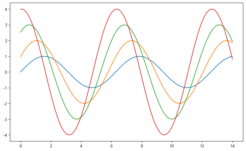
# sns.set_style() 종류 : styles = ["white", "dark", "whitegrid", "darkgrid", "ticks"]
sns.set_style("dark")
plt.figure(figsize=(10,6))
plt.plot(x, y1, x, y2, x, y3, x, y4)
plt.show()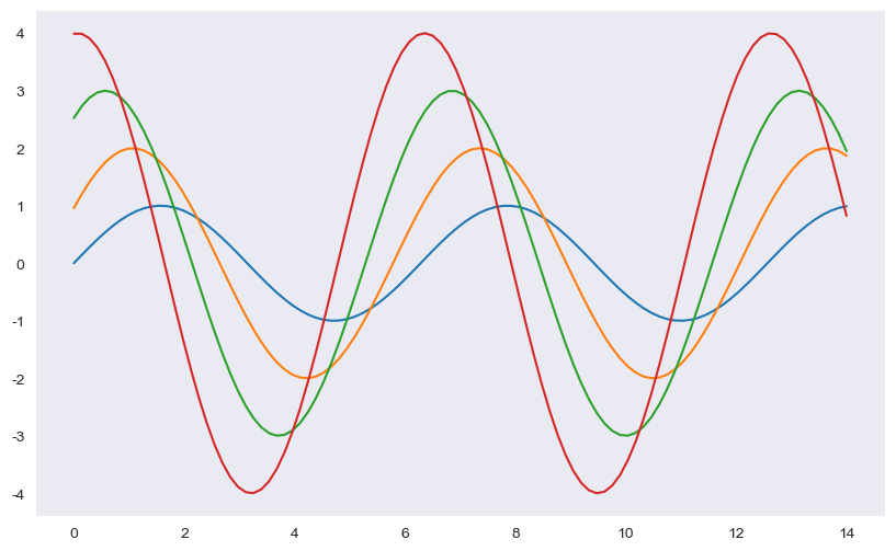
예제2. seaborn tips data
- boxplot
- swarmplot
- implot
tips = sns.load_dataset("tips")
tips| total_bill | tip | sex | smoker | day | time | size | |
|---|---|---|---|---|---|---|---|
| 0 | 16.99 | 1.01 | Female | No | Sun | Dinner | 2 |
| 1 | 10.34 | 1.66 | Male | No | Sun | Dinner | 3 |
| 2 | 21.01 | 3.50 | Male | No | Sun | Dinner | 3 |
| 3 | 23.68 | 3.31 | Male | No | Sun | Dinner | 2 |
| 4 | 24.59 | 3.61 | Female | No | Sun | Dinner | 4 |
| ... | ... | ... | ... | ... | ... | ... | ... |
| 239 | 29.03 | 5.92 | Male | No | Sat | Dinner | 3 |
| 240 | 27.18 | 2.00 | Female | Yes | Sat | Dinner | 2 |
| 241 | 22.67 | 2.00 | Male | Yes | Sat | Dinner | 2 |
| 242 | 17.82 | 1.75 | Male | No | Sat | Dinner | 2 |
| 243 | 18.78 | 3.00 | Female | No | Thur | Dinner | 2 |
244 rows × 7 columns
#tips 데이터 요약 정보 확인
tips.info()<class 'pandas.core.frame.DataFrame'>
RangeIndex: 244 entries, 0 to 243
Data columns (total 7 columns):
# Column Non-Null Count Dtype
--- ------ -------------- -----
0 total_bill 244 non-null float64
1 tip 244 non-null float64
2 sex 244 non-null category
3 smoker 244 non-null category
4 day 244 non-null category
5 time 244 non-null category
6 size 244 non-null int64
dtypes: category(4), float64(2), int64(1)
memory usage: 7.4 KB# boxplot 그리기
plt.figure(figsize=(8,6))
sns.boxplot(x=tips["total_bill"])
plt.show()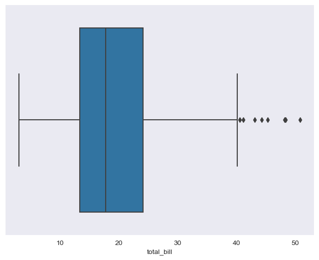
plt.figure(figsize=(8,6))
sns.boxplot(x="day", y="total_bill", data = tips)
plt.show()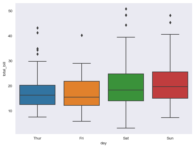
# "day" 데이터 항목 확인
tips["day"].unique()
['Sun', 'Sat', 'Thur', 'Fri']
Categories (4, object): ['Thur', 'Fri', 'Sat', 'Sun']#boxplot의 hue, palette 옵션
#hue="" 기준으로 나눠서 비교
plt.figure(figsize=(8,6))
sns.boxplot(x="day", y="total_bill", data=tips, hue="smoker", palette="Set1") #palette Set색상 1~3 3가지
plt.show()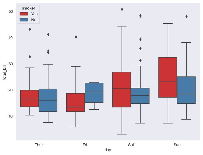
# swarmplot

plt.figure(figsize=(8,6))
sns.swarmplot(x="day",y="total_bill", data=tips,color="0.5" )  #color 옵션(0~1사이, 검=0, 흰=1)
plt.show()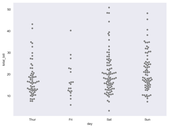
# boxplot + swarmplot 같이 나타내기
plt.figure(figsize=(8,6))
sns.boxplot(x="day", y="total_bill", data=tips)
sns.swarmplot(x="day", y="total_bill", data=tips, color="0.25")
plt.show()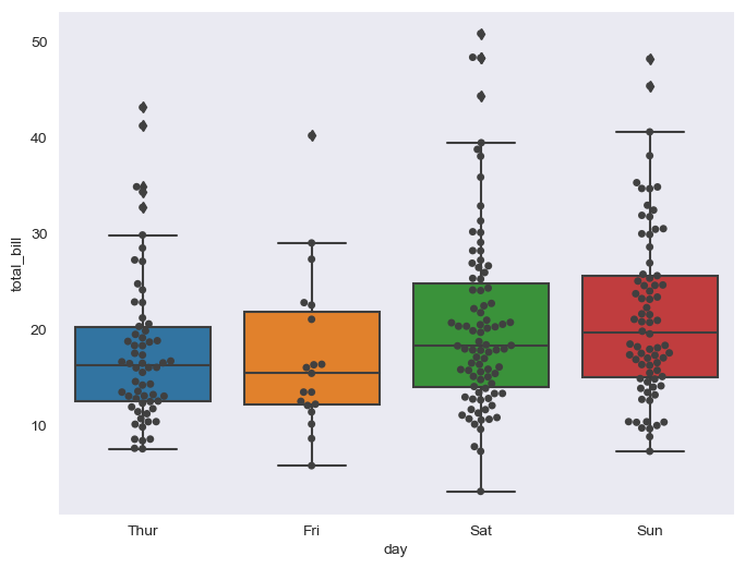
# lmplot 로 total_bill과 tip사이 관계 파악

sns.set_style("darkgrid")
sns.lmplot(x="total_bill", y="tip", data=tips, height=5)  #size옵션 대신 height옵션으로 사용
plt.show()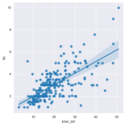
sns.set_style("darkgrid")
sns.lmplot(x="total_bill", y="tip", data = tips, height=5, hue="smoker")
plt.show()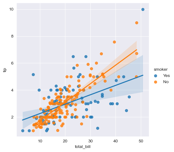
예제3. flight data
- heatmap
flights = sns.load_dataset("flights")
flights.head()| year | month | passengers | |
|---|---|---|---|
| 0 | 1949 | Jan | 112 |
| 1 | 1949 | Feb | 118 |
| 2 | 1949 | Mar | 132 |
| 3 | 1949 | Apr | 129 |
| 4 | 1949 | May | 121 |
flights.info()<class 'pandas.core.frame.DataFrame'>
RangeIndex: 144 entries, 0 to 143
Data columns (total 3 columns):
# Column Non-Null Count Dtype
--- ------ -------------- -----
0 year 144 non-null int64
1 month 144 non-null category
2 passengers 144 non-null int64
dtypes: category(1), int64(2)
memory usage: 2.9 KB# pivot기능 활용
# index, columns, values
flights = flights.pivot(index="month", columns="year", values="passengers")
flights.head()| year | 1949 | 1950 | 1951 | 1952 | 1953 | 1954 | 1955 | 1956 | 1957 | 1958 | 1959 | 1960 |
|---|---|---|---|---|---|---|---|---|---|---|---|---|
| month | ||||||||||||
| Jan | 112 | 115 | 145 | 171 | 196 | 204 | 242 | 284 | 315 | 340 | 360 | 417 |
| Feb | 118 | 126 | 150 | 180 | 196 | 188 | 233 | 277 | 301 | 318 | 342 | 391 |
| Mar | 132 | 141 | 178 | 193 | 236 | 235 | 267 | 317 | 356 | 362 | 406 | 419 |
| Apr | 129 | 135 | 163 | 181 | 235 | 227 | 269 | 313 | 348 | 348 | 396 | 461 |
| May | 121 | 125 | 172 | 183 | 229 | 234 | 270 | 318 | 355 | 363 | 420 | 472 |
# heatmap

plt.figure(figsize=(10,8))
sns.heatmap(data=flights, annot=True, fmt="d") # annot=True는 데이터 값 표시, False는 숫자표시x / fmt="d":정수형, "f":소수형
plt.show()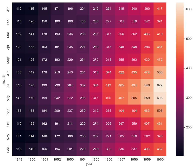
# colormap 옵션
plt.figure(figsize=(10,8))
sns.heatmap(flights, annot=True, fmt="d", cmap="YlGnBu")
plt.show()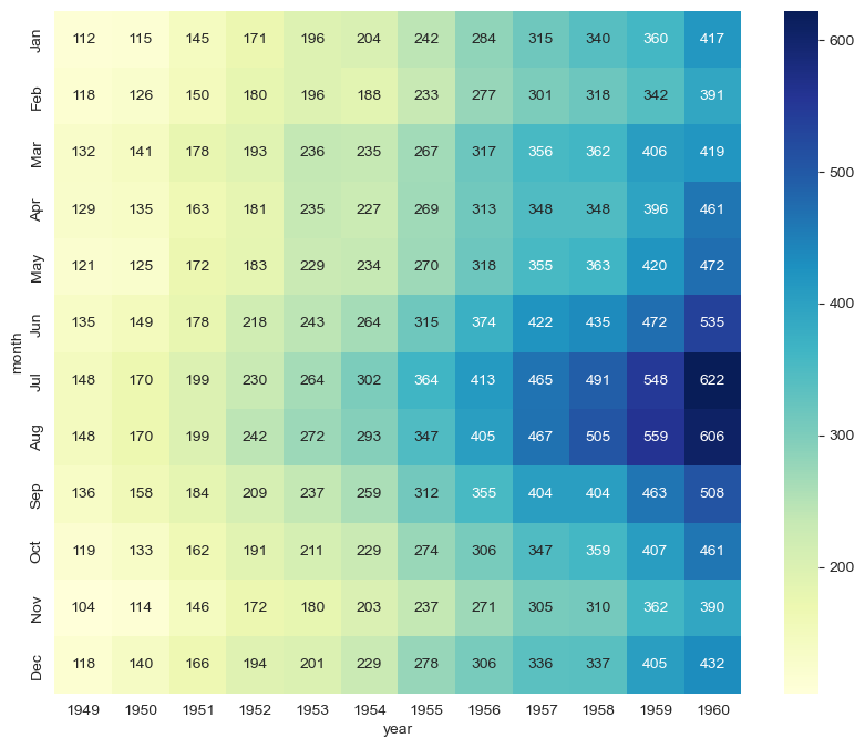
예제4. iris 데이터
- pairplot
iris = sns.load_dataset("iris")
iris.tail()| sepal_length | sepal_width | petal_length | petal_width | species | |
|---|---|---|---|---|---|
| 145 | 6.7 | 3.0 | 5.2 | 2.3 | virginica |
| 146 | 6.3 | 2.5 | 5.0 | 1.9 | virginica |
| 147 | 6.5 | 3.0 | 5.2 | 2.0 | virginica |
| 148 | 6.2 | 3.4 | 5.4 | 2.3 | virginica |
| 149 | 5.9 | 3.0 | 5.1 | 1.8 | virginica |
# pairplot 그려보기

sns.set_style("ticks")
sns.pairplot(iris)
plt.show()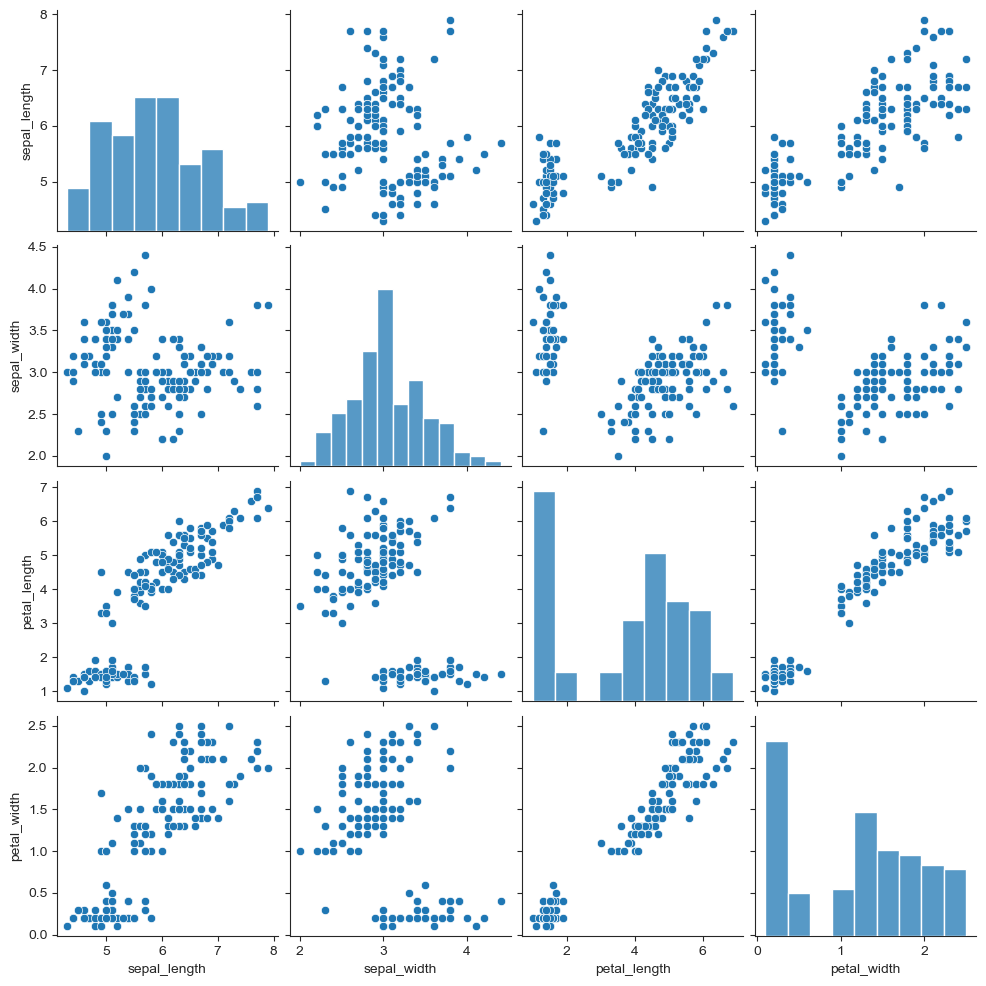
iris["species"].unique()array(['setosa', 'versicolor', 'virginica'], dtype=object)# hue 옵션
sns.pairplot(iris, hue="species")<seaborn.axisgrid.PairGrid at 0x1750dd65520>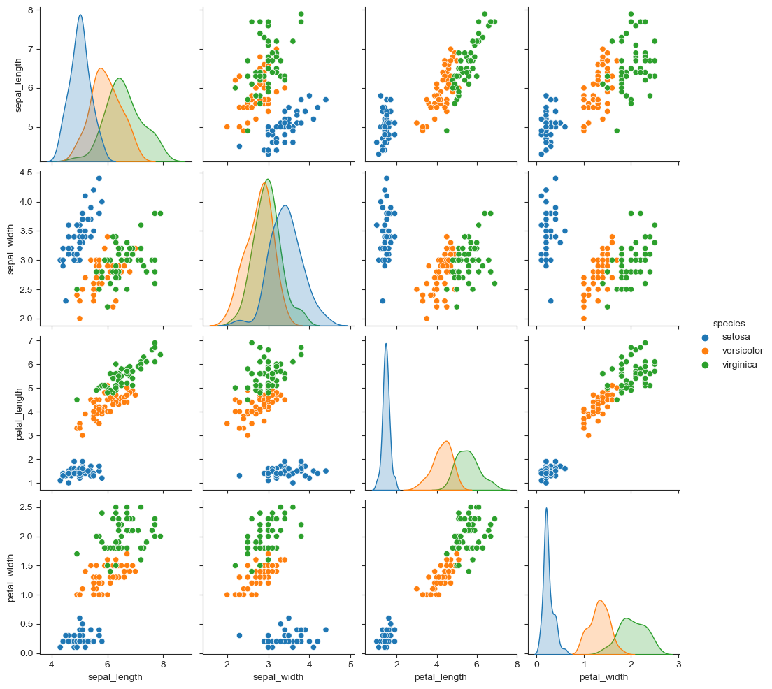
# 원하는 컬럼만 선택해 pairplot

sns.pairplot(iris, x_vars=["sepal_width", "sepal_length"],
            y_vars=["petal_width", "petal_length"])
plt.show()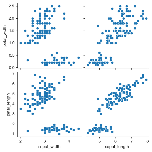
예제5. ansbombe data
- lmplot
anscombe = sns.load_dataset("anscombe")
anscombe.tail()| dataset | x | y | |
|---|---|---|---|
| 39 | IV | 8.0 | 5.25 |
| 40 | IV | 19.0 | 12.50 |
| 41 | IV | 8.0 | 5.56 |
| 42 | IV | 8.0 | 7.91 |
| 43 | IV | 8.0 | 6.89 |
anscombe["dataset"].unique()array(['I', 'II', 'III', 'IV'], dtype=object)sns.set_style("darkgrid")
sns.lmplot(x="x", y="y", data=anscombe.query("dataset=='I'"), ci=None, height=7) #ci : 신뢰구간 설정
plt.show()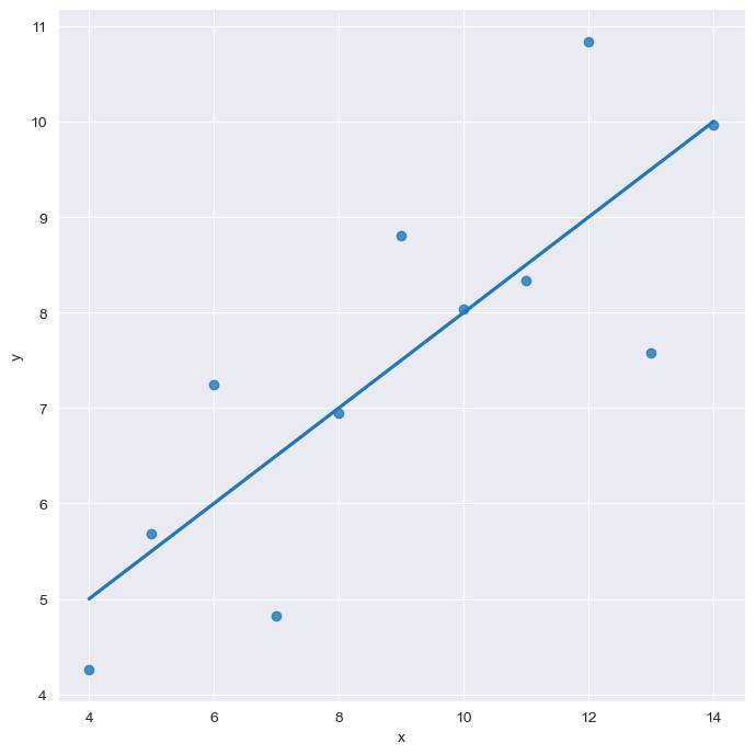
sns.set_style("darkgrid")
sns.lmplot(x="x", y="y", data=anscombe.query("dataset=='I'"), ci=None, height=7, scatter_kws={"s":50}) #점의 크기 설정
plt.show()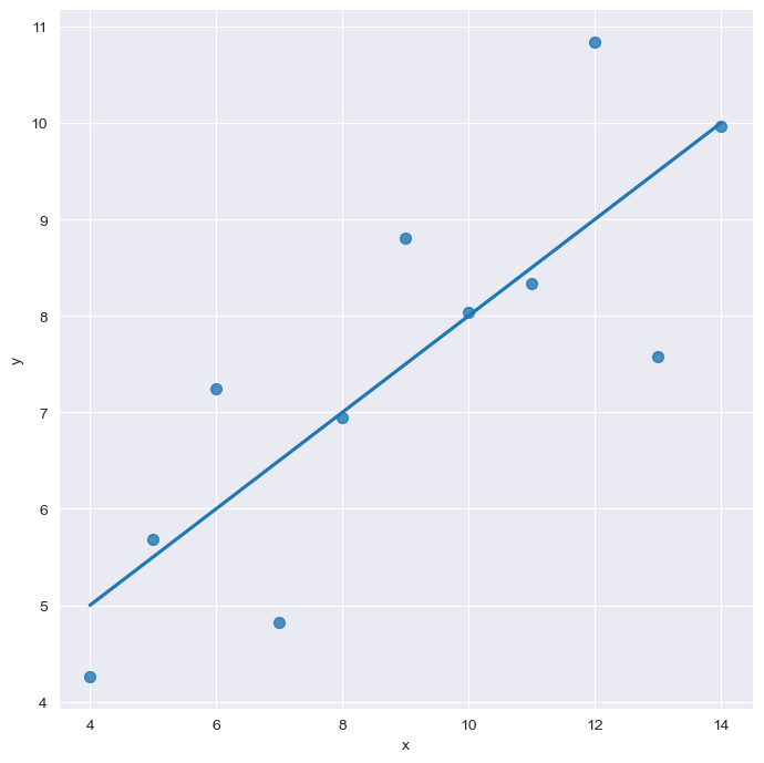
# order 옵션
sns.set_style("darkgrid")
sns.lmplot(
    x="x",
    y="y",
    data=anscombe.query("dataset=='II'"),
    order = 1,
    ci=None,
    height=7,
    scatter_kws={"s":50})
plt.show()
# order 옵션
sns.set_style("darkgrid")
sns.lmplot(
    x="x",
    y="y",
    data=anscombe.query("dataset=='II'"),
    order = 2,
    ci=None,
    height=7,
    scatter_kws={"s":50})
plt.show()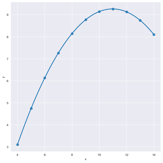
#이상치 outlier
sns.set_style("darkgrid")
sns.lmplot(
    x="x",
    y="y",
    data=anscombe.query("dataset=='III'"),
    ci=None,
    height=7,
    scatter_kws={"s":50})
plt.show()
#이상치로 인해 올라간 직선 그래프에 robuts=True 설정하면 이상치에 민감하게 값이 출력되지 않는다.


sns.set_style("darkgrid")
sns.lmplot(
    x="x",
    y="y",
    data=anscombe.query("dataset=='III'"),
    robust=True,
    ci=None,
    height=7,
    scatter_kws={"s":50})
plt.show()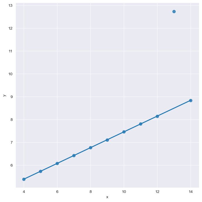
pairplot 이용해서 강도/살인/폭력 상관관계 파악
sns.pairplot(data=crime_anal_norm, vars=["살인", "강도", "폭력"], kind="reg", height=3) #kind="reg": 회귀
#kind 종류 : "scatter", "kde", "hist", "reg"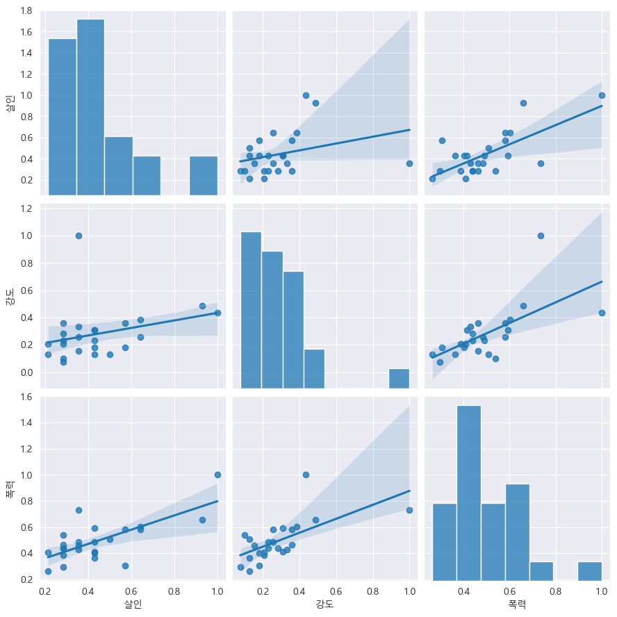
인구수, CCTV와 살인, 강도의 상관관계 확인
def drawGraph():
    sns.pairplot(
    data=crime_anal_norm,
    x_vars=["인구수", "CCTV"],
    y_vars=["살인", "강도"],
    kind="reg",
    height=4
    )
    plt.show()
drawGraph()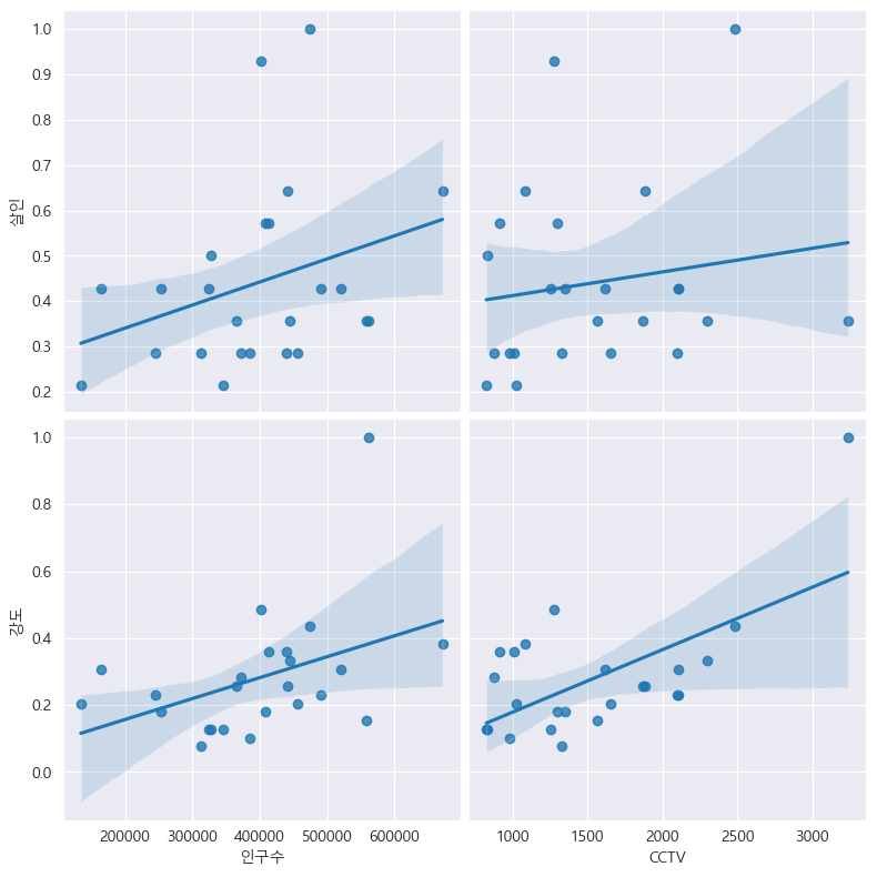
인구수, CCTV와 살인검거율, 폭력검거율의 상관관계 확인
def drawGraph():
    sns.pairplot(
    data=crime_anal_norm,
    x_vars=["인구수", "CCTV"],
    y_vars=["살인검거율", "폭력검거율"],
    kind="reg",
    height=4
    )
    plt.show()
drawGraph()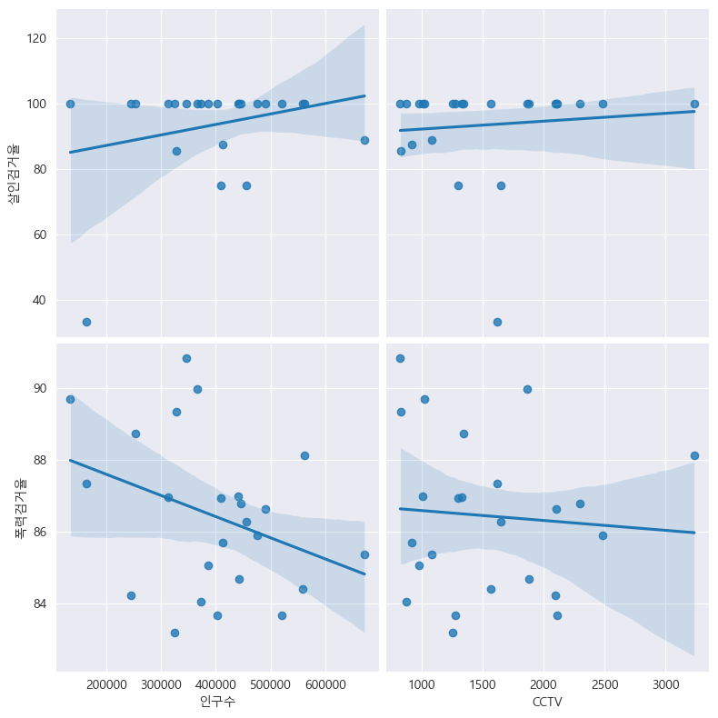
절도검거율, 강도검거율과 비교
def drawGraph():
    sns.pairplot(
    data=crime_anal_norm,
    x_vars=["인구수", "CCTV"],
    y_vars=["절도검거율", "강도검거율"],
    kind="reg",
    height=4
    )
    plt.show()
drawGraph()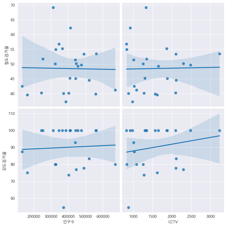
검거율에 대한 히트맵 / "검거" 컬럼을 기준으로 정렬
def drawGraph():
    # 데이터프레임 설정
    target_col= ["강간검거율", "강도검거율", "살인검거율", "절도검거율", "폭력검거율", "검거"]
    crime_anal_norm_sort = crime_anal_norm.sort_values(by="검거", ascending=False) #내림차순

    #그래프 설정
    plt.figure(figsize=(10,10))
    sns.heatmap(
        data=crime_anal_norm_sort[target_col],
        annot=True,
        fmt="f",
        linewidths=0.5, #박스 간 간격 (디폴트:0)
        cmap = "RdPu",
    )
    plt.title("범죄 검거 비율(정규화된 검거의 합으로 정렬)")
drawGraph()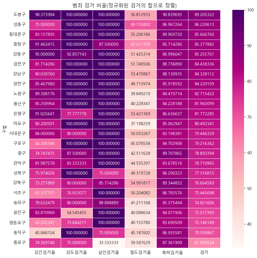
범죄발생 건수 히트맵, "범죄"컬럼 기준으로 설정
def drawGraph():
    target_col= ["강간", "강도", "살인", "절도", "폭력", "범죄"]
    crime_anal_norm_sort = crime_anal_norm.sort_values(by="범죄", ascending=False) #내림차순

    plt.figure(figsize=(10,10))
    sns.heatmap(
        data=crime_anal_norm_sort[target_col],
        annot=True,
        fmt="f",
        linewidths=0.5, #박스 간 간격 (디폴트:0)
        cmap = "RdPu",
    )
    plt.title("범죄 비율(정규화된 발생 건수로 정렬)")
drawGraph()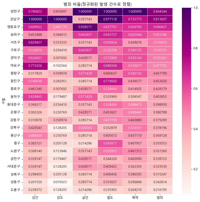
#데이터 저장
crime_anal_norm.to_csv("../data/02.crime_in_Seoul_final.csv", sep=",", encoding="utf-8")
데이터분석 스터디노트🧐✍️