효과적인 UI 컴포넌트 문서를 위한 Storybook 활용

스토리북 소개
스토리북(Storybook)은 UI 컴포넌트를 독립적으로 개발하고, 문서화하며, 테스트할 수 있는 오픈 소스 도구다. 주로 React, Vue, Angular와 같은 다양한 프레임워크에서 사용되며, 개발자들에게 유용한 도구로 자리 잡고 있다. 스토리북을 사용하면 컴포넌트를 개별적으로 다룰 수 있어 전체 애플리케이션에 영향을 주지 않고도 컴포넌트 개발을 쉽게 진행할 수 있다.
1. 주요 기능과 장점
-
컴포넌트 독립 개발: 스토리북을 사용하면 애플리케이션의 나머지 부분과 분리된 상태에서 컴포넌트를 개발할 수 있다. 이렇게 하면 각 컴포넌트를 별도로 개발하고 테스트할 수 있어, 애플리케이션의 복잡성을 줄이고 개발 속도를 높일 수 있다.
-
문서화: 스토리북은 자동으로 컴포넌트 문서를 생성할 수 있다. 특히 팀 내에서 매우 유용하. 각 컴포넌트의 사용법과 다양한 상태를 문서화하여 다른 개발자들이 쉽게 이해하고 사용할 수 있도록 도와준다.
-
테스트: 스토리북은 컴포넌트의 다양한 상태를 쉽게 테스트할 수 있게 해준다. 이를 통해 예상치 못한 버그를 사전에 발견하고 수정할 수 있다. 또한, 시각적 회귀 테스트와 상호작용 테스트도 지원한다.
-
애드온 확장: 스토리북은 다양한 애드온을 통해 기능을 확장할 수 있다. 예를 들어, Actions 애드온을 사용하면 컴포넌트의 이벤트를 쉽게 추적할 수 있고, Knobs 애드온을 사용하면 실시간으로 컴포넌트의 속성을 조작할 수 있다.
2. 주요 기능과 단점
-
빌드 시간 증가: 스토리북을 사용하면 빌드 시간이 길어질 수 있다. 특히, 많은 스토리와 애드온을 사용하는 경우 빌드 및 로드 시간이 늘어날 수 있다.
-
버전 호환성 문제: 스토리북과 사용 중인 다른 라이브러리(예: Next.js) 간의 버전 호환성 문제가 발생할 수 있다. 이는 업데이트 시 주의해야 한다.
3. 스토리북을 사용하는 회사들
-
Airbnb
-
GitHub
-
Shopify
-
IBM
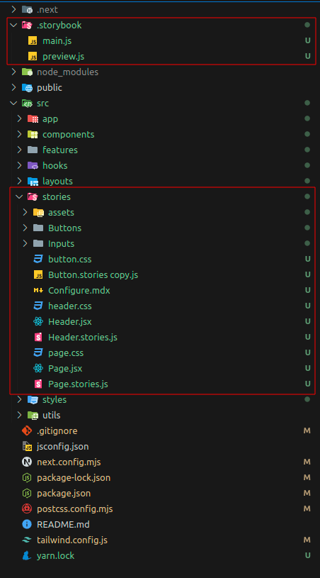
4. 폴더 구조
.storybook 폴더
main.js
- 스토리북의 기본 설정 파일
- 리 파일의 위치, 사용되는 애드온, 프로젝트별 설정 등을 정의한다.
preview.js
- 스토리북의 프리뷰 설정을 포함하며, 글로벌 데코레이터와 파라미터를 정의한다.
- 컴포넌트가 어떻게 렌더링될지를 제어
5. 스토리북의 기본 구조
5-1. 암시적 구조화
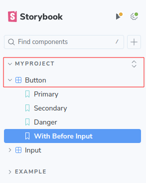
파일의 물리적 위치에 따라 사이드바에서 스토리의 위치가 결정된다. 예를 들어, Button.stories.js 파일이 components/Button 폴더에 있으면, 스토리북은 이를 components/Button 카테고리 아래에 표시한다.
5-2. 명시적 구조화
title 파라미터를 사용하여 스토리의 위치를 명시적으로 정의할 수 있다. 예를 들어, 다음과 같이 설정할 수 있다.
export default {
  title: 'Design System/Atoms/Button',
  component: Button,
};
프로젝트 환경 설정
스토리북과 테일윈드 CSS를 설치하고 설정해 본다. 여기서는 React 18, Next.js 14.2.4, Tailwind CSS 3.4.7 환경을 사용한다.
1. 스토리북과 테일윈드 CSS를 설치 및 설정
1-1. 스토리북 설치
npx sb init
1-2. 테일윈드 CSS 설치
npm install -D tailwindcss postcss autoprefixer
1-3. 테일윈드 CSS 초기 설정 파일을 생성
npx tailwindcss init
1-4. 테일윈드 CSS 설정
tailwind.config.js 파일 설정
module.exports = {
  content: [
    "./src/**/*.{js,jsx,ts,tsx}",
    "./.storybook/**/*.{js,jsx,ts,tsx}"
  ],
  theme: {
    extend: {},
  },
  plugins: [],
}
1-5. 글로벌 CSS 파일 설정
src/styles/globals.css 파일 생성 및 내용 추가
@tailwind base;
@tailwind components;
@tailwind utilities;
1-6. 스토리북에 테일윈드 CSS 적용
.storybook/preview.js 파일에 아래 코드 추가
import "../src/styles/globals.css";
1-7. 스토리북 서버 실행
npm run storybook
스토리(Stories) 작성
1. 컴포넌트 생성
import React from "react";
import PropTypes from "prop-types";
import classNames from "classnames";

// 스타일을 위한 기본 클래스 정의 (TailwindCSS 사용)
const baseClasses = "px-4 py-2 font-semibold transition duration-200 shadow";

// 사이즈 클래스 정의
const sizeClasses = {
  small: "pt-1 pb-1 pr-3 pl-3 text-[13px]",
  medium: "pt-1 pb-1 pr-4 pl-4 text-[15px]",
  large: "pt-1 pb-1 pr-5 pl-5 text-[18px]",
};

// 색상 클래스 정의
const colorClasses = {
  primary: "bg-blue-500 text-white hover:bg-blue-600",
  secondary: "bg-gray-500 text-white hover:bg-gray-600",
  danger: "bg-red-500 text-white hover:bg-red-600",
};

// 모양 클래스 정의
const shapeClasses = {
  rounded: "rounded-3xl",
  square: "rounded",
};

export default function Button(props) {
  const {
    type = "button",
    className = "",
    onClick,
    children,
    size = "medium",
    color = "primary",
    shape = "rounded",
    icon,
    ...rest
  } = props;

  const buttonClasses = classNames(
    baseClasses,
    sizeClasses[size],
    colorClasses[color],
    shapeClasses[shape],
    className
  );

  return (
    <button type={type} className={buttonClasses} onClick={onClick} {...rest}>
      {icon && <span className="mr-2">{icon}</span>}
      {children}
    </button>
  );
}

Button.propTypes = {
  type: PropTypes.string,
  className: PropTypes.string,
  onClick: PropTypes.func,
  children: PropTypes.node.isRequired,
  size: PropTypes.oneOf(["small", "medium", "large"]),
  color: PropTypes.oneOf(["primary", "secondary", "danger"]),
  shape: PropTypes.oneOf(["rounded", "square"]),
  icon: PropTypes.node,
};
2. 스토리 생성
2-1. 스토리북 메타데이터 설정
스토리북에서 버튼 컴포넌트를 설명하기 위해 기본적인 메타데이터를 설정
export default {
  title: "MyProject/Button",
  component: Button,
};
2-2. 템플릿 생성
Template 함수는 전달된 args를 사용하여 버튼 컴포넌트를 렌더링
const Template = (args) => <Button {...args} />;2-3. 각 상태에 대한 스토리 정의
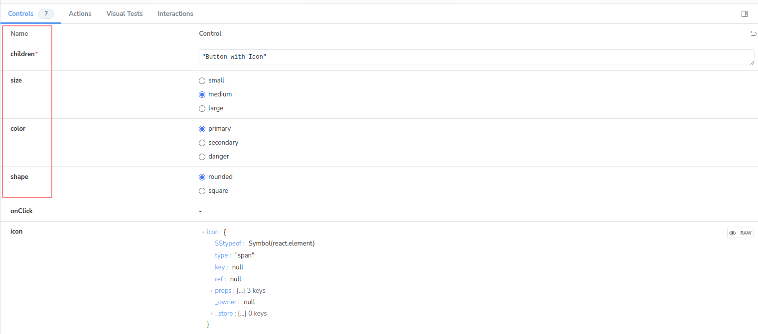
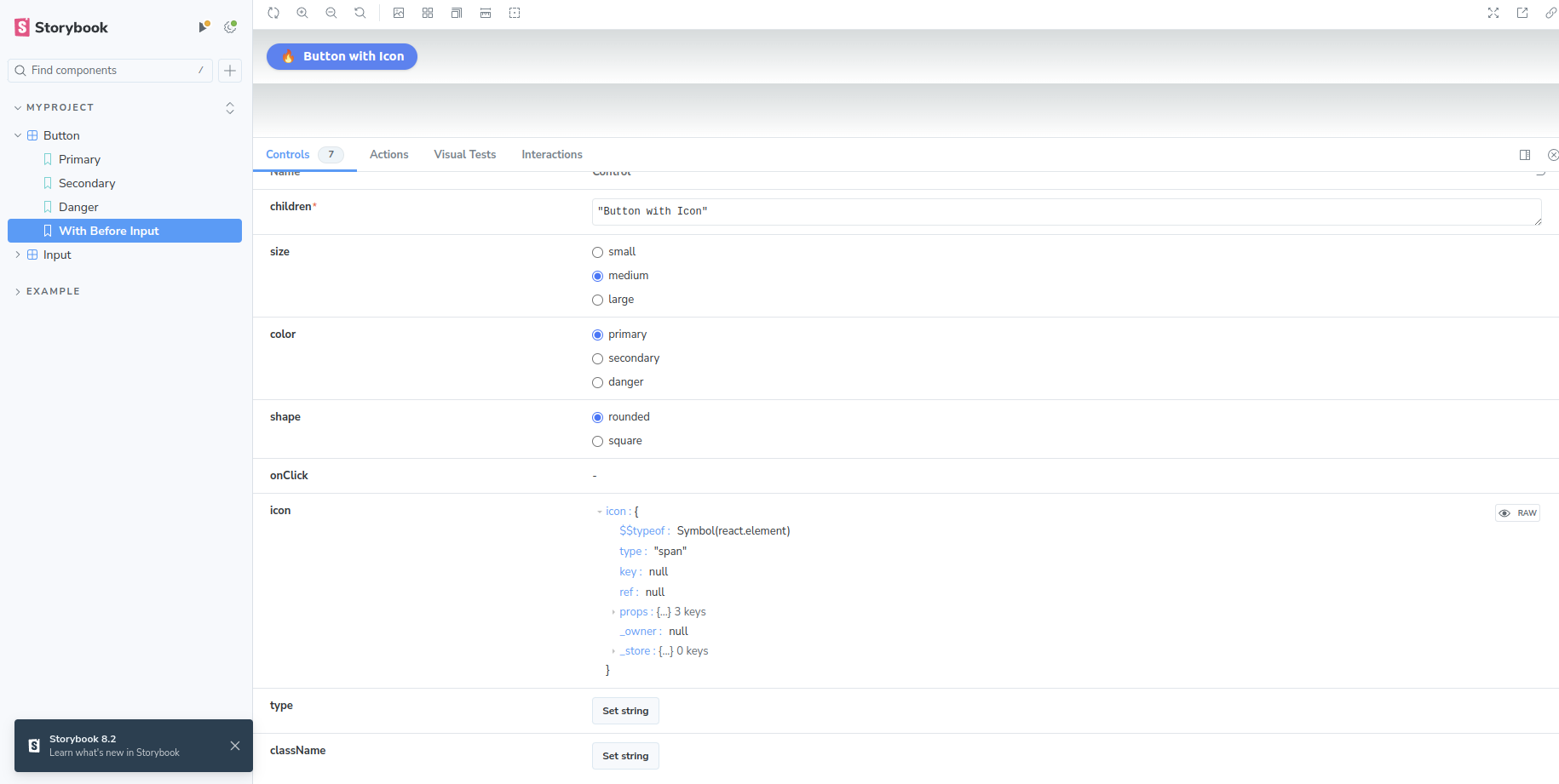
각 스토리는 버튼 컴포넌트의 다양한 상태를 정의한다. Primary, Secondary, Danger, WithIcon과 같은 다양한 버튼 변형을 보여준다.
export const Primary = Template.bind({});
Primary.args = {
  children: "Primary Button",
  size: "medium",
  color: "primary",
  shape: "rounded",
  onClick: action("clicked"),
};
2-4. 버튼 컴포넌트 스토리
import React from "react";
import { action } from "@storybook/addon-actions";
import Button from "@/components/Buttons/Button";

export default {
  title: "MyProject/Button",
  component: Button,
};

const Template = (args) => <Button {...args} />;

export const Primary = Template.bind({});
Primary.args = {
  children: "Primary Button",
  size: "medium",
  color: "primary",
  shape: "rounded",
  onClick: action("clicked"),
};

export const Secondary = Template.bind({});
Secondary.args = {
  children: "Secondary Button",
  size: "small",
  color: "secondary",
  shape: "square",
  onClick: action("clicked"),
};

export const Danger = Template.bind({});
Danger.args = {
  children: "Danger Button",
  size: "large",
  color: "danger",
  shape: "rounded",
  onClick: action("clicked"),
};

export const WithIcon = Template.bind({});
WithIcon.args = {
  children: "Button with Icon",
  size: "medium",
  color: "primary",
  shape: "rounded",
  onClick: action("clicked"),
  icon: (
    <span role="img" aria-label="icon">
      🔥
    </span>
  ),
};
스토리북 에드온 사용
스토리북 에드온은 스토리북의 기능을 확장하는 중요한 도구
1. Actions 에드온
- Actions 에드온은 컴포넌트의 이벤트를 추적하고, 로그를 확인할 수 있게 해준다.
- 컴포넌트의 상호작용을 쉽게 모니터링할 수 있다.
1-1. 설치
npm install @storybook/addon-actions
1-2. 설정
.storybook/main.js 파일에 @storybook/addon-actions를 추가
module.exports = {
  addons: ['@storybook/addon-actions'],
};
1-3. 사용법
스토리 파일에서 action 함수를 사용하여 이벤트를 추적
import React from 'react';
import { action } from '@storybook/addon-actions';
import Button from '@/components/Buttons/Button';

export default {
  title: 'Example/Button',
  component: Button,
};

const Template = (args) => <Button {...args} />;

export const Primary = Template.bind({});
Primary.args = {
  children: 'Primary Button',
  onClick: action('clicked'),
};
2. Controls 에드온
- Controls 에드온은 컴포넌트의 props를 실시간으로 조작할 수 있는 UI를 제공한다.
- 개발자와 디자이너가 쉽게 컴포넌트의 다양한 상태를 테스트할 수 있다.
2-1. 설치
npm install @storybook/addon-controls
2-2. 설정
.storybook/main.js 파일에 @storybook/addon-controls를 추가
module.exports = {
  addons: ['@storybook/addon-controls'],
};
2-3. 사용법
스토리 파일에서 argTypes을 사용하여 props를 정의
import React from 'react';
import Button from '@/components/Buttons/Button';

export default {
  title: 'Example/Button',
  component: Button,
  argTypes: {
    size: {
      control: { type: 'select', options: ['small', 'medium', 'large'] },
    },
    color: {
      control: { type: 'select', options: ['primary', 'secondary', 'danger'] },
    },
  },
};

const Template = (args) => <Button {...args} />;

export const Primary = Template.bind({});
Primary.args = {
  children: 'Primary Button',
  size: 'medium',
  color: 'primary',
};
3. Docs 에드온
- Docs 에드온은 자동으로 문서를 생성하여 컴포넌트를 문서화할 수 있다.
- 팀 내 다른 개발자들이 컴포넌트를 쉽게 이해하고 사용할 수 있도록 도와준다.
3-1. 설치
npm install @storybook/addon-docs
3-2. 설정
.storybook/main.js 파일에 @storybook/addon-docs를 추가
module.exports = {
  addons: ['@storybook/addon-docs'],
};
3-3. 사용법
스토리 파일에서 parameters를 사용하여 문서화 설정을 추가
import React from 'react';
import Button from '@/components/Buttons/Button';

export default {
  title: 'Example/Button',
  component: Button,
  parameters: {
    docs: {
      description: {
        component: 'Button 컴포넌트는 다양한 크기, 색상, 모양을 지원하는 기본적인 버튼입니다.',
      },
    },
  },
};

const Template = (args) => <Button {...args} />;

export const Primary = Template.bind({});
Primary.args = {
  children: 'Primary Button',
  size: 'medium',
  color: 'primary',
};
4. Viewport 에드온
- Viewport 에드온은 다양한 화면 크기에서 컴포넌트를 테스트할 수 있다.
- 반응형 디자인을 쉽게 테스트하고 검증할 수 있다.
4-1. 설치
npm install @storybook/addon-viewport
4-2. 설정
.storybook/main.js 파일에 @storybook/addon-viewport를 추가
module.exports = {
  addons: ['@storybook/addon-viewport'],
};
4-3. 사용법
스토리 파일에서 parameters를 사용하여 Viewport 설정을 추가
import React from 'react';
import Button from '@/components/Buttons/Button';
import { INITIAL_VIEWPORTS } from '@storybook/addon-viewport';

export default {
  title: 'Example/Button',
  component: Button,
  parameters: {
    viewport: {
      viewports: INITIAL_VIEWPORTS,
    },
  },
};

const Template = (args) => <Button {...args} />;

export const Primary = Template.bind({});
Primary.args = {
  children: 'Primary Button',
  size: 'medium',
  color: 'primary',
};
참고
스토리북 공식 문서
테일윈드 CSS 공식 문서
이해관계자를 위한 문서 - Storybook Tutorials
컴포넌트와 스토리를 구성하는 모범 사례