Flex 레이아웃
웹페이지 레이아웃을 효율적으로 구성하기 위한 기술, flexbox를 사용하면 요소들을 부모컨테이너에서 유연하게 정렬하고 배치할 수 있다.
flex-direction : column(수직) | column-reverse | row(수평) | row-reverse
(자식요소들을 정렬할 떄 어떤 축을 기준으로 할 것인지)
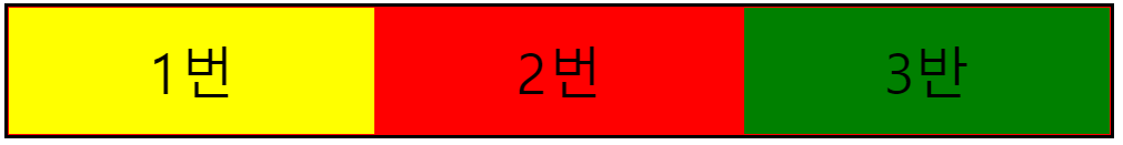
.container{
border: 3px solid black;
display: flex;
flex-direction: row;
}
.flex-item{
color: black;
font-size: 50px;
padding: 24px;
text-align: center;
border: 1px solid red;
width: 100px;
flex: 1;
}
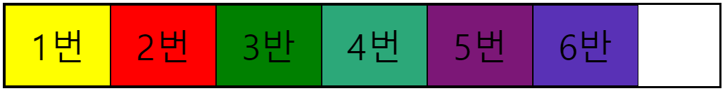
.container2{
border: 3px solid black;
display: flex;
flex-direction: row;
flex-wrap: wrap;
justify-content: flex-start;
align-items: center;
}
.flex-item2{
color: black;
font-size: 50px;
padding: 24px;
text-align: center;
border: 1px solid black;
width: 100px;
}