
Display
블록요소 인라인으로 바꾸기
display: inline;
인라인요소 블록으로 바꾸기
display: block;
같은 줄에 배치할 수 있는 블록 요소
display: inline-block;
화면에서 없애기(투명해지는 것이 아닌 애초에 만들지 않았던 것처럼 없어진다.)
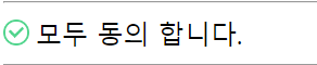
display: none;체크박스 아이콘 바꾸기
  <style>
    #agree_all {
      display: none;
    }
    .wrap5 > label {
      padding-left: 20px;
      background-image: url(../../assets/images/check1.png);
      background-repeat: no-repeat;
      background-size: 16px 16px;
      background-position: 0px 2px ;

      -webkit-user-select:none;   // 이부분은 드래그가 안되게 설정하는 부분
      -moz-user-select:none;
      -ms-user-select:none;
      user-select:none
    }
    #agree_all:checked + label {
      background-image: url(../../assets/images/check2.png);
    }
  </style>
  <div class="wrap5">
    <input type="checkbox" id="agree_all">
    <label for="agree_all">모두 동의 합니다.</label>
  </div>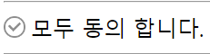
Float
 float 속성
1. HTML 요소들은 기본 배치를 가진다.
   1) 위에서 아래 방향으로 배치한다.
   2) 왼쪽에서 오른쪽 방향으로 배치한다.
   3) 블록 요소는 각 라인을 각각 차지하고, 인라인 요소는 라인에 포함된다.
2. HTML 기본 배치를 무시하고 새롭게 배치된다.
   1) 왼쪽에 배치할 수 있다.
   2) 오른쪽에 배치할 수 있다.
float: top,bottom,left,right;

float 요소의 영역에서 벗어나는 법
clear: left, right, both;
Overflow
스크롤바 만들기 (border-box의 크기보다 큰 내용이 있을 경우)
overflow: scroll;

숨기기 (border-box의 크기보다 큰 내용이 있으면 박스의 크기를 넓히지 않고 숨겨줌)
oerflow: hidden;
Layout
수평 레이아웃 설정 방법
1. float + clear 속성
   1) 수평 배치할 box를 float 처리한다.
   2) 수평 배치된 box 아래에 배치할 box를 clear 처리한다.
2. float + overflow 속성
   1) box를 하나 만들고 수평으로 배치할 box 들을 내부에 배치한다.
   2) 부모 요소에 overflow 속성을 visible이 아닌 값을 설정한다. (주로 hidden 설정)
   3) 자식 요소에 float 속성을 설정한다.
3. float + display 속성
   1) box를 하나 만들고 수평으로 배치할 box 들을 내부에 배치한다.
   2) 부모 요소에 display 속성을 flow-root로 설정한다.
   3) 자식 요소에 float 속성을 설정한다.
4. display 속성
   1) box를 하나 만들고 수평으로 배치할 box 들을 내부에 배치한다.
   2) 부모 요소에 overflow 속성을 flex로 설정한다.
   3) 부모 요소 : flex container, 자식요소 : flex item

.wrap3 > .wrapper {
      width: 1000px;
      height: 100px;
      display: flex;
      flex-direction: row; /* row : flex-item을 main axis(메인 축, X축)로 배치 디폴트 */
                           /* column : flex-item을 cross axis(교차 축, y축)로 배치 */
      justify-content: space-between;   /* flex_item 사이에 공백을 둠*/
      flex-wrap: nowrap;                /* nowrap : flex-item을 flex-container를 벗어나지 않게 크기를 조절해서 배치함, 디폴트 */
                                        /* wrap : flex-item의 크기가 그애로 사용되기 때문에 flex-container를 벗어날 수 있음*/
    }
    .wrap3 > .wrapper > .box2 {
      flex:  3; /* flex-item의 크기(width 대체) */
      height: 100px;
    }
    .wrap3 > .wrapper > .box3 {
      flex: 1; /* flex-item의 크기(width 대체) */
      height: 100px;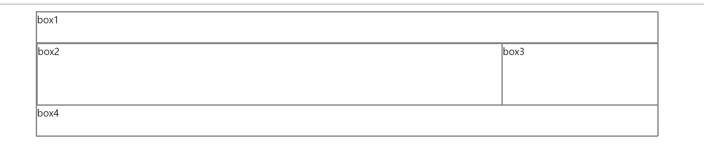
Position
position: static;
  1) 디폴트, 생략 가능
  2) HTML 기본 배치를 따른다.
  3) 위치 조정(top, bottom, left, right)이 불가능하다.

position: relative;
  1) HTML 기본배치를 따른다.
  2) 위치 조정(top, bottom, left, right)이 가능하다.
  3) HTML 기본 배치를 기준으로 위치가 조정된다.

position: absolute;
  1) HTML 기본 배치를 따르지 않는다.
  2) 부모 요소를 기분으로 위치 조정(top, bottom, left, right)이 가능하다.
  3) 부모 요소가 position: static;이 아닌 경우에 동작 가능하다.

position: fixed;
  1) HTML 기본 배치를 따리지 않고 특정 위치에 고정된 상태로 배치된다.
  2) 브라우저 화면을 기준으로 위치조정(top, bottom, left, right)이 가능하다.
  3) fixed 된 구성 요소는 다른 요소를 가린다.

position: fixed; 를 이용한 예제

 .wrap4 {
      width: 100%;
      height: 100px;
      background-color: skyblue;
      position: fixed;

      left: 0px;
      bottom: 0px;
      background: url(https://user-images.githubusercontent.com/14011726/94132137-7d4fc100-fe7c-11ea-8512-69f90cb65e48.gif );
      background-size: 100px;
    }
  </style>
  <div class="wrap4">
</div> 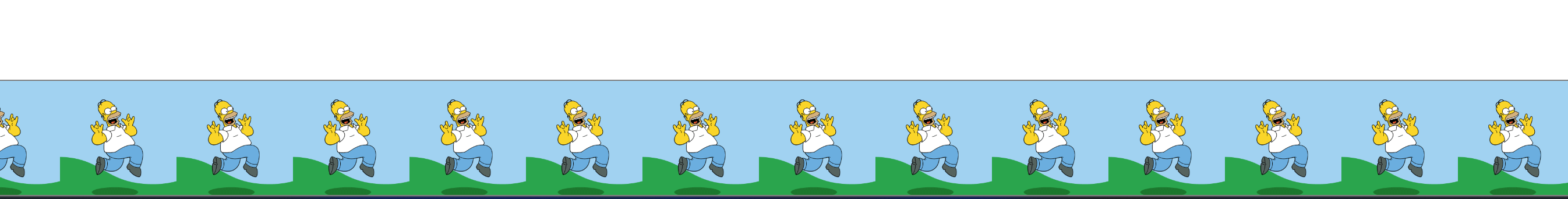
스크롤을 위 아래로 움직여도 하단에 고정되어 있다.

백엔드 준비생의 막 블로그