🚩 들어가면서..
저는 아직 많은 프로젝트에 참여해보진 않았지만, React를 활용해 실습&작업할 때면 반드시 사용했던 라이브러리가 몇 가지 있었습니다. 그 중 하나는 대표적인 cSS-in-js 라이브러리인 styled-components 였죠..
styled-components 를 사용할 경우, css 파일을 별도로 만들지 않아도 되기 때문에 작업이 편리해지고, 디자인이 완성된 컴포넌트를 여러 파일에서 호출할 수 있기 때문에 재상용성이 높아진다는 장점이 있습니다. 덕분에 지금까지 직접 css 파일을 생성해 본 적은 한번도 없었습니다. 😅
하지만 특정 라이브러리에 의존적인 개발습관을 들이면 안된다고 어디선가 들었던 거 같아요... 이번 개인 프로젝트에서는 습관적으로 사용했던 styled-components 없이 진행하는 것으로 개인 도전과제를 설정했습니다.
💡 기본 개념
처음 들었던 아이디어는 심플했습니다. jsx 에서 style 속성을 이용할 경우, styled-components 와 마찬가지로 css 파일을 별도로 두지 않고도 ui 컴포넌트 를 쉽게 디자인 할 수 있습니다. 이를 inline-styling 이라고 한답니다. 🙃
// inline-styling
export const TestComponent = () => {
return (
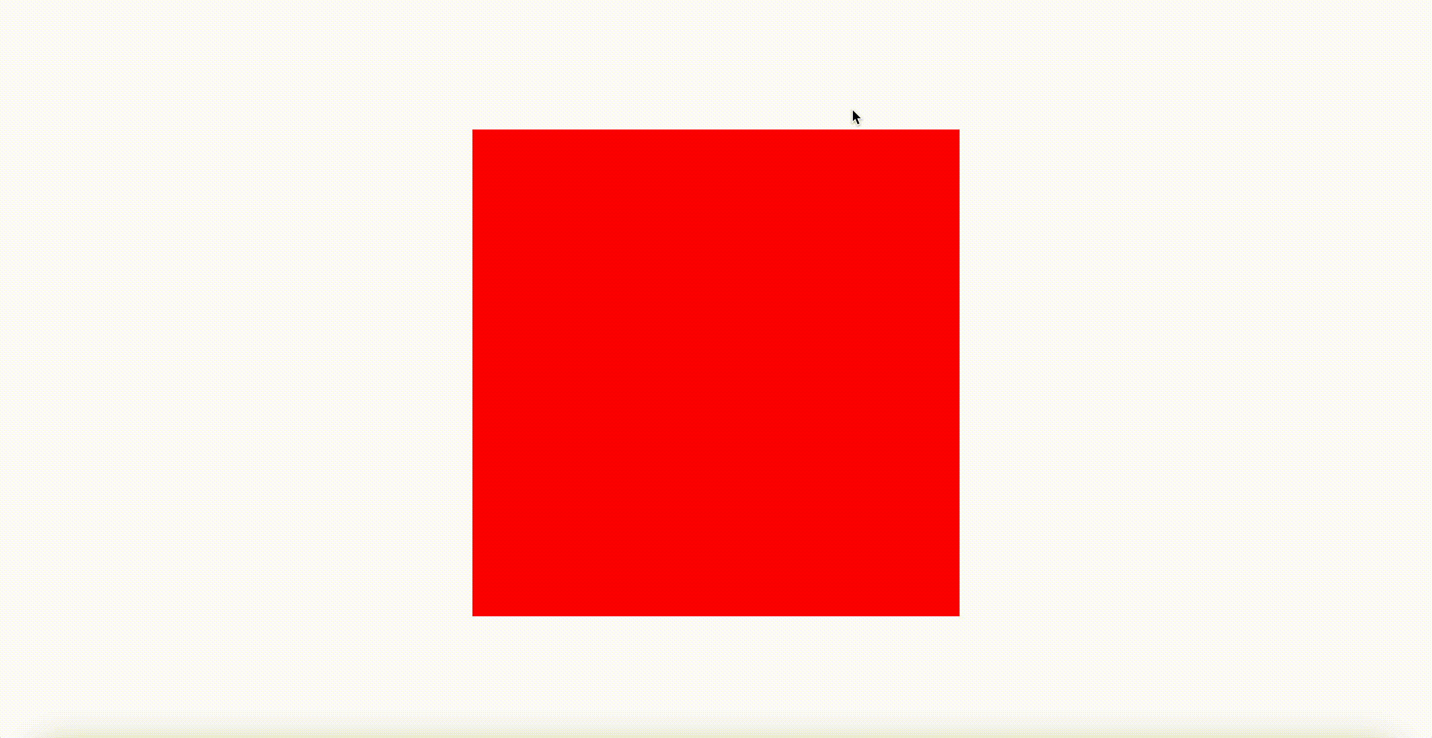
<div style={{ width: "500px", height: "500px", backgroundColor: "red" }}>
<p> 한변의 길이가 500px 인 빨간 상자 </p>
</div>
);
};위의 형식을 보았을 때, style 의 값으로 객체형태의 css 속성이 필요한 것을 알 수 있습니다.
이 형태를 예쁘게(?) 만들어보면 styled-components 와 비슷한 코드 형식이 나올 거 같다고 생각했습니다.
#1 - styled-components 사용
import styled from 'styled-components'

export const UsingStyledComponents = () => {
	return (
		<RedBox>
			<p> 한변의 길이가 500px 인 빨간 상자 </p>
		</RedBox>
	);
};
export const RedBox = styled.div`
  height: 500px;
  weight: 500px;
  background-color: 'red';
`
#2 - style 속성 사용
export const InlineStyling = () => {
	return (
		<div style={RedBox}>
			<p> 한변의 길이가 500px 인 빨간 상자 </p>
		</RedBox>
	);
};
const RedBox: React.CSSProperties = {
	width: "500px",
	height: "500px",
	backgroundColor: 'red'
};
슥슥(?) 봤을 때, 얼핏 비슷하게 보이지 않나요????
저의 경우엔, 위와 작성을 할 경우 지금까지 작성해왔던 코드들과 큰 이질감 없이 작업할 수 있겠다는 확신이 생겼답니다..
물론, 단순히 코드를 비슷하게 작성할 수 있다는 장점뿐만 아니라 외부 라이브러리에 대한 의존성을 하나 줄일 수 있는 일이기도 하죠. 😀
- type-script 로 작성할 경우,
React.CSSPropertiestype 을 style 객체에 부여할 수 있습니다.- 덕분에 자동완성기능을 활용할 수 있기도 했고, 일반 객체와의 구별이 가능했습니다. 👍
이렇게 해결했습니다.! 🍀
맨 처음 고민했던 것은 스타일 컴포넌트에 props 를 전달하는 경우 였습니다. styled-components 를 사용할 경우, 다음과 같이 너비와 높이를 유동적으로 변경 가능한 box 컴포넌트를 생성할 수 있습니다.
import styled from 'styled-components';
import { ReactNode } from 'react';

type BoxProps = {
  width?: string
  height?: string
  children: ReactNode
}
export const Box = ({ width = '100%', height = '100%', children }: BoxProps) => {
  return (
    <StyledBox width={width} height={height}>
      {children}
    </StyledBox>
  )
}

type StyledBoxProps = {
  width: string
  height: string
}
const StyledBox = styled.div<StyledBoxProps>`
  width: ${(props) => props.width};
  height: ${(props) => props.height};
  background-color: 'red';
`
하지만 위에서 작성했던대로 style 객체를 선언할 경우, props 를 전달할 방법이 없습니다.
모양이 조금 안 예쁘다고(?) 생각했지만 저는 다음의 방법으로 같은 결과물을 만들어 냈습니다.!
import { ReactNode } from 'react';

type BoxProps = {
  width?: string
  height?: string
  children: ReactNode
}

export const TestBox = ({ width = '100%', height = '100%', children }: BoxProps) => {
  return <div style={{ ...StyleBox, width, height }}> {children}</div>
}

const StyleBox: CSSProperties = {
  backgroundColor: 'red',
}
다른 개발자에 의해 디자인이 유동적이어야 하는 prop 의 경우, 바로 style 속성으로 꽂은거죠(.?)
그 외 값들은 (위의 상황에선 배경색상) CSSProperties 객체에 그 값을 지정하되, spread 연산자를 통해 style 로 전달했습니다.
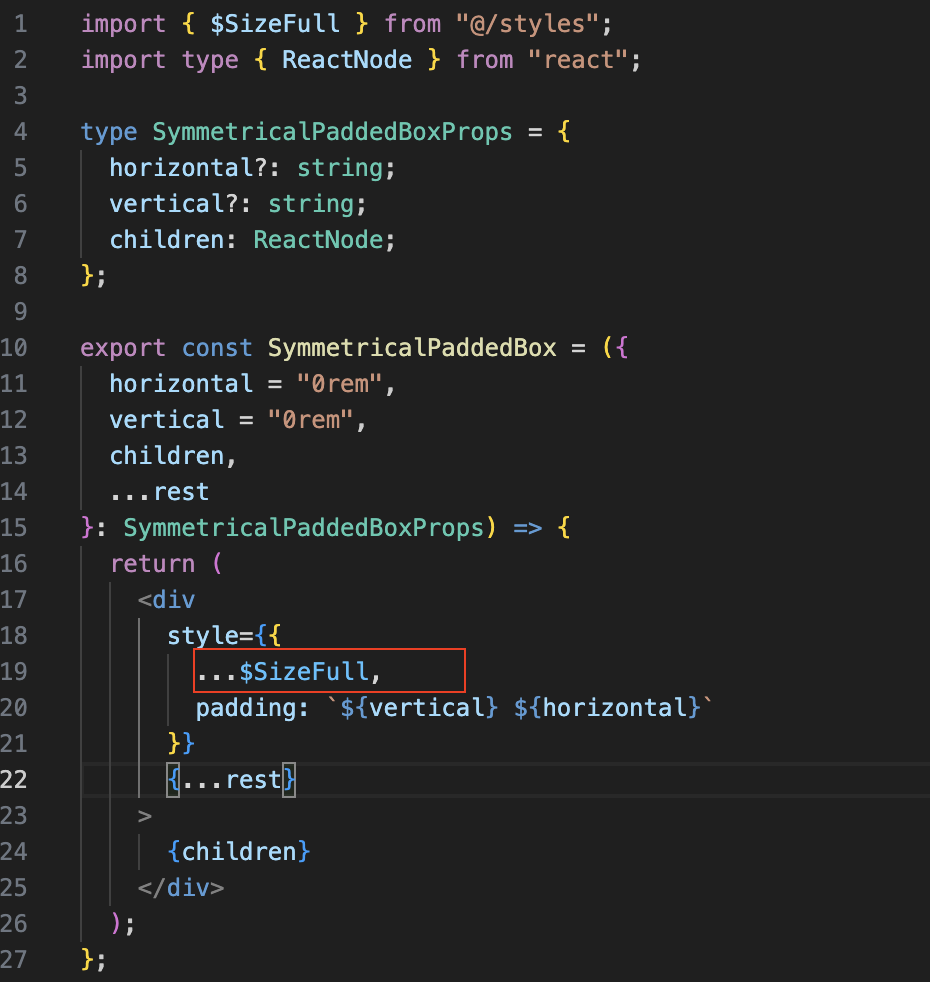
자주 사용하는 속성 값의 경우엔 별도로 작성해두었다가, 필요한 경우에 다른 속성과 섞어 사용할 수 가 있었습니다. 😃
# 크기 관련 css 속성
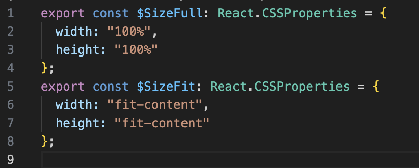
# 사용 예시
돌이켜 보면 가장 골치가 아팠던 건 styled-components 의GlobalStyles 기능을 살리는 것이었습니다. GlobalStyles 를 사용할 경우, 해당 프로젝트에서 사용되는 폰트 설정이나 jsx 태그에 대해 기본적인 스타일을 적용할 수 있습니다.
전역적인 디자인 설정이 꼭 필요했던 이유 중 하나는 (개인적으로..) 화면에 크기에 따른 유동적인 font-size 변경이었습니다. 이전까지는 GlobalStyles 에 media-query 설정을 통해 구현이 가능했었지요..
import { createGlobalStyle } from 'styled-components'
import { GIANTS_BOLD, GIANTS_REGULAR } from './css-utils'
import { BORDER_RADIUS, BREAK_POINT, COLOR, FONT_SIZE } from './reference-tokens'

const GlobalStyles = createGlobalStyle`
  html{
    background-color: ${COLOR.grayScale[300]};
    color: ${COLOR.grayScale[1500]};

    // 화면 비율에 따라 폰트 크기
    font-size: 62.5%;
    @media screen and (max-width: ${BREAK_POINT.md}) {
      font-size: 50%;
    }
    @media screen and (max-width: ${BREAK_POINT.sm}) {
      font-size: 31.25%;
    }
  }
  .
  .
  .
`
분명 방법이 있었을 것 같은데,, 이에 대한 번뜩이는 아이디어는 없었습니다..
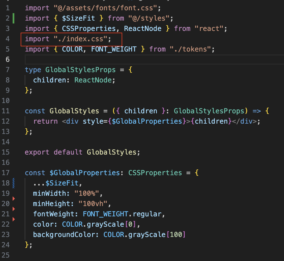
일단 이번 프로젝트에서는 css 파일 작성하여 적용했습니다.ㅠㅠㅠ 추가적으로 각 페이지 에 대한 배경 색상이나, 기본 폰트 색상 등을 CSSProperties 객체로 만들어서 상속 적용이 되도록 했어요.!
globalStyles.tsx
main.tsx
미해결 과제 🤦
hover, active, focus 등 pseudo-selectors(가상 선택자) 를 이용한 효과 부여는 프로젝트에 적용하지 못했습니다. 특히 저는 hover 효과를 잘 자주 사용하는 편인데, 아쉽더라구요 🥲
물론 찾아보니 비슷한 효과를 주기 위한 방법이 아예 없는 건 아니었습니다.
onmouseover, onmouseleave 이벤트를 감지하여 호버 효과를 주는 것이 가능합니다.
const App = () => {
	const Hover: MouseEventHandler<HTMLDivElement> = (event) => {
        // 마우스가 컴포넌트 위에 있다면 파란색
		if (event.type === 'mouseover') (event.target as HTMLDivElement).style.backgroundColor = 'blue'
        // 마우스가 컴포넌트 바깥에 있다면 빨간색
		else (event.target as HTMLDivElement).style.backgroundColor = 'red'
	}
	return (
		<CenterBox>
			<div style={RedBox} onMouseOver={Hover} onMouseLeave={Hover}></div>
		</CenterBox>
	)

const RedBox: CSSProperties = {
	width: '500px',
	height: '500px',
	backgroundColor: 'red',
	transition: 'background-color 0.5s' // trasition 설정
}
하지만 위의 Hover()를 보면 알 수 있듯, ui 디자인과 관련된 로직을 일단 다른 함수와 함께 작성해야함이 조금 꺼려졌기 때문에 이번 프로젝트에선 사용하진 않았습니다.
( 근데, 이 문제는 별도의 파일에 효과 로직을 분리 작성후, 인스턴스를 가져오는 방법으로 해결가능 할 것 같네요.. 😲💡 )
무엇보다도 styled-components 를 사용할 경우, 코드작성이 더 쉽고 직관적으로 작성이 가능하며 컴포넌트의 기능 로직과 완벽하게 구분되기 때문에 굳이 이렇게 효과를 부여해야 하나 싶습니다;;
// 훨씬 직관적!!
const $RedBox = styled.div`
	width: '500px';
	height: '500px';
	background-color: 'red';
	transition: background-color 1s;

	&:hover {
		background-color: 'blue';
	}
	&:active {
		// active 효과
	}
	&:focus {
		// focus 효과
	}
`
회고
어려운 점이 많이 있긴 했지만, 검색과 고민을 많이 해보니 styled-components 없이도 기능 로직, 데이터 객체와 구분 가능하게 ui 디자인 코드를 작성할 수 있었습니다. (아는 지식 선에서,, 그 형태와 기능을 최대한 비슷하게 구현하려고 노력을 했던 것 같습니다.) 그럼에도 사람들이 많이 사용하는 라이브러리는 감히 저같은 ...😎... 가 흉내내기 어려울만큼 훌륭한 developer-experience 을 제공한다는 사실이 실감했습니다.😅
그런 이유로 협업 프로젝트를 진행할 때, 별도의 styling-library 없이 inline-styling 방식으로 진행하자고 제안하기는 힘들 것 같습니다;; 컨벤션이나 코드패턴 등을 굉장히 꼼꼼히 통일해야 라이브러리를 사용하는 것 만큼의 경험을 할 수 있을 것 같아요,, 그런 과정에서 발생하는 시간비용도 클 거 같습니다.
참고 및 기타