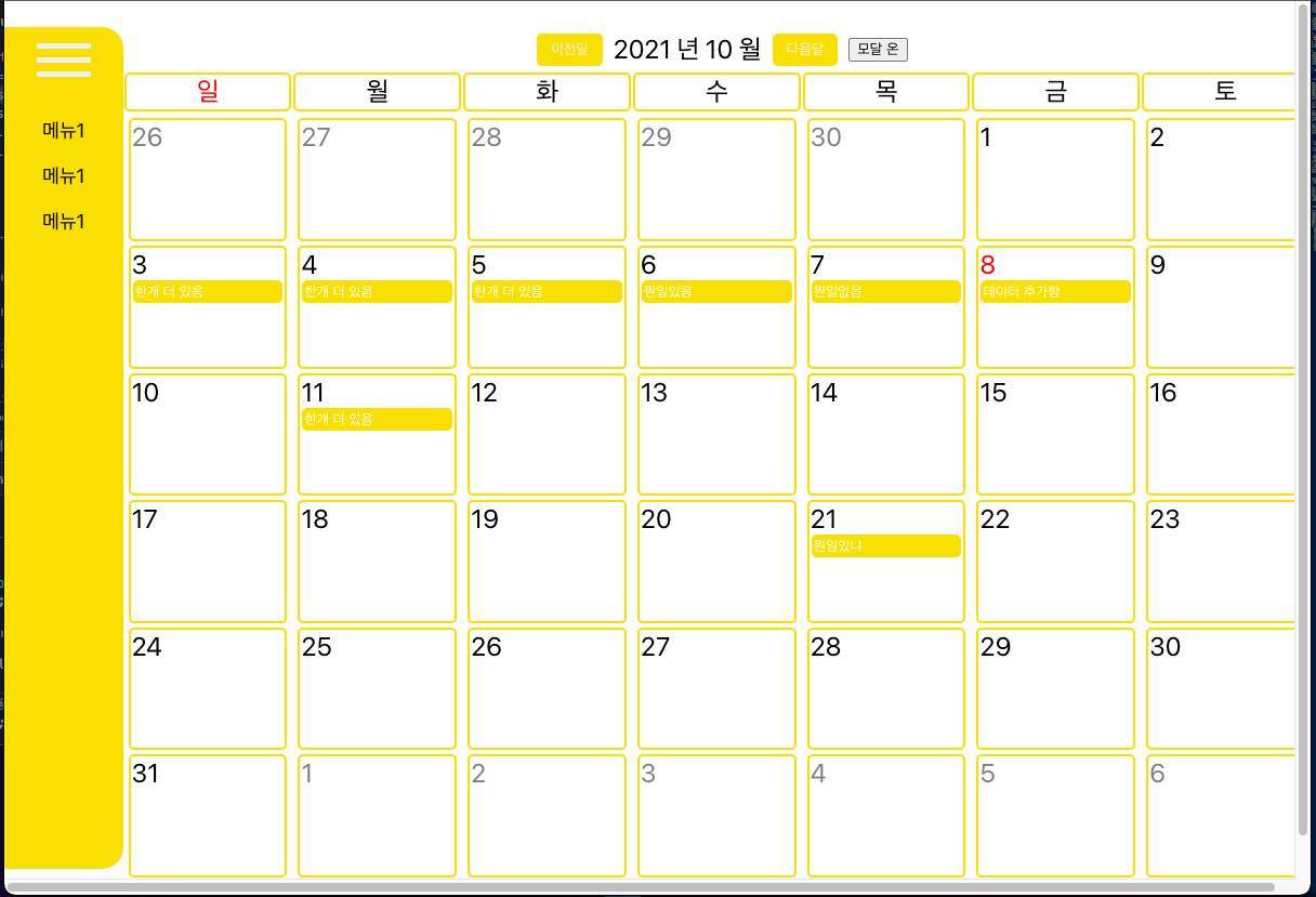
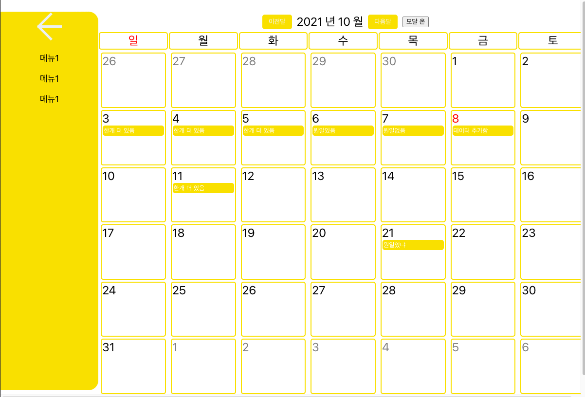
리액트 사이드바 구현
side_bar.js
import { useState } from 'react';
import './assets/css/ham.scss'

const Side_bar = () => {
    const [side_bar, setside_bar] = useState(false);

    return (
        <div className={side_bar == false ? 'ham' : 'ham_click'}>
            <div className="ham_button" onClick={() => setside_bar(!side_bar)}>
                <div className={side_bar == false ? 'hamburger' : 'hamburger_click'}>
                    <span className="line"></span>
                    <span className="line"></span>
                    <span className="line"></span>
                </div>
            </div>
            <div className='ham_menu'>
                <ul>
                    <div className='ham_menu_box'>
                        <div className='ham_menu_text'>
                            메뉴1
              </div>
                    </div>
                    <div className='ham_menu_box'>
                        <div className='ham_menu_text'>
                            메뉴1
              </div>
                    </div>
                    <div className='ham_menu_box'>
                        <div className='ham_menu_text'>
                            메뉴1
              </div>
                    </div>
                </ul>
            </div>
        </div>
    );
}
export default Side_bar;
sidebar css
@keyframes slidein {
    0% { width: 0%; }
    30% { width: 30%; }
    70% { width: 70%; }
    100% { width: 100%; }
}
.ham{
    width: 10%;
    background-color: #f9e000;
    margin-top: 2%;
    margin-bottom: 2%;
    border-radius: 0px 20px 20px 0px;
    transition: all ease 1s 0s;
}
.ham_button{
    cursor: pointer;
    width: 100%;
    height: 50px;
    display: flex;
    justify-content: center;
    padding-top: 7px;
}
.ham_click{
    width: 20%;
    background-color: #f9e000;
    margin-top: 2%;
    margin-bottom: 2%;
    border-radius: 0px 20px 20px 0px;
    transition: all ease 1s 0s;
}
.hamburger{
    height: 100%;
}


.hamburger_click{
    .line{
        width: 50px;
        height: 5px;
        background-color: #ecf0f1;
        display: block;
        margin: 8px auto;
        -webkit-transition: all 0.2s ease-in-out;
        -o-transition: all 0.2s ease-in-out;
        transition: all 0.2s ease-in-out;
    }
    .line:nth-child(1),
    .line:nth-child(3){
        width: 40px;
    }
    .line:nth-child(1){
        -webkit-transform: translateX(-10px) rotate(-45deg); //구글 사파리
        -ms-transform: translateX(-10px) rotate(-45deg); //익스플로러 적용 보통 생략
        -o-transform: translateX(-10px) rotate(-45deg); //오페라 브라우저
        transform: translateX(-10px) rotate(-45deg);
    }
    .line:nth-child(3){
        -webkit-transform: translateX(-10px) rotate(45deg);
        -ms-transform: translateX(-10px) rotate(45deg);
        -o-transform: translateX(-10px) rotate(45deg);
        transform: translateX(-10px) rotate(45deg);
    }
}

.hamburger:hover {
	cursor: pointer;
}
.hamburger_click :hover{
	cursor: pointer;
}
.hamburger .line {
	width: 50px;
	height: 5px;
	background-color: #ecf0f1;
	display: block;
	margin: 8px auto;
	-webkit-transition: all 0.2s ease-in-out;
	-o-transition: all 0.2s ease-in-out;
	transition: all 0.2s ease-in-out;
}

.ham_menu_box{
    margin-top: 5px;
    height: 37px;
}
.ham_menu_box:hover{
    animation-name: slidein;
    animation-duration: 0.2s;
    animation-timing-function: all 0.3s ease;
    transition: transform 0.3s;
    border-radius: 0 10px 10px 0;
    background-color: whitesmoke;
}
.ham_menu{
    margin-top : 20px;
    ul{
        list-style: none;
        margin-block-start: 0;
        margin-block-end: 0;
        margin-inline-start: 0;
        margin-inline-end: 0;
        padding-inline-start: 0;
        position: relative;
        .ham_menu_text{
            position: absolute;
            margin: 0 auto;
            left: 0;
            right: 0;
            display: flex;
            align-items: center;
            justify-content: center;
            cursor: pointer;
            height: 37px;
            font-size: 18px;
            text-align: center;
        }

    }
}
keyframe을 사용해서 메뉴에 마우스를 올릴경우 div넓이를 0%~100% 뒤에 색이
왼쪽에서 오른쪽으로 움직이는 느낌으로 만들었다.

이것저것합니다
혹시 사이드바를 오른쪽에서 왼쪽으로 열기 위해선 어떻게 해야 하는지 알 수 있을까요?