
빅쿼리에서 SQL을 사용하여 전처리하고 분석한 데이터를 가지고
python으로 고객 Segmentation을 해보자
01. 이상치 찾기
# 라이브러리 불러오기
import pandas as pd

# 데이터 불러오기
user_data = pd.read_csv('aiffel/customer_segmentation/user_data.csv')

# 데이터의 상위 5번째 행까지 출력
user_data.head()
from scipy import stats
import numpy as np
# Z-score 계산
z_scores = stats.zscore(user_data.iloc[:, 1:], axis=0)
# Z-score 절대값 계산
z_scores = np.abs(z_scores)
# Z-score 출력
z_scores- z-score, 3이상이면 outlier로 간주
# 임계값(threshold) 설정
threshold = 3

# z-score 기준으로 이상치를 찾아서 outlier 컬럼에
# 이상치 여부 기입 (0: 정상, 1:이상치)

user_data['outlier'] = (z_scores> threshold).any(axis=1).astype(int)
user_data.head()- outlier 비율 구하고 시각화하기
# 시각화에 필요한 라이브러리 불러오기
import matplotlib.pyplot as plt
# user_data['outlier']을 활용하여 이상치 여부에 따른 확률 계산
# value_counts()는 열의 고윳값의 개수를 반환하지만 normalize=True를 사용하면 열에 있는 값의 개수 비율(상대적 빈도)을 반환함
outlier_percentage = pd.value_counts(user_data['outlier'], normalize=True) * 100
# 시각화 자료 크기 조정
plt.figure(figsize=(3, 4))
# outlier_percentage라는 데이터로 bar chart 시각화
# x축 값을 0과 1로 지정
bars = plt.bar(['0', '1'], outlier_percentage)
# 퍼센트(%) 표시
for bar in bars:
yval = bar.get_height()
plt.text(bar.get_x() + bar.get_width()/2, yval/2, f'{yval:.2f}%', fontsize=10, va='center', ha='center')
plt.title('Normal(0) vs Outlier(1)') # 표 제목
plt.yticks(ticks=np.arange(0, 101, 10)) # y축 표기 (0~100까지 10단위로 증가)
plt.ylabel('Percentage (%)') # y축 범례
plt.xlabel('Outlier') # x축 범례
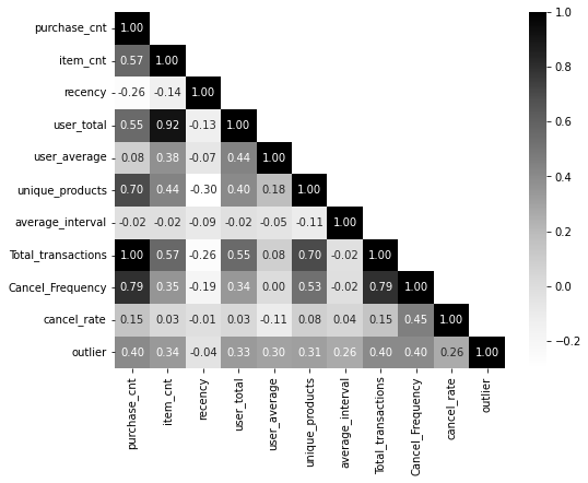
plt.show() # 출력02. 변수간 상관관계 분석
- 변수 간에 상관관계가 지나치게 높은 경우 '다중공선성'문제가 발생할 수 있음
- '다중공선성(multicolinearity)' 발생 시 문제점
- 독립 변수들 간에 강한 상관관계가 있으면, 회귀계수(β)가 작은 데이터 변경에도 크게 변동할 수 있음 -> 회귀계수 신뢰성 떨어짐
- 중요한 변수를 누락하거나, 중요하지 않은 변수를 선택할 가능성
- 훈련 데이터에서는 괜찮아 보일 수 있지만, 다중공선성은 일반화 성능을 약화
# 시각화 라이브러리 불러오기
import seaborn as sns

# 'CustomerID' 열을 제외(drop)하고 상관 관계 행렬 계산(corr())
corr = user_data.drop(columns=['CustomerID']).corr()

# 행렬이 대각선을 기준으로 대칭이기 때문에 하단만 표시하기 위한 마스크 생성
mask = np.zeros_like(corr) # np.zeros_like()는 0으로 가득찬 array 생성, 크기는 corr와 동일
mask[np.triu_indices_from(mask, k=1)] = True # array의 대각선 영역과 그 윗 부분에 True가 들어가도록 설정

# 히트맵 그리기
plt.figure(figsize=(8, 6))
sns.heatmap(corr, mask=mask, cmap='Greys', annot=True, fmt='.2f') # 'Greys'제시, 'coolwarm'도 시도
plt.show()- 히트맵 결과
03. 피쳐 스케일링(feature scaling)
- K-Means 클러스터링은 데이터 포인트 간의 '거리' 개념에 크게 의존하여 클러스터를 형성
- 그렇기 때문에 스케일링을 하지 않으면 변수간 측정 단위가 달라서(키, 몸무게 등) feature 간의 거리 계산을 왜곡할 수 있음
# Standard Scaler 불러오기
from sklearn.preprocessing import StandardScaler
scaler = StandardScaler()
# 원본 데이터에 영향을 주지 않기 위해 복사
data = user_data.copy()
# CustomerID를 제외한 데이터에 스케일링 적용
columns_list = data.iloc[:, 1:].columns # iloc: 데이터 특정 값 추출, columns: 데이터프레임의 열 이름 조회
data[columns_list] = scaler.fit_transform(data[columns_list])# 스케일링 된 데이터 출력
data.head()- Scaling의 종류
- MinMaxScaler : 모든 값이 0과 1사이에 위치하도록 스케일링
- RobustScaler : 중앙값, 사분위수 사용하여 스케일링
- StandardScaler : 평균 0, 표준편차 1이 되도록 스케일링
04 차원 축소
- 왜 차원 축소를 할까?
- 다중 공선성 완화
- K-Means clustering의 성능이 향상될 수 있음
- 노이즈 감소, 시각화 향상
- 차원 축소 방법 종류
- PCA(주성분 분석), t-SNE 등이 있음
사실 PCA(Principal Component Analysis, 주성분 분석)의 경우 제대로 배우려면 SVD(Singular Value Decomposition)에 대한 이해가 선행되어야 하는데, 아쉽게도 6개월 간의 교육과정 특성상 그런 디테일까지는 잘 다뤄지기는 어려운 것 같다.
- PCA 적용
# PCA 불러오기
from sklearn.decomposition import PCA

# CustomerID를 인덱스로 지정
data.set_index('CustomerID', inplace=True)

# PCA 적용
pca = PCA().fit(data)
# Explained Variance의 누적합 계산
explained_variance_ratio = pca.explained_variance_ratio_ # explained_variance_ratio_: Explained Variance 비율을 계산해 주는 함수
cumulative_explained_variance = np.cumsum(explained_variance_ratio) # cumsum: 각 원소의 누적합을 계산하는 함수plt.figure(figsize=(15, 8))
# 각 성분의 설명된 분포에 대한 막대 그래프
barplot = sns.barplot(x=list(range(1, len(cumulative_explained_variance) + 1)), y=explained_variance_ratio, alpha=0.8)
# 누적 분포에 대한 선 그래프
lineplot, = plt.plot(range(0, len(cumulative_explained_variance)), cumulative_explained_variance, marker='o', linestyle='--', linewidth=2)
# 레이블과 제목 설정
plt.xlabel('Number of Components', fontsize=14)
plt.ylabel('Explained Variance', fontsize=14)
plt.title('Cumulative Variance vs. Number of Components', fontsize=18)
# 눈금 및 범례 사용자 정의
plt.xticks(range(0, len(cumulative_explained_variance)))
plt.legend(handles=[barplot.patches[0], lineplot],
labels=['Explained Variance', 'Cumulative Explained Variance'])
# 두 그래프의 분산 값 표시
x_offset = -0.3
y_offset = 0.01
for i, (ev_ratio, cum_ev_ratio) in enumerate(zip(explained_variance_ratio, cumulative_explained_variance)):
plt.text(i, ev_ratio, f"{ev_ratio:.2f}", ha="center", va="bottom", fontsize=10)
if i > 0:
plt.text(i + x_offset, cum_ev_ratio + y_offset, f"{cum_ev_ratio:.2f}", ha="center", va="bottom", fontsize=10)
plt.grid(axis='both')
plt.show()
- 시각화 결과(PC에 따른 분산에 대한 누적 설명 비율)
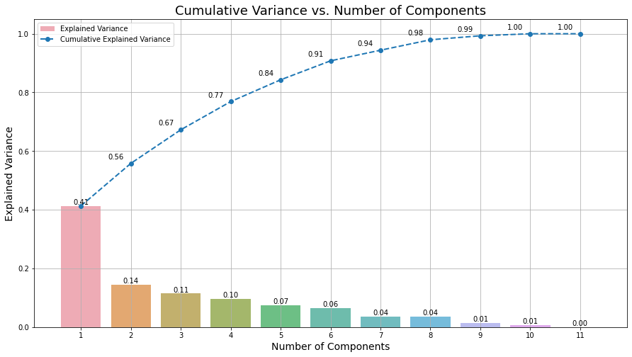
# 6개의 주성분을 유지하는 PCA 선언
pca = PCA(n_components=6)

# 기존 data를 pca에 fit_transform
data_pca = pca.fit_transform(data)

# 압축된 데이터 셋 생성
data_pca = pd.DataFrame(data_pca, columns=['PC'+str(i+1) for i in range(pca.n_components_)])

# 인덱스로 빼 두었던 CustomerID 다시 추가
data_pca.index = data.index
05. K-means clustering
- K-Means는 지정된 그룹 수(K)로 데이터를 클러스터링
- 각 군집의 평균을 활용하여 데이터를 클러스터링
from sklearn.cluster import KMeans
from collections import Counter

# k=3개의 클러스터로 K-Means 클러스터링 적용
kmeans = KMeans(n_clusters=3, init='k-means++', n_init=10, max_iter=100, random_state=0)
kmeans.fit(data_pca)

# 각 클러스터의 빈도수 구하기
cluster_frequencies = Counter(kmeans.labels_)

# 빈도수에 기반하여 이전 레이블에서 새 레이블로의 매핑 생성
label_mapping = {label: new_label for new_label, (label, _) in
                 enumerate(cluster_frequencies.most_common())}

# 매핑을 적용하여 새 레이블 얻기
new_labels = np.array([label_mapping[label] for label in kmeans.labels_])

# 원래 데이터셋에 새 클러스터 레이블 추가
user_data['cluster'] = new_labels

# PCA 버전의 데이터셋에 새 클러스터 레이블 추가
data_pca['cluster'] = new_labels
# 각 군집별로 몇 명의 고객이 있는지 확인
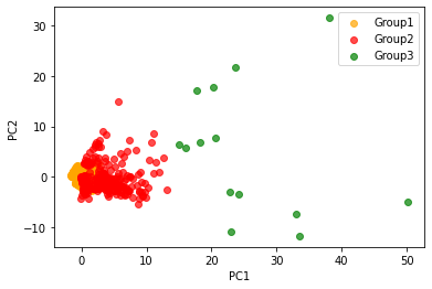
user_data.value_counts('cluster')06. K-means 시각화
- K-means 군집화 결과 시각화
# 각 클러스터 별 데이터 분리
cluster_0 = data_pca[data_pca['cluster'] == 0]
cluster_1 = data_pca[data_pca['cluster'] == 1]
cluster_2 = data_pca[data_pca['cluster'] == 2]


# 클러스터 별 시각화
plt.scatter(cluster_0['PC1'], cluster_0['PC2'], color = 'orange', alpha = 0.7, label = 'Group1')
plt.scatter(cluster_1['PC1'], cluster_1['PC2'], color = 'red', alpha = 0.7, label = 'Group2')
plt.scatter(cluster_2['PC1'], cluster_2['PC2'], color = 'green', alpha = 0.7, label = 'Group3')

plt.xlabel('PC1')
plt.ylabel('PC2')
plt.legend()
plt.show()- 시각화 그림

2025화이팅!