⭐ favicon적용
📝 favicon 이란?
웹사이트 또는 웹 페이지를 대표하기 위해 웹 브라우저에서 사용되는 16x16 픽셀의 작은 이미지 (즐겨찾기 아이콘(favorite icon)의 줄임말로 주로 웹 브라우저 상단에 있는 탭에 표시된다.)
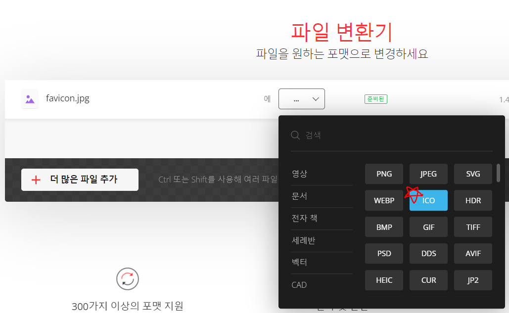
📝 이미지 파일을 ico로 변환하기
https://convertio.co/kr/ ← 해당 사이트에서 이미지 파일을 ico로 변환할 수 있다.
jpg, png, svg 등의 이미지 파일을 선택 → ICO 선택 → 변환 버튼을 눌러주기만 하면 끝!!
📝 Next.js에 적용하기
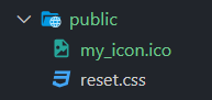
public에 위에서 변환했던 ico 파일을 넣어주고 app>layout.tsx에 icons 코드를 추가해주면 된다.
//layout.tsx
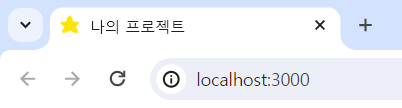
export const metadata = {
title: '나의 프로젝트',
description: 'Generated by me',
icons: {
icon: '/my_icon.ico',
},
};
export default function RootLayout({ children }: { children: React.ReactNode }) {
return (
<html lang="en">
<body>{children}</body>
</html>
);
}
🛫 둥둥 뜨는 CSS
위아래로 움직이는(마치 둥둥 떠있는거처럼 보이는) CSS 애니메이션 적용해보기!
📝 animation
스타일 사이에 애니메이션을 적용할 때 사용한다.
animation-name : 애니메이션 이름 (@keyframes 이름)
animation-duration : 작동 시간
animation-delay : 애니메이션 시작 전 지연 시간
animation-iteration-count : 반복 횟수 (기본값: 1 / infinite: 무한반복)
animation-direction : 반복 방향 설정 (정방향 / 역방향 / 번갈아가며)
transition-timing-function : 애니메이션 속도 조절 (linear / ease / ease-in / ease-out / ease-in-out / cubic-bezier)
animation-fill-mode : 애니메이션 시작 / 끝 상태 제어 (none / forwords / backwords / both)
한 줄로 작성할 수 있으며 순서들은 크게 상관 없지만,
⭐ 1. duration 과 2. delay 순서는 맞춰야 한다. ⭐animation: 애니메이션 이름 1s linear 1s infinite alternate;
📝 @keyframes
애니메이션 중간중간의 특정 지점들을 거칠 수 있는 키프레임들을 설정함으로써 CSS 애니메이션 과정의 중간 절차를 제어할 수 있게 한다.
@keyframes 애니메이션 이름 {
    0% { /* 또는 from (처음 위치) */
        css 스타일;
    }
    100% { /* 또는 to (마지막 위치) */
        css 스타일;
    }
}
0%와 100% 사이에는 여러 개의 중간 값(%)을 설정해 프레임을 작성할 수 있다.
@keyframes 애니메이션 이름 {
  0% {
    top: 0;
  }
  50% {
    top: 30px;
    left: 20px;
  }
  50% {
    top: 10px;
  }
  100% {
    top: 0;
  }
}
📝 적용하기 (Next.js, emotion)
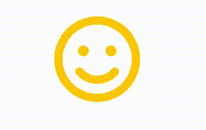
<StyledImage src={'/images/icon/smile.svg'} alt="icon" width={100} height={100} />

const StyledImage = styled(Image)`
  animation: motion 0.7s linear infinite alternate;

  @keyframes motion {
    0% {
      margin-top: 0px;
    }
    100% {
      margin-top: 10px;
    }
  }
`;
참고
https://velog.io/@jungmin211
https://ho-ding.tistory.com/6
https://velog.io/@pikadev1771