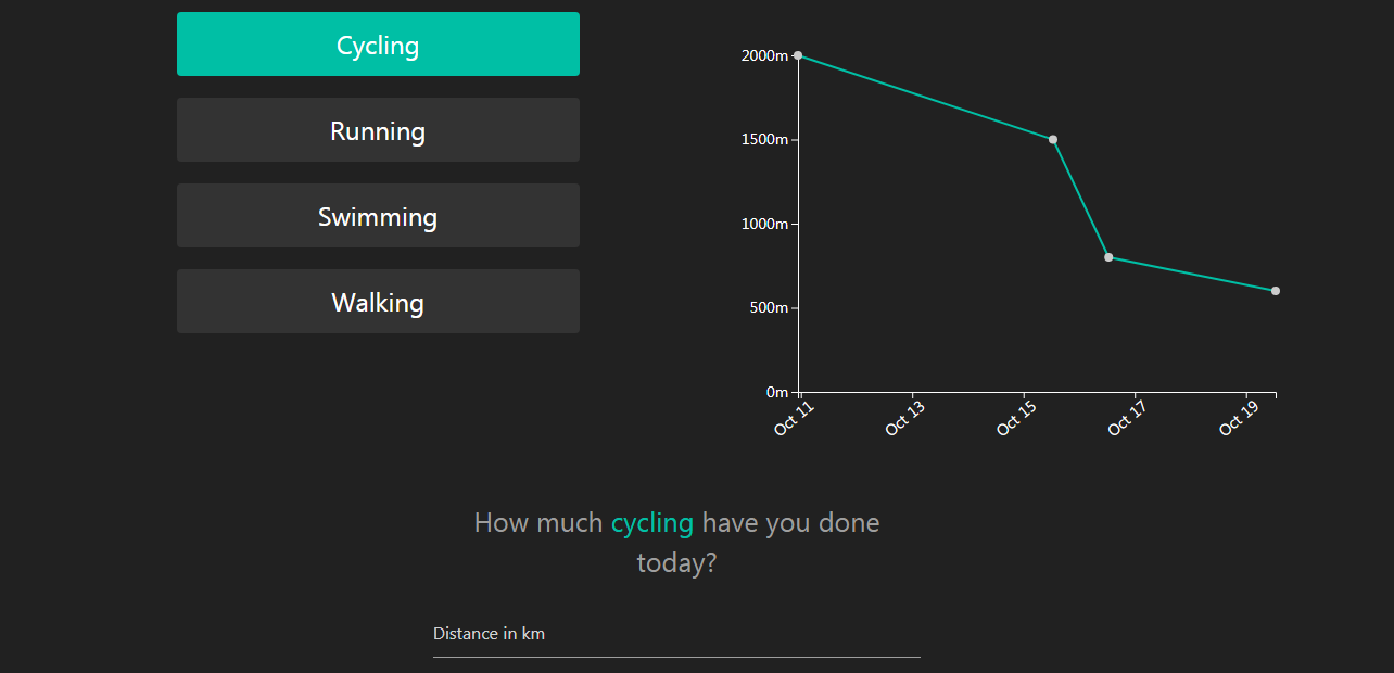
기본 셋팅
각각의 버튼을 클릭하면 해당하는 데이터에 따라 다른 차트를 보여주려고 한다.
html에는 버튼과 데이터를 추가할 input, 차트가 그려지는 canvas로 구성했고,
기본적인 레이아웃은 meterialize로 스타일링을 해줬다.
Firebase 연동
html 파일에 firebase를 연결해준다.
<!-- The core Firebase JS SDK is always required and must be listed first -->
    <script src="https://www.gstatic.com/firebasejs/7.2.1/firebase-app.js"></script>
    <script src="https://www.gstatic.com/firebasejs/7.2.1/firebase-firestore.js"></script>
    <!-- TODO: Add SDKs for Firebase products that you want to use
     https://firebase.google.com/docs/web/setup#available-libraries -->
    <script src="https://www.gstatic.com/firebasejs/7.2.1/firebase-analytics.js"></script>

    <script>
        // Your web app's Firebase configuration
        var firebaseConfig = {
            // 생략
        };
        // Initialize Firebase
        firebase.initializeApp(firebaseConfig);
        firebase.analytics();

        const db = firebase.firestore();
    </script>
그리고 Form을 제출하면 firebase에 데이터가 저장되도록 form과 연결해준다.
index.js
// form submit
form.addEventListener("submit", e => {
  e.preventDefault();

  const distance = parseInt(input.value); // string타입 number타입으로 변환
  if (distance) {
    db.collection("activities")
      .add({
        distance,
        activity,
        date: new Date().toString()
      })
      .then(() => {
        error.textContent = "";
        input.value = "";
      });
  } else {
    error.textContent = "Please enter a valid distance";
  }
});
Graph setup
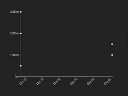
그래프를 그리기 위해 기본적인 마진값과 canvas 사이즈, graph 사이즈를 지정해준다.
const margin = { top: 40, right: 20, bottom: 50, left: 100 };
const graphWidth = 560 - margin.left - margin.right;
const graphHeight = 400 - margin.top - margin.bottom;

const svg = d3
  .select(".canvas")
  .append("svg")
  .attr("width", graphWidth + margin.left + margin.right)
  .attr("height", graphHeight + margin.top + margin.bottom);

const graph = svg
  .append("g")
  .attr("width", graphWidth)
  .attr("height", graphHeight)
  .attr("transform", `translate(${margin.left}, ${margin.top})`);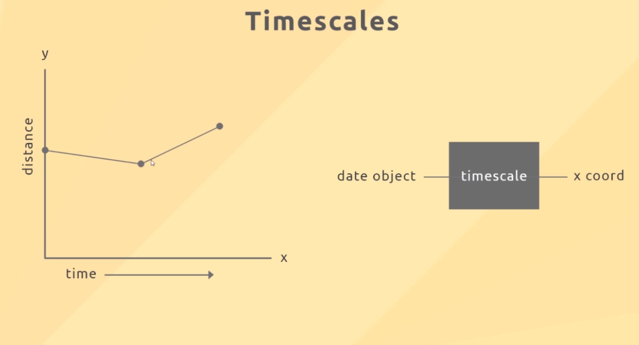
x축을 따라 다른 위치에 시간을 두고 D3에 내장된 scaleLinear()을 사용한다.
이 시간 척도는 Date 객체를 가져가는 것이고, javascript 일반 데이터 객체일 뿐이다.
d3.scaleLinear()
      .domain([참조최소값, 참조최대값])
      .range([출력최소값, 출력최대값]);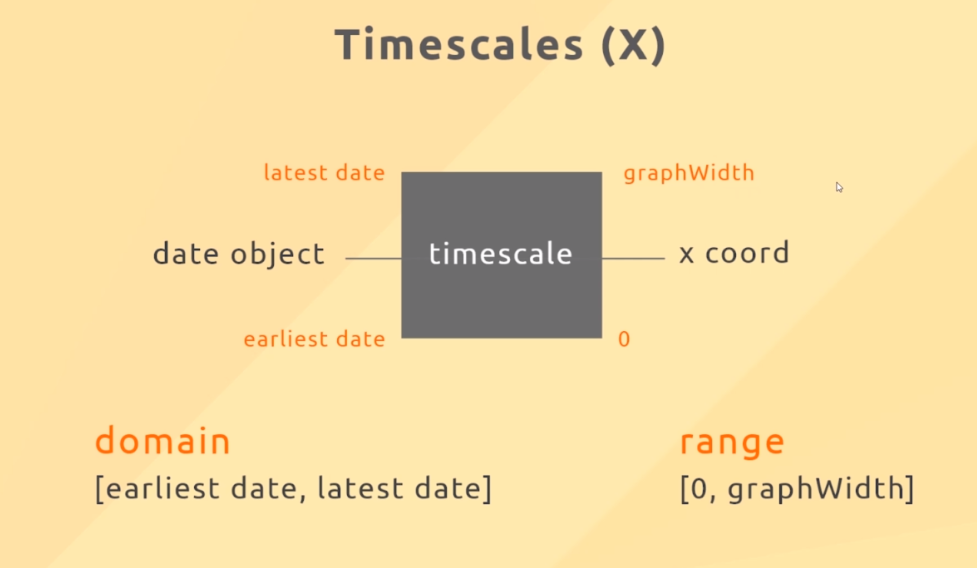
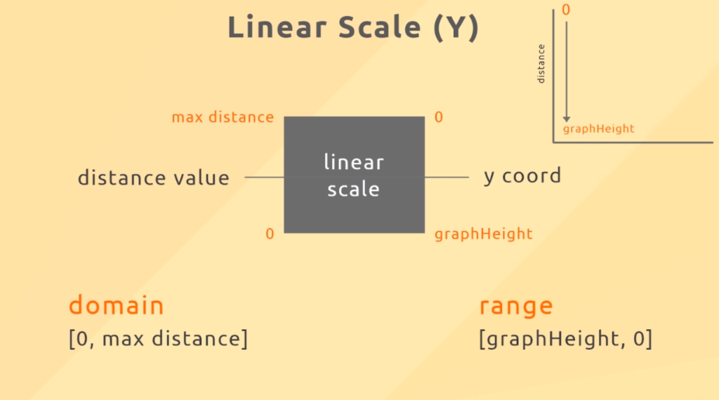
// scales
const x = d3.scaleTime().range([0, graphWidth]);
const y = d3.scaleLinear().range([graphHeight, 0]);

// axes groups
const xAxisGroup = graph
  .append("g")
  .attr("class", "x-axis")
  .attr("transform", "translate(0," + graphHeight + ")");

const yAxisGroup = graph.append("g").attr("class", "y-axis");
축 만들기
update 함수 안에 x축과 y축을 만들어준다. ticks는 눈금의 갯수를 만들어준다.
// create axes
  const xAxis = d3
    .axisBottom(x)
    .ticks(4)
    .tickFormat(d3.timeFormat("%b %d"));
  const yAxis = d3
    .axisLeft(y)
    .ticks(4)
    .tickFormat(d => d + "m");

  // call axes
  xAxisGroup.call(xAxis);
  yAxisGroup.call(yAxis);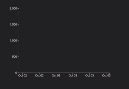
차트 Point 만들기
point를 만들기 위해 데이터를 연결해주고 속성들을 적용해준다.
// create circles for points
  const circles = graph.selectAll("circle").data(data);

  // remove unwanted points
  circles.exit().remove();

  // update current points
  circles
    .attr("r", "5")
    .attr("cx", d => x(new Date(d.date)))
    .attr("cy", d => y(d.distance))
    .attr("fill", "#ccc");

  // add new points
  circles
    .enter()
    .append("circle")
    .attr("r", "4")
    .attr("cx", d => x(new Date(d.date)))
    .attr("cy", d => y(d.distance))
    .attr("fill", "#ccc");
데이터 필터링
버튼을 클릭하면 해당하는 activity로 바뀌게 되고 update함수가 실행된다.
index.js
btns.forEach(btn => {
  btn.addEventListener("click", e => {
    // get data activity
    activity = e.target.dataset.activity;

    // remove active class
    btns.forEach(btn => btn.classList.remove("active"));
    e.target.classList.add("active");

    // set id of input
    input.setAttribute("id", activity);

    // set text of form span
    formAct.textContent = activity;

    // call the update function
    update(data); // 추가된 부분
  });
});
현재 상태에 해당하는 activity의 data만 필터링해서 볼 수 있도록 update 함수안에 작성해준다.
graph.js
 // 버튼 클릭 시 해당하는 data만 볼 수 있게 필터링
  data = data.filter(item => item.activity == activity);
선 그리기
x축은 시간을 기준으로 그려지고, y축은 거리를 나타낸다.
/ d3 Line path generator *****
const line = d3
  .line()
  .x(function(d) {
    return x(new Date(d.date));
  })
  .y(function(d) {
    return y(d.distance);
  });

// line path element
const path = graph.append("path");
update 함수 안에 data를 연결해주고 속성을 적용해준다.
// update line path data *****
  path
    .data([data]) // [] 안에 업데이트
    .attr("fill", "none")
    .attr("stroke", "#00bfa5")
    .attr("stroke-width", 2)
    .attr("d", line);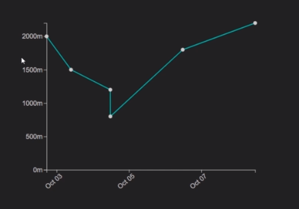
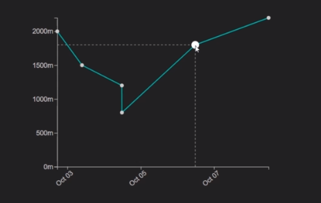
이벤트
차트에 Point에 마우스를 올리면 사이즈가 커지고, 점선으로 수치를 표시해 주는 이벤트를 만들어 보자
마우스 올렸을 때
 graph
    .selectAll("circle")
    .on("mouseover", (d, i, n) => {
      d3.select(n[i])
        .transition()
        .duration(100)
        .attr("r", 8)
        .attr("fill", "#fff");
마우스 사라졌을 때
.on("mouseleave", (d, i, n) => {
      d3.select(n[i])
        .transition()
        .duration(100)
        .attr("r", 4)
        .attr("fill", "#fff");
      // hide the dotted line group (opacity)
      dottedLines.style("opacity", 0);
점선 표시
// set x dotted line coords (x1,x2,y1,y2)
      xDottedLine
        .attr("x1", x(new Date(d.date)))
        .attr("x2", x(new Date(d.date)))
        .attr("y1", graphHeight)
        .attr("y2", y(d.distance));
      // set y dotted line coords (x1,x2,y1,y2)
      yDottedLine
        .attr("x1", 0)
        .attr("x2", x(new Date(d.date)))
        .attr("y1", y(d.distance))
        .attr("y2", y(d.distance));
      // show the dotted line group (opacity)
      dottedLines.style("opacity", 1);
    })
이렇게 해서 데이터를 실시간으로 반영하는 라인차트를 완성했다!

d3 자료 감사합니다!