Pie Chart
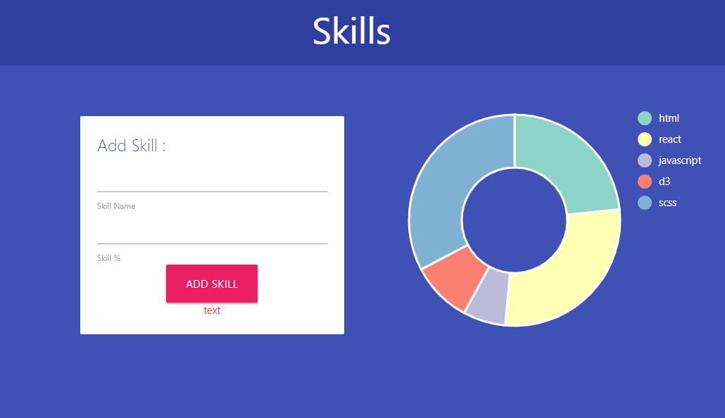
Firebase에 데이터를 저장해서 실시간으로 차트에 반영되는 Pie 차트를 만들어 보자.
html 파일에 input 을 data와 연결해준다.
index.js
// input에 아이템 추가 시 firebase 데이터베이스에 추가

const form = document.querySelector("form");
const name = document.querySelector("#name");
const cost = document.querySelector("#cost");
const error = document.querySelector("#error");

const handleSubmit = e => {
  e.preventDefault();
  if (name.value && cost.value) {
    const item = {
      name: name.value,
      cost: parseInt(cost.value)
    };

    db.collection("expenses")
      .add(item)
      .then(res => {
        // item이 들어온다면 아래 코드 실행
        name.value = ""; // 인풋 초기화
        cost.value = "";
      });
  } else {
    error.textContent = "Please enter values before submitting";
  }
};

form.addEventListener("submit", handleSubmit);
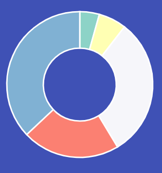
submit을 통해 입력한 값이 firebase에 잘 저장이 된다.
이제 data를 사용해 pie 차트를 만들어 보자
graph.js
// dimensions 치수
const dims = { height: 300, width: 300, radius: 150 };
// center
const cent = { x: dims.width / 2 + 5, y: dims.height / 2 + 5 };
// svg 생성
const svg = d3
.select(".canvas")
.append("svg")
.attr("width", dims.width + 150)
.attr("height", dims.height + 150);
const graph = svg
.append("g")
.attr("transform", `translate(${cent.x}, ${cent.y})`);
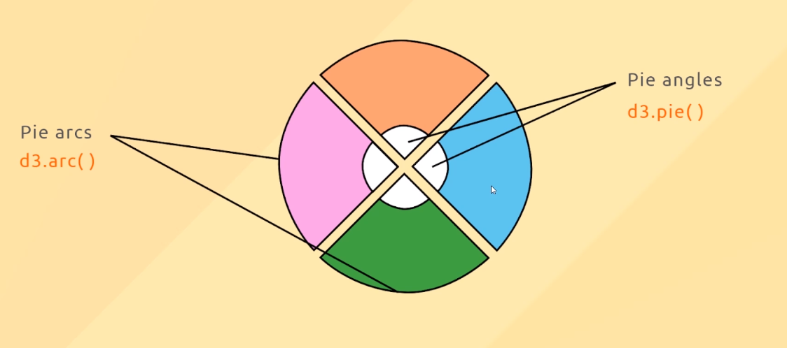
// 파이차트 생성
const pie = d3
.pie()
.sort(null)
.value(d => d.cost);
const arcPath = d3
.arc()
.outerRadius(dims.radius)
.innerRadius(dims.radius / 2);
// update function
const update = data => {
// Join enhanced (pie) data to path elements
const path = graph.selectAll("path").data(pie(data));
path
.enter()
.append("path")
.attr("class", "arc")
.attr("d", arcPath)
.attr("stroke", "white")
.attr("stroke-width", 3);
};
let data = [];
// db 연결
db.collection("expenses").onSnapshot(res => {
// 실시간 데이터 업데이트
res.docChanges().forEach(change => {
const doc = {
...change.doc.data(),
id: change.doc.id
};
// type에 따라 상태 업데이트
switch (change.type) {
case "added":
data.push(doc);
break;
case "modified":
const index = data.findIndex(item => item.id == doc.id);
data[index] = doc;
break;
case "removed":
data = data.filter(item => item.id !== doc.id);
break;
default:
break;
}
});
update(data);
});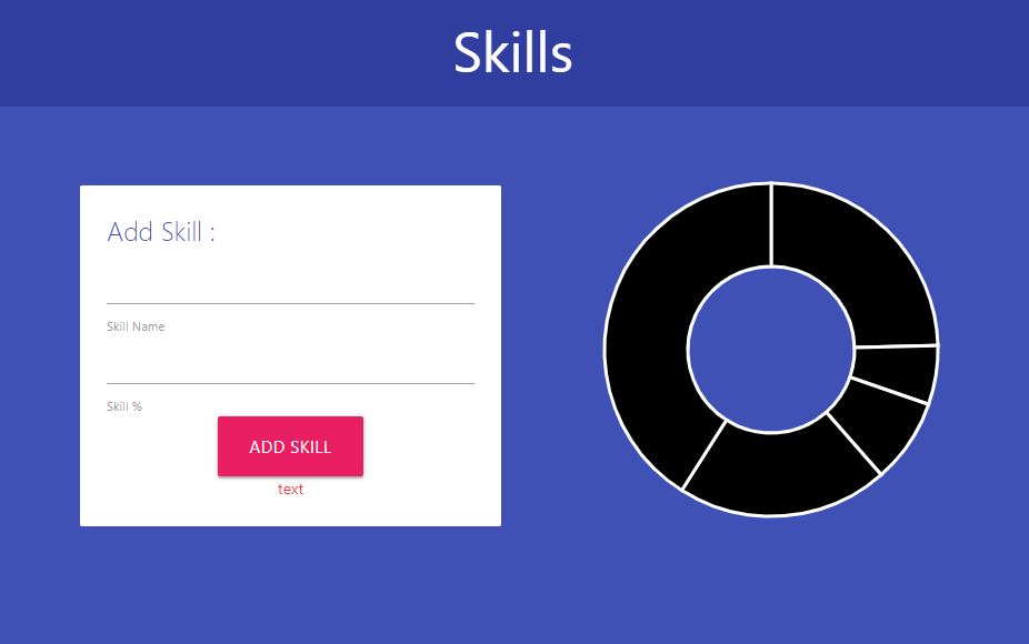
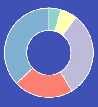
차트 실시간 변형
일단 각각 컬러를 설정해준다.
const color = d3.scaleOrdinal(d3["schemeSet3"]);

// update function
const update = data => {
  // update color scale domain
  color.domain(data.map(d => d.name));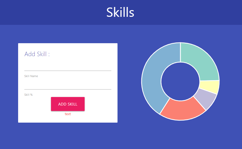
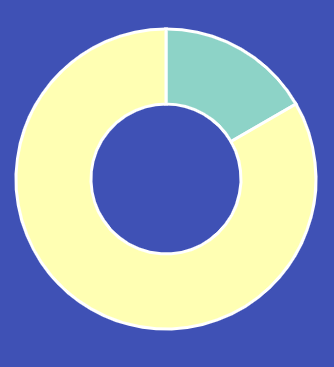
데이터가 삭제되면 차트에 반영되도록 한다.
paths.exit().remove();
그런데 data 차트 조각이 통째로 사라진다.
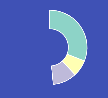
 paths.exit().remove();
 paths.attr("d", arcPath);
이렇게 사라진 조각을 다른 path로 채우면 된다.
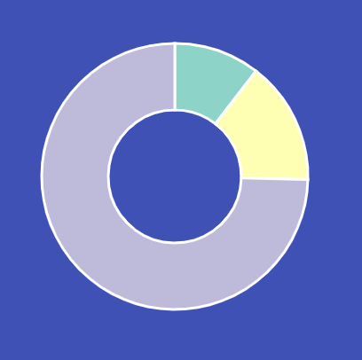
차트 Animating Arcs
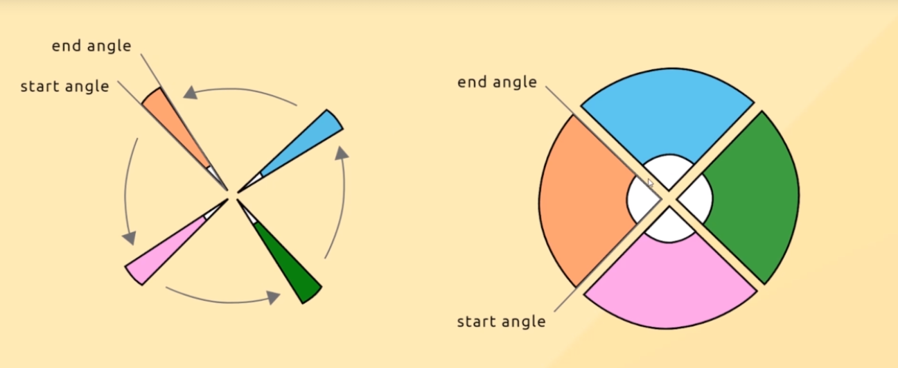
start 각도와 end 각도를 기준으로 transition을 적용해야한다.
i = d3.interpolate(d.endAngle, d.startAngle)
Tween 함수를 만들어준다.
// Animation
const arcTweenEnter = d => {
  let i = d3.interpolate(d.endAngle, d.startAngle);

  return function(t) {
    d.startAngle = i(t);
    return arcPath(d);
  };
};
paths.enter 속성에 적용
.transition()
    .duration(750)
    .attrTween("d", arcTweenEnter);
D3 - Legend
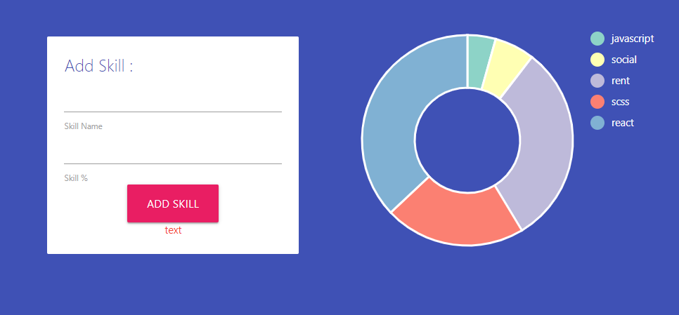
우측에 Legend를 만들어 보자.
https://www.d3-legend.susielu.com/ 에서 CDN 적용
// Legend setup
const legendGroup = svg
  .append("g")
  .attr("transform", `translate(${dims.width + 40}, 10)`);

const legend = d3
  .legendColor()
  .shape("circle")
  .shapePadding(10)
  .scale(color);
// update and call legend
legendGroup.call(legend);
// text white
legendGroup.selectAll("text").attr("fill", "white");
Interactivity
차트에 이벤트 효과를 적용해보자.
- Hover events
- Click events
- Tooltips
Event Listeners
- Click events
- Mouseover events
- Double-click events
- ect
Mouse over event
path에 mouseover 하면 white로 color가 바뀌고,
mouseout 하면 다시 원래 컬러로 돌아오는 event 적용
paths.enter() 속성 다음에 작성
graph
    .selectAll("path")
    .on("mouseover", handleMouseOver)
    .on("mouseout", handleMouseOut)
파일 맨 아래 작성
// event handlers
const handleMouseOver = (d, i, n) => {
  d3.select(n[i])
    .transition("changeSliceFill")
    .duration(300)
    .attr("fill", "white");
};

const handleMouseOut = (d, i, n) => {
  d3.select(n[i])
    .transition("changeSliceFill")
    .duration(300)
    .attr("fill", color(d.data.name));
};
mouseover
mouseout
Click event
graph
    .selectAll("path")
    .on("mouseover", handleMouseOver)
    .on("mouseout", handleMouseOut)
    .on("click", handleClick);	// 추가
path를 클릭하면 해당하는 data가 삭제되는 event 적용
const handleClick = d => {
const id = d.data.id;
db.collection("expenses")
.doc(id)
.delete();
};확인해 보면 삭제가 잘 된다.
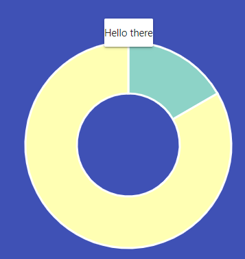
Tooltips
https://cdnjs.com/libraries/d3-tip 에서 CDN을 가져온다.
update 함수 위쪽에 tip을 생성한다.
// Tooltip
const tip = d3
  .tip()
  .attr("class", "tip card")
  .html(d => {
    return `<p>Hello there</p>`;
  });

graph.call(tip);
// Add events
graph
.selectAll("path")
.on("mouseover", (d, i, n) => {
tip.show(d, n[i]); // data 와 this 파라미터
handleMouseOver(d, i, n);
})
.on("mouseout", handleMouseOut)
.on("click", handleClick);
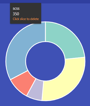
};mouseover시 event에 해당하는걸 보여줌
content를 data와 연결해준다.
// Tooltip
const tip = d3
  .tip()
  .attr("class", "tip card")
  .html(d => {
    let content = `<div class="name">${d.data.name}</div>`;
    content += `<div class="cost">${d.data.cost}</div>`;
    content += `<div class="delete">Click slice to delete</div>`;
    return content;
  });

graph.call(tip);
스타일 지정.
.tip {
            padding: 10px;
            background: #333;
            color: white;
        }

        .tip .delete {
            color: rgb(238, 148, 75);
            font-size: 0.8em;
        }
이렇게 해서 Firebase를 연동한 interactive Pie Chart를 완성했다.