Static Directory
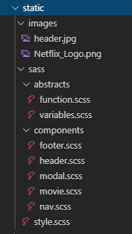
style을 담당하는 static (정적) 폴더에 스타일링에 관련된 파일들을 담아둔다.
/images
필요한 이미지와 로고 등이 들어가있는 폴더
/sass
scss 파일을 작성하는 폴더로 abstracts 와 components 두 가지 하위 폴더로 나눠져 있고 index 파일인 style.scss로 구성했다.
Abstracts
abstracts (추상적인) 필요한 함수와 변수를 정의해주는 폴더
컴포넌트들에 공통으로 사용되는 함수를 작성해주는 파일로 Sass에 mixin이라는 내장 함수를 사용해서 미디어 쿼리를 작성해 준다.
abstracts/function.scss
@mixin responsive($breakpoint) {
    @if $breakpoint == phone {
        @media only screen and (max-width: 600px) {
            @content
        };
    }

    @if $breakpoint == tab_medium {
        @media only screen and (max-width: 980px) {
            @content
        };
    }

    @if $breakpoint == tab_port {
        @media only screen and (max-width: 1187px) {
            @content
        };
    }

    @if $breakpoint == desktop {
        @media only screen and (max-width: 1633px) {
            @content
        };
    }

}
abstracts/variables.scss
컴포넌트들에서 공통으로 많이 사용되는 부분을 변수로 만들어서 사용할 수 있다.
사용할 color를 변수로 만들어서 사용해보자.
$color-dark: #171818;
$color-background: #111111;
$color-background-modal: #000000;
$color-light-grey:  rgb(158, 158, 158);
$color-dark-grey: rgb(80, 80, 80);
$color-white: rgb(221, 218, 218);

$color-green: #1cb831;
$color-green-modal: rgb(92, 223, 92);
$color-modal-grey: rgb(172, 171, 171);
$color-modal-grey-2: rgb(122, 122, 122);

$color-red: #e21221;
$color-red-2: #f80616de;

$color-dark-blue: #082452;
$color-light-blue: rgb(15, 61, 129);
$color-light-blue-2: #2b2da5;

$color-purple: #782da3;
Import
sass/style.scss
@import "abstracts/variables.scss";
@import "abstracts/function.scss";

@import "components/movie.scss";
@import "components/nav.scss";
@import "components/footer.scss";
@import "components/header.scss";
@import "components/modal.scss";

* {
    padding: 0;
    margin: 0;
}
스타일링을 지정하기 전에 일단 생성한 파일들을 style파일에 모두 불러와주고
src/index.js 파일에서 import 해주면 모든 파일에 scss가 적용된다.
import './static/sass/style.scss';
Components
각 컴포넌트의 스타일링을 해주는 파일을 작성하는 폴더.
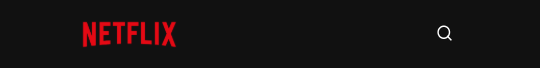
Nav
nav는 항상 가장 위쪽에 위치하도록 position: fixed 와 z-index를 적용해주고 화면이 스크롤시 nav의 background-color가 나타나도록 설정해준다.
.navigation {
    width: 100%;
    position: fixed;
    z-index: 100;
    transition: all 0.5s ease-in;

    &.black {
        background: $color-background;
    }
미디어 쿼리를 사용해서 반응형 적용시켜 줬다.
.link {
            font-size: 12px;
            font-weight: 500;
            color: white;
            cursor: pointer;

            @include responsive(tab_port) {
                display: none;
            }
DesckTop

Tab_port

Phone
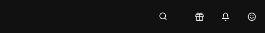
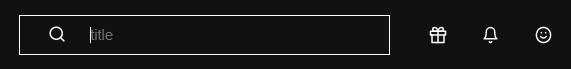
SearchBar
search 아이콘을 클릭하면 input이 왼쪽으로 나타나는 효과 적용
.searchContainer {

    .inputContainer {
        display: flex;
        align-items: center;
        position: relative;

        .searchLogo {
            position: absolute;
            left: 5%;
            padding: 10px;
            cursor: pointer;
        }

        .search-txt {
            z-index: 1;
            border: none;
            color: #fff;
            outline: none;
            width: 0px;
            padding: 10px;
            padding-right: 2rem;
            background: $color-background;
            border: 1px solid #fff;
            transition: all .5s;
            cursor: pointer;
            opacity: 0;

            &:focus {
                z-index: 0;
                padding-left: 4rem;
                width: 15rem;
                cursor: text;
                opacity: 1;
            }
        }
    }
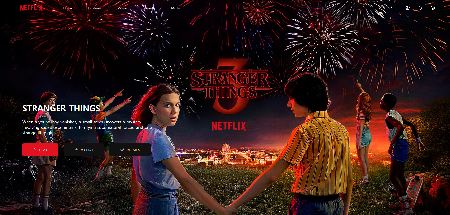
Header
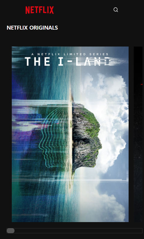
header에는 꽉찬 배경이미지와 컨텐츠에 미디어 쿼리를 적용시켜 줬다.
DesckTop
Phone
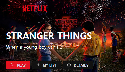
text-overflow: ellipsis;를 사용해 text가 넘치면 ... 으로 나타나게 설정해줬다.
.headerContents {
            position: absolute;
            bottom: 10%;
            left: 5%;
            width: 60%;
            height: 50%;
            color: white;

            @include responsive(tab_port) {
                width: 80%;
            }

            h1 {
                font-size: 2em;
                font-weight: 600;
            }

            p {
                margin-top: 2%;
                width: 50%;

                @include responsive(phone) {
                    width: 200px;
                    height: 50px;
                    display: block;
                    overflow: hidden;
                    text-overflow: ellipsis;
                    white-space:nowrap;
                }
            }
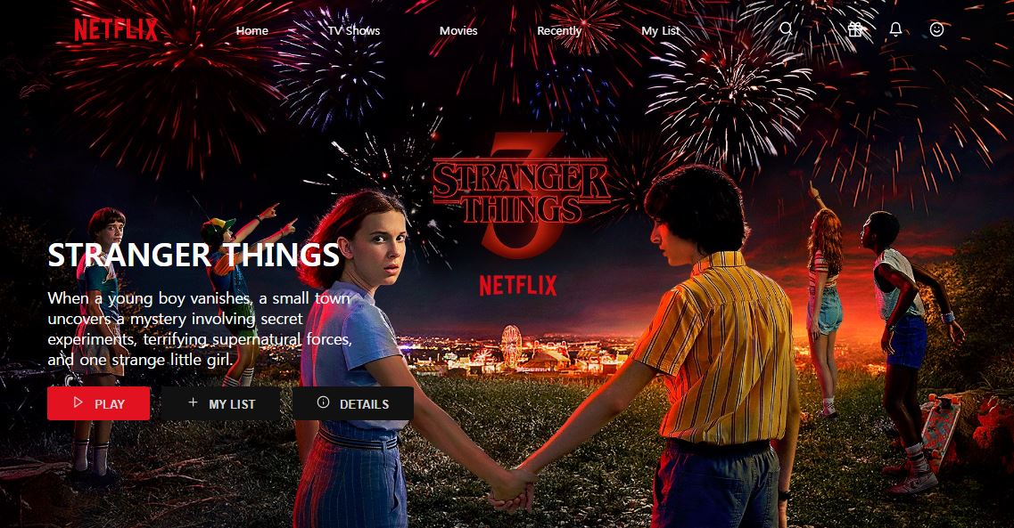
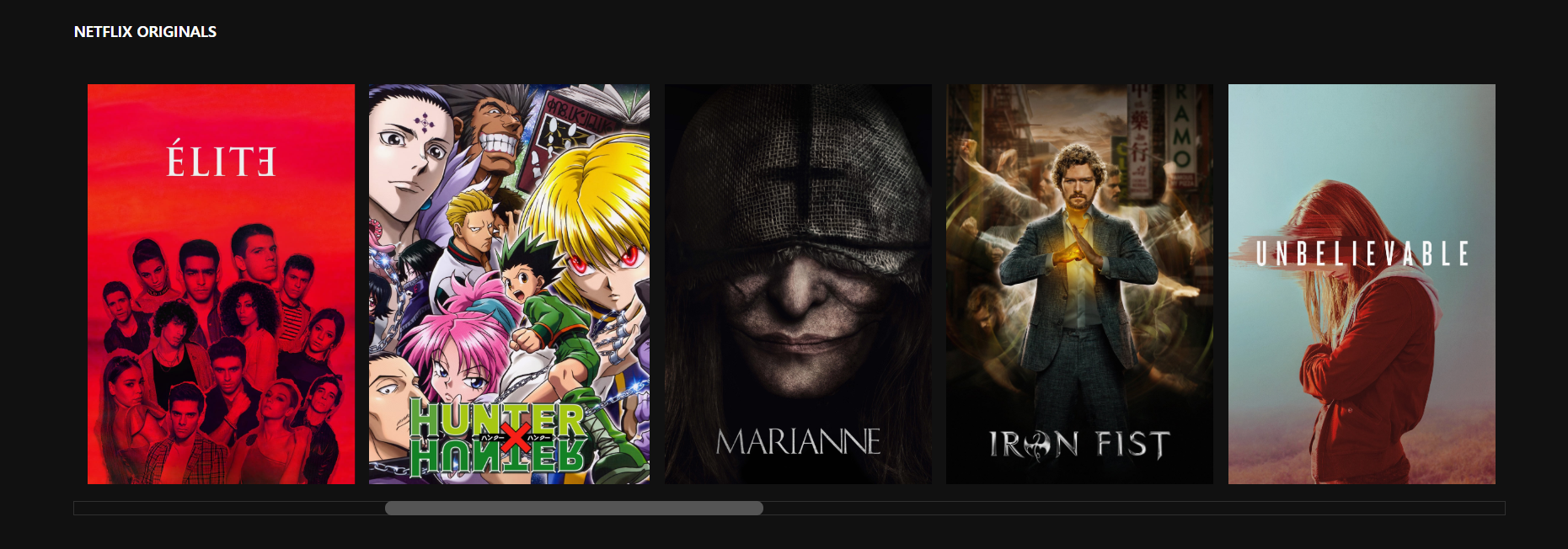
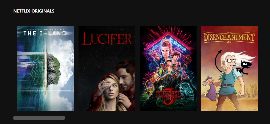
Netflix Movie
스크롤을 컨트롤할 수 있는 -webkit-scrollbar를 사용해서 스크롤 컬러와 bar를 변경해 준다.
&::-webkit-scrollbar {
        background: none;
        border: 1px solid rgb(48, 48, 48);
    }
    &::-webkit-scrollbar-thumb {
        background: rgb(85, 85, 85);
        border-radius: 30px;
    }
미디어 쿼리 적용
DesckTop
Tab_port
Phone