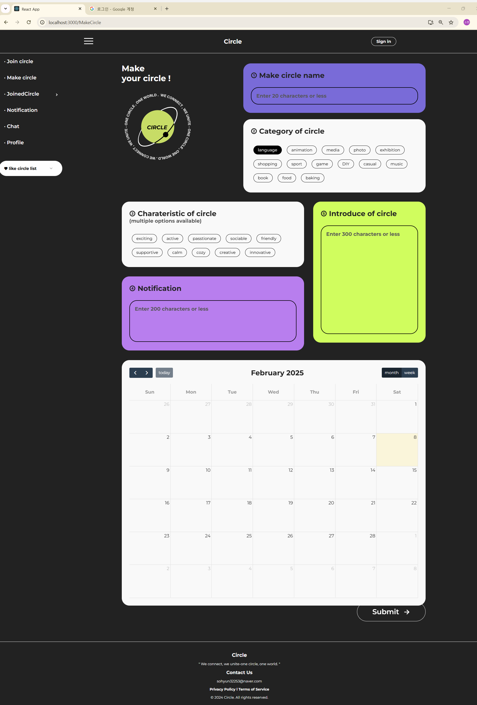
문제 상황
위와 같은 레이아웃을 구현하였는데 화면 사이즈를 줄이면 원래 있던 위치에서 벗어나는 문제가 발생
.make_circle_cont{
    position: relative;
    height: 2200px;
}

.make_circle_name{
    background: #796BD8;
    height: 195px;
    position: absolute;
    right: 0;
    top: 0;
    width: 60%;
    margin-bottom: 40px;
}
이런 식으로 부모 속성에 relative를 주고 자식 속성에 absolute와 그에 따른 위치를 작성한 상태이다.
하지만 이렇게 작성하면 내가 원하는 디자인대로 표현하지 못하는 한계가 있다.
그래서 찾아본 결과 css의 grid 시스템을 사용하기로 하였다.
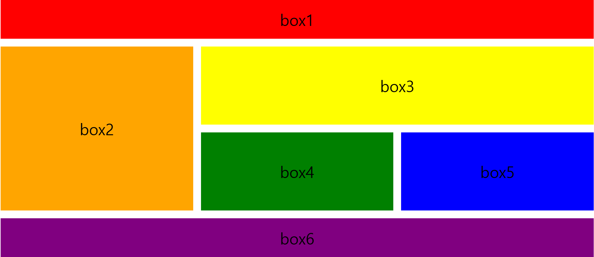
grid system 예제
<style>
.container{
display: grid;
grid-template-columns: 1fr 1fr 1fr;
grid-template-rows: 100px 200px 200px 100px;
gap: 20px;
}
.box{
display: flex;
justify-content: center;
align-items: center;
font-size: 40px;
}
.box1{
background: red;
grid-column: 1 / 4;
}
.box2{
background: orange;
grid-row: 2 / 4;
}
.box3{
background: yellow;
grid-column: 2 / 4;
}
.box4{
background: green;
grid-column: 2 / 3;
}
.box5{
background: blue;
grid-column: 3 / 4;
}
.box6{
background: purple;
grid-column: 1 / 4;
}
</style>
</head>
<body>
<div class="container">
<div class="box1 box">box1</div>
<div class="box2 box">box2</div>
<div class="box3 box">box3</div>
<div class="box4 box">box4</div>
<div class="box5 box">box5</div>
<div class="box6 box">box6</div>
</div>
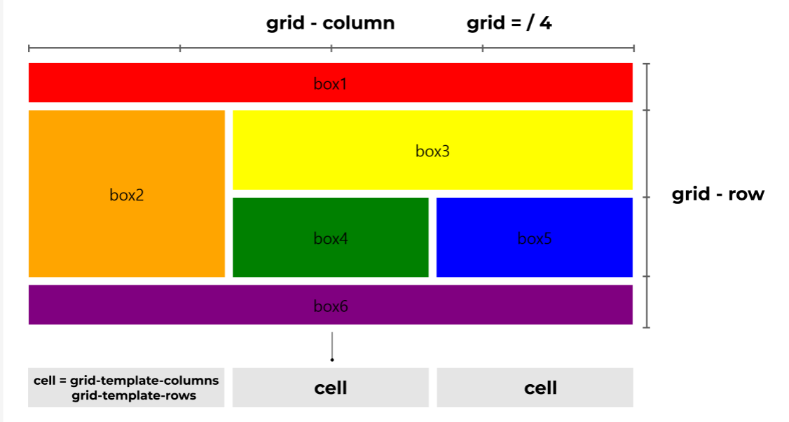
</body>위와 같은 레이아웃을 출력하려면 이런 코드를 작성해야하는데 grid 에선 우리가 흔히 알고있는 개념이랑 다른 방식을 적용한다.
우리는 보통 행을 먼저 계산하지만 css에선 열을 먼저 계산하기 때문에 column을 가로, row를 세로라고 생각하면 이해하기 쉽다.
grid-template-columns: 1fr 1fr 1fr; // 가로가 같은 3개의 셀
grid-template-rows: 100px 200px 200px 100px; // 100px 200px 200px 100px 사이즈인 4개의 셀
따라서 이렇게 표현이 되는 것이다.
.box1{
       background: red;
       grid-column: 1 / 4;
 }
그런데 한 가지 의문인건 분명 3개의 columns로 설정을 했는데 왜 한 줄을 다 차지할 때는 1 / 3이 아닌 1 / 4로 표현을 하냐는 것이다.
찾아보니 cell과 grid는 다른 개념으로 적용이 된다고 한다.
보통 css에서 grid는 한줄에 4개로 정해져있다.
좀 더 쉽게 이해하려면 1 / 4는 1부터 4전까지라고 해석하면 된다.
.box2{
      background: orange;
      grid-row: 2 / 4;
}
따라서 두번째 박스도 2번째 행부터 4번째 행 전 즉, 2-3번째 칸을 차지한다고 생각하면 된다.
개념이 복잡해서 그림으로 말하면 이런 식으로 표현할 수 있다.
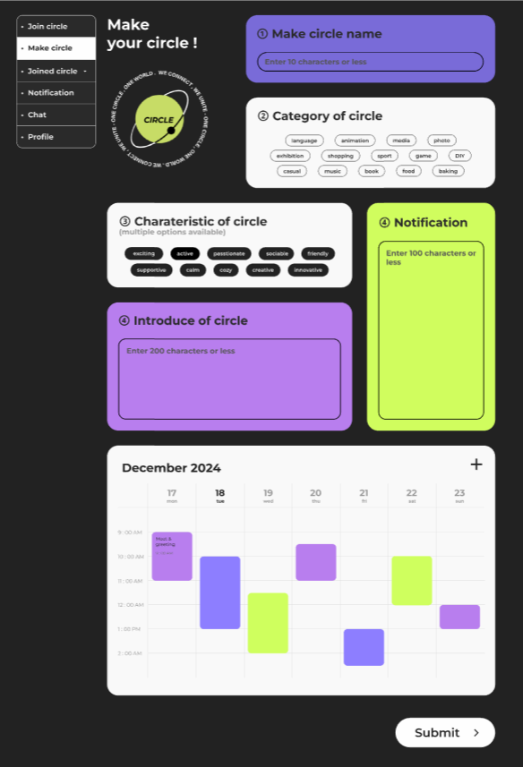
실제 적용하기
form{
    display: grid;
    gap: 40px;
    grid-template-columns: 1fr 1fr 1fr;
    grid-template-rows: auto auto auto auto auto;
}

.make_circle_name{
    background: #796BD8;
    height: 195px;
    grid-column: 2 / 4;
}

.category_of_circle{
    background: #f9f9f9;
    height: auto;
    grid-column: 2 / 4;
}

.input_box input{
    display: none;
}

.input_box input:checked + label {
    background: #000;
    color: #fefefe;
  }

.charateristic_of_circle{
    background: #f9f9f9;
    height: auto;
    grid-column: 1 / 3;
    grid-row: 3 / 4;
}

.mc_notification{
    background: #B87EEE;
    grid-column: 1 / 3;
    grid-row: 4 / 5;
}

.introduce_of_circle{
    background: #D0FD5E;
    grid-row: 3 / 5;
    grid-column: 3 / 4;
}

.mc_schedule{
    background: #f9f9f9;
    width: 100%;
    color: #222222;
    grid-column: 1 / 4;
}
⭐⭐⭐ 복잡한 레이아웃은 grid-colum과 grid-row를 둘 다 지정해서 정확하게 배치가능!

hi