내가 할일
Randomize버튼과 Text Alignment을 만들어야 하는줄 알았는데 그게 아니었다.
Randomize버튼과 TextShadow가 내가 할 일이었다.
채영님, 선아님, 나 이렇게 셋이서 만들 컴포넌트를 분담했다.

Input 컴포넌트 그리기
원래 다른분이 Input부분을 만들어주신다고 했었는데 안되는 부분이 있다고 하셨다.
처음에 store을 만들 때 액션함수도 같이 만들어뒀는데 그 부분을 잘 모르셔서 내가했다.
// 바꾸기전 코드
interface InputProps {
    inputValName: 'borderWidth' | 'fontSize' | 'heightRatio'
    changeInputFunction:
        typeof changeBorderWidth |
        typeof changeFontSize
}

export default function InputBt({
    inputValName,
    changeInputFunction
}: InputProps) {
    const defaultNum = useAppSelector(state => state.option[inputValName])
    const dispatch = useAppDispatch()

    const [num, setNum] = React.useState<number>(defaultNum);

    const handleChange = (e: ChangeEvent<HTMLInputElement>): void => {
        let num = Number(e.target.value);
        setNum(num);
        dispatch(changeInputFunction(num))
    };

    return (
        <InputField
            id="borderw"
            type="number"
            name="username"
            value={num}
            onChange={handleChange}
            min="0"
        />
    );
}
// 바꾼후 코드
interface InputProps {
type: React.HTMLInputTypeAttribute;
value?: string | number | readonly string[];
accept?: string;
onChange?: (e: React.ChangeEvent<HTMLInputElement>) => void;
display?: 'block' | 'none';
}
const Input = React.forwardRef(({
type,
value,
accept,
onChange,
display,
}: InputProps, ref: React.ForwardedRef<HTMLInputElement>) => {
return (
<InputField
ref={ref}
type={type}
value={value}
accept={accept}
onChange={onChange}
display={display}
/>
);
});
export default Input변경전 코드는 input만 받으면 되는 컴포넌트가 너무 많은 일을 하고있었다.
그래서 styled components를 사용해 정의된 스타일의 input에
필요한 prop들을 넘겨주면 되는 간단한 방법으로 바꿔버렸다.
ColorPicker 컴포넌트 수정
colorPicker 컴포넌트는 내가 만들었었는데 Input 컴포넌트처럼 받아야하는 값만 받게 바꿨다.
//바꾸기 전
interface ColorPickerProps {
    whosColorChange: 'backgroundColor' | 'foregroundColor' | 'borderColor';
    changeColorFunction:
        | typeof changeBackgroundColor
        | typeof changeForegroundColor
        | typeof changeBorderColor;
}

const ColorPicker = ({
    whosColorChange,
    changeColorFunction
}:ColorPickerProps) => {
    const color =  useAppSelector(state=>state.option[whosColorChange]);
    const dispatch = useAppDispatch();

    const [isClick, setIsClick] = useState(false);
    const circleRef = useRef<HTMLDivElement>(null);

    useOutsideDetect(circleRef, () => {
        setIsClick(false);
    });


    const handleChangePicker = (color: ColorResult) => {
        dispatch(changeColorFunction(color.hex));
    };
    const handleClickPickerCircle = () => {
        setIsClick(!isClick);
    }
    return (
        <ColorPickerBlock>
            <PickerCircle
                color={color}
                onClick={handleClickPickerCircle}
                ref={circleRef}
            >
                {isClick &&
                    <Picker>
                        <SketchPicker
                            color={color}
                            onChange={handleChangePicker}
                        />
                    </Picker>
                }
            </PickerCircle>
        </ColorPickerBlock>
    );
}
export default ColorPicker;
// 바꾼 후 코드
interface ColorPickerProps {
color: string;
onChange: (color: ColorResult) => void;
}
const ColorPicker = ({
color,
onChange
}:ColorPickerProps) => {
const [isClick, setIsClick] = useState(false);
const circleRef = useRef<HTMLDivElement>(null);
useOutsideDetect(circleRef, () => {
setIsClick(false);
});
const handleClickPickerCircle = () => {
setIsClick(!isClick);
}
return (
<ColorPickerBlock>
<PickerCircle
color={color}
onClick={handleClickPickerCircle}
ref={circleRef}
>
{isClick &&
<Picker>
<SketchPicker
color={color}
onChange={onChange}
/>
</Picker>
}
</PickerCircle>
</ColorPickerBlock>
);
}
export default ColorPicker;변경되기 전에는 바꿀 상태에 대한 정보와 함수를 넘겨줬다.
그리고서 그 안에서 현재 상태에서 색상정보를 넘겨받았따.
그리고서 함수를 한번 더 만들어서 해당 함수를 피커가 값을 선택할 때 넘겨줬다.
근데 바꾸고 나서는 그냥 바로 값을 받아오고 함수도 받아왔다.
그래서 ColorPicker가 할 일을 덜어주고 보기도 편해졌다.
이제 colorPicker를 사용하려면 색상과 onChange함수를 넘겨주면 된다.
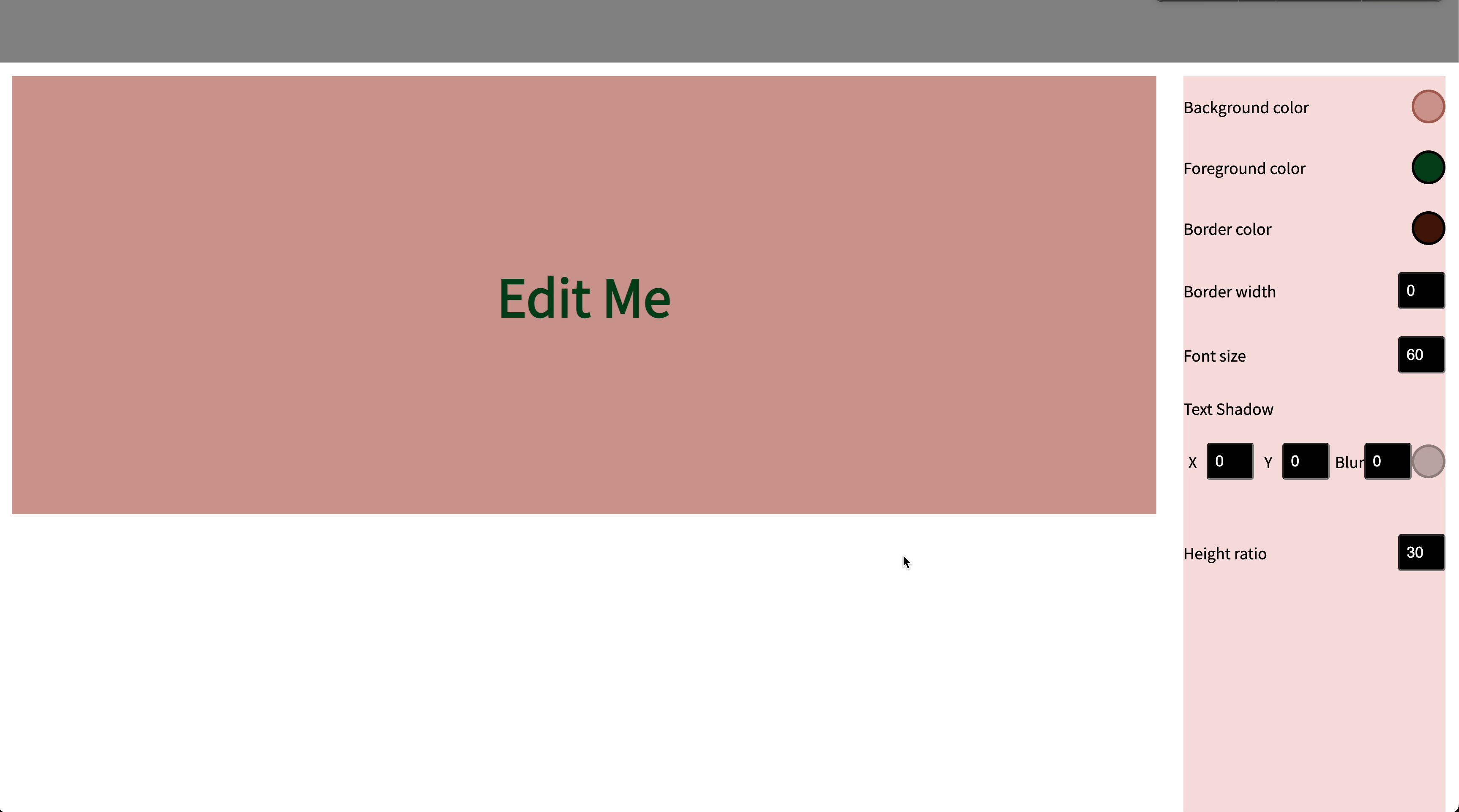
TextShadow부분 그리기
이제 오늘 하려고 했던 메인부분이다.
기존에 만들어놨던 ControlsBox 컴포넌트를 사용해 row, column 레이아웃을 잡았다.
거기에 Input과 colorPicker를 넣어주기만 해서 완성했다.
<ControlsBox
    title='Text Shadow'
    flexDirection='column'
    alignItems='flex-start'
>
    <ControlsBox justifyContent='space-around'>
        <ControlsBox title="X" justifyContent='space-around'>
            <Input
                type={'number'}
                value={options.textShadow.x}
                onChange={e => { handleChangeTextShadow(e,"x") }}
            />
        </ControlsBox>
        <ControlsBox title="Y" justifyContent='space-around'>
            <Input
                type={'number'}
                value={options.textShadow.y}
                onChange={e => { handleChangeTextShadow(e,"y") }}
            />
        </ControlsBox>
        <ControlsBox title="Blur" justifyContent='space-around'>
            <Input
                type={'number'}
                value={options.textShadow.blur}
                onChange={e => { handleChangeTextShadow(e,"blur") }}
            />
        </ControlsBox>
        <ColorPicker
            color={options.textShadow.color}
            onChange={handleChangeTextShadowColor}
        />
    </ControlsBox>
</ControlsBox>
앞으로 할일
코드 리팩토링이 시급해보인다.
Controls부분을 보면 저어어엉말 중복되는 부분이 많아서 암걸릴것같다.
const handleChangeBackgroundColor = (color: ColorResult) => {
    dispatch(changeBackgroundColor(color.hex));
}
const handleChangeForegroundColor = (color: ColorResult) => {
    dispatch(changeForegroundColor(color.hex));
}
const handleChangeBorderColor = (color: ColorResult) => {
    dispatch(changeBorderColor(color.hex));
}
const handleChangeTextShadowColor = (color: ColorResult) => {
    dispatch(changeTextShadow({type: 'color', value: color.hex}));
}

const handleChangeBorderWidth = (e: InputChangeEvent) => {
    dispatch(changeBorderWidth(e.target.valueAsNumber));
}
const handleChangeFontSize = (e: InputChangeEvent) => {
    dispatch(changeFontSize(e.target.valueAsNumber));
}
const handleChangeTextShadow = (e: InputChangeEvent, type: 'x' | 'y' | 'blur') => {
    dispatch(changeTextShadow({type, value: e.target.valueAsNumber}));
}
const handleChangeHeighRatio = (e: InputChangeEvent) => {
    dispatch(changeHeightRatio(e.target.valueAsNumber));
}
위의 함수들은 전부 hadling 해주는 함수들인데 전달받은 인자를 dispatch 해주기만 한다.
하나의 createDispatch를 사용해 함수와 값을 넘겨 dispatch할 수 있을것같다.
다음은 render 부분이다.
<ControlsBlock>
    <ControlsBox title="Background color">
        <ColorPicker
            color={options.backgroundColor}
            onChange={handleChangeBackgroundColor}
        />
    </ControlsBox>
    <ControlsBox title="Foreground color">
        <ColorPicker
            color={options.foregroundColor}
            onChange={handleChangeForegroundColor}
        />
    </ControlsBox>
    <ControlsBox title="Border color">
        <ColorPicker
            color={options.borderColor}
            onChange={handleChangeBorderColor}
        />
    </ControlsBox>
    <ControlsBox title="Border width">
        <Input
            type={'number'}
            value={options.borderWidth}
            onChange={handleChangeBorderWidth}
        />
    </ControlsBox>
    <ControlsBox title="Font size">
        <Input
            type={'number'}
            value={options.fontSize}
            onChange={handleChangeFontSize}
        />
    </ControlsBox>
    {/* Text Shadow */}
    <ControlsBox
        title='Text Shadow'
        flexDirection='column'
        alignItems='flex-start'
    >
        <ControlsBox justifyContent='space-around'>
            <ControlsBox title="X" justifyContent='space-around'>
                <Input
                    type={'number'}
                    value={options.textShadow.x}
                    onChange={e => { handleChangeTextShadow(e,"x") }}
                />
            </ControlsBox>
            <ControlsBox title="Y" justifyContent='space-around'>
                <Input
                    type={'number'}
                    value={options.textShadow.y}
                    onChange={e => { handleChangeTextShadow(e,"y") }}
                />
            </ControlsBox>
            <ControlsBox title="Blur" justifyContent='space-around'>
                <Input
                    type={'number'}
                    value={options.textShadow.blur}
                    onChange={e => { handleChangeTextShadow(e,"blur") }}
                />
            </ControlsBox>
            <ColorPicker
                color={options.textShadow.color}
                onChange={handleChangeTextShadowColor}
            />
        </ControlsBox>
    </ControlsBox>
    <ControlsBox title="Height ratio">
        <Input
            type={'number'}
            value={options.heightRatio}
            onChange={handleChangeHeighRatio}
        />
    </ControlsBox>
</ControlsBlock>
ControlsBox 컴포넌트가 너무 많은 일을 한다.
display: flex 적용후 flexDirection을 설정해 줄 수 있는데
이는 가독성을 너무 떨어트린다고 생각한다.
그래서 리팩토링을 하려면 ControlsBox을 두부분으로 나눠서
Row, Column 컴포넌트로 나눌 수 있을것같다.
지금까지 완성된 기능들