레이아웃(layout)
사전적 의미 : 배치, 정리
기술적 의미 : 구성 요소를 제한된 공간에 효율적으로 배치하는 것을 의미
화면 배치 방법(형식) : display 속성
요소가 화면에 어떻게 보여질지 형식을 지정하는 속성
- block : 화면을 수직 분할(행을 나눔) + width / height 속성 사용 가능
- inline : 화면을 수평 분할 + width / height 속성 사용 불가능
- inline-block : inline의 수평분할 + block 크기 조정
- none : 화면에 요소가 표시되지는 않으나 존재하고 있는 상태
- flex : 요소의 정렬되는 방향, 요소간의 간격을 유연하게 처리하는 형식
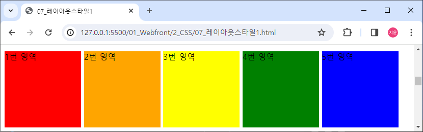
block 형식의 요소(div)를 inline으로 변경
html code
<div class="area1 inline">1번 영역</div>
<div class="area2 inline">2번 영역</div>
<div class="area3 inline">3번 영역</div>
<div class="area4 inline">4번 영역</div>
<div class="area5 inline">5번 영역</div>
css code
.area1 {background-color: red;}
.area2 {background-color: orange;}
.area3 {background-color: yellow;}
.area4 {background-color: green;}
.area5 {background-color: blue;}

.inline {display: inline;}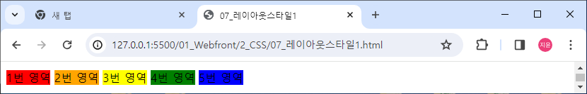
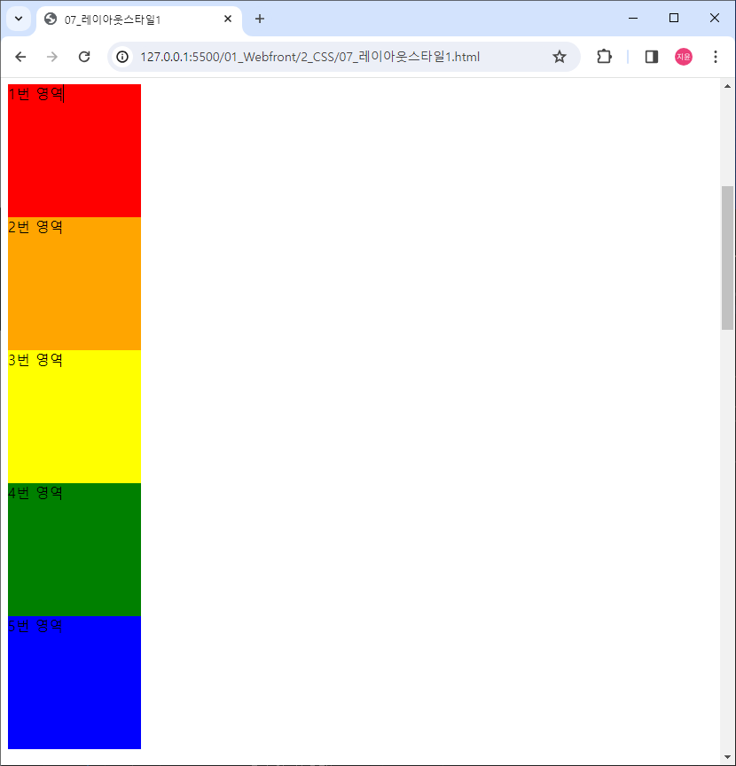
inline 형식의 요소(span)를 block 형식으로 변경
html code
<span class="area1 block">1번 영역</span>
<span class="area2 block">2번 영역</span>
<span class="area3 block">3번 영역</span>
<span class="area4 block">4번 영역</span>
<span class="area5 block">5번 영역</span>
css code
.block {
    display: block;

    width: 150px;
    height: 150px;
}
inline-block 확인하기
html code
<span class="area1 block inline-block">1번 영역</span>
<span class="area2 block inline-block">2번 영역</span>
<span class="area3 block inline-block">3번 영역</span>
<span class="area4 block inline-block">4번 영역</span>
<span class="area5 block inline-block">5번 영역</span>
css code
.inline-block {display: inline-block;}위에서 설정한 width / height 속성도 같이 들어감
화면 (영역) 분할
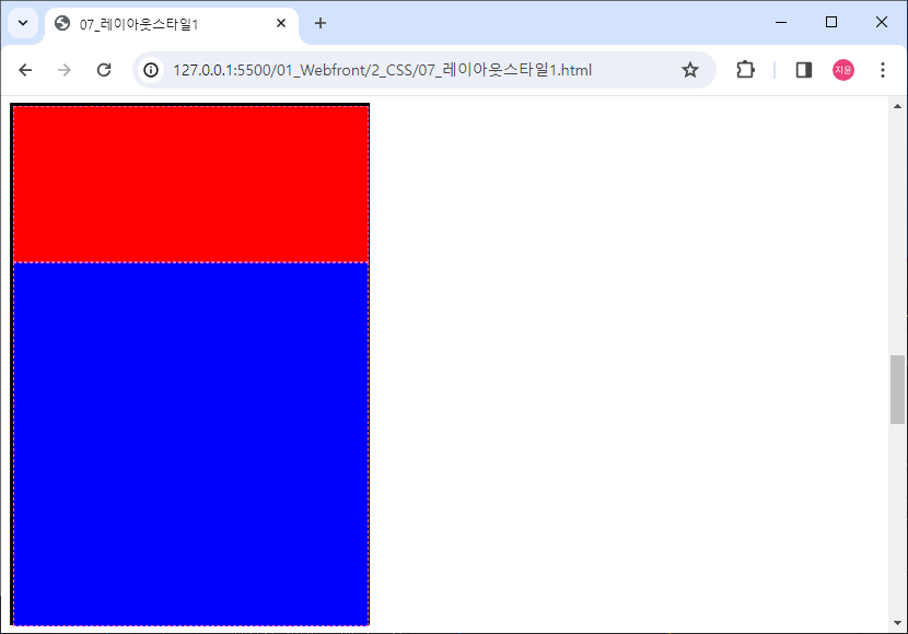
상하 2분할
필요한 것
- 감싸는 영역 요소
- 내부에 영역을 분할할 요소
- display: block
- 크기 단위 (고정(px) / 가변(%))
html code
<div id="container-1">
	<div class="div-1 div--2"></div>
	<div class="div-1 div--3"></div>
</div>
css code
#container-1 {
    border: 3px solid black;
    width: 323px;
    height: 472px;
}

.div-1 {
    height: 50%;
    width: 100%;
    border: 1px dashed hotpink;
}

.div--2 {
    height: 30%;
    background-color: red;
}

.div--3 {
    height: 70%;
    background-color: blue;
}
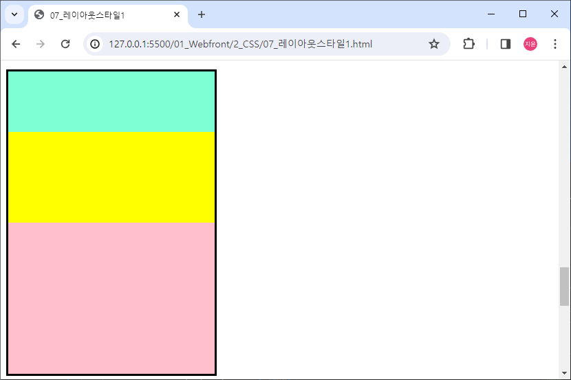
상하 3분할
- 감싸는 영역 요소 : id="container-2"
- 화면 분할 내부 요소 : class="div-2"
- 분할 비율 -> 20:30:50
- 배경색 자유롭게
html code
<div id="container-2">
	<div class="div-2"></div>
	<div class="div-2"></div>
	<div class="div-2"></div>
</div>
css code
#container-2 {
    border: 3px solid black;
    width: 300px;
    height: 440px;
}

#container-2 > .div-2:first-of-type {
    background-color: aquamarine;
    height: 20%;
}

#container-2 > .div-2:nth-of-type(2) {
    background-color: yellow;
    height: 30%;
}

#container-2 > .div-2:last-of-type {
    background-color: pink;
    height: 50%;
}
block 형식의 요소는 별도의 width가 지정되지 않으면 항상 100%
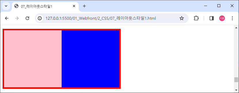
좌우 2분할
- 감싸는 영역 요소
- 내부 분할 요소
- 크기 단위
- display : inline-block (약간 문제점 있음. 이어서 써야함)
html code
내부 요소 사이에 공백이 있으면 아래로 내려감
<div id="container-3">
	<div class="div-3"></div><div class="div-3"></div>
</div>
css code
#container-3 {
    border: 5px solid red;
    width: 400px;
    height: 200px;
}

.div-3 {
    width: 50%;
    height: 100%;
    display: inline-block;
}

#container-3 > .div-3:first-child {
    background-color: pink;
}

#container-3 > .div-3:last-child {
    background-color: blue;
}
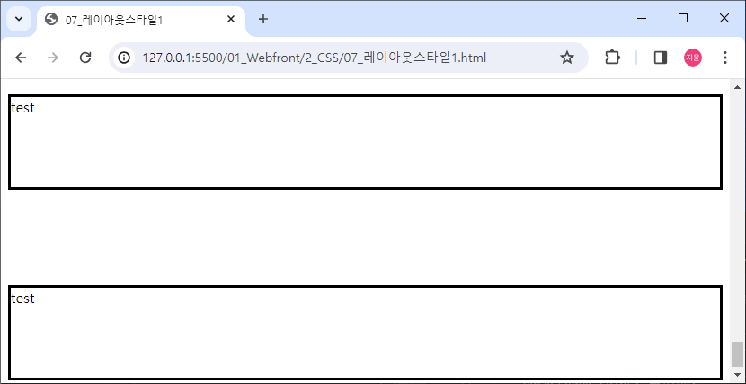
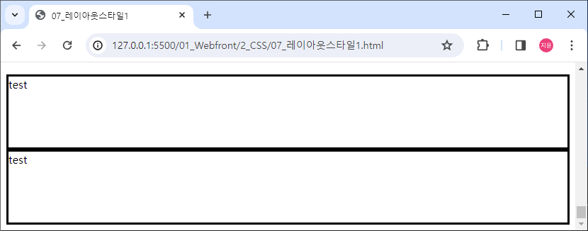
display: none;
요소는 존재하지만 화면에는 보이지 않음 (투명X)
html code
<div class="div-4">test</div>
<div class="div-4" id="test4">test</div>
<div class="div-4">test</div>
css
.div-4 {
    border: 3px solid black;
    height: 100px;
}

#test4 {
    background-color: deeppink;
    display: none;
}
visibility: hidden; (투명O)
css code
#test4 {
    background-color: deeppink;
    visibility: hidden;
}