2차원 변형
x축, y축만 존재
transform : 변형 관련 속성
css 속성 작성 시 크로스 브라우저(브라우저가 달라지는 경우) 처리 방법
-ms- : 마이크로 소프트 (익스플로어, 엣지)
-webkit- : 크롬, 사파리
-o- : 오페라
-moz- : 파이어폭스
설정 안해도 될 때도 있음
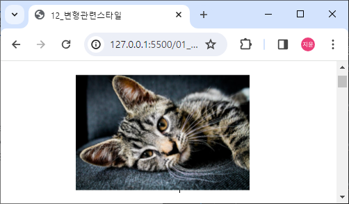
좌우로 움직이기
html code
<img src="../images/cats/cat1.jpg" class="trans-x-2d">css code
마우스 올려뒀을 때 x 축 이동
img {width: 250px;}

.trans-x-2d:hover {
    /* -webkit-transform: translateX(100px);
    -ms-transform: translateX(100px); */
    transform: translateX(100px);
}
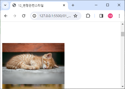
상하로 움직이기
html code
<img src="../images/cats/cat2.jpg" class="trans-y-2d">css code
.trans-y-2d:hover {
    transform: translateY(100px);
}
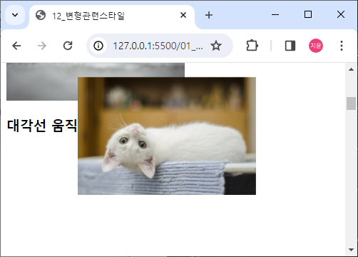
대각선 움직이기
html code
<img src="../images/cats/cat3.jpg" class="trans-xy-2d">css code
오른쪽 위로 올라감
.trans-xy-2d:hover {
    transform: translate(100px, -100px);
}
가로방향 확대 축소
html code
<img src="../images/cats/cat4.jpg" class="trans-x-scale-2d">css code
.trans-x-scale-2d:hover {
    transform: scaleX(2);
    margin-left: 200px;
    /* 왼쪽 잘려서 나와서 넣어줌 */
}
세로방향 확대 축소
html code
<img src="../images/cats/cat5.jpg" class="trans-y-scale-2d">css code
.trans-y-scale-2d:hover {
    transform: scaleY(2);
}
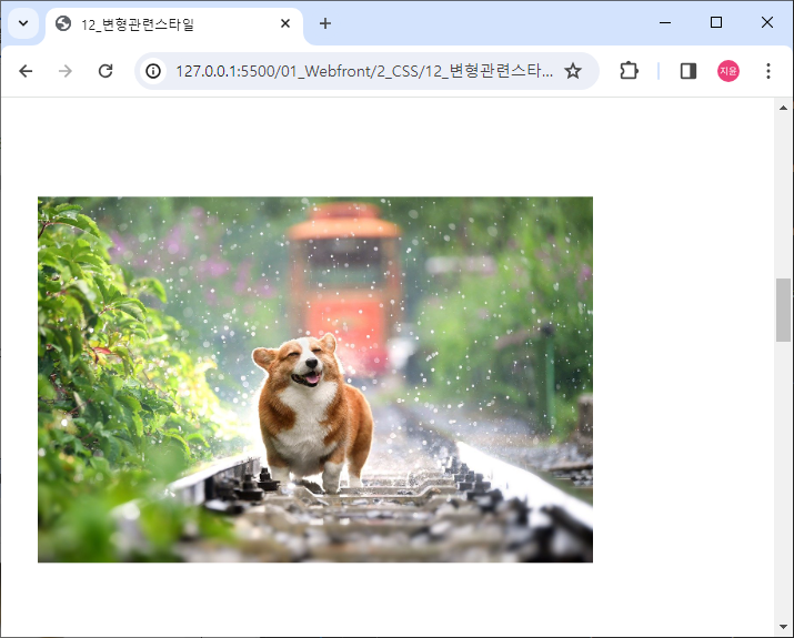
대각선 확대 축소
html code
<img src="../images/dogs/dog1.jpg" class="trans-scale-2d">css code
.trans-scale-2d:hover {
    transform: scale(2, 2);
    margin: 150px 150px;
}
요소 회전
html code
<img src="../images/dogs/dog2.jpg" class="trans-rotate">css code
.trans-rotate:hover {
    transform: rotate(180deg);
}
3차원 변형
x, y, z축 이동
perspective(z축 길이) : 원근법 적용
html code
<img src="../images/dogs/dog3.jpg" class="trans-3d">css code
.trans-3d:hover {
    transform: perspective(300px) translate3d(50px, 50px, 100px);
}
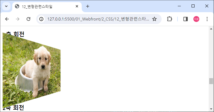
x축 회전
html code
<img src="../images/dogs/dog4.jpg" class="trans-rotate-x-3d">css code
.trans-rotate-x-3d{
    transform: perspective(300px) rotateX(45deg);
}
사진이 뒤로 누움
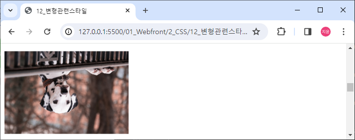
y축 회전
html code
<img src="../images/dogs/dog5.jpg" class="trans-rotate-y-3d">css code
.trans-rotate-y-3d{
    transform: perspective(300px) rotateY(45deg);
}
사진이 y축 기준 오른쪽은 뒤로 왼쪽은 앞으로 돌아감
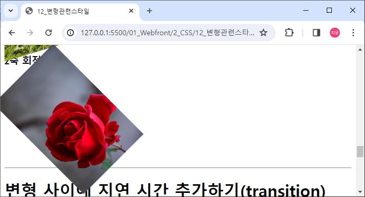
z축 회전
html code
<img src="../images/flowers/flower1.jpg" class="trans-rotate-z-3d">css code
.trans-rotate-z-3d:hover{
    transform: perspective(300px) rotateZ(45deg);
}
변형 사이에 지연 시간 추가하기(transition)
html code
<div class="box test1"></div>css code
.box {
    width: 150px;
    height: 150px;
    background-color: red;
    border: 1px solid black;
}

.test1:hover {
    background-color: yellow;
    transition-duration: 1s;
}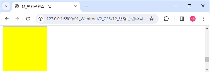
빨간색이 1초에 걸쳐 노란색으로 변함
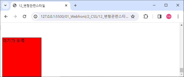
html code
<div class="box test2">여기가 위쪽</div>css code
.test2:hover {
    background-color: skyblue;
    transform: rotate(360deg);
    border-radius: 50%;
}

.test2 {
    transition-duration: 3s;
    /* 들어올 때 나갈 때 둘 다 됨 */
    /* :hover 안에 넣으면 나갈 때 안됨 */
}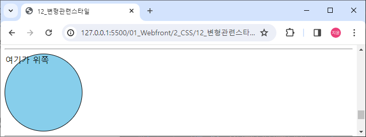
border-radius : 테두리 모서리 곡률 속성
:hover에 duration 속성을 주면 마우스를 올렸을 때만 적용됨 마우스 내리면 바로 원래 상태로 돌아옴
따로 속성 적용하면 돌아올 때도 적용됨
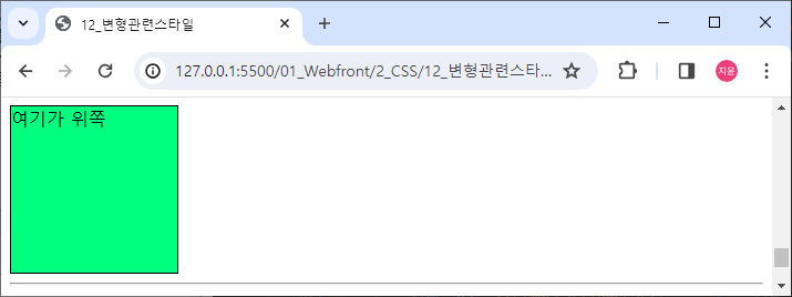
스타일 변형 진행 속도 조정
ease(기본값)
ease-in : 점점 빨라짐
ease-out : 점점 느려짐
ease-in-out : 중간에 속도가 가장 느림
linear : 등속(같은 속도)
html code
<div class="box test3">여기가 위쪽</div>css code
.test3 {
    transition-duration: 5s;
    transition-timing-function: ease-in-out;
}

.test3:hover {
    background-color: springgreen;
    transform: rotate(720deg);
}
스타일 변형 딜레이(일정 시간 후 변형)
html code
<div class="box test4">여기가 위쪽</div>css code
.test4:hover {
    transform: translateY(100px);
}

.test4 {
    transition-delay: 2s;
}
마우스 올리면 2초 후 이동
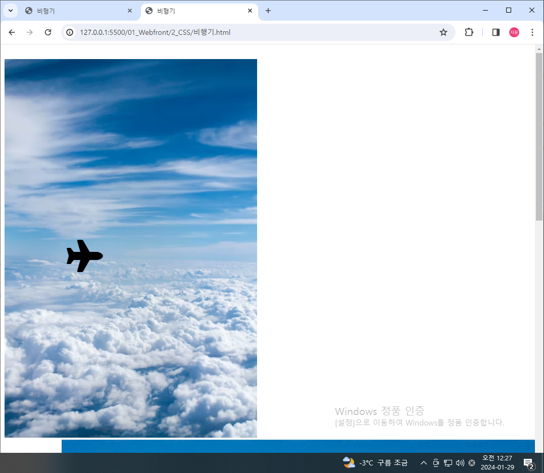
수업을 듣다가 재밌는 생각이 들어서 혼자 만들어봄
하늘을 나는 비행기
html code
<head>
	<script src="https://kit.fontawesome.com/3dd1cd3301.js" crossorigin="anonymous"></script>
</head>

<body>
	<div>
		<section class="airplane">
			<i class="fa-solid fa-plane"></i>
        </section>

        <section class="sky">
            <img src="https://images.unsplash.com/photo-1513002749550-c59d786b8e6c?w=500&auto=format&fit=crop&q=60&ixlib=rb-4.0.3&ixid=M3wxMjA3fDB8MHxzZWFyY2h8M3x8c2t5fGVufDB8fDB8fHww">
        </section>
    </div>
</body>
css code
.airplane i {
    transition-duration: 5s;
}

.airplane i:hover {
    transform: translate(150px, 400px) scale(4) rotate(720deg);
}
icon 가져오는 법
head 태그 안에 script 복사 붙여넣기
icon 복사해오기
img도 복사해서 붙여넣고 마우스 올리면 움직이게 설정
소 무리에 합류하기
html code
<div>
<section class="cow">
<section > </section>
<section>
<i class="fa-solid fa-cow"></i>
</section>
</section>
<section>
<img src="https://plus.unsplash.com/premium_photo-1664304423623-4f9d5ed90b4f?q=80&w=1168&auto=format&fit=crop&ixlib=rb-4.0.3&ixid=M3wxMjA3fDB8MHxwaG90by1wYWdlfHx8fGVufDB8fHx8fA%3D%3D">
</section>
</div>css code
body div:nth-child(2) {
    display: flex;
}

.cow {
    display: flex;
    flex-direction: column;
}

.cow section:first-child {
    flex-basis: 50%;
}

.cow section:last-child {
    flex-basis: 50%;
    display: flex;
    align-items: center;
}

.cow i {
    font-size: 90px;
    transition-duration: 10s;
}

.cow i:hover {
    transform: translateX(600px);
}
만들다보니 생각보다 신경 써야할 게 많았음
아이콘과 그림이 위 아래로 배치되는 걸 바꾸고
소 위치를 다른 무리에 맞춰서 움직여야했음
음식 접시에 담기
html code
<div class="third">
	<section class="dish">
		<img src="https://plus.unsplash.com/premium_photo-1681412205520-49c7f9b8b67f?q=80&w=1974&auto=format&fit=crop&ixlib=rb-4.0.3&ixid=M3wxMjA3fDB8MHxwaG90by1wYWdlfHx8fGVufDB8fHx8fA%3D%3D">
	</section>

	<section class="food">
		<br>
		<br>
		<i class="fa-solid fa-burger"></i>
		<br>
		<i class="fa-solid fa-hotdog"></i>
	</section>
</div>
css code
.third {
    display: flex;
}

.dish > img {
    height: 1000px;
    width: auto;
}

.food {
    display: flex;
    flex-direction: column;
    justify-content: center;
    font-size: 100px;
}

.food i {
    transition-duration: 0.5s;
}

.food i:first-of-type:hover {
    transform: translateX(-300px);
}

.food i:last-of-type:hover {
    transform: translateX(-500px);
}
하나 하나 따로 따로 움직여야함