
Storybook 이란?
- UI 구성 요소와 페이지를 별도로 구축하기 위한 오픈 소스 도구로, UI개발, 테스트 및 문서화를 간소화 시켜줌
- 정해진 스타일 가이드가 있다면, 디자인팀과의 협업에서 스토리북을 이용해 소통하고 수정사항등을 빠르게 체크하고, Mock 데이터를 이용해 실제 보여질 디자인을 빠르게 확인할 수 있음
Storybook 설치
npx -p @storybook/cli sb init --type react_scripts

Or

npx sb init
npx -p 옵션: 패키지 선택- 위의 명렁는 @storybook/cli 패키지의 명령어 sb init을 실행함 => 스토리북 세팅을 자동으로 진행해줌
sb init --type 옵션: 프로젝트 타입을 설정해주는 옵션으로, CRA로 만들어진 프로젝트의 프로젝트 타입인 react_scripts 입력- 세팅이 완료되면 샘플 폴더로 stories라는 폴더안에 몇가지 샘플 코드들이 생성됨. 삭제하고 진행해도 상관없음
- root폴더에 .storybook이라는 설정파일이 생성됨
// .storybook/main.js
module.exports = {
  // story 파일들의 경로를 설정 (main.js의 상대적 경로로 지정)
  "stories": [
    "../src/**/*.stories.mdx",
    "../src/**/*.stories.@(js|jsx|ts|tsx)"
  ],
  // storybook addon(스토리북 제공 기능) 설정 배열
  "addons": [
    "@storybook/addon-links",
    "@storybook/addon-essentials",
    "@storybook/addon-interactions",
    "@storybook/preset-create-react-app"
  ],
  // react를 사용
  "framework": "@storybook/react",
  // webpack 구성설정
  "core": {
    "builder": "webpack5"
  }
}
story 파일 만들기
- Atomic 디자인 패턴을 적용해보기 위해 폴더구조를 다음과 같이 정의함
root
L componets
   L atoms
      L Button
         L index.tsx
         L styles.ts
L Button.stories.tsxindex.tsx: 컴포넌트 정의파일styles.ts: 스타일 정의파일 (styled-components 사용)Button.stories.tsx: Button 스토리 파일
// components/atoms/Button/index.tsx

import React, { FunctionComponent, HTMLProps } from 'react';
import { ButtonLayout, ButtonLayoutProps } from './styles';

export interface ButtonProps
	extends HTMLProps<HTMLButtonElement>,
		ButtonLayoutProps {}

const Button: FunctionComponent<ButtonProps> = ({
	children,
	buttonType,
	isFull,
}) => {
	return (
		<ButtonLayout type="button" buttonType={buttonType} isFull={isFull}>
			{children}
		</ButtonLayout>
	);
};

export default Button;
// components/atoms/Button/styles.ts

import styled, { css } from 'styled-components';

export interface ButtonLayoutProps {
	buttonType: 'primary' | 'ghost' | 'default';
	isFull?: boolean;
}

export const defaultButtonStyles = css`
	background: #e1e1e1;
	color: #4b4b4b;

	&:hover {
		background: #e7e7e7;
	}

	&:active {
		background: #d7d7d7;
	}
`;

export const primaryButtonStyles = css`
	background: #33ccbd;
	color: #fff;

	&:hover {
		background: #6fd0c6;
	}

	&:active {
		background: #0b9688;
	}
`;

export const ghostButtonStyles = css`
	background: transparent;
	color: #33ccbd;
	border: 1px solid #33ccbd;

	&:hover {
		background: #33ccbd;
		color: #fff;
	}

	&:active {
		background: #0b9688;
	}
`;

export const ButtonLayout = styled.button<ButtonLayoutProps>`
	padding: 10px 30px;
	border: none;
	width: ${({ isFull }) => (isFull ? '100%' : 'auto')};
	${({ buttonType }) => {
		switch (buttonType) {
			case 'primary':
				return primaryButtonStyles;
			case 'ghost':
				return ghostButtonStyles;
			case 'default':
				return defaultButtonStyles;
			default:
				return primaryButtonStyles;
		}
	}}
`;

export default {
	ButtonLayout,
};
// components/atoms/Button/Button.stories.tsx
import React from 'react';
import { Story } from '@storybook/react';
import Button, { ButtonProps } from './index';
export default {
title: 'Button',
component: Button,
};
const Template: Story<ButtonProps> = (args) => <Button {...args} />;
export const Default = Template.bind({});
Default.args = {
buttonType: 'default',
isFull: false,
children: '버튼',
};
export const Primary = Template.bind({});
Primary.args = {
buttonType: 'primary',
isFull: false,
children: '버튼',
};
export const Ghost = Template.bind({});
Ghost.args = {
buttonType: 'ghost',
isFull: false,
children: '버튼',
};- export default : 폴더구조를 생성함 (이름과 사용 컴포넌트 등 정의)
- export const 함수명 : 목록에서 보여줄 이름 (args값에 props 주입)
storybook 실행하기
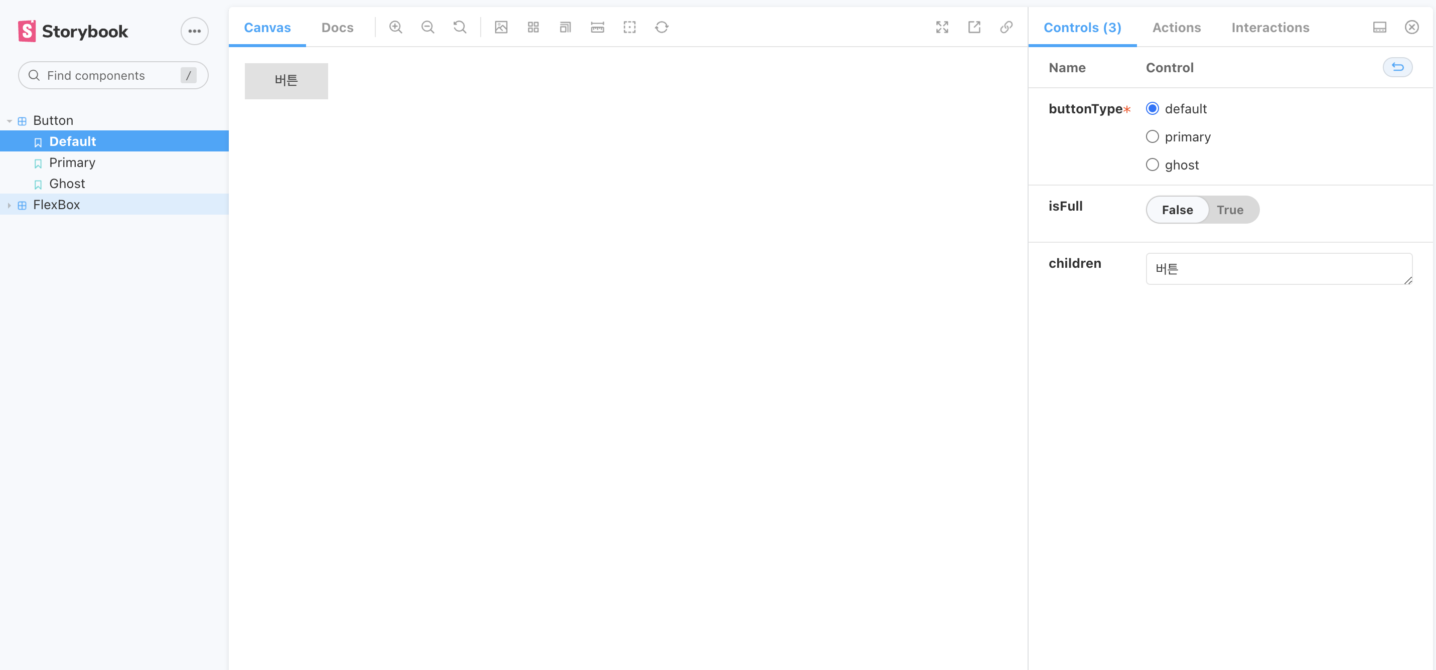
yarn storybook- 위의 명령어를 이용해 스토리북을 실행할 수 있음(기본 6006포트로 프로젝트가 실행됨)
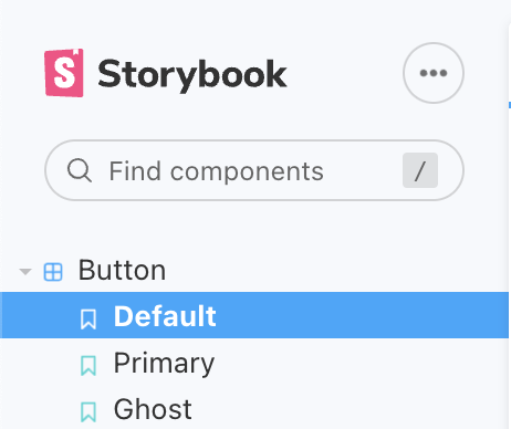
- 위에서 설정한 스토리가 잘 적용되었는지는 좌측 메뉴바를 보면 알 수 있음
- Template라는 스토리 컴포넌트 생성자를 만들어 args 값을 지정해 주게되면 controls 기능이 활성화 됨 (props를 변경해 볼 수 있음, 우측 탭에서 props값 설정 가능)

모든것이 궁금한 신입 프론트 개발자 일지