Flexbox 레이아웃 사용법
html
<div class="flex-container">
  <div class="box"></div>
  <div class="box"></div>
  <div class="box"></div>
</div>
css
.flex-container {
  display : flex;
}
.box {
  width : 100px;
  height : 100px;
  background : grey;
  margin : 5px;
}
박스들을 감싸는 부모 요소에게 display : flex를 사용 그러면은 쉽게 박스들이 가로정렬로 배치
flex 세부속성
.flex-container {
  display : flex;
  justify-content : center;  /* 좌우정렬 */
  align-items : center;  /* 상하정렬 */
  flex-direction : column; /* 세로정렬 */
  flex-wrap : wrap;  /* 폭이 넘치는 요소 wrap 처리 */
}
.box {
  flex-grow : 2;  /* 폭이 상대적으로 몇배인지 결정 */
}
많기 때문에 필요할때마다 찾아서 쓰기
- 박스 좌측 & 우측정렬 동시에 하기
<div class="flex-container">
  <div class="box"></div>
  <div class="box" style="flex-grow : 1"></div>
  <div class="box"></div>
</div>
첫 div는 왼쪽, 마지막 div는 우측정렬을 하고싶을 때 이렇게 쓰면,
가운데 임시 div 하나 만들어주고, flex-grow: 1 이런 식으로 사이즈를 크게 키워주면 된다.
그럼 알아서 나머지 요소들은 좌측 우측으로 퍼집니다.
align-content
display : flex; 이걸 준 요소에 align-content 속성을 줄 수 있는데
이러면 내부에 들어있는 박스들의 상하정렬이 어떻게 될지 조절할 수 있다.
align-content는 박스가 가로로 여러줄일 때 박스들의 상하배치를 조절할 수 있는 속성
- 코딩애플 강의 img
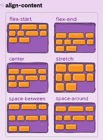
justify-content의 세로버전이라고 생각할 수 있다.
