CSS3 - Position
1. position
- position : 요소의 위치 정의, top, bottom, left, right와 함께 사용하여 위치 지정
1.1 static (기본위치)
- static
- position property의 기본값
- 기본적인 요소 배치 순서 (위->아래, 왼쪽->오른쪽) 에 따라 배치
- 부모 요소 내 자식 요소로서 존재할 때는 부모 요소의 위치를 기준으로 배치
- 이미 설정된 position을 무력화하기 위해 사용
- 좌표 property (top, bottom, left, right)를 사용 X, 사용할 경우 무시됨
<!DOCTYPE html>
<html>
  <head>
    <style>
      body { margin: 0; }
      .parent {
        width: 150px;
        height: 150px;
        background: #bcbcbc;
        border: 1px solid #bcbcbc;
      }
      .static-box {
        position: static;
        background: #2E303D;
        color: #e55c3c;
        font-weight: bold;
        text-align: center;
        line-height: 150px;
      }
    </style>
  </head>
  <body>
    <div class="parent">
      <div class="static-box">static-box</div>
    </div>
  </body>
</html>
1.2 relative (상대위치)
- relative : 기본 위치(static)를 기준으로 좌표 property (top, bottom, left, right)를 사용하여 위치 이동
<!DOCTYPE html>
<html>
  <head>
    <style>
      body { margin: 0; }
      .parent {
        width: 150px;
        height: 150px;
        background: #bcbcbc;
        border: 1px solid #bcbcbc;
      	margin: 50px;
      }
      .relative-box {
        position: relative;
      	top: 50px; left: 50px;
        background: #2E303D;
        color: #e55c3c;
        font-weight: bold;
        text-align: center;
        line-height: 150px;
      }
    </style>
  </head>
  <body>
    <div class="parent">
      <div class="relative-box">relative-box</div>
    </div>
  </body>
</html>- 부모 요소 parent의 weight, height와 자식 요소 relative-box의 weight, height가 동일함
- relative-box 요소에서 좌표 property가 적용된 것만 다르고, 그 이외 property는 static을 지정했을 때와 동일함
- width: 100%;로 parent의 weight와 동일한 값을 가지며, height: auto;이고 line-height: 150px;이므로 parent의 height와 동일한 값을 가짐
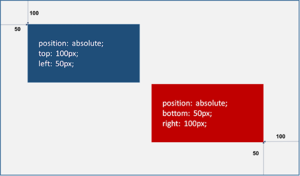
1.3 absolute (절대위치)
- absolute
- 부모 또는 조상 요소 (static 제외) 를 기준으로 좌표 property (top, bottom, left, right) 만큼 이동
- 부모 또는 조상 요소가 static일 경우, document body를 기준으로 하여 좌표 property대로 위치
- 따라서 부모 요소가 relative일 때, 부모 요소를 배치 요소의 기준으로 삼을 수 있음
- 이때 다른 요소가 먼저 위치를 점유하고 있어도 뒤로 밀리지 않고 덮어씀 (부유 특성 또는 부유 객체)
- absolute 선언 시, block 레벨 요소의 width는 inline 요소와 같이 content에 맞게 변화되므로 적절한 width를 지정해야함
<!DOCTYPE html>
<html>
  <head>
    <style>
      body { margin: 0; }
      .parent {
        width: 200px;
        height: 200px;
        background: #bcbcbc;
        border: 1px solid #bcbcbc;
      	margin: 50px 0 0 300px;
      	position: relative;
      }

      .absolute-box {
        position: absolute;
      	height: 200px; width: 200px;
      	top: 50px; left: 50px;
        background: #2E303D;
        color: #e55c3c;
        font-weight: bold;
        text-align: center;
        line-height: 200px;
      }
    </style>
  </head>
  <body>
    <div class="parent">
      <div class="absolute-box">absolute-box (in parent)</div>
    </div>
    <div class="absolute-box">absolute-box (no parent)</div>
  </body>
</html>-
relative 와 absolute 차이점
-
relative : 기본 위치(static으로 지정했을 때의 위치)를 기준으로 좌표 property를 사용하여 이동, 따라서 무조건 부모 요소를 기준으로 위치
-
absolute : 부모에 static 이외의 position property가 지정되었을 때만 부모 요소를 기준으로 위치, 부모와 조상 모두 static property인 경우, document body를 기준으로 위치
-
<!DOCTYPE html>
<html>
  <head>
    <style>
      body { margin: 0; }
      .parent {
        width: 150px;
        height: 150px;
        background: #bcbcbc;
        border: 1px solid #bcbcbc;
      	margin: 50px;
      	float: left;
      }
      .relative-box {
        position: relative;
      	top: 10px; left: 10px;
      	width: 150px; height: 150px;
        background: #2E303D;
        color: #e55c3c;
        font-weight: bold;
        text-align: center;
        line-height: 150px;
      }
      .absolute-box {
        position: absolute;
      	top: 10px; left: 10px;
      	width: 150px; height: 150px;
        background: #2E303D;
        color: #e55c3c;
        font-weight: bold;
        text-align: center;
        line-height: 150px;
      }
    </style>
  </head>
  <body>
    <div class="parent">
      <div class="absolute-box">absolute-box</div>
    </div>
    <div class="parent">
      <div class="relative-box">relative-box</div>
    </div>
  </body>
</html>
1.4 fixed (고정위치)
- fixed
- 부모 요소와 관계없이 브라우저의 viewpoint를 기준을 좌표 property(top, bottom, left, right)을 사용하여 이동
- 스크롤이 되더라도 화면에서 사라지지 않고 항상 같은 곳에 위치
- fixed 선언 시, block 요소의 width는 inline 요소와 같이 content에 맞춰 변화되므로 적절한 width를 지정해야함
<!DOCTYPE html>
<html>
  <head>
    <style>
      body { margin: 0; }
      .fixed-box {
        position: fixed;
        color: #e55c3c;
        font-weight: bold;
        text-align: center;
        background: #2E303D;
      }
      .sidebar {
        width: 50px;
        height: 100%;
        top: 0;
        right: 0;
        padding-top: 100px;
      }
      .footer {
      width: 200px;
      width: 100%;
      height: 50px;
      bottom: 0;
      left: 0;
      line-height: 50px;
      }
    </style>
  </head>
  <body>
    <div class="fixed-box sidebar">fixed-box (sidebar)</div>
    <div class="fixed-box footer">fixed-box (footer)</div>
  </body>
</html>
2. z-index
- z-index : 큰 숫자값을 지정할수록 화면 전면에 출력함, position property가 static 이외인 요소만 적용
<!DOCTYPE html>
<html>
  <head>
    <style>
      .normal-box {
      	width: 100px; height: 100px;
      }
      .absolute-box {
      	width: 100px; height: 100px;
      	position: absolute;
      }
      /* z-index property는 static 이외인 요소에만 적용 */

      .orange {
        background-color: orange;
        z-index: 1000;
      }
      .red {
        background-color: red;
      	left: 50px; top: 50px;
        z-index: 100;
      }
      .green {
      	background-color: green;
      	left: 100px; top: 100px;
        z-index: 10;
      }
      .blue {
        background-color: blue;
      	left: 150px; top: 150px;
        z-index: 1;
      }
    </style>
  </head>
  <body>
    <div class="normal-box orange"></div>
    <div class="absolute-box red"></div>
    <div class="absolute-box green"></div>
    <div class="absolute-box blue"></div>
  </body>
</html>
3. overflow
- overflow : 자식 요소가 부모 요소의 영역을 벗어났을 때 처리 방법을 정의
| property 값 | description |
|---|---|
| visible | 영역을 벗어난 부분을 표시 (기본값) |
| hidden | 영역을 벗어난 부분을 잘라내어 보이지 않게 함 |
| scroll | 영역을 벗어난 부분이 없어도 스크롤 표시 (auto와 동일하게 동작) |
| auto | 영역을 벗어난 부분이 있을 때만 스크롤 표시 |
<!DOCTYPE html>
<html>
  <head>
    <style>
      div {
        width: 150px;
        height: 150px;
        padding: 10px;
        margin: 30px;
        font-size: 1.2em;
        border-radius: 6px;
        border-color: gray;
        border-style: dotted;
        float: left;
      }
      .visible { overflow: visible; }
      .hidden { overflow: hidden; }
      .scroll { overflow: scroll; }
      .auto { overflow: auto; }
    </style>
  </head>
  <body>
    <h1>overflow</h1>
    <div class="visible"><h3>visible</h3>The CSS overflow property controls what happens to content that is too big to fit into an area.</div>
    <div class="hidden"><h3>hidden</h3>The CSS overflow property controls what happens to content that is too big to fit into an area.</div>
    <div class="scroll"><h3>scroll</h3>The CSS overflow property controls what happens to content that is too big to fit into an area.</div>
    <div class="auto"><h3>auto</h3>The CSS overflow property controls what happens to content that is too big to fit into an area.</div>
  </body>
</html>