내가 보려고 만든 CSS 정리(두서없음)
Rem vs em
rem은 1 rem = 16
em은 부모의 기준
inline(in the same line) - inline은 width와 height가 없다. (Display:inline)
block(box) - 높이, 너비 있다. 그리고 margin, padding, border을 가진다.(display: block)
- User agent stylesheet: 윈도우에서 기본적으로 부여한 CSS 스타일시트를 기본으로 줬다
margin: border경계의 바깥에 있는 공간이다.
margin-top: 20px; margins-left:10px;이런식으로도 사용가능
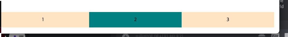
- collasping margins (상하에서만 발생함) (노마드 3.5강 참고)
위와 같이 흰 box의 경계가 보라색 box의 경계와 같을때이고 이때 두 box의 margins은 하나가 된다.
body안에 div의 위 아래 마진이 body의 마진과 만나면 둘 중 큰 값의 마진으로 body에 적용이된다.(흰 box의 경계가 보라색 box의 경계와 같다면 이 두 margin은 하나로 취급이 된다. 경계가 만나면 하나가 된다.)
span(inline)
- span은 마진을 좌우만 가질 수 있다.
- 패딩은 사방 모두 가질 수 있다.
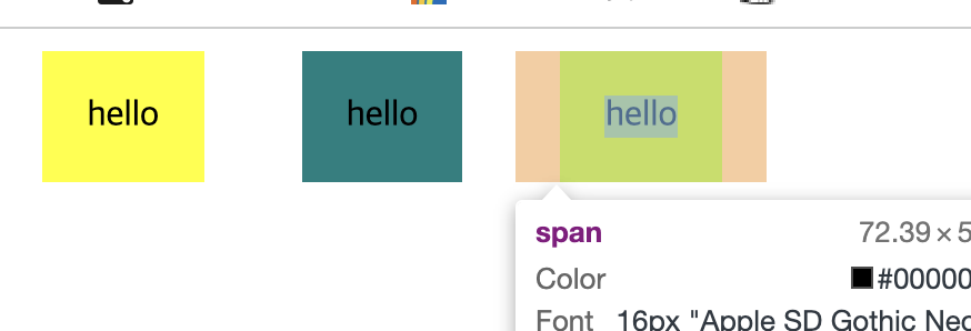
<style>
 /* span은 마진을 좌우만 가질 수 있다. */
 /* 패딩은 사방 모두 가질 수 있다. */
   body{
       margin:30px;
  }
   span {
       padding: 20px;
       background-color: yellow;
       margin: 20px;

   }
   .tomato {
       background-color: teal;
   }
</style>
display: block -> inline로 놓기
display:inline-block은 block이 inline속성을 가지게주는것이다.
즉, 옆에 둘수도있고, width와 height를 가질 수있다. display:inline을 하면 아무것도 뜨지 않음(왜냐햐면 inline은 width와 heigth가 없기 때문)
단점: 옆자리에 작은 틈이있고 반응형이 아니다. => 해결책 display:flex
<style>

    body{
        margin:30px;
   }
    div {

        display: inline-block;
        width:50px;
        height:50px;
        background-color: bisque;
        text-align: center;

    }
    .tomato {
        background-color: teal;
    }
</style>

<body>
  <div>hello</div>
  <div class='tomato'>hello</div>
  <div>hello</div>
  <div class='tomato'>hello</div>
  <div>hello</div>
</body>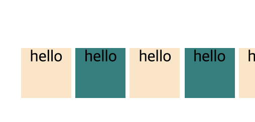
display:flex (부모박스에서만 이이야기해야한다.)(반응형)
    body{
        height:1000vh (vh: 화면 크기에 따라 변한다. text-aligns 사용하려면 꼭 적용해주자)
        margin:30px;
        display: flex;
        (주축)justify-content: center, flex-end, flex-start, space-evenly, space-around, space-between
        (교차축-기본적으로 수직)align-items: center, flex-end, flex-start, stretch(div크기가 고정된 경우는 적용불가)  body에 height를 적용해줘야 align-items가 가능하다.
        justify-content, align-items를 이용해주고싶다면.. display:flex를 먼저 써야 나머지 속성 사용이 가능하다.
    }
     div {
    width:50px;
    height:50px;
    background-color: bisque;


    }
    .tomato {
        background-color: teal;
    }
</style>

<body>
  <div></div>
  <div class='tomato'></div>
  <div></div>
  <div class='tomato'></div>
</body> 
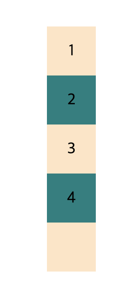
<style>

    body {
        height:1000vh;
        display:flex;
        flex-direction:column;
        /* (디폴트 옵션이 수직)display:flex를 했을떄 flex-direction:row(수평)가 디폴트 옵션이다.*/
        justify-content: center;
        align-items: center;
    }
    div {
        /* display:flex; */
        /* justify-content:center; */
        /* align-items:center; */
        width:50px;
        height:50px;
        background-color: bisque;
    }
    .tomato {
        background-color: teal;
    }
</style>

<body>
  <div>1</div>
  <div class='tomato'>2</div>
  <div>3</div>
  <div class='tomato'>4</div>

</body>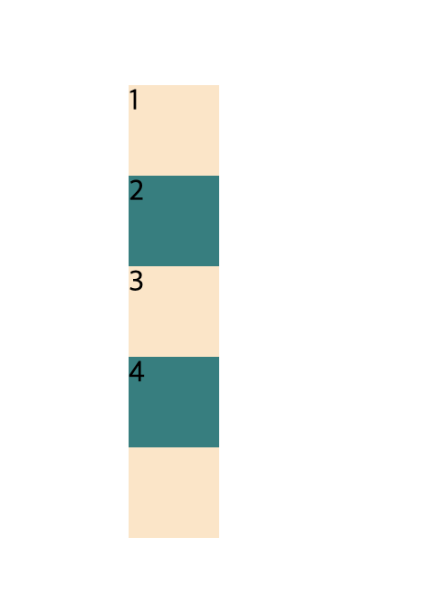
위에 코드에서 div처리 해제 => text부분도 적용가능하다.(text의 부모는 현재 해당하는 태그라고 생각하자)
flex-wrap: nowrap;
flex-wrap: wrap;
flex-direction:row-reverse;

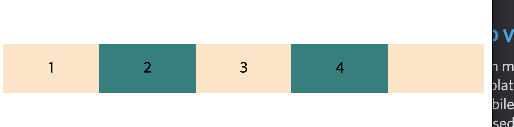
<style>

    body {
        height:1000vh;
        display:flex;
        /* flex-direction:column;  */
       /*  (디폴트 옵션이 수직)display:flex를 했을떄 flex-direction:row(수평)가 디폴트 옵션이다. */
        justify-content: center;
        align-items: center;
        /*flex-wrap: nowrap;
        /* 이게 디폴트값이라 사용안해줘도 되지만..이게 뭐냐면 아래 div에 width:300이라도 브라우저의 사이즈에따라 사이즈가 변할 수 있다는걸 의미한다. 즉 이걸하면 flexbox는 width를 단지 초기값으로만 여긴다는 의미*/
        flex-wrap: wrap; /*wrap-reverse도 있음*/
        /* 초기 width를 계속해서 반영한다. 브라우저가 작아지면 한 줄에 들어가는만큼 최대한 집어넣고 안되면 다음줄로 옮긴다.*/
        flex-direction:row-reverse;
        /*123 이순서가 321로 바뀐다 column-reverse도있음*/
    }
    div {
        display:flex;
        justify-content:center;
        align-items:center;
        width:300px;
        height:50px;
        background-color: bisque;
    }
    .tomato {
        background-color: teal;
    }
</style>

<body>
  <div>1</div>
  <div class='tomato'>2</div>
  <div>3</div>
  <div class='tomato'>4</div>

</body>
의미없는 삽질은 없다1