요소의 위치 지정 방법의 유형(기준)을 설정
position 속성 값
static
- default value
- 유형이 없음. 배치 불가능
relative
- 요소 자신을 기준으로 배치
- 자신의 원래 위치를 기준으로 배치하는 것이기 때문에 형제 요소들에게 영향을 주거나 받을 수 있다.
absolute
- 위치 상 부모 요소를 기준으로 배치
absolute와 fixed position을 주면 display가 inline-block으로 변한다. relative는 원래 display 속성을 유지
fixed
- 브라우저(=viewport)를 기준으로 배치
- 스크롤 했을 때도 고정되어있게 해줌.
sticky
- 스크롤 영역을 기준으로 배치 (스크롤되는 영역 전체의 어딘가에 요소를 붙여서 사용하겠다~..)
- top, bottom, left, right 값이 한개 이상 존재해야한다.
- sticky가 부여되어 있는 특정한 요소의 부모 요소 밖으로 벗어날 수 없다.
- IE 지원 x
position과 같이 사용되는 속성
top
- 요소의 position 기준에 맞는 '위쪽'에서의 거리를 설정
- 단위가 %일 경우 부모(위치 상의 부모(조상)) 요소의 세로 너비의 비율로 지정, 음수 값 허용
위치 상의 부모: HTML 구조와는 상관 없음. position 값이 부여되어 있는 요소가 위치 상의 부모가 됨.
bottom
- 요소의 position 기준에 맞는 '아래쪽'에서의 거리를 설정
- 단위가 %일 경우 부모(위치 상의 부모(조상)) 요소의 세로 너비의 비율로 지정, 음수 값 허용
left
- 요소의 position 기준에 맞는 '왼쪽'에서의 거리를 설정
- 단위가 %일 경우 부모(위치 상의 부모(조상)) 요소의 가로 너비의 비율로 지정, 음수 값 허용
right
- 요소의 position 기준에 맞는 '오른쪽'에서의 거리를 설정
- 단위가 %일 경우 부모(위치 상의 부모(조상)) 요소의 가로 너비의 비율로 지정, 음수 값 허용
예제
기본 1
- html
<div class="parent">
  <div class="child"></div>
</div>- css
.parent {
width: 400px;
height: 300px;
border: 4px dashed lightgray;
position: relative;
}
.child {
width: 150px;
height: 100px;
background: tomato;
border: 4px dashed red;
border-radius: 10px;
/* 부모 요소를 기준으로 배치되기 시작 -> 부모도 배치 기준을 설정해줘야한다. position: relative; */
position: absolute;
/* 위에서 50px, 왼쪽에서 100px 지점에 배치 */
top: 50px;
left: 100px;
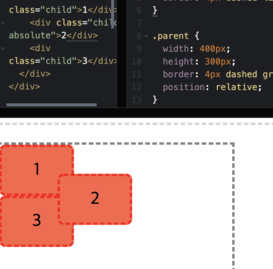
}기본 2(relative)
- html
<div class="box">1</div>
<div class="box relative">2</div>
<div class="box">3</div>- css
.box {
  width: 100px;
  height: 100px;
  background: tomato;
  border: 4px dashed red;
  border-radius: 10px;
  display: flex;
  justify-content: center;
  align-items: center;
  font-size: 30px;
}

.relative {
  /* 자기자신을 기준으로 배치할것 (만약에 부모가 있었다고 가정하면 부모 position 값 설정할 필요 없음.)
  relative는 자기자신을 기준으로 배치하니까 형제 요소에게 영향을 주고 받음.
  -> 조심해서 사용해야함. (배치할 때는 absolute, fixed 순으로 추천)
  */
  position: relative;
  bottom: 40px;
  left: 160px;

}
기본 3(absolute)
- html
<div class="grand-parent">
  <div class="parent">
    <div class="child">1</div>
    <div class="child absolute">2</div>
    <div class="child">3</div>
  </div>
</div>- css
.grand-parent {
  width: 400px;
  height: 300px;
  padding: 30px 100px 100px 30px;
  border: 4px dashed lightgray;
}

.parent {
  width: 400px;
  height: 300px;
  border: 4px dashed gray;
}

.child {
  width: 120px;
  height: 80px;
  background: tomato;
  border: 4px dashed red;
  font-size: 30px;
  display: flex;
  justify-content: center;
  border-radius: 10px;
  align-items: center;
}

.absolute {
  /* 부모 요소를 기준으로 배치될 준비를 한 상태 -> 1, 2, 3 사이의 상관관계 무시 */
  position: absolute;
  top: 50px;
  left: 100px;
}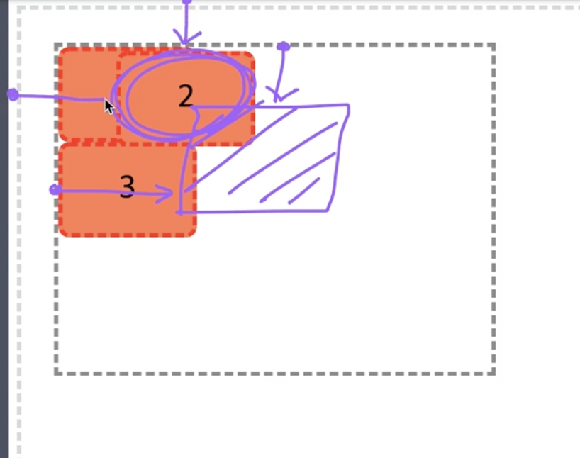
원래 보라색 박스에 2번 박스가 오도록 의도 했다. -> 2번 박스의 위치 상의 부모를 회색 테두리 박스로 바꿔줘야함. -> position 값을 회테박에 추가해주면 된다. 이때 position 값은 아무거나 ㄱㅊ
parent에 position 값 추가해서 의도했던 곳에 2번 박스가 오게됨.
absolute를 사용할 때는 구조상 부모(조상도 가능)에 자신이 기준으로 삼고 싶은 요소(위치 상의 부모)의 position 값이 부여되어 있어야 한다. BUT static은 기준 값을 설정하지 않기 때문에 사용해도 적용 안됨.
만약 구조상의 부모에 어떤 position 값도 없다면 body -> html -> viewport까지 타고 올라가게되고 absolute는 뷰포트를 기준으로 배치됨.
기본 4(sticky)
- html
<div class="section">
  <h1>Title 1</h1>
</div>
<div class="section">
  <h1>Title 2</h1>
</div>
<div class="section">
  <h1>Title 3</h1>
</div>
<div class="section">
  <h1>Title 4</h1>
</div>
<div class="section">
  <h1>Title 5</h1>
</div>
<div class="section">
  <h1>Title 6</h1>
</div>
<div class="section">
  <h1>Title 7</h1>
</div>
<div class="section">
  <h1>Title 8</h1>
</div>- css
.section {
  height: 200px;
  border: 4px dashed lightgray;
}

.section h1 {
  text-align: center;
  line-height: 2;
  font-size: 24px;
  font-weight: bold;
  /* sticky가 부여되어 있는 요소의 부모요소 밖으로는 벗어날 수 없다. */
  position: sticky;
  top: 0;
}- html
<div class="container">
    <div class="section">
    <h1>Title 1</h1>
  </div>
  <div class="section">
    <h1>Title 2</h1>
  </div>
  <div class="section">
    <h1>Title 3</h1>
  </div>
  <div class="section">
    <h1>Title 4</h1>
  </div>
  <div class="section">
    <h1>Title 5</h1>
  </div>
  <div class="section">
    <h1>Title 6</h1>
  </div>
  <div class="section">
    <h1>Title 7</h1>
  </div>
  <div class="section">
    <h1>Title 8</h1>
  </div>
</div>- css
.container {
  width: 400px;
  height: 400px;
  border: 4px solid red;
  overflow: auto;
  margin: 50px;
}
.section {
  height: 200px;
  border: 4px dashed lightgray;
}

.section h1 {
  text-align: center;
  line-height: 2;
  font-size: 24px;
  font-weight: bold;
  /* sticky가 부여되어 있는 요소의 부모요소 밖으로는 벗어날 수 없다. */
  position: sticky;
  top: 0;
}
요소 쌓임 순서(Stack order)
요소가 쌓이는 순서를 통해 어떤 요소가 사용자와 가깝게 있는지를 결정(z축)
static을 제외한position속성의 값이 있을 경우 가장 위에 쌓임. (값은 무관)position이 모두 존재한다면z-index속성의 숫자 값이 높을수록 위에 쌓임.position속성의 값이 있고,z-index속성의 숫자 값이 같다면 'HTML'의 마지막 코드일수록 위에 쌓임(나중에 작성한 코드)
position > z-index > HTML 마지막 코드
z-index는position이 없으면 효력이 없음.
- html
<div class="box-group">
  <div class="box box1">1</div>
  <div class="box box2">2</div>
  <div class="box box3">3</div>
  <div class="box box4">4</div>
  <div class="box box5">5</div>
</div>- css
.box-group {
  display: flex;
}

.box-group .box {
  width: 100px;
  height: 100px;
  background: tomato;
  border: 4px dashed red;
  border-radius: 10px;
  font-size: 30px;
  display: flex;
  justify-content: center;
  align-items: center;
  margin-right: -30px;
  box-shadow: 0 0 10px rgba(255, 0, 0.7);
}

.box-group .box:nth-child(2n) {
  margin-top: 30px;

}

.box1 {

}

.box2 {

}

.box3 {
  position: relative;
  z-index: 1;
}

.box4 {
  position: relative;
}

.box5 {
  position: relative;
}
display 수정
absolute, fixed 속성 값이 적용된 요소는 display 속성의 값이 대부분 block으로 수정됨.