flex container
flex item을 감싸고 있는 컨테이너
- ✨ 적용할 수 있는 속성들
displayflex-flowflex-directionflex-wrapjustify-contentalign-contentalign-items
1. display 속성
flex container의 화면 출력(보여짐) 특성
flex: 블록 요소와 같이 flex container 정의inline-flex: 인라인 요소와 같이 flex container 정의
2. flex-direction 속성
수평 정렬을 할지 수직 정렬을 할지 주 축을 설정
- 수평
row: 행 축 (좌 → 우) ✨(기본값)row-reverse: 행 축 (우 → 좌)
- 수직
column: 열 축 (위 → 아래)column-reverse: 열 축 (아래 → 위)
3. flex-wrap 속성
flex item의 묶음(줄 바꿈) 여부
nowrap: 묶음(줄 바꿈) 없음 ✨(기본값)wrap: 여러 줄로 묶음wrap-reverse: wrap의 반대 방향으로 묶음
flex container에 아무것도 설정되어 있지 않으면 한 줄에서 다 표현하려고 시도하다보니 지정해놓은 너비만큼 적용되지 않고 flex item 요소들이 찌그러진다.
flex-wrap 속성을 wrap으로 해주면 한 줄에 표현할 수 있는 아이템들만 나열하고 다음줄로 넘어가면서 찌그러지지 않게 된다.
3. jusify-content 속성
주축의 정렬 방법
flex-star: flex items를 시작점으로 정렬flex-end: flex items를 끝점으로 정렬center: flex items를 가운데 정렬space-between: 각 flex items 사이를 균등하게 정렬space-around: 각 flex items 외부 여백을 균등하게 정렬
4. align-content 속성
교차축의 여러 줄 정렬 방법
stretch: flex items를 시작점으로 정렬 ✨(기본값)flex-star: flex items를 시작점으로 정렬flex-end: flex items를 끝점으로 정렬center: flex items를 가운데 정렬space-between: 각 flex items 사이를 균등하게 정렬space-around: 각 flex items 외부 여백을 균등하게 정렬
💥 조건
- item들이 한 줄이 아닌 두 줄 이상이어야 함
- 정렬이 가능한 여백이 있어야 함
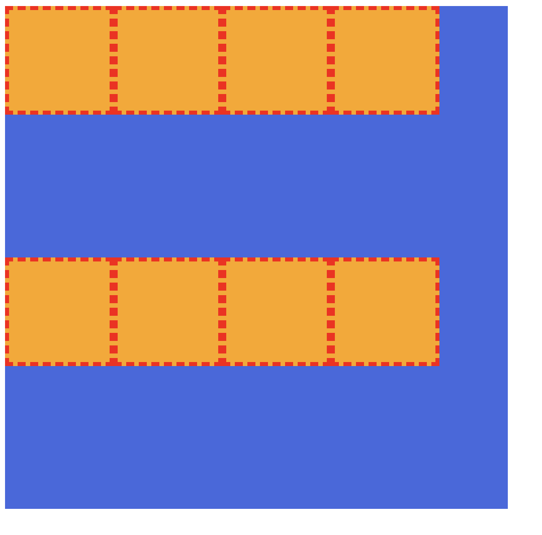
1) stretch
위 두 가지 조건에 맞는 코드를 작성해보았다.
flex-wrap: wrap;을 적용하여 여러 줄인 상태로 만들어주고 flex item들의 높이를 지정하여 여백이 있도록 만들어주었다.
<div class="container">
  <div class="item"></div>
  <div class="item"></div>
  <div class="item"></div>
  <div class="item"></div>
  <div class="item"></div>
  <div class="item"></div>
  <div class="item"></div>
  <div class="item"></div>
</div>
.container {
width: 500px;
height: 500px;
background-color: royalblue;
display: flex;
flex-wrap: wrap;
}
.item {
border: 4px dashed red;
width: 100px;
height: 100px;
background-color: orange;
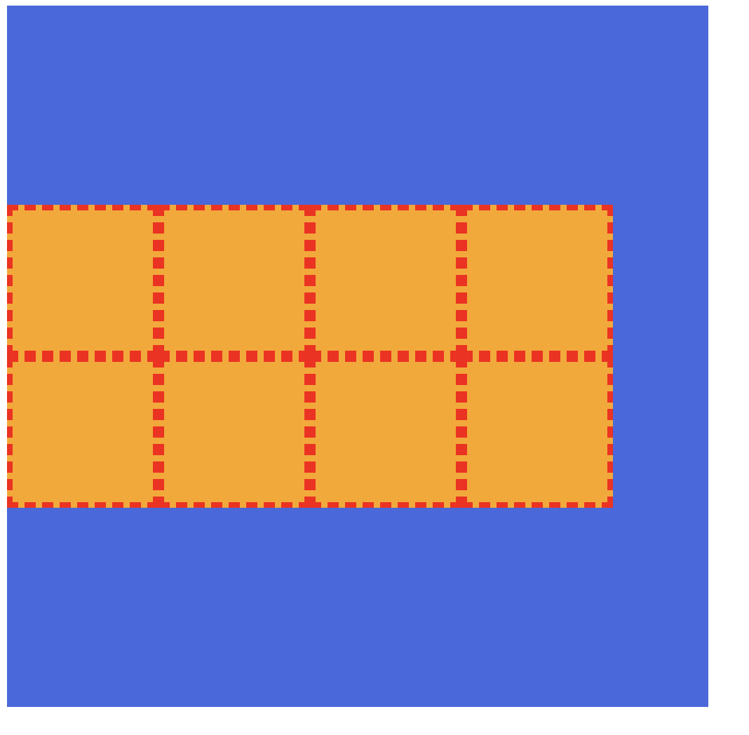
}화면에 나타나있는 두 줄이 한 줄 바로 아래에 다른 한 줄이 위치하지 않고 빈공간을 가지며 절반씩 차지하고 있는 이유는 현재 상태가 align-content이 기본값인 stretch이므로 수직축이 늘어날 수 있을만큼 늘어나게 된다.
(파란색 박스인 flex container 내부에는 두 줄이 만들어지고 수직축으로 늘어날 수 있을만큼 늘어남)
그런데 여기서는 item들의 높이 값을 지정해주었으므로 아이템의 높이 자체는 줄어들게 되어 빈 공간이 생기게 된다.
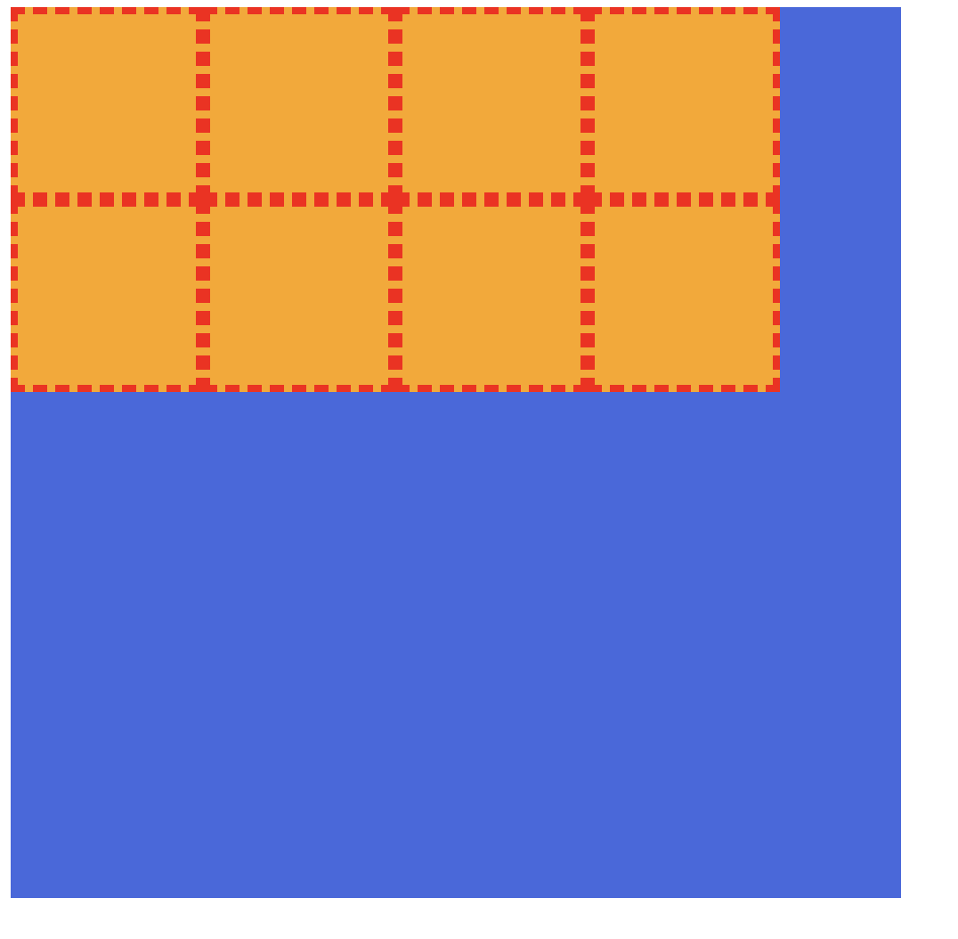
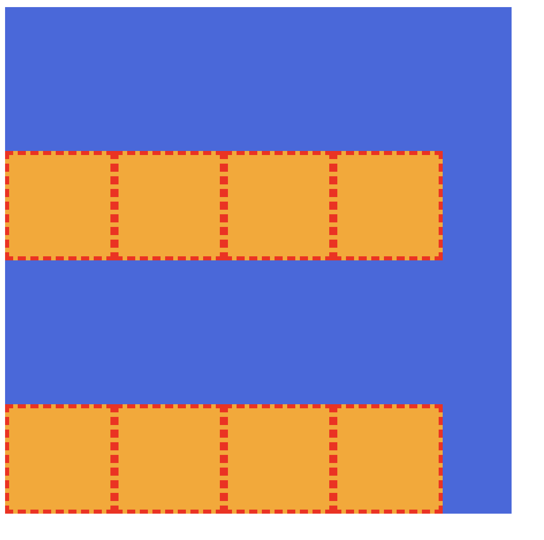
2) flex-start
container에 align-content: flex-start; 를 적용해보자.
.container {
  width: 500px;
  height: 500px;
  background-color: royalblue;
  display: flex;
  flex-wrap: wrap;
  align-content: flex-start;
}
여러 줄이 하나로 묶여서 수직축의 시작점으로 정렬되는 것을 볼 수 있다.
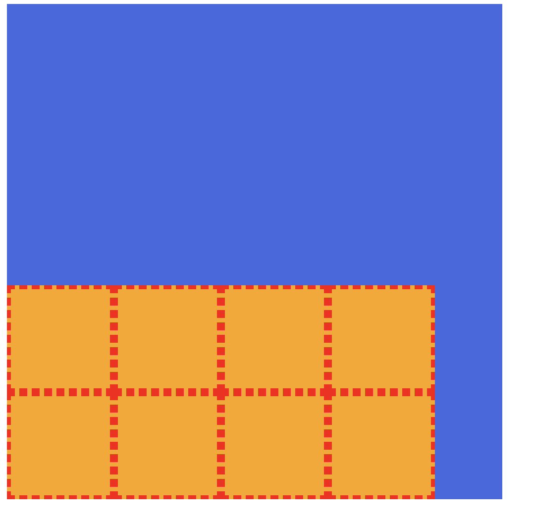
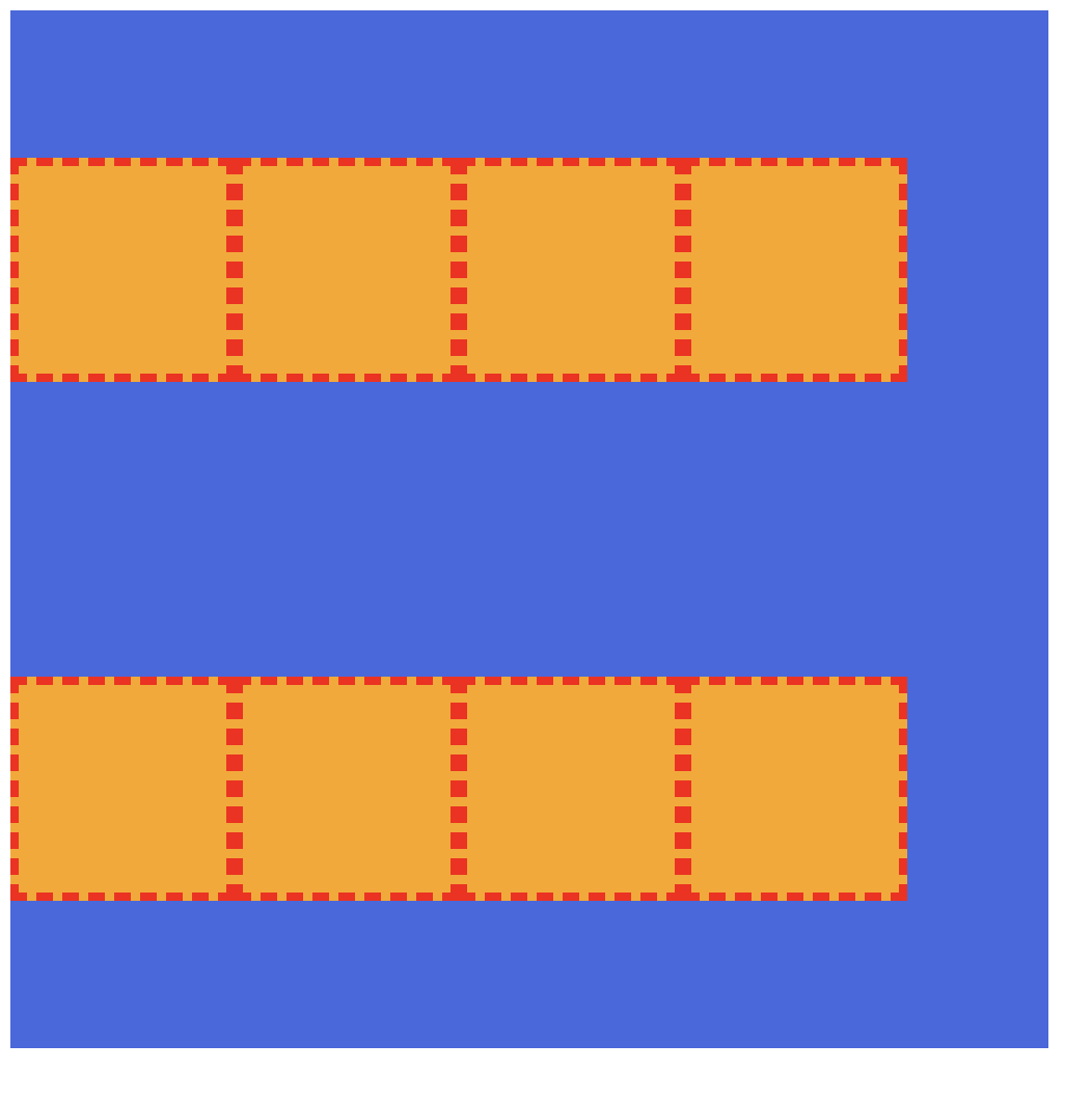
3) flex-end
container에 align-content: flex-end; 를 적용해보자.
.container {
  width: 500px;
  height: 500px;
  background-color: royalblue;
  display: flex;
  flex-wrap: wrap;
  align-content: flex-end;
}
여러 줄이 하나로 묶여서 수직축의 끝점으로 정렬되는 것을 볼 수 있다.
4) center
container에 align-content: center; 를 적용해보자.
.container {
  width: 500px;
  height: 500px;
  background-color: royalblue;
  display: flex;
  flex-wrap: wrap;
  align-content: center;
}
여러 줄이 하나로 묶여서 수직축의 가운데로 정렬되는 것을 볼 수 있다.
5. align-items 속성
교차축의 한 줄 정렬 방법
stretch: flex items를 교차 축으로 늘림 ✨(기본값)flex-star: flex items를 각 줄의 시작점으로 정렬flex-end: flex items를 각 줄의 끝점으로 정렬center: flex items를 각 줄의 가운데 정렬baseline: flex items를 각 줄의 문자 기준선에 정렬
1) flex-start
container에 align-items: flex-start; 를 적용해보자.
.container {
  width: 500px;
  height: 500px;
  background-color: royalblue;
  display: flex;
  flex-wrap: wrap;
  align-items: flex-start;
}
각 줄의 시작점에서부터 정렬이 되는 것을 볼 수있다.
2) flex-end
container에 align-items: flex-end; 를 적용해보자.
.container {
  width: 500px;
  height: 500px;
  background-color: royalblue;
  display: flex;
  flex-wrap: wrap;
  align-items: flex-end;
}
각 줄의 끝점에서부터 정렬이 되는 것을 볼 수있다.
3) center
container에 align-items: center; 를 적용해보자.
.container {
  width: 500px;
  height: 500px;
  background-color: royalblue;
  display: flex;
  flex-wrap: wrap;
  align-items: center;
}
각 줄의 가운데로 정렬이 되는 것을 볼 수있다.
flex item
flex container 안에 있는 하나 하나의 자식 요소들
- ✨ 적용할 수 있는 속성들
orderflexflex-growflex-shrinkflex-basisalign-self
flex-grow
flex item의 증가 너비 비율
0: 증가 비율 없음 ✨(기본값)숫자: 증가 비율
아래와 같은 박스들에 flex-grow를 적용해보자.
<div class="container">
  <div class="item">1</div>
  <div class="item">2</div>
  <div class="item">3</div>
</div>
.container {
padding: 10px;
width: 600px;
height: 200px;
background-color: royalblue;
display: flex;
}
.item {
width: 100px;
height: 100px;
}
.item:nth-child(1) {
background-color: orange;
}
.item:nth-child(2) {
background-color: yellowgreen;
}
.item:nth-child(3) {
background-color: beige;
}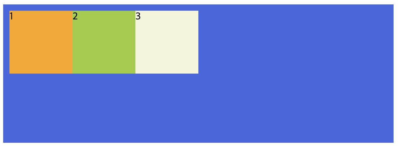
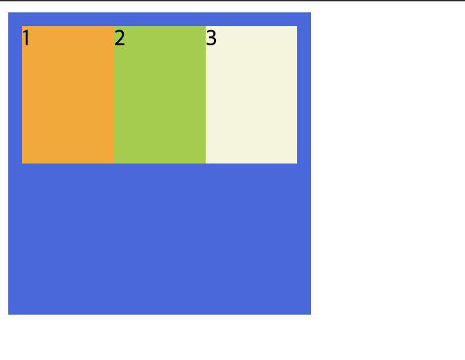
flex-grow의 기본값은 0이므로 증가 비율이 없는 결과 화면이다.
여기서 1번 박스에 flex-grow: 1;을 해보자.
.item:nth-child(1) {
background-color: orange;
flex-grow: 1;
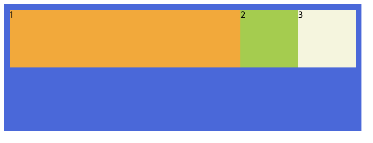
}1번 박스가 나머지 빈 공간을 채우는 것을 확인할 수 있다.
1번 박스에만 flow-grow를 적용해줌으로써 남은 빈공간에 대해 혼자만 1의 비율으로 적용이 되기 때문이다.
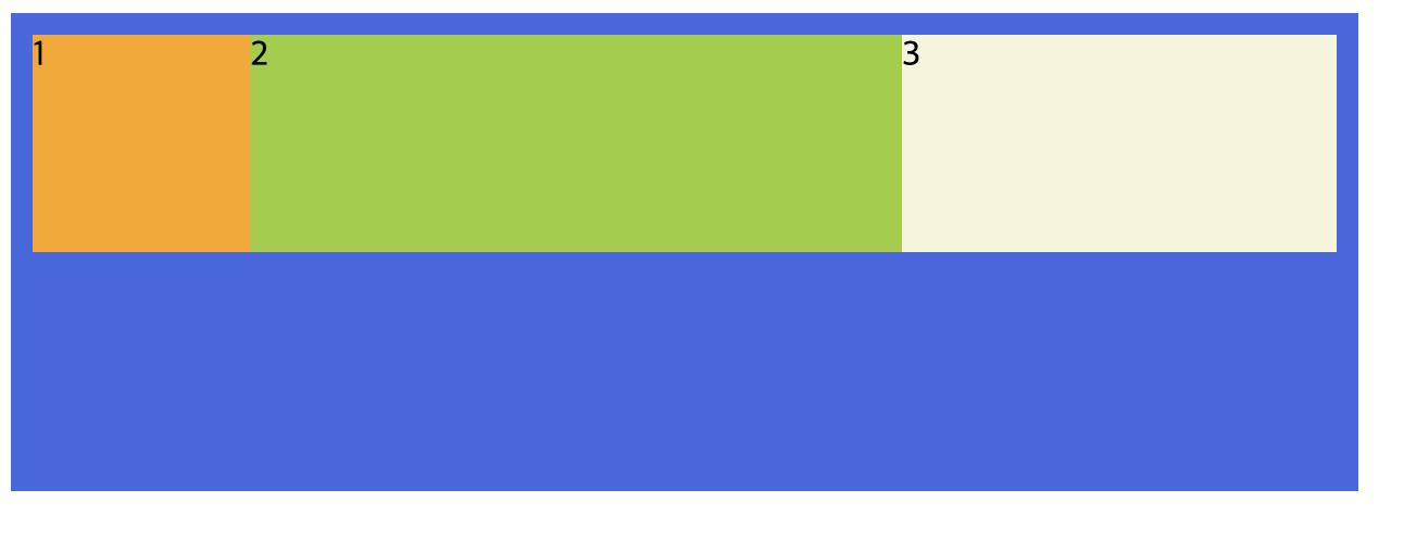
다음으로는 1번 박스는 제외하고 2번 박스에 flex-grow: 2;, 3번 박스에 flex-grow: 1;를 적용해보자.
.item:nth-child(1) {
  background-color: orange;
}
.item:nth-child(2) {

  background-color: yellowgreen;
  flex-grow: 2;
}
.item:nth-child(3) {
  background-color: beige;
  flex-grow: 1;
}
2, 3번 박스에만 flex-grow가 적용되었으므로 1번을 제외한 공간에서 2번 박스는 2의 비율로, 3번 박스는 1의 비율로 차지하게 된다.
flex-shrink
flex item의 감소 너비 비율
1: flex container 너비에 따라 감소 비율 적용 ✨(기본값)숫자: 감소 비율
아래와 같은 박스들에 flex-shrink를 적용해보자.
<div class="container">
  <div class="item">1</div>
  <div class="item">2</div>
  <div class="item">3</div>
</div>
.container {
padding: 10px;
width: 600px;
height: 200px;
background-color: royalblue;
display: flex;
}
.item {
width: 100px;
height: 100px;
}
.item:nth-child(1) {
background-color: orange;
}
.item:nth-child(2) {
background-color: yellowgreen;
}
.item:nth-child(3) {
background-color: beige;
}
파란색 플렉스 컨테이너 박스를 플렉스 아이템들의 너비보다 작은 200px로 설정해보면 아래와 같이 플렉스 아이템 박스들이 줄어드는 것을 볼 수 있다.
flex-shrink의 기본값은 1이므로 감소 비율이 적용된 결과 화면이다.
여기서 플렉스 아이템 박스들에 flex-shrink: 0;을 적용하면 박스들이 줄어들지 않는다.
.item {
  width: 100px;
  height: 100px;
  flex-shrink: 0;
}
flex-basis
flex item의 공간 배분 전 기본 너비
auto: 요소의 content 너비 ✨(기본값)단위: px, em, rem 등 단위로 지정
아래의 예제를 보면서 알아보자.
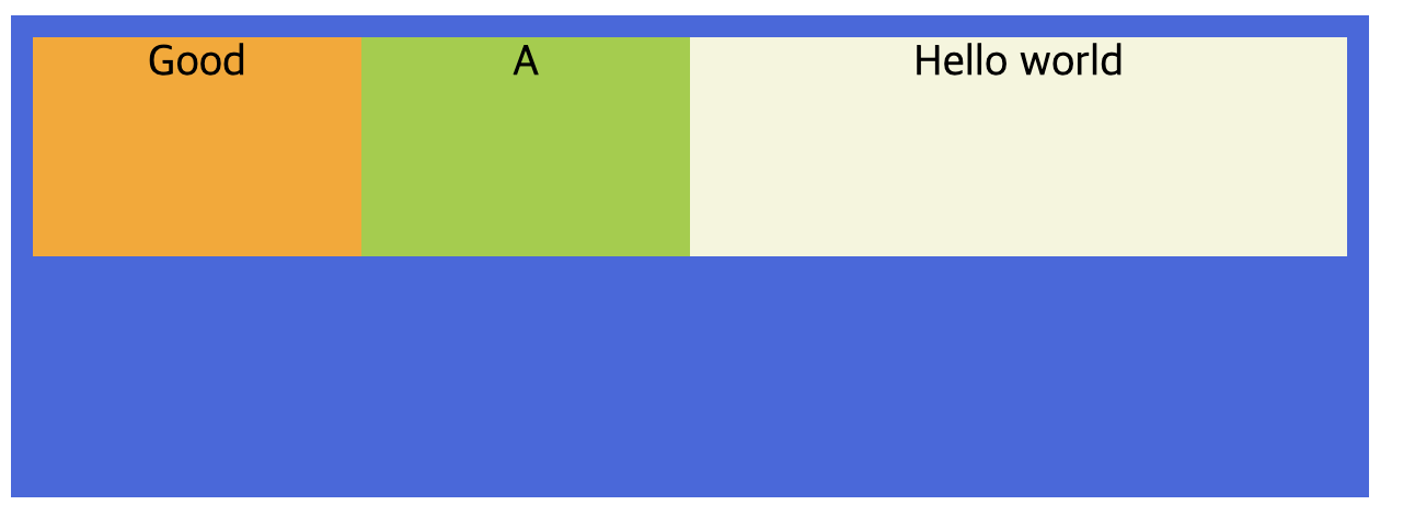
다음과 같이 1번, 2번 박스 비율을 1, 3번 박스 비율을 2를 주었다.
<div class="container">
  <div class="item">Good</div>
  <div class="item">A</div>
  <div class="item">Hello world</div>
</div>
.container {
padding: 10px;
width: 600px;
height: 200px;
background-color: royalblue;
display: flex;
}
.item {
height: 100px;
font-size: 20px;
text-align: center;
}
.item:nth-child(1) {
background-color: orange;
flex-grow: 1;
}
.item:nth-child(2) {
background-color: yellowgreen;
flex-grow: 1;
}
.item:nth-child(3) {
background-color: beige;
flex-grow: 2;
}1번과 2번 박스에 똑같이 비율 1을 주었는데도 크기가 다르고 3번 박스도 비율 2가 아닌 것처럼 보인다.
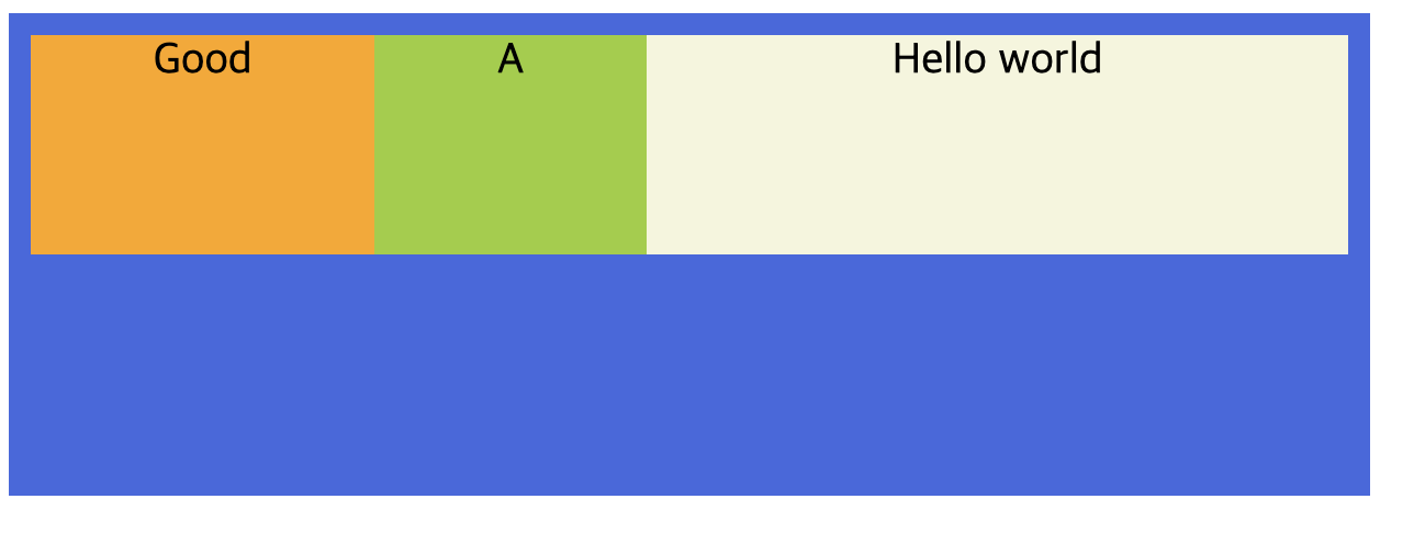
비율이 이상해보이는 이유는 각 요소의 content 크기를 제외한 양 옆 공간에 대해서 비율이 적용되기 때문이다.
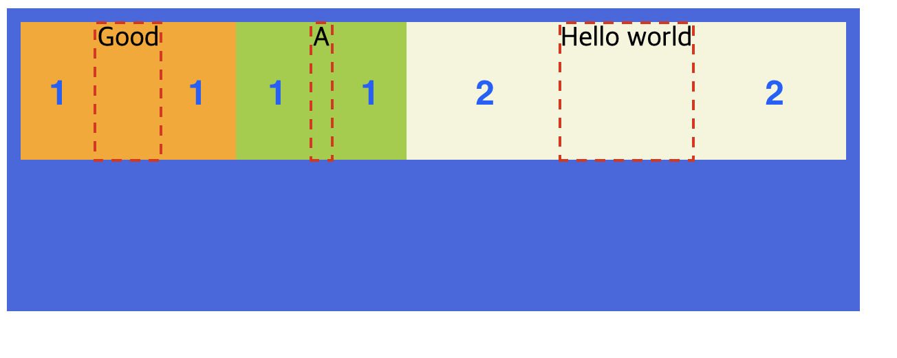
요소의 content 크기를 상관하지 않고 비율을 맞추고 싶다면 flex-basis: 0;을 적용해주면 된다.
.item {
  height: 100px;
  font-size: 20px;
  text-align: center;
  flex-basis: 0;
}