
청년취업사관학교 SeSAC의 CSS 강의를 통해 학습한 Flexbox에 대한 첫 번째 개념 정리 문서입니다.
플렉스 컨테이너(flex container)
- 플렉스 레이아웃이 적용되는 부모 요소
- 내부 요소를 플렉스 아이템으로 변환하는 영역
플렉스 아이템(flex item)
- 플렉스 컨테이너 내부의 자식 요소
- 플렉스 박스 레이아웃에 따라 배치되는 대상
예제 코드 1
[ index.html ]
<!DOCTYPE html>
<html lang="en">
  <head>
    <meta charset="UTF-8" />
    <meta name="viewport" content="width=device-width, initial-scale=1.0" />
    <title>Document</title>
    <link rel="stylesheet" href="./style.css" />
  </head>
  <body>
    <div class="flex-container">
      <!-- 플렉스 컨테이너 내부 div -->
      <!-- block 이라도 플렉스 item이 되어서
      부모인 flex container에 의해 배치 영향을 받는다. -->
      <div class="box"></div>
      <div class="box"></div>
      <div class="box"></div>
    </div>

    <!-- 플렉스 컨테이너 외부 div -->
    <div class="box"></div>
    <div class="box"></div>
    <div class="box"></div>
  </body>
</html>
[ style.css ]
.flex-container {
  display: flex;
  background-color: bisque;

  width: 100vw;
  height: 500px;
}

.box {
  background-color: lightblue;
  width: 100px;
  height: 200px;
  margin: 20px;
}
-
display: flex;<div class ="flex-container">를flex container로 설정하는 코드.
-
flex item은 별도의display를 설정하지 않아도 된다.-
부모가
display: flex;라면, 자동으로 flex item 이 된다. -
여기서는
<div class="box">가<div class ="flex-container">내에 들어가 있는 즉, 자식이므로 별도의display설정을 하지 않았다.
-
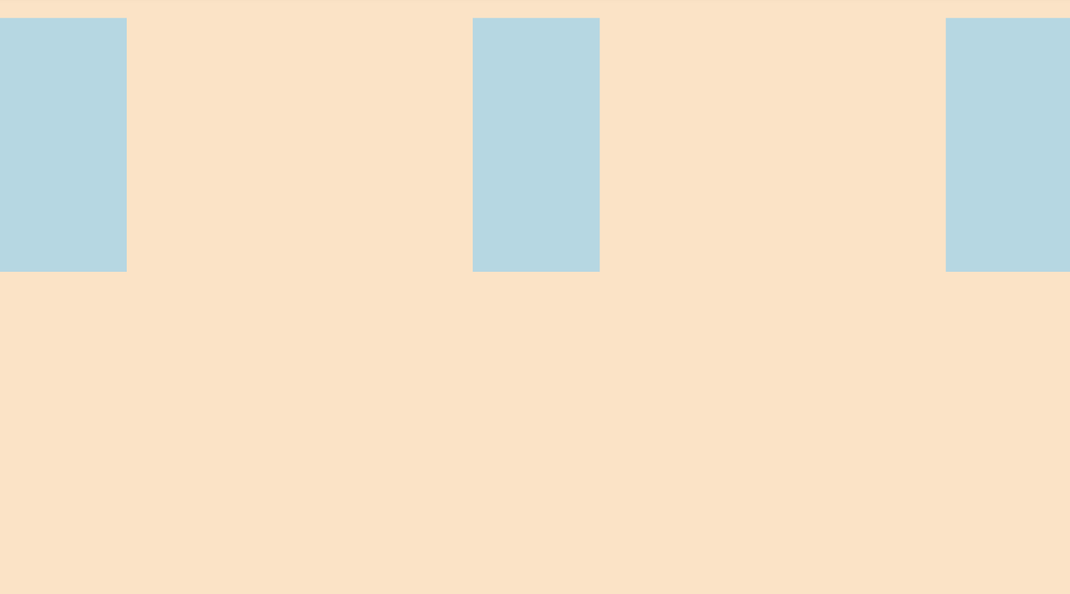
예제 화면 1
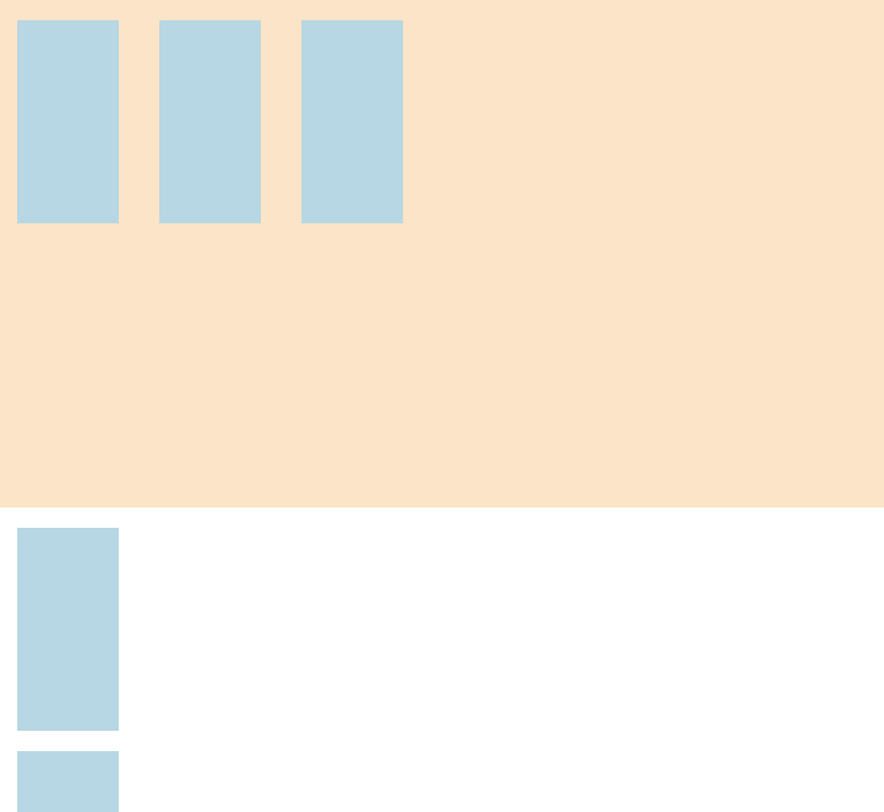
화면 캡쳐 이슈로 아래 블록 두 개가 짤렸습니다.
-
<div class="flex-container">내부의<div class="box">는block임에도 줄바꿈 없이 부모에 의해 배치(정렬)가 되었다. -
<div class="flex-container">외부의<div class="box">는 부모(flex container)에서 벗어나 정렬이 되지 않았다.
justify-content 예제 코드
[ index.html ]
<!DOCTYPE html>
<html lang="en">
  <head>
    <meta charset="UTF-8" />
    <meta name="viewport" content="width=device-width, initial-scale=1.0" />
    <title>Document</title>
    <link rel="stylesheet" href="./style.css" />
  </head>
  <body>
    <div class="flex-container flex-end">
      <!-- 플렉스 컨테이너 내부 div -->
      <div class="box"></div>
      <div class="box"></div>
      <div class="box"></div>
    </div>
  </body>
</html>
[ style.css ]
.flex-container {
  display: flex; /* flex container로 설정 */
  background-color: bisque;

  width: 100vw;
  height: 500px;
}

/* flex-item의 배치(정렬) 방식 */
.flex-start {
  /* justify-content 속성 */
  /* 주축을 기준으로 한 배치 방식 */
  justify-content: flex-start; /* flex-start가 기본 값 */
}

.flex-end {
  /* start가 왼쪽이니, 그 반대쪽인 오른쪽에서 시작된다. */
  justify-content: flex-end;
}

.center {
  /* 주축 방향 중앙 정렬 */
  justify-content: center;
}

/* 두 개의 아이템을 양끝에 붙이고,
   아이템 사이에 동일한 간격을 배치 */
.space-between {
  justify-content: space-between;
}

/* 양옆을 동일한 간격으로 배치 */
.space-around {
  justify-content: space-around;
}

/* 아이템 간의 모든 간격을 동일하게 배치*/
.space-evenly {
  justify-content: space-evenly;
}

.box {
  background-color: lightblue;
  width: 100px;
  height: 200px;
  margin: 20px;
}
-
위의
style.css파일을 기반으로index.html파일을 수정하며 예시를 알아 보자. -
index.html파일에서 중점적으로 수정 되는 코드 라인은 다음과 같다.<div class="flex-container">
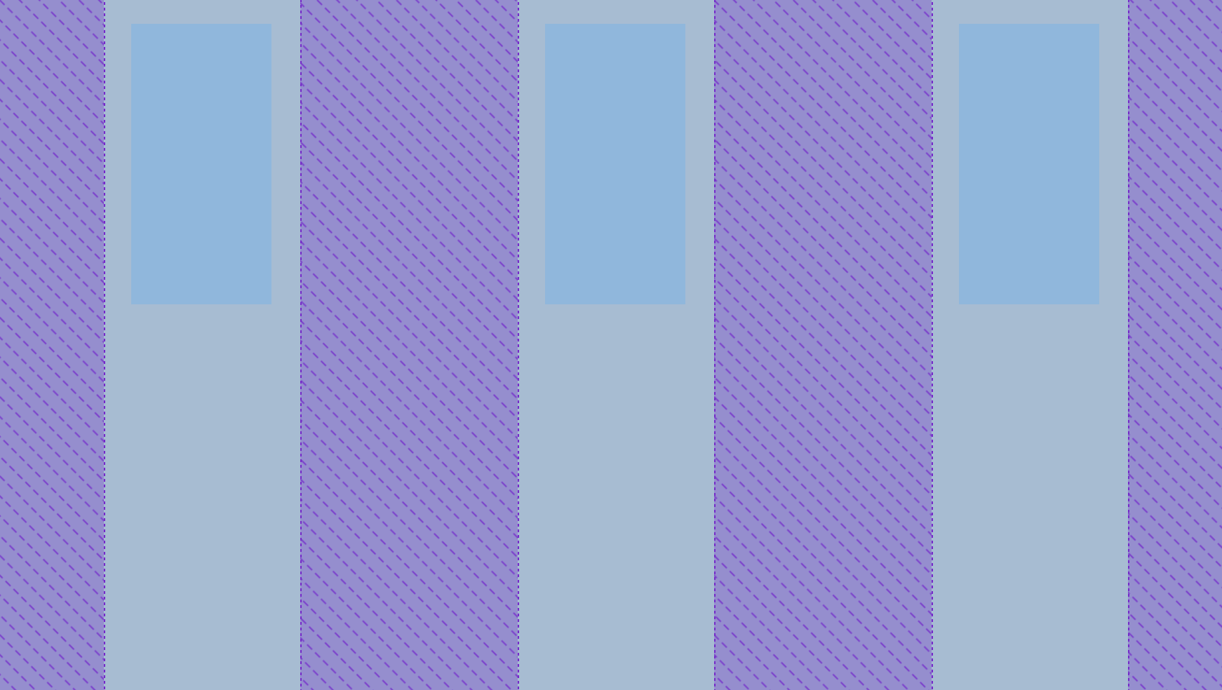
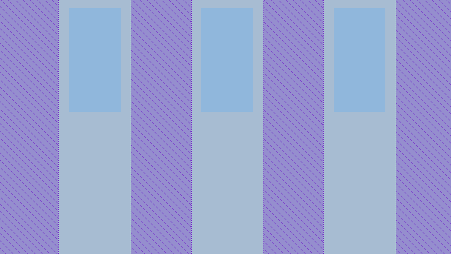
justify-content 예제 결과 화면
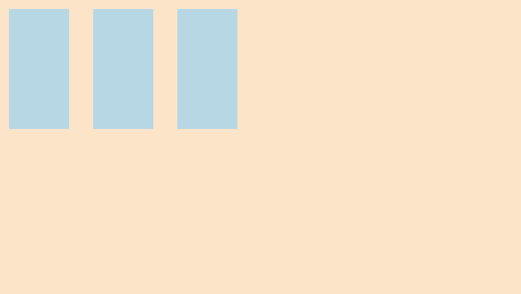
2-1. <div class="flex-container flex-start">
- default 상태
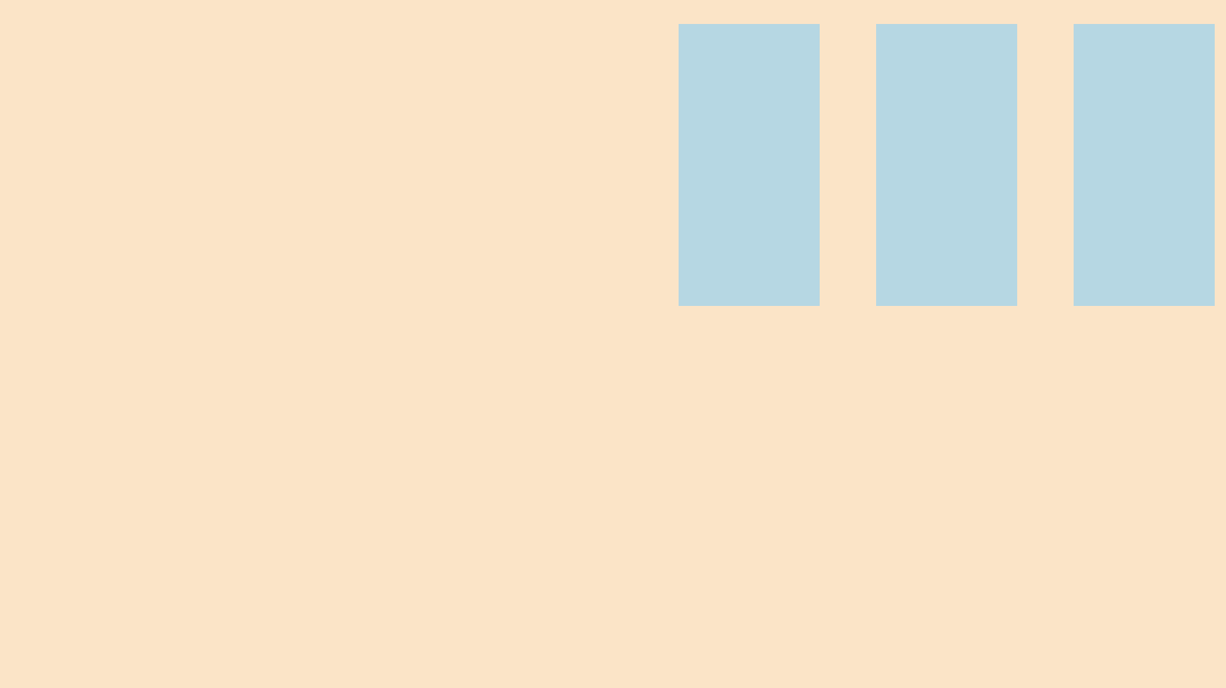
2-2. <div class="flex-container flex-end">
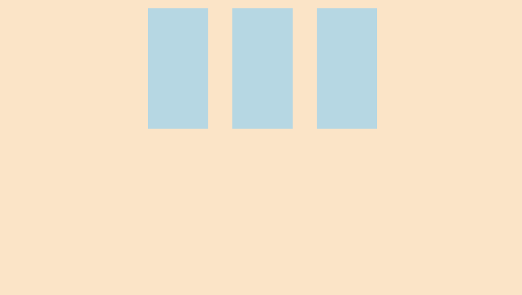
2-3. <div class="flex-container flex-center">
2-4. <div class="flex-container space-between">
space-between: 아이템 사이만 간격, 양 끝 여백 없음
2-5. <div class="flex-container space-around">
개발자 도구를 통해 선택한 화면.
space-around: 양옆을 동일한 간격으로 배치.
2-6. <div class="flex-container space-evenly">
개발자 도구를 통해 선택한 화면.
space-evenly: 아이템 간의 모든 간격을 동일하게 배치.

백엔드 개발자를 희망하는 코린이입니다 :)