부분의존도그림(Partial Dependence Plot, PDP)
관심 있는 특성들이 타겟에 어떻게 영향을 주는지 쉽게 파악할 수 있고
개별 특성과 타겟간의 관계를 볼 수 있음
복잡한 모델 – 이해하기 어렵지만 성능이 좋다
단순한 모델 – 이해하기 쉽지만 성능이 부족하다
- 랜덤포레스트, 부스팅의 경우 특성중요도 값을 얻을 수 있는데 이것은 어떤 특성들이 모델의 성능에 중요하다 많이 쓰인다 라는 정보이다
- 특성의 값에 따라 타겟값이 증가/감소 하는지 어떻게 영향을 미치는지의 정보는 없다
→ 트리모델은 부분의존그림(Partial dependence plots)을 사용하여 개별 특성과 타겟간의 관계를 볼 수 있다
1. PDP(1 특성) 시각화
!pip install PDPbox
# 이미지 화질
import matplotlib.pyplot as plt
plt.rcParams['figure.dpi'] = 144

import sklearn
from pdpbox.pdp import pdp_isolate, pdp_plot

# 인코더와 분류모델 분리
encoder = pipe.named_steps['preprocessing']
X_train_encoded = encoder.fit_transform(X_train) # 학습데이터
X_val_encoded = encoder.transform(X_val) # 검증데이터

tree = pipe.named_steps['Classifier']  # 분류모델

# 인코딩한 데이터 fit
tree.fit(X_train_encoded, y_train)

# 관계를 구할 특성들
feature = ['AAA', 'BBB', 'CCC', 'DDD']

for i in range(len(feature)):
  isolated = pdp_isolate(
      model=tree,
      dataset=X_val_encoded,
      model_features=X_val_encoded.columns,
      feature=feature[i],
      grid_type='percentile',
      num_grid_points=10
  )
  pdp_plot(isolated, feature_name=feature[i], figsize=(5, 5));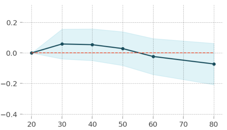
PDP(2 특성) 시각화
from pdpbox.pdp import pdp_interact, pdp_interact_plot

features = ['AAA', 'BBB']    # AAA와 BBB의 관계

interaction = pdp_interact(
    model=boosting,
    dataset=X_val_encoded,
    model_features=X_val.columns,
    features=features
)

pdp_interact_plot(interaction, plot_type='grid',
                  feature_names=features);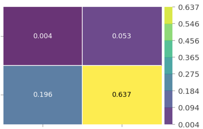
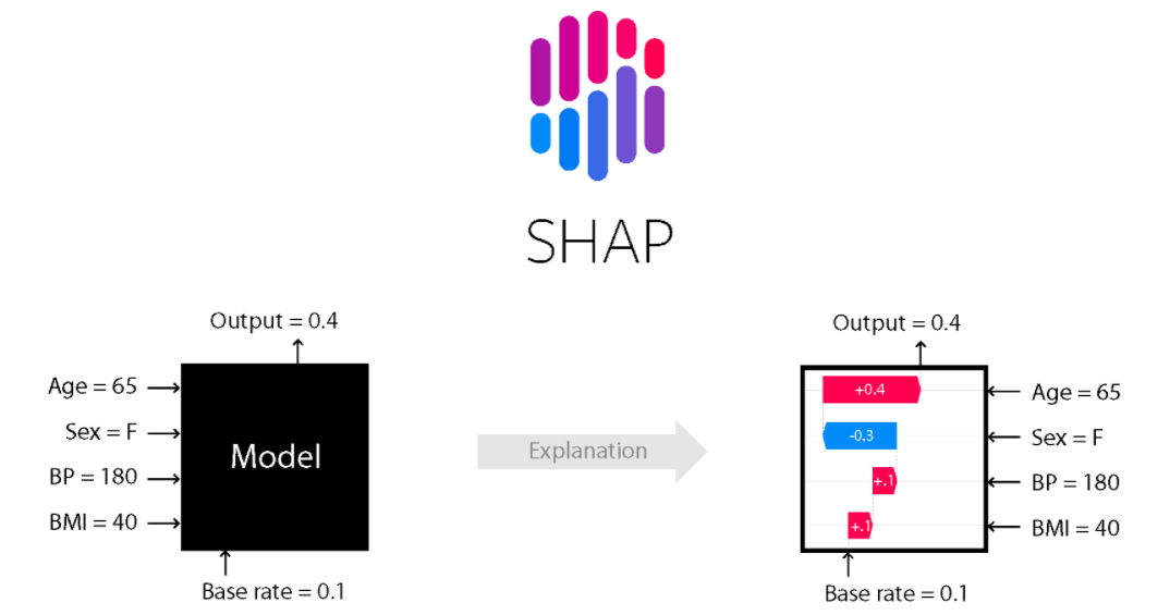
SHAP
단일 관측치로부터 특성들의 기여도(feature attribution)를 계산하기 위한 방법
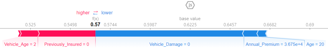
1. force plot(특정 row에대한 시각화)
!pip install shap
import warnings
warnings.filterwarnings(action='ignore')

shap.initjs()

# 인코더와 분류모델 분리
encoder = pipe.named_steps['preprocessing']
X_train_encoded = encoder.fit_transform(X_train)   # 학습데이터
X_val_encoded = encoder.transform(X_val)           # 검증데이터

tree = pipe.named_steps['DT']

tree.fit(X_train_encoded, y_train)

row = X_train_encoded.iloc[[1]]  # 특정 row

explainer = shap.TreeExplainer(tree)
row_encoded = encoder.transform(row)
shap_values = explainer.shap_values(row_encoded)

shap.force_plot(
    base_value=explainer.expected_value[1],
    shap_values=shap_values[1],
    features=row,
    link='logit'
)
⚠️ 이진분류일때 0이 false / 1이 true라 했을 때 1일때의 영향 : shap_values[1]
어떤 특성이 + / - 에 어느정도 영향을 줬는지 나타남
# 100개의 row
shap.initjs()
shap_values = explainer.shap_values(X_test.iloc[:100])
shap.force_plot(explainer.expected_value, shap_values, X_test.iloc[:100])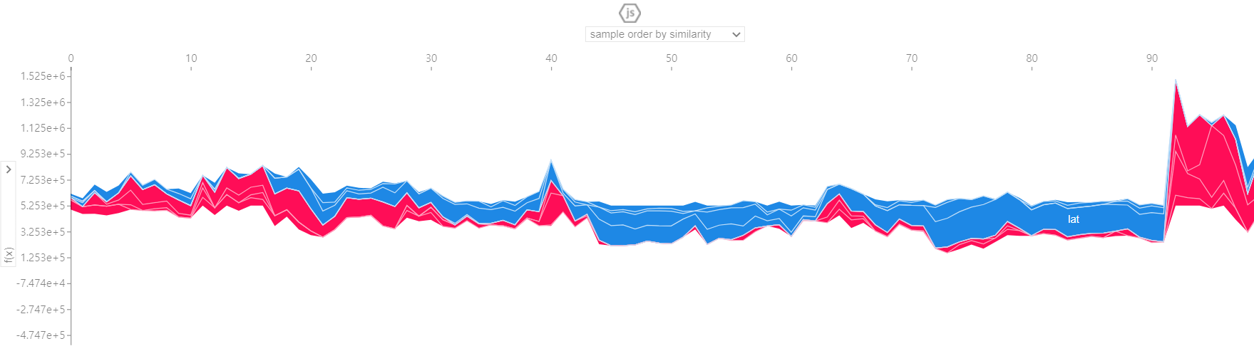
2. summary plot(전체 특성)
# 1000개만 나타냄
shap_values = explainer.shap_values(X_train_encoded.iloc[:1000])
shap.summary_plot(shap_values[1], X_train_encoded.iloc[:1000]) 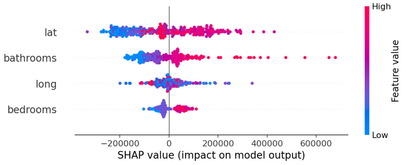
# 바이올린 형태
shap.summary_plot(shap_values, X_test.iloc[:1000], plot_type="violin")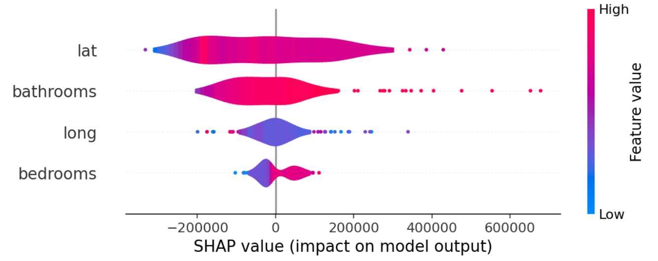
# bar 형태
shap.summary_plot(shap_values, X_test.iloc[:1000], plot_type="bar")
# 모델에 대한 영향력을 보여줌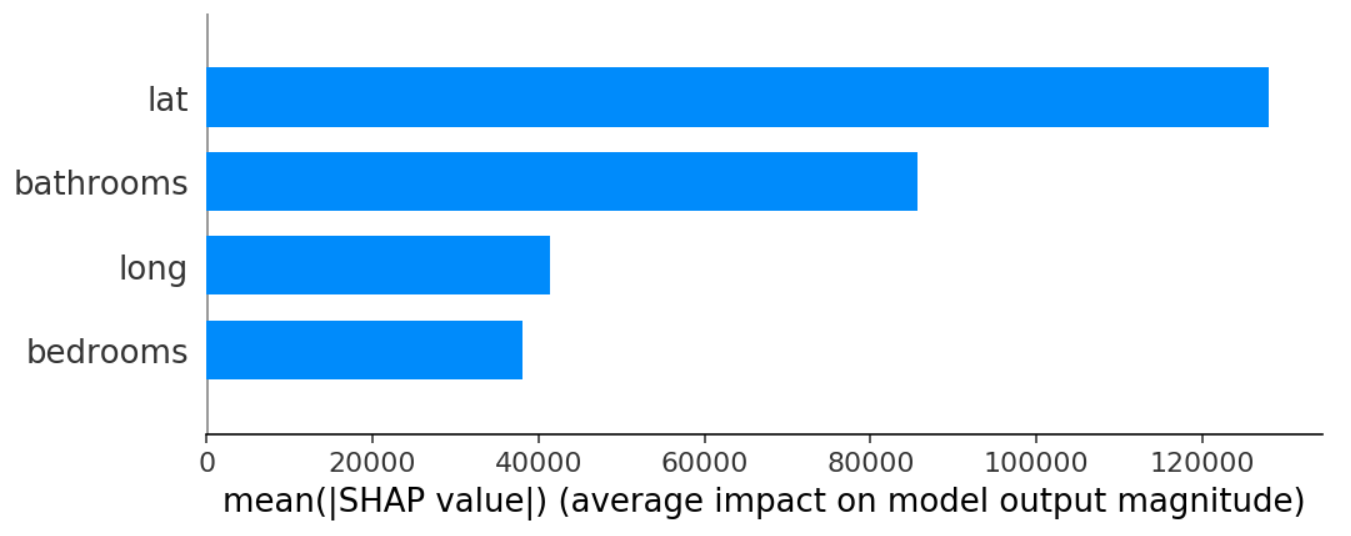

AI/Data Science