1. Stack Navigation - 헤더수정(실습)
1-1. 헤더 숨기기: headerShown
Stack.js
const StackNav = () => {
    return (
        <Stack.Navigator initialRouteName='Home' screenOptions={{ cardStyle: { backgroundColor: '#ffffff' } }}>
            <Stack.Screen name='Home' component={Home} options={{ headerShown: false }} />
            <Stack.Screen name='Chat' component={Chat} />
            <Stack.Screen name='List' component={List} />
        </Stack.Navigator>
    );
};
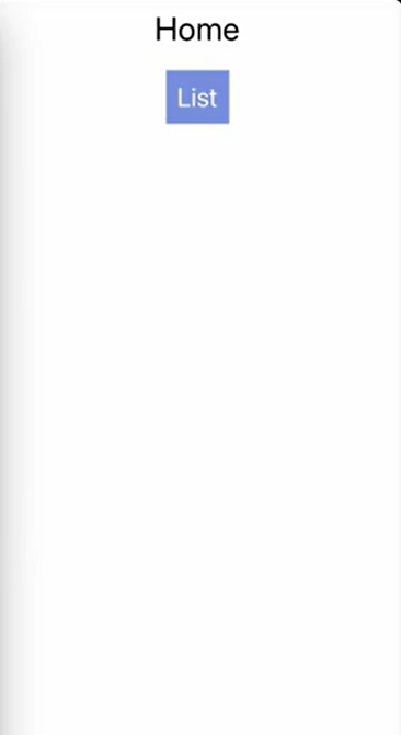
홈 화면에서 헤더가 사라짐
1-2. 노치 문제 해결 : useSafeAreaInsets
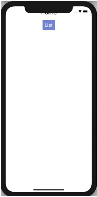
헤더를 없애니깐 특정 기기의 노치에 의해 화면이 가려지는 현상이 발생한다.
SafeAreaView로 해결해줄 수 있지만 React Navigation에서 제공하는useSafeAreaInsets을 이용해서 더 디테일한 설정 가능
useSafeAreaInsets에서 알려주는 값. 각 위치에 해당 값만큼의 공간을 띄어야 해당 기기에 의해 가려지는 부분이 없다는 것을 의미
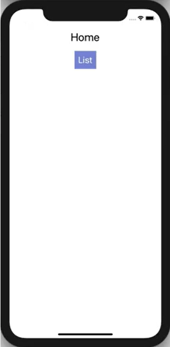
{"bottom": 0, "left": 0, "right": 0, "top": 41.599998474121094}해당 값을 활용하여 Home.js의 padding 값 변경하여 노치 문제 해결
import { useSafeAreaInsets } from 'react-native-safe-area-context';

const Container = styled.View`
    align-items: center;
    padding-top: ${({ insets: { top } }) => top}px;
    padding-bottom: ${({ insets: { bottom } }) => bottom}px;
    padding-right: ${({ insets: { right } }) => right}px;
    padding-left: ${({ insets: { left } }) => left}px;
`;

const StyledText = styled.Text`
    font-size: 30px;
    margin: 10px;
`;

const Home = ({ navigation }) => {
    const insets = useSafeAreaInsets();
    return (
        <Container insets={insets}>
            <StyledText>Home</StyledText>
            <Button title='List' onPress={() => navigation.navigate('List')} />
        </Container>
    );
};
1-3. 헤더 타이틀 변경 : headerTitle
기본적으로 헤더의 타이틀은 screen컴포넌트의 name 속성에 설정된 값을 지정
//Stack.js
<Stack.Screen name='List2' component={List} />

//Home.js
  <Button title='List' onPress={() => navigation.navigate('List2')} />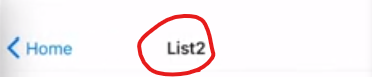
screen 컴포넌트의 options에 헤더 타이틀을 설정하는 방법
//Stack.js
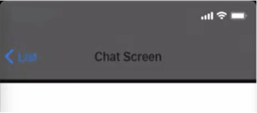
<Stack.Screen name='Chat' component={Chat} options={{ headerTitle: 'Chat Screen' }} />
1-4. 헤더의 스타일 수정 : headerStyle
💥 Tip. Expo 메뉴에서 show Element Inspector을 눌러 Inspect를 활용해 요소들의 스타일을 확인할 수 있다. 끌때도 동일하게 Hide Element Inspector를 누르면 된다.
React Navigation의 Options에서 스타일 관련된 코드를 작성할때 react Native에서 스타일을 작성하는 방법으로 작성해야 한다.
//Stack.js
        <Stack.Navigator
            initialRouteName='Home'
            screenOptions={{
                cardStyle: { backgroundColor: '#ffffff' },
                headerStyle: {
                    height: 120,
                    backgroundColor: '#555555',
                    borderBottomWidth: 5,
                    borderBottomColor: '#111111',
                },
            }}
        >
잘 변경된다.
1-5. 헤더 타이틀 스타일 변경 : headerTitleStyle
headerStyle에 color 속성을 설정해도 타이틀의 색은 변하지 않는다.
                headerStyle: {
                    height: 120,
                    backgroundColor: '#555555',
                    borderBottomWidth: 5,
                    borderBottomColor: '#111111',
                    color: '#ffffff' // 적용안됨
                },
headerTitleStyle을 이용해서 타이틀 색을 변경해야 한다.
//Stack.js
            screenOptions={{
                cardStyle: { backgroundColor: '#ffffff' },
                headerStyle: {
                    height: 120,
                    backgroundColor: '#555555',
                    borderBottomWidth: 5,
                    borderBottomColor: '#111111',
                },
                headerTitleStyle: {
                    fontSize: 24,
                    color: '#ffffff',
                },
            }}
잘 변경된다.
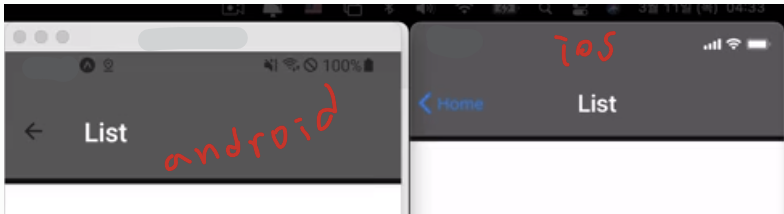
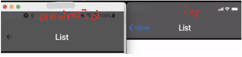
1-6. ios와 android 헤더 스타일 차이 : 1. headerTitleAlign 2. 타이틀 자체를 변경
아래 사진을 보면 안드로이드와 ios의 디자인 차이를 볼수 있다. 이 문제는 타이틀의 정렬을 담당하는 헤더 타이틀 align 속성이 ios와 안드로이드가 기본값이 다르기에 발생하는 문제이다.
1. headerTitleAlign : 텍스트를 수정하고 싶을때 사용
//Stack.js
        <Stack.Navigator
            initialRouteName='Home'
            screenOptions={{
                cardStyle: { backgroundColor: '#ffffff' },
                headerStyle: {
                    height: 120,
                    backgroundColor: '#555555',
                    borderBottomWidth: 5,
                    borderBottomColor: '#111111',
                },
                headerTitleStyle: {
                    fontSize: 24,
                    color: '#ffffff',
                },
                headerTitleAlign: 'center',
            }}
        >
잘 변경된다.
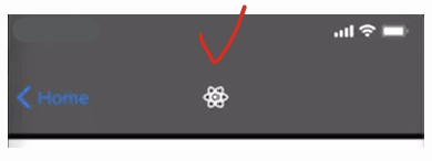
2. 타이틀 자체를 변경 : headerTitle
텍스트가 아닌 로고나 다른거를 렌더링 하고 싶을 때 사용. headerTitle 속성에 컴포넌트를 반환하는 함수를 설정하면 렌더링된는 title컴포넌트를 변경할 수 있다.
headerTitle함수로 확인한 헤더의 파라미터 값들
{"allowFontScaling": undefined, "children": "List", "onLayout": [Function handleTitleLayout], "style": {"color": "#ffffff", "fontSize": 24}, "tintColor": undefined}expo/vector-icons을 활용한 로고
홈페이지 : https://icons.expo.fyi/Index
import { FontAwesome5 } from '@expo/vector-icons';
(...)
        <Stack.Navigator
            initialRouteName='Home'
            screenOptions={{
                cardStyle: { backgroundColor: '#ffffff' },
                headerStyle: {
                    height: 120,
                    backgroundColor: '#555555',
                    borderBottomWidth: 5,
                    borderBottomColor: '#111111',
                },
                headerTitleStyle: {
                    fontSize: 24,
                    color: '#ffffff',
                },
                headerTitleAlign: 'center',
                  //컴포넌트의 style은 headerTitle의 파라미터로 전달되는 style을 적용
                headerTitle: ({ style }) => {
                    return <FontAwesome5 name='react' style={style} />;
                },
            }}
        >
로고 잘 나온다.
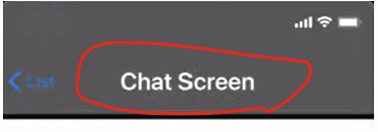
screen이 navigator보다 높기 떄문에 아래 코드와 같이 options가 설정되어있는 Chat 헤더는 바뀌지 않는 것을 확인할 수 있다.
<Stack.Screen name='Chat' component={Chat} options={{ headerTitle: 'Chat Screen' }} />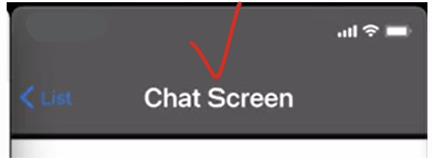
2. 헤더 버튼 수정
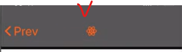
2-1. headerBackTitle : 헤더 왼쪽 타이틀 수정
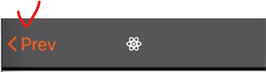
- 원래 뒤로가기 버튼에 이전 화면이름이 기본이다.
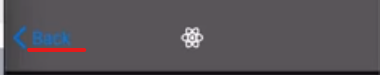
headerBackTitle: 'Prev'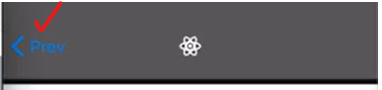
만약 headerBackTitle: ''이렇게 빈값을 설정시 Back이 나온다.
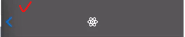
2-2. headerBackTitleVisible
만약 타이틀을 사용하지 않고 빈 문자열만 사용하고 싶다면 headerBackTitleVisible : false설정
2-3. headerBackTitleStyle
왼쪽 버튼 스타일 수정 headerBackTitleStyle: { fontSize: 26 },
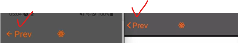
2-4. headerTintColor
헤더 왼쪽 버튼 색깔 수정 headerTintColor: '#ff6600',
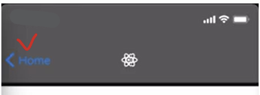
주의! 버튼에만 적용되는 것이 아닌 헤더 전체에 적용이 된다.
아이콘 로고 tintColor로 색상변경
만약 아이콘 로고에도 tintColor를 적용시키고 싶으면 아래와 같이 tintColor를 props로 받아서 색깔 변경해주면 된다.
headerTitle: ({ style, tintColor }) => {
    return <FontAwesome5 name='react' style={style} color={tintColor} />;
                },
ios와 android의 스타일 차이
아래를 보면 ios와 android의 버튼 스타일이 다른 것을 볼 수 있다.
2-5. 뒤로가기 버튼의 이미지를 변경 : headerBackImage 속성
headerBackImage 속성을 활용하여 뒤로가기 버튼의 이미지를 변경할 수 있다.
import { MaterialCommunityIcons } from '@expo/vector-icons';
(...)
<Stack.Screen
  name='Chat'
  component={Chat}
  options={{
   headerTitle: 'Chat Screen',
   headerBackImage: ({ tintColor }) => {
      return (
         <MaterialCommunityIcons
           name='keyboard-backspace'
           size={26}
           color={tintColor}
           style={{ marginRight: 5, marginLeft: 5 }}
         />
      );
    },
  }}
/>
2-6. 버튼 컴포넌트 자체 변경 : headerLeft 속성
컴포넌트에서 props로 전달되어 온 navigation을 이용해서 화면의 옵션을 설정
- props로 전달된 navigation의 setOptions 함수에 객체 형태로 설정하고 싶은 값들을 전달
- headerLeft에 컴포넌트를 반환하는 함수 설정 및 headerLeft에 설정된 함수에 파라미터에 데이터들 전달
- onPress 프로퍼티에는 headerLeft에 있는 뒤로가기 기능이 정의된 함수 전달(직접 onPress를 정의해도 된다.)
- color에는 props로 전달받은 tintColor 설정
import React, { useLayoutEffect } from 'react';
import { MaterialIcons } from '@expo/vector-icons';

(...)

const Chat = ({ navigation, route }) => {
    useLayoutEffect(() => {
        navigation.setOptions({
            headerLeft: ({ onPress, tintColor }) => {
                return (
                    <MaterialIcons
                        name='chevron-left'
                        size={30}
                        style={{ marginLeft: 11 }}
                        color={tintColor}
                        onPress={onPress}
                    />
                );
            },
        });
    });

	(...)
};

export default Chat;
💥 useLayoutEffect
useEffect와 사용법 및 동작 방식이 거의 동일한 Hook. 주요 차이점은
useLayoutEffect은 컴포넌트가 렌더링 되기 전에 모둘 처리된다는 점. 이러한 특징 때문에 화면을 렌더링 하기 전에 변경할 부분이 있는 경우에 많이 사용된다.
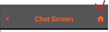
2-7. 헤더 오른쪽에 컴포넌트를 렌더링 : headerRight
import React, { useLayoutEffect } from 'react';
import { MaterialIcons } from '@expo/vector-icons';

(...)

const Chat = ({ navigation, route }) => {
    useLayoutEffect(() => {
        navigation.setOptions({
            headerLeft: ({ onPress, tintColor }) => {
                return (
                    <MaterialIcons
                        name='chevron-left'
                        size={30}
                        style={{ marginLeft: 11 }}
                        color={tintColor}
                        onPress={onPress}
                    />
                );
            },
              headerRight: ({ tintColor }) => {
                return (
                    <MaterialIcons
                        name='home'
                        size={30}
                        style={{ marginLeft: 11 }}
                        color={tintColor}
                        onPress={() => navigation.popTotTop()}
                    />
                );
            },
        });
    });

	(...)
};

export default Chat;
💥popToTop()
popToTop은 navigation에서 제공하는 함수로 현재 쌓여있는 모든 화면을 걷어내고 가장 아래있는 화면으로 이동하는 기능이다. 위 코드에서 제일 아래에 있는 화면은 home 화면이다.