section class="notice"
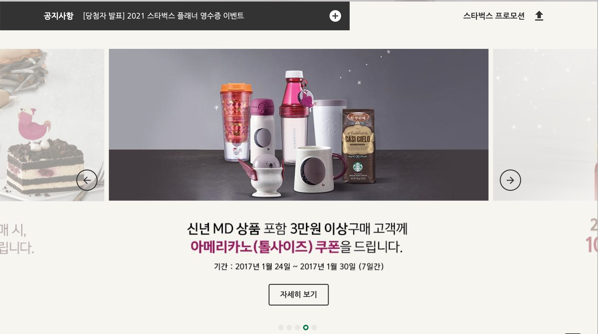
이 섹션은 2가지 구역으로 구성 되어 있다.
- notice-line
- inner-left : 고정된 공지사항 + 수직으로 돌아가는 공지사항
- inner-right : 위 쪽 화살표를 누르면 프로모션이 감춰지는 기능을 구현해야한다.
- promotion
수평으로 돌아가는 promotion 슬라이드, 슬라이드 제어 버튼과 그 아래의 자세히 보기 버튼 구현하기
swiper 알아두기
- swiperjs 검색
- swiperjs.com 클릭!
- get started 클릭!
- swiper-bundle.min.css 링크, swiper-bundle.min.js 스크립트 태그 두줄을 복사해서 index.html에 붙인다
  <!--Swiper-->
    <link rel="stylesheet" href="https://unpkg.com/swiper@6.8.4/swiper-bundle.min.css" />
<script src="https://unpkg.com/swiper@6.8.4/swiper-bundle.min.js"></script>- HTML에서 쓰이는 방법
a. swiper-container 슬라이더의 메인이 되는 컨테이너 부분
b. swiper-wrapper
c. swiper-slide 실제로 슬라이드를 해야할 항목들
div class="notice-line"
<!--NOTICE-->
  <section class="notice">

    <!--NOTICE LINE-->
    <div class="notice-line">

      <div class="bg-left"></div>
      <div class="bg-right"></div>
      <div class="inner">

        <div class="inner__left">
<div class="inner__right">-
.notice .notice-line {}
- position: relative;
-
.notice .notice-line .bg-left {}
- width: 50%; 너비는 반만 활용
- height: 100%; 높이는 100% 활용
- background-color: #333; 배경색상은 어두운 회색
- position: absolute; 부모요소 기준 배치
- top: 0; 위에서부터 시작
- left: 0; 왼쪽 부터 시작
-
.notice .notice-line .bg-right {}
- width: 50%; 너비는 반만 활용
- height: 100%; 높이는 100% 활용
- background-color: #f6f5ef; 배경색상은 밝은 회색
- position: absolute; 부모요소 기준 배치
- top: 0; 위에서부터 시작
- right: 0; 오른쪽 부터 시작
-
.notice .notice-line .inner {}
- height: 62px;
- z-index: 1;
- display: flex; 자식 요소들(.inner__left, .inner__right)를 가로로 배치한다
-
.notice .notice-line .inner__left {}
- width: 60%; 왼쪽 부분 파트가 더 길어야 한다.
- height: 100%;
- background-color: #333;
- display: flex; h2, swiper-container, 더하기 아이콘을 수평정렬해준다
- align-items: center; 세로 가운데에 배치
-
.notice .notice-line .inner__right {}
- width: 40%;
- height: 100%;
- display: flex;
- justify-content: flex-end; 오른쪽 정렬
- align-items: center; 수직 가운데
div class="inner-left"
<div class="inner__left">

  <h2>공지사항</h2>
  <div class="swiper-container">
    <div class="swiper-wrapper">
      <div class="swiper-slide">
        <a href="javascript:void(0)">크리스마스 & 연말연시 스타벅스 매장 영업시간 변경 안내</a>
      </div>
      <div class="swiper-slide">
        <a href="javascript:void(0)">[당첨자 발표] 2021 스타벅스 플래너 영수증 이벤트</a>
      </div>
      <div class="swiper-slide">
         <a href="javascript:void(0)">스타벅스커피 코리아 애플리케이션 버전 업데이트 안내</a>
      </div>
      <div class="swiper-slide">
         <a href="javascript:void(0)">[당첨자 발표] 뉴이어 전자영수증 이벤트</a>
      </div>
    </div>
  </div>

  <a href="javascript:void(0)" class="notice-line__more">
    <span class="material-icons">add_circle</span>
  </a>

</div>- swiper-slide는 클릭해서 세부사항 페이지를 볼수 있도록 a태그를 이용한다.
CSS
-
.notice .notice-line .inner__left h2 {}
- color: #fff;
- font-size: 17px;
- font-weight: 700;
- margin-right: 20px; 오른쪽에만 마진값을 줘서 swiper-container에서 띄워진다
-
.notice .notice-line .inner__left .swiper-container {}
- height: 62px;
- flex-grow: 1; 최대한 늘어나라. 이 값이 없으면 최대한 줄어 들어서 보이지 않는다.
-
.notice .notice-line .inner__left .swiper-slide {}
- height: 62px;
- display: flex;
- align-items: center;
-
.notice .notice-line .inner__left .swiper-slide a {}
- color: #fff; 슬라이드 되는 항목의 글자색을 흰색으로
-
.notice .notice-line .inner__left .notice-line__more {}
- width: 62px;
- height: 62px; 컨테이너와 높이를 맞춰줘야 영역이 없어지지 않는다
- display: flex; 아이콘을 안쪽으로 옮기고
- justify-content: center; 수평 가운데
- align-items: center; 수직 가운데
-
.notice .notice-line .inner__left .notice-line__more .material-icons {}
- color: #fff;
- font-size: 30px;
JS
swiper-container의 기능을 명시해줘야 정상적으로 작동한다
new Swiper('.notice-line .swiper-container',{
  direction: 'vertical',
  autoplay: true,
  loop: true
});- new Swiper(선택자, 옵션)
- direction: 'vertical',
- 'horizontal'이 기본값. 이 경우 direction은 명시하지 않아도 된다.
- 문자열로 되어 있는 속성은 따옴표 안에 작성해주어야 한다
- autoplay: true,
- 자동 재생
- loop: true
- 끝 슬라이드에 도착하면 시작 슬라이드로 다시 시작
- direction: 'vertical',
div class="inner-right"
<div class="inner__right">
  <h2>스타벅스 프로모션</h2>
  <div class="toggle-promotion">
    <div class="material-icons">upload</div>
  </div>
</div>-
.notice .notice-line .inner__right h2 {}
- font-size: 17px;
- font-weight: 700; 두꺼운 폰트
-
.notice .notice-line .inner__right .toggle-promotion {}
- width: 62px;
- height: 62px;
- cursor: pointer; 이 부분은 버튼 입니다
- display: flex; 아이콘을 안으로 옮기고
- justify-content: center; 수평 가운데
- align-items: center; 수직 가운데
-
.notice .notice-line .inner__right .toggle-promotion .material-icons {}
- font-size: 30px; .inner__left의 더하기 아이콘도 폰트사이즈를 30px로 지정하였으므로 똑같이.
div class="promotion"
<!-- PROMOTION -->
    <div class="promotion">

      <div class="swiper-container">
        <div class="swiper-wrapper">
          <div class="swiper-slide">
            <img src="./images/promotion_slide1.jpg" alt="2021 뉴이어, 스타벅스와 함께 즐겁고 활기차게 시작하세요!">
            <a href="javascript:void(0)" class="btn">자세히 보기</a>
          </div>
          <div class="swiper-slide">
            <img src="./images/promotion_slide2.jpg" alt="2021 뉴이어, 스타벅스와 함께 즐겁고 활기차게 시작하세요!">
            <a href="javascript:void(0)" class="btn">자세히 보기</a>
          </div>
          <div class="swiper-slide">
            <img src="./images/promotion_slide3.jpg" alt="2021 뉴이어, 스타벅스와 함께 즐겁고 활기차게 시작하세요!">
            <a href="javascript:void(0)" class="btn">자세히 보기</a>
          </div>
          <div class="swiper-slide">
            <img src="./images/promotion_slide4.jpg" alt="2021 뉴이어, 스타벅스와 함께 즐겁고 활기차게 시작하세요!">
            <a href="javascript:void(0)" class="btn">자세히 보기</a>
          </div>
          <div class="swiper-slide">
            <img src="./images/promotion_slide5.jpg" alt="2021 뉴이어, 스타벅스와 함께 즐겁고 활기차게 시작하세요!">
            <a href="javascript:void(0)" class="btn">자세히 보기</a>
          </div>
        </div>
      </div>

      <div class="swiper-pagination"></div>
      <div class="swiper-prev">
        <div class="material-icons">arrow_back</div>
      </div>
      <div class="swiper-next">
          <div class="material-icons">arrow_forward</div>
      </div>

</div>- swiper-pagination
페이지 번호를 사용하는 선택자 - swiper-prev
이전 슬라이드 버튼 - swiper-next
다음 슬라이드 버튼
CSS
-
.notice .promotion {}
height: 693px;
background-color: #f6f5ef;
position: relative;
transition: height .4s; 자연스럽게 숨길수 있게 한다
overflow: hidden; hide 될 때 넘치는 부분을 다 숨긴다 -
.notice .promotion.hide {}
- height: 0; 높이를 0 으로 하므로써 프로모션 부분을 숨긴다. js로 hide 클래스를 더하거나 빼서 조절해준다
-
.notice .promotion .swiper-container {}
- width: calc(819px * 3 + 20px); 819 너비 사진 3개. 그 사이의 20 공간.
- calc()로 계산을 쉽게 할 수 있고 실수를 줄인다.
- height: 553px;
- position: absolute;
- top: 40px;
- left: 50%; 화면의 반부터 파트 시작
- margin-left: calc((819px * 3 + 20px) / -2);
- 화면의 반을 왼쪽으로 옮김으로써 가운데에 위치하게 된다
- width: calc(819px * 3 + 20px); 819 너비 사진 3개. 그 사이의 20 공간.
-
.notice .promotion .swiper-slide {}
- opacity: .4; 슬라이드를 불투명 하게
- transition: opacity 1s; 자연스럽게 불투명도 조절
- position: relative;
-
.notice .promotion .swiper-slide-active {} 현재 활성화된 슬라이드.
- opacity: 1; 가운데 있는 슬라이드만 선명하게
-
.notice .promotion .swiper-slide .btn {}
- position: absolute; 부모요소(swiper-slide) 기준 배치
- bottom: 0; 부모의 아래쪽에 배치
- left: 0;
- right: 0;
- margin: auto; 요소의 가로너비가 있어야 가로 가운데에 넣을 수 있는데 btn은 이미 가로너비를 지정해놓음
-
.notice .promotion .swiper-pagination {}
bottom: 40px; swiper-slide 밑 40px 아래에 위치시키기
left: 0;
right: 0; -
.notice .promotion .swiper-pagination .swiper-pagination-bullet {}
- background-color: transparent;
- background-image: url('../images/promotion_slide_pager.png');
- width: 12px;
- height: 12px;
- margin-right: 6px;
- outline: none; 파란 선으로 보이게 되는 아웃라인은 생략
-
.notice .promotion .swiper-pagination .swiper-pagination-bullet-active {} 현재 선택된 슬라이드의 위치인 불렛을 다른이미지로 표시해주기
- background-image: url('../images/promotion_slide_pager_on.png');
}
- background-image: url('../images/promotion_slide_pager_on.png');
-
.notice .promotion .swiper-pagination .swiper-pagination-bullet:last-chld {}
- margin-right: 0; 오른쪽 끝의 불렛의 경우 오른쪽 여백은 필요 없음
-
.notice .promotion .swiper-prev,
.notice .promotion .swiper-next {}
이전 버튼, 다음버튼 둘다 적용- width: 42px;
- height: 42px;
- border: 2px solid #333;
- border-radius: 50%; 원이 되도록
- position: absolute;
- top: 300px;
- z-index: 1; 슬라이드보다 위에 오게
- cursor: pointer;
- outline: none;
- display: flex; 화살표 아이콘 원 안에 넣기
- justify-content: center; 아이콘을 원의 중간에 넣기
- align-items: center; 원안의 아이콘 수직 중간에 넣기
- transition: .4s; 호버 될 때 색깔을 자연스럽게 바꾼다
- color: #333;
-
.notice .promotion .swiper-prev {}
- left: 50%; 왼쪽에서 정 가운데 배치
- margin-left: -480px; 정 중앙 슬라이드 바깥 왼쪽으로
-
.notice .promotion .swiper-next {}
- right: 50%; 오른쪽에서 정 가운데 배치
- margin-right: -480px; 정 중앙 슬라이드 바깥 오른쪽으로
-
.notice .promotion .swiper-prev:hover,
.notice .promotion .swiper-next:hover {}- background-color: #333;
- color: #fff;
JS
new Swiper('.promotion .swiper-container',{
  slidesPerView: 3,
  spaceBetween: 10,
  centeredSlides: true,
  loop: true,
  autoplay: {
    delay: 3000,
  },
  pagination: {
    el: '.promotion .swiper-pagination',
    clickable: true
  },
  navigation: {
    prevEl: '.promotion .swiper-prev',
    nextEl: '.promotion .swiper-next'
  }
});- new Swiper('.promotion .swiper-container',
- slidesPerView: 3, 한번에 보여줄 슬라이드 갯수. 기본값은 1
- spaceBetween: 10, 슬라이드 사이 여백
- centeredSlides: true, 1번 슬라이드가 가운데 보이기
- loop: true,
- autoplay: {},
- delay: 3000, 3초에 한번씩 슬라이드(기본값)
- pagination: {} 각 슬라이드에 바로 접근 할 수 있게 해주는 기능. {} 객체 데이터를 할당해서 추가 옵션을 적용할 수 있다
- el: '.promotion .swiper-pagination', 페이지 번호요소 선택자
- clickable: true 사용자의 페이지 번호요소 제어가능 여부
},
- navigation: {}
- prevEl: '.promotion .swiper-prev', 이전 슬라이드 보는 버튼
- nextEl: '.promotion .swiper-next' 다음 슬라이드 보는 버튼
const promotionEl = document.querySelector('.promotion');
const promotionToggleBtn = document.querySelector('.toggle-promotion');
let isHidePromotion = false;
promotionToggleBtn.addEventListener('click', function(){
  isHidePromotion = !isHidePromotion;
  if (isHidePromotion) { // true -> 숨기기
    promotionEl.classList.add('hide');
  } else { // false -> 보이기
    promotionEl.classList.remove('hide');
  }
});- let isHidePromotion = false;
- true, false 바꿔가면서 조절할 것이므로 let
- isHidePromotion = !isHidePromotion;
- 클릭하면 원래 들어 있던 값의 반대값을 넣어준다
section class="rewards"
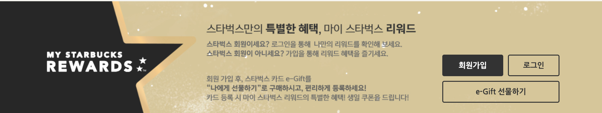
1. 어두운 왼쪽 배경
2. 금색 오른쪽 배경
a. btn-group(회원가입, 로그인, 선물하기)
HTML
<section class="rewards">
  <div class="bg-left"></div>
  <div class="bg-right"></div>
  <div class="inner">
    <div class="btn-group">
      <div class="btn btn--reverse sign-up">회원가입</div>
      <div class="btn sign-in">로그인</div>
      <div class="btn gift">e-Gift 선물하기</div>
    </div>
  </div>
</section>- 회원가입- 회원가입 버튼만 어두운 버튼으로 출력
CSS
-
.rewards {}
- position: relative;
-
.rewards .bg-left {}
- width: 50%; 화면 반만쓸거임
- height: 100%;
- background-color: #272727; inner바깥의 왼쪽을 금색으로
- position: absolute;
- top: 0;
- left: 0; 화면 반의 왼쪽부터
-
.rewards .bg-right {}
- width: 50%; 화면 반만쓸거임
- height: 100%;
- background-color: #d5c798; inner바깥의 오른쪽을 어두운색으로
- position: absolute; reward를 기준으로 정렬할건데
- top: 0; reward 윗 모서리에서 에서 시작하는 영역
- right: 0; 화면 반의 오른쪽에서 시작하는 영역
-
.rewards .inner {}
- background-image: url(../images/rewards.jpg);
- height: 241px; 높이값을 줘야 이미지가 보임
-
.rewards .btn-group {}
- position: absolute;
- bottom: 24px;
- right: 0;
- width: 250px;
- display: flex; 소속 버튼 세개를 수평정렬
- flex-wrap: wrap; 버튼 너비가 250보다 넘치면 그 아랫줄로
-
.rewards .btn-group .btn.sign-up {}
- margin-right: 10px; 회원가입, 로그인버튼 사이의 공간
-
.rewards .btn-group .btn.sign-in {}
- width: 110px;
-
.rewards .btn-group .btn.gift {}
- margin-top: 10px; 윗줄 버튼들 사이에 여백 넣기
- flex-grow: 1; 가로사이즈를 최대한 까지 채우기
section class="youtube"
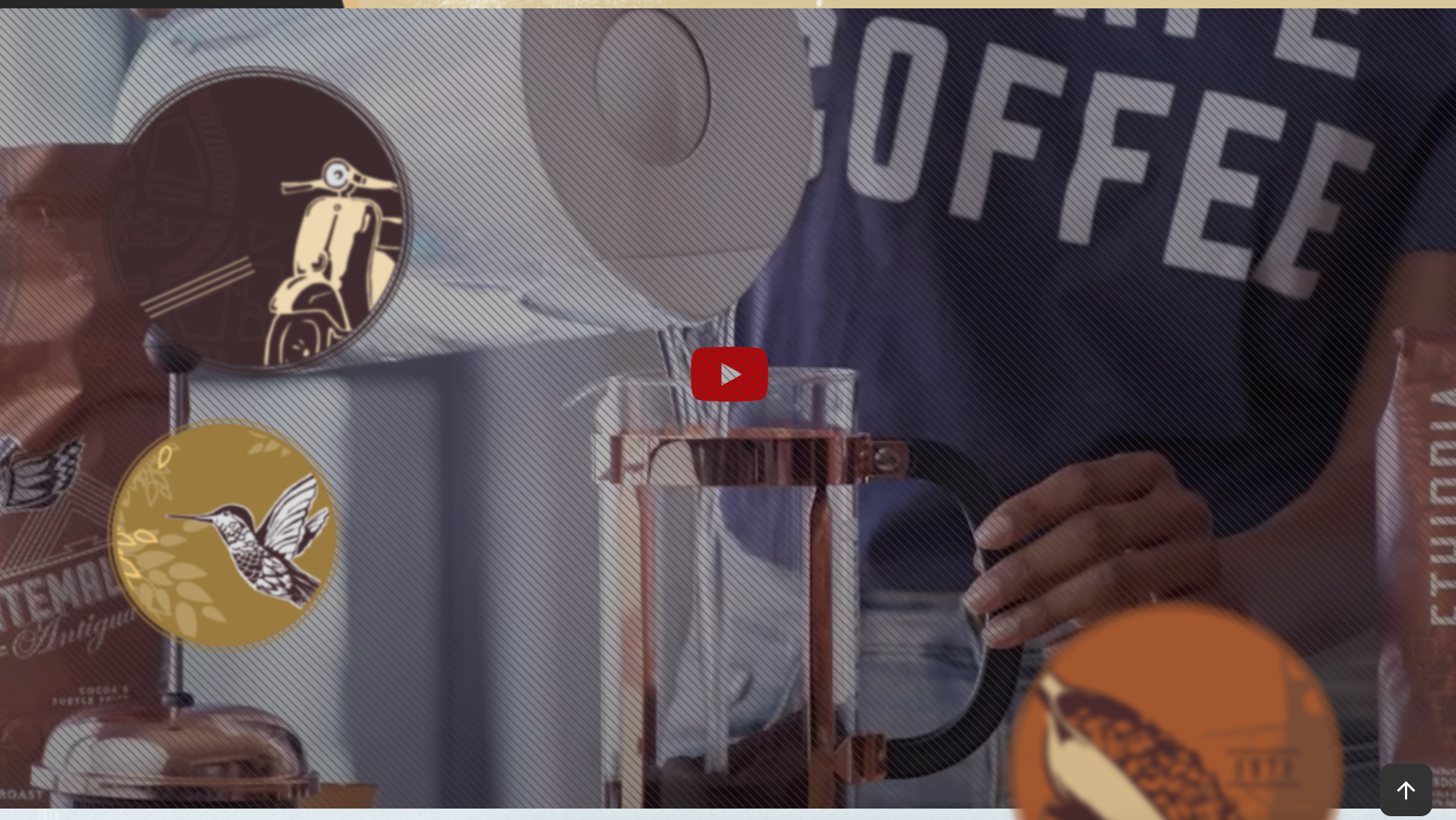
- 자동재생되는 유투브 + 필터 배경 이미지
- 둥둥 뜨는 스티커들
사전 지식
부모요소와 자식요소를 가지고 css 에서 영역의 비율을 조절할 수 있다
<div class="container">
  <div class="item"></div>
</div>
.container {
width: 100px;
background-color: orange;
}
.container .item {
width: 100%;
padding-top: 50%;
}
- padding-top, bottom 상관 없음
- padding-left/right 영역 표시 안됨
유투브를 끌어 오려면..
- iframe player api 검색
- div id="player" 가 비디오 자체가 된다
- js 로 조절한다. (따로 js파일 만들어주기)
HTML
<section class="youtube">
  <div class="youtube__area">
    <div id="player"></div>
  </div>
  <div class="youtube__cover"></div>
  <div class="inner">

    <img src="./images/floating1.png" alt="Icon" class="floating floating1"/>
    <img src="./images/floating2.png" alt="Icon" class="floating floating2"/>

  </div>
</section>- \<div id="player"></div> 없으면 비디오가 로드 되지 않음!
CSS
-
.youtube {}
- position: relative;
- height: 700px;
- background-color: #333;
- overflow: hidden;
-
.youtube .youtube__area {}
영상 재생 영역 원래 #player로 조절해야 하는데 잘 안돼서 이걸루 함- width: 1920px;
- position: absolute;
- left: 50%;
- margin-left: calc(1920px / -6);
- top: 200%;
- margin-top: calc(1920px * 9 / 16 / -2);
- zoom: 300%;
-
.youtube .youtube__area ::before {}
- content: "";
- display: block;
- width: 100%;
- height: 0;
- padding-top: 56.25%; 영상 비율 16:9 로 조절
-
.youtube .youtube__cover {}
- background-image: url("../images/video_cover_pattern.png");
- background-color: rgba(0,0,0,.3);
- position: absolute;
- top: 0;
- left: 0;
- width: 100%;
- height: 100%;
-
/ #player {} / 이 설정을 적용하면 비디오가 사라져서 코멘트처리함
width: 100%;
height: 100%;
position: absolute;
top: 0;
left: 0; -
.youtube .inner {}
둥둥 스티커는 이너영역 안에 붙일 것
height:700px; -
.youtube .floating1 {}
position: absolute;
top: 50px;
left: 0; -
.youtube .floating2 {}
position: absolute;
top: 350px;
left: 150; -
.youtube .floating3 {} 은 그 다음 섹션 사이 중간에 배치할 것인데 유튜브 overflow:hidden으로 만들어서 짤리게됨. -> 그 다음 섹션으로 넣어서 배치하자
JS
유투브 동영상 연결하기
// 2. This code loads the IFrame Player API code asynchronously.
let tag = document.createElement('script');
tag.src = "https://www.youtube.com/iframe_api";
let firstScriptTag = document.getElementsByTagName('script')[0];
firstScriptTag.parentNode.insertBefore(tag, firstScriptTag);

// 3. This function creates an <iframe> (and YouTube player)
//    after the API code downloads.
function onYouTubeIframeAPIReady() {
  new YT.Player('player', {
    videoId: 'An6LvWQuj_8', // 최초 재생할 유튜브 영상 id
    playerVars:  {
      autoplay: true,
      loop: true,
      playlist: 'An6LvWQuj_8'
    },
    events: {
      onReady: function(event){
        event.target.mute(); // 음소거
      }
    }
  });
}- onYouTUbeIframeAPIReady() 함수이름 그대로 써야함
- '#player'라고 하면 안됨! 'player'
- videoID 는 url 끝부분의 값
- playlist 같은 비디오를 반복하도록 한다
- target 재생되고 있는 영상 자체
스티커 동동 에니메이션 추가하기
// 범위 랜덤 함수(소수점 2자리까지)
function random(min, max) {
  // `.toFixed()`를 통해 반환된 문자 데이터를,
  // `parseFloat()`을 통해 소수점을 가지는 숫자 데이터로 변환
  return parseFloat((Math.random() * (max - min) + min).toFixed(2))
}

function floatingObject(selector, delay, size) {
  gsap.to(
    selector, // 선택자
    random(1.5, 2.5), // 애니메이션 동작 시간
    {
      y: size,
      repeat: -1, // 무한 반복
      yoyo: true,
      ease: Power1.easeInOut,
      delay: random(0,delay)
    }
  );
}
floatingObject('.floating1', 1, 15);
floatingObject('.floating2', .5, 15);
floatingObject('.floating3', 1.5, 20);- y : y축으로 얼마나 왔다갔다 할 건지
- yoyo : 위 -> 아래, 아래 -> 위로 역재생
- ease: 좀더 부드럽고 세심한 움직임 조절
- .easeInOut 움직임 타입
- delay: 몇 초 뒤에 에니메이션 실행
section class="pick-your-favorite scroll-spy"
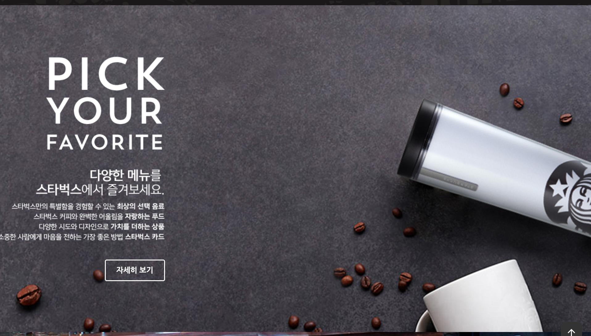
<section class="pick-your-favorite scroll-spy">
  <div class="inner">

    <div class="text-group">
      <img src="./images/favorite_text1.png" alt="" class="title back-to-position to-right delay-0"/>
      <img src="./images/favorite_text2.png" alt="" class="description back-to-position to-right delay-1"/>
      <div class="more back-to-position to-right delay-2">
        <a href="javascript:void(0)" class="btn btn--white">자세히 보기</a>
      </div>
    </div>

  </div>
</section>- class="btn btn--white" 하얀버튼으로 추가
고정이미지 배경
-
.pick-your-favorite {}
- background-image: url("../images/favorite_bg.jpg");
- background-repeat: no-repeat; 반복출력 안함
- background-position: center; 섹션의 정 가운데
- background-attachment: fixed; 요소가 스크롤 될 때 같이 스크롤 되지 않고 뷰 포트에 고정이 되서 스크롤과 같이 움직이지 않음
- background-size: cover; 이미지를 더 넓은 너비에 맞춰서 출력이 된다
-
.pick-your-favorite .inner {}
- padding: 110px 0; 좌우는 사용하지 않음. 컨텐츠 위아래 여백을 준다.
-
.pick-your-favorite .text-group {}
- display: flex; 수평정렬
- width: 263px; 가로너비 제한
- flex-wrap: wrap; 제한된 너비 안에 한줄로 줄바꿈되어서 출력 된다
- justify-content: flex-end; 오른쪽 정렬
-
.pick-your-favorite .text-group .title {}
- margin-bottom: 40px; 아이템사이 여백
-
.pick-your-favorite .text-group .description {}
- margin-bottom: 40px; 아이템사이 여백
section class="reserve-store"
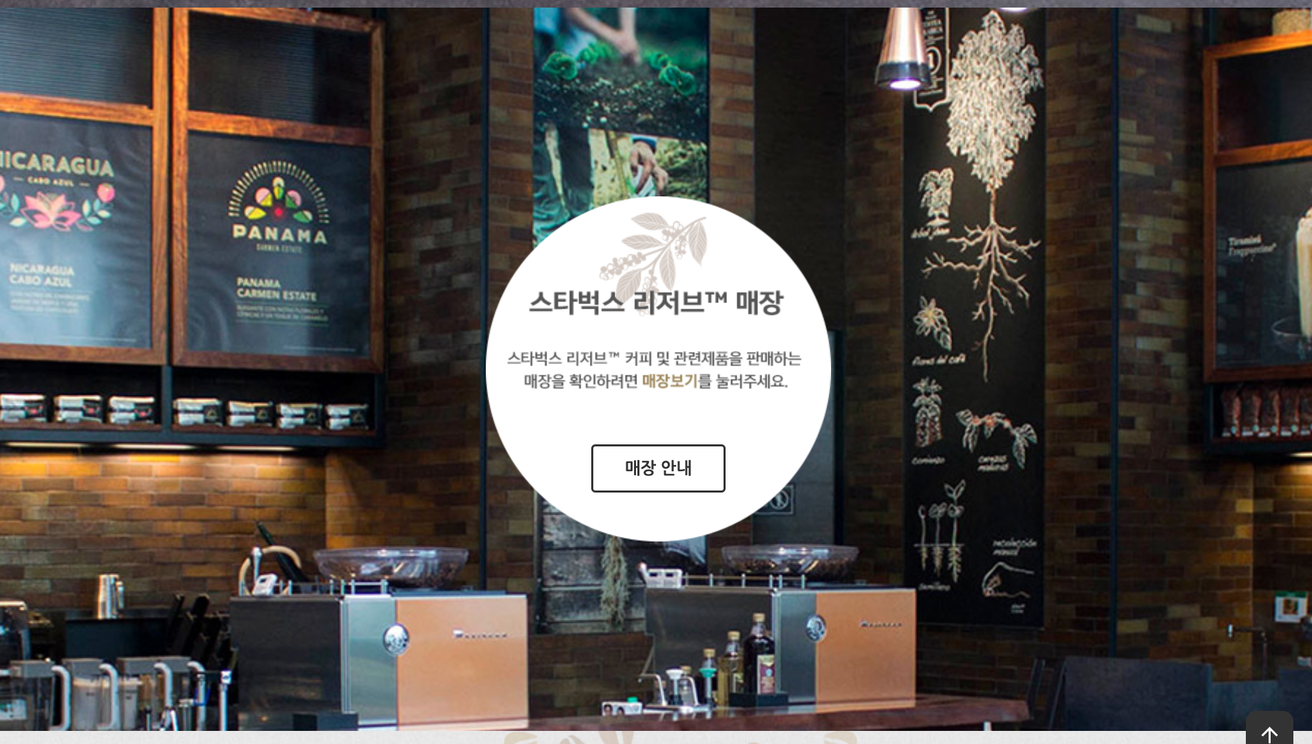
회전이 되는 뱃지 만들기
<section class="reserve-store">
  <div class="inner">

    <div class="medal">
      <div class="front">
        <img src="./images/reserve_store_medal_front.png" alt="" />
      </div>
      <div class="back">
          <img src="./images/reserve_store_medal_back.png" alt="" />
          <a href="javascript:void(0)" class="btn">매장 안내 </a>
        </div>
    </div>

  </div>
</section>
CSS
-
.reserve-store .inner{}
- height: 700px;
- display: flex; 메달 안에 다 넣을 수 있도록 해준다
- justify-content:center; 가로 중간 정렬
- align-items: center; 세로 중간 정렬
-
.reserve-store .medal {}
- width: 334px;
- height: 334px;
- perspective: 600px; 부모요소로부터 600px만큼 떨어져 있음. 3차원의 효과가나면서 뒤집어 지게 된다.
-
.reserve-store .medal .front,
.reserve-store .medal .back {}- width: 334px;
- height: 334px;
- backface-visibility: hidden; 뒷면을 안보이게
- transition: 1s;
- position: absolute; 앞 뒤 로고가 겹칠 수 있도록 해준다
-
.reserve-store .medal .front {}
- transform: rotateY(0deg); 기본으로 앞면이 보이도록. 명시적으로 브라우저가 제대로 이해할 수 있게 해준다.
-
.reserve-store .medal:hover .front {}
- position: absolute; 호버 되었을 때도 뒷면과 겹치게한다
- transform: rotateY(180deg); 180도 돌게됨
-
.reserve-store .medal .back {}
- transform: rotateY(-180deg); 기본으로 -180도 돌려짐. 그래야 돌렸을 때 자연스럽고 좌우반전 되지 않음
-
.reserve-store .medal:hover .back {}
- transform: rotateY(0deg); 호버되었을 때 뒷면이 보이게 된다
스크롤 위치계산 애니메이션
- scrollmagic cdn 검색
- min.js 버전 스크립트 복사. 붙여넣기
<!-- ScrollMagic -->
<script defer src="https://cdnjs.cloudflare.com/ajax/libs/ScrollMagic/2.0.8/ScrollMagic.min.js" integrity="sha512-8E3KZoPoZCD+1dgfqhPbejQBnQfBXe8FuwL4z/c8sTrgeDMFEnoyTlH3obB4/fV+6Sg0a0XF+L/6xS4Xx1fUEg==" crossorigin="anonymous" referrerpolicy="no-referrer"></script>
JS
화면에 0.8 부분에 오면 show 클래스를 넣었다 빼준다
const spyEls = document.querySelectorAll('section.scroll-spy');
spyEls.forEach(function (spyEl) {
  new ScrollMagic
    .Scene({
      triggerElement: spyEl,
      triggerHook: .8,
    })
    .setClassToggle(spyEl, 'show')
    .addTo(new ScrollMagic.Controller());
});- section.scroll-spy
섹션에 scroll-spy라는 클래스는 다 찾겠다 - spyEls.forEach(function (spyEl)
spyEls 의 각각의 요소 spyEl에 대해 function을 실행할 것 - .Scene()
이 메소드는 특정한 요소를 감시하는 옵션을 설정할 수 있다.- triggerElement: spyEl,
보여짐 여부를 감시할 요소를 지정한다 - triggerHook: .8,
viewport의 0.8 지점에 걸리면 효과(setClassToggle)를 적용한다
- triggerElement: spyEl,
- setClassToggle()
클래스를 넣었다 뺐다 하며 제어해 준다- spyEl, 'show'
spayEl에 show라는 클래스를 넣었다 뺀다
- spyEl, 'show'
- addTo()
이 메소드는 scrollMagic 라이브러리의 컨트롤러 기능을 추가해준다.- new ScrollMagic.Controller()
css
부하가 많이 걸리는 효과 처리는 자바스크립트보다 css로 처리해주는 것이 좋다
-
.back-to-position {}
- opacity: 0; 완전히 투명상태에서 시작
- transition: 1s;
-
.back-to-position.to-right {} 일치선택자(동시에 만족 &)
- transform: translateX(-150px); 왼쪽에서 오른쪽으로 이동
- class="reserve-logo back-to-position to-right delay-0"
-
.back-to-position.to-left {} 일치선택자
- transform: translateX(150px); 오른쪽에서 왼쪽으로 이동
- class="product back-to-position to-left delay-3"
-
.show .back-to-position {}
- opacity: 1; 완전히 보이고
- transform: translateX(0); 원래 지정했던 위치에 놓임
-
.show .back-to-position.delay-0 {}
- transition-delay: 0s;
-
.show .back-to-position.delay-1 {}
- transition-delay: .3s;
-
.show .back-to-position.delay-2 {}
- transition-delay: .6s;
footer
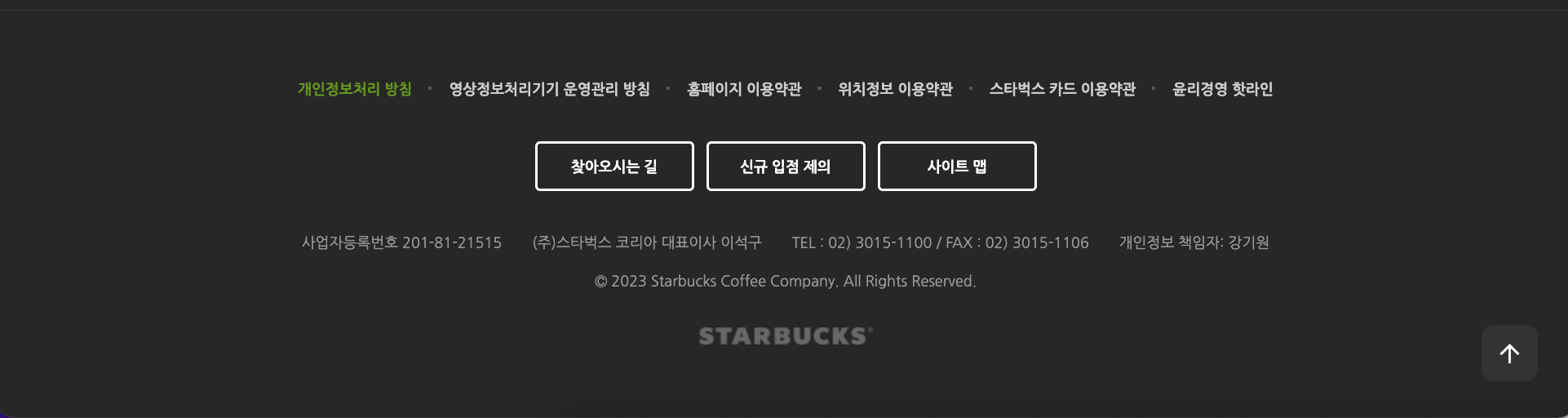
<footer>
<div class="inner">
<ul class="menu">
<li><a href="javascript:void(0)" class="green">개인정보처리 방침</a></li>
<li><a href="javascript:void(0)">영상정보처리기기 운영관리 방침</a></li>
<li><a href="javascript:void(0)">홈페이지 이용약관</a></li>
<li><a href="javascript:void(0)">위치정보 이용약관</a></li>
<li><a href="javascript:void(0)">스타벅스 카드 이용약관</a></li>
<li><a href="javascript:void(0)">윤리경영 핫라인</a></li>
</ul>
<div class="btn-group">
<a href="javascript:void(0)" class="btn btn--white">찾아오시는 길</a>
<a href="javascript:void(0)" class="btn btn--white">신규 입점 제의</a>
<a href="javascript:void(0)" class="btn btn--white">사이트 맵</a>
</div>
<div class="info">
<span>사업자등록번호 201-81-21515</span>
<span>(주)스타벅스 코리아 대표이사 이석구</span>
<span>TEL : 02) 3015-1100 / FAX : 02) 3015-1106</span>
<span>개인정보 책임자: 강기원</span>
</div>
<p class="copyright">
© <span class="this-year"></span> Starbucks Coffee Company. All Rights Reserved.
<!-- html 특수기호 html entities -->
</p>
<img src="./images/starbucks_logo_only_text.png" alt="" class="logo">
</div>
</footer>- 태그로 해석되는 특수문자 사용하기
- © -> ©
- & &
- &Tap;
- 

- $ $
- span class="this-year"
Date()에서 연도만 출력을 할 것
  const thisYear = document.querySelector('.this-year');
  thisYear.textContent = new Date().getFullYear();
CSS
-
footer .menu li {}
- position: relative;
li::before 요소 position지정하기 위해서
- position: relative;
-
footer .menu li::before {}
- content: "";
비포는 content요소 필수 - background-color: #555;
- top: 0;
- bottom: 0;
- right: -1px;
- margin: auto;
- position: absolute;
부모요소 기준 배치. display block을 내포하고 있음 - width: 3px; 블록 요소가 되었으므로 지정 가능
- height: 3px;
- content: "";
-
footer .menu li:last-child::before {}
- display: none;
맨 오른쪽의 점은 필요 없음
- display: none;
-
footer .menu li a {}
- color: #ccc;
- font-size: 12px;
- font-weight: 700;
- padding: 15px;
- display: block;
패딩요소를 잘 쓸 수 있도록. 사용자가 a태그를 클릭할 수 잇는 영역확보해주기
-
footer .menu li a.green {}
- color: #669900
- a href="javascript:void(0)" class="green"
-
footer .logo {}
- margin: 30px auto 0; 상, 중, 하
이미지 요소이므로 가로를 명시하지 않아도 정렬이 된다.
- margin: 30px auto 0; 상, 중, 하
div id="to-top"
- gsap cdn 검색
- ScrollToPlugin.min.js 태그복사, 붙여넣기
<!-- ScrollToPlugIn -->
<script src="https://cdnjs.cloudflare.com/ajax/libs/gsap/3.11.4/ScrollToPlugin.min.js" integrity="sha512-tQFq+nb/TSS648SDzWbSj0A67t4I1PFzR0U6Oi/yEYFyUbAIwg74SOCbr7t2X1Rn+iln7sYwfh8y+z7p0gddOw==" crossorigin="anonymous" referrerpolicy="no-referrer"></script>

<div id="to-top">
  <div class="material-icons">arrow_upward</div>
</div>- #to-top {}
- width: 42px;
- height: 42px;
- background-color: #333;
테두리선은 - color: #fff;
흰색. - border: 2px solid #333;
- border-radius: 10px;
- display: flex;
내부에 화살표 아이콘 넣기 - justify-content: center;
- align-items: center;
- position: fixed;
뷰포트 기준으로 배치 - bottom: 30px;
- right: 30px;
- z-index: 9; 맨위에 있을 수 있도록
- cursor: pointer;
JS
버튼을 누르면 맨 위로 스크롤 되는 기능 넣기
const badgeEl= document.querySelector('header .badges');
const toTopEl = document.querySelector('#to-top');

window.addEventListener('scroll',_.throttle(function(){
  if (window.scrollY > 500) { //스크롤이 아래쪽에 있을 때
    // 배지 숨기기
    gsap.to(badgeEl, .6, {
      opacity: 0,
      display: 'none'
    });
    // 버튼 보이기
    gsap.to(toTopEl, .2, {
      x: 0
    })
  } else { // 스크롤이 메인부분에 있을 때
    // 배지 보이기
    gsap.to(badgeEl, .6, {
      opacity: 1,
      display: 'block'
    });
    // 오른쪽으로 버튼 숨기기
    gsap.to(toTopEl, .2, {
      x: 100
    })
  }
},300));

toTopEl.addEventListener('click', function(){
  gsap.to(window, .7, {
    scrollTo: 0
  })
})- x: 0 원위치
- x: 100 원위치에서 오른쪽으로 100
- gsap.to(window, .7, {scrollTo: 0})
- window 객체. 화면 자체.
- 0.7 초 동안 효과
- 스크롤의 위치를 0으로 옮겨주기