[AI][Data Analysis and Machine Learning]Matplotlib

파이썬의 자료(DataFrame, Series..)을 차트나 플롯으로 시각화하는 모듈
Matplotlib는 정형화된 차트나 플롯 이외에도 저수준 api를 사용한 다양한 시각화 기능을 제공한다.
- 라인 플롯
- 스캐터 플롯
- 컨투어 플롯
- 서피스 플롯
- 바 차트
- 히스토그램
- 박스 플롯
- ……..
import numpy as np
import pandas as pd
import matplotlib.pyplot as plt
Line plot
선을 그리는 라인 플롯
데이터가 시간, 순서 등에 따라 어떻게 변화하는지 보여주기 위한 용도
arr=np.array([10,20,14,20])

plt.plot(arr)

# ↓ index 는 x 축으로, value 는 y 축으로 표현.
plt.show()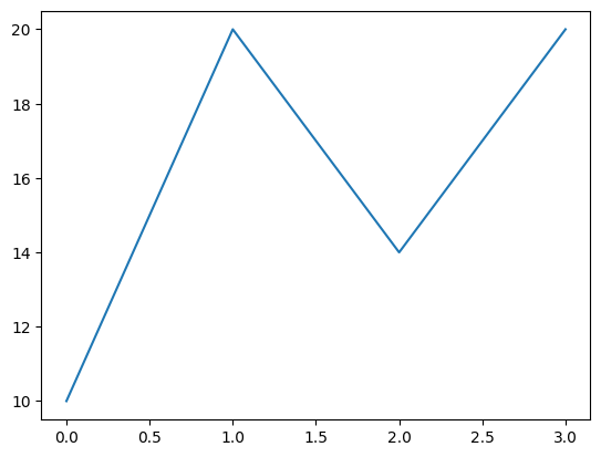
# 2차원 array 의 경우는?
arr = np.array([
    [10, 30, 14, 20],
    [20, 50, 33, 10],
    [30, 20, 5, 0]
])
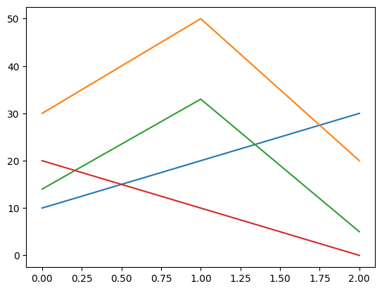
# 두 개의 array 객체로 각각 x,y
x=np.arange(0,1,0.01)
y = x**2

plt.plot(x,y)
plt.show()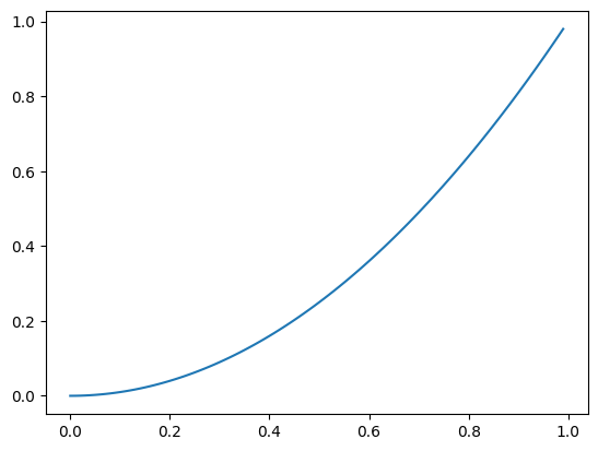
- Series 로 line plot 그리기
- index 가 x축, value 가 y 축
s = pd.Series(np.random.randn(10).cumsum(), index = np.arange(0, 100, 10))
s

plt.plot(s)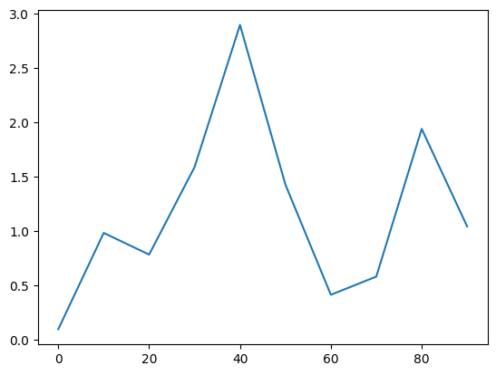
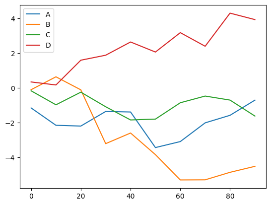
df = pd.DataFrame(np.random.randn(10, 4).cumsum(axis=0),
                  columns=["A", "B", "C", "D"],
                  index=np.arange(0, 100, 10))
df| 0 | -1.146454 | -0.098968 | -0.161774 | 0.346750 |
|---|---|---|---|---|
| 10 | -2.144958 | 0.642376 | -0.966804 | 0.173377 |
| 20 | -2.188395 | -0.106686 | -0.240107 | 1.597660 |
| 30 | -1.349294 | -3.199973 | -1.079126 | 1.884451 |
| 40 | -1.379968 | -2.588583 | -1.837254 | 2.644551 |
| 50 | -3.425423 | -3.832291 | -1.788554 | 2.066589 |
| 60 | -3.080246 | -5.285021 | -0.848798 | 3.181507 |
| 70 | -2.003803 | -5.278669 | -0.464313 | 2.398813 |
| 80 | -1.570444 | -4.847772 | -0.695673 | 4.302363 |
| 90 | -0.699239 | -4.504405 | -1.613179 | 3.931636 |
df.plot()
df[['B','A']].plot()
plt.plot(df[['B','A']])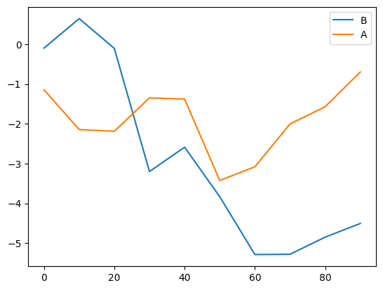
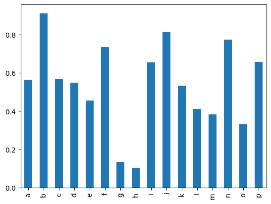
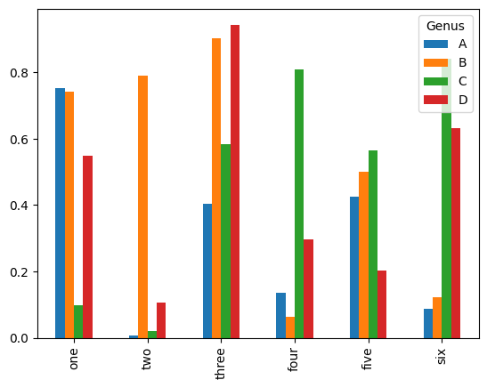
Bar plot
s2 = pd.Series(np.random.rand(16), index=list("abcdefghijklmnop"))

s2.plot(kind='bar')
s2.plot(kind='barh')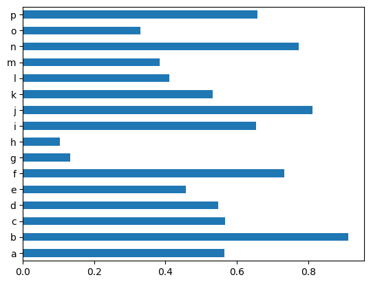
df2 = pd.DataFrame(np.random.rand(6, 4),
                   index=["one", "two", "three", "four", "five", "six"],
                   columns=pd.Index(["A", "B", "C", "D"], name="Genus"))

df2.plot(kind='bar')
plt.show()
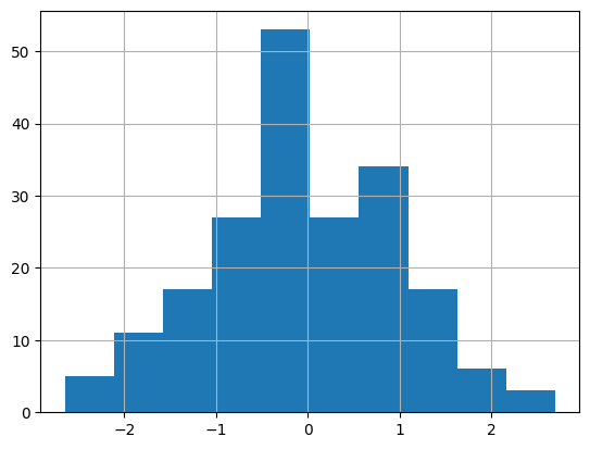
Histogram
도수분포표의 하나, 가로축이 계급, 세로축이 도수
인덱스 필요 X
s3 = pd.Series(np.random.normal(0, 1, size=200))
s3.hist()
- 가로축이 value(구간)
- 세로축이 분포(수량,개수)
- bins=구간
s3.hist(bins=50)    # bins= 구간
plt.show()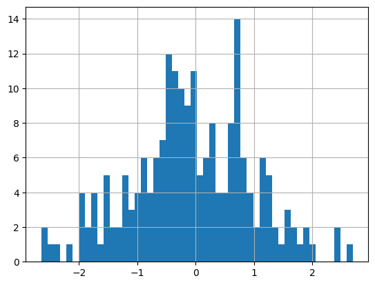
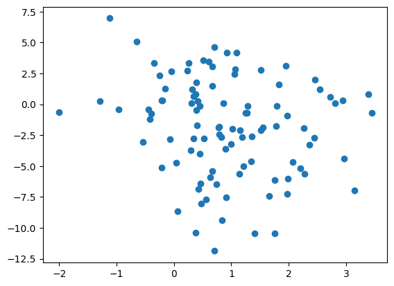
Scatter plot
산점도: 산점도의 경우 서로 다른 두 개의 독립변수에 대해 두 변수가 어떤 관계가 있는지 살펴보기 위해 사용된다
x1 = np.random.normal(1, 1, size=(100, 1))
x2 = np.random.normal(-2, 4, size=(100, 1))

X = np.concatenate((x1,x2),axis=1)

df3=pd.DataFrame(X,columns=["x1","x2"])

plt.scatter(df3.x1,df3.x2)
Matplotlib 한글 문제
#Colab 한글 글꼴 설치 fonts-nanum

!sudo apt-get install -y fonts-nanum
!sudo fc-cache -fv
!rm ~/.cache/matplotlib -rf
plt.rc('font',family='NanumBarunGothic')- 후에 세션 다시시작
figure, subplot
- figure=그림
- subplot=그림 안의 공간
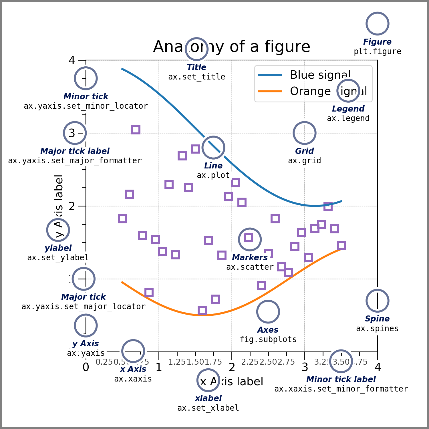
- figure 객체 생성
fig = plt.figure()
- subplot(그림공간) 추가
#2x2 그림공간 생성 후 그 중에서 1번째
ax1 = fig.add_subplot(2,2,1)

ax4 = fig.add_subplot(2,2,4)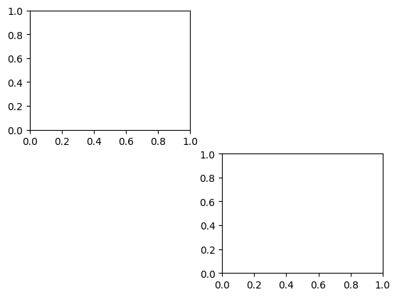
- plt.subplots(row,col) 을 더 많이 씀
fig, (ax1,ax2,ax3) = plt.subplots(1,3)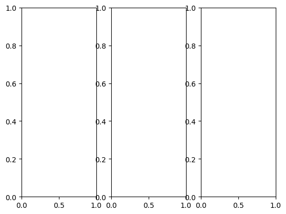
fig,((ax1,ax2),(ax3,ax4))=plt.subplots(2,2)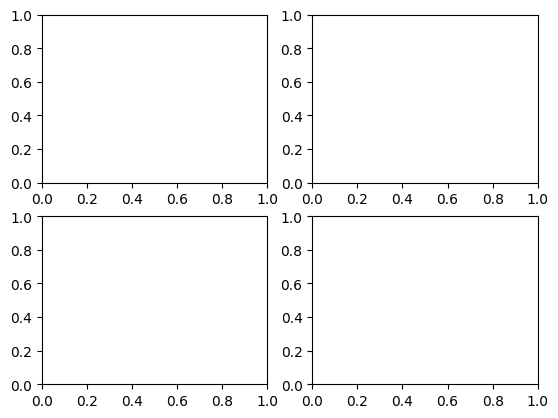
정리
- Series 나 DataFrame 에서 plot() 호출하여 직접 작성
s=pd.Series(np.random.randn(10).cumsum(),index=np.arange(0,100,10))
s.plot()- pyplot의 메소드 호출
- 간결하지만 복잡한 그래프를 그리는데 한계가 있음
plt.plot(s)- figure 생성 후 subplot 에 그리기
- 그래프는 여러 파트로 구성되어 있는데
- 전체그림: Figure
- Figure 안의 세부 그림→Subplot
fig =  plt.figure()ax1 = fig.add_subplot(1,1,1)
ax1.plot(s)
plot 꾸미기
plt.plot(np.random.randn(50),color='g',marker='o',linestyle='--')
plt.show()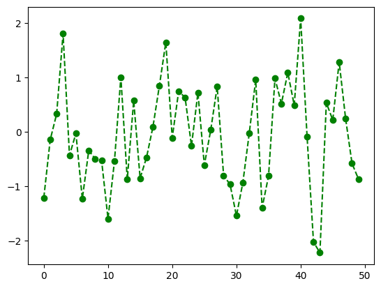
- plot 꾸미기 옵션
# plot 꾸미기 옵션

# color
# 값 색상
# "b" blue
# "g" green
# "r" red
# "c" cyan
# "m" magenta
# "y" yellow
# "k" black
# "w" white

# marker
# 값 마킹
# "." point
# "," pixel
# "o" circle
# "v" triangle_down
# "^" triangle_up
# "<" triangle_left
# ">" triangle_right
# "8" octagon
# "s" square
# "p" pentagon
# "*" star
# "h" hexagon
# "+" plus
# "x" x
# "D" diamond

# line style
# 값 라인 스타일
# "-" solid line
# "--" dashed line
# "-." dash-dotted line
# ":" dotted line
# "None" draw nothing
figure→파일로 저장하기
import os
base_path=r'/content/drive/MyDrive/AI_1900/dataset'

if not os.path.exists(os.path.join(base_path,'out')):
	os.makedirs(os.path.join(base_path,'out'))


x = [1,2,3]
y = [10,20,30]

plt.plot(x,y,color='g',linestyle='-',marker='v')

plt.title('3rd Graph')
plt.savefig(os.path.join(base_path,'out','figimag1.png'))
#해상도  (출판물은 300dpi 이상 선호)
plt.savefig(os.path.join(base_path,'out','figimg2.png',dpi=200))

#벡터 포맷 저장
#확대, 축소 등의 상황에서도 이미지가 깨지지 않고 선명하게 보임

#svg 벡터
plt.savefig(os.path.join(base_path,'out','figimg3.svg'))
#pdf 벡터
plt.savefig(os.path.join(base_path,'out','figimg4.pdf'))
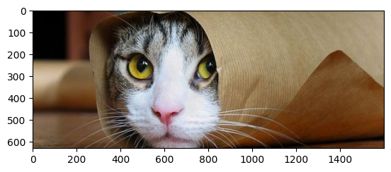
이미지 시각화
from IPython.display import Image

img_path = os.path.join(base_path,'cat.jpg')
Image(img_path)

- 이미지 → array
arr = plt.imread(img_path)
arr
array([[[ 5, 3, 4],
[ 5, 3, 4],
[ 5, 3, 4],
...,
[ 2, 2, 2],
[ 2, 2, 2],
[ 2, 2, 2]],
[[ 5, 3, 4],
[ 5, 3, 4],
[ 5, 3, 4],
...,
[ 2, 2, 2],
[ 2, 2, 2],
[ 2, 2, 2]],
[[ 5, 3, 4],
[ 5, 3, 4],
[ 5, 3, 4],
...,
[ 2, 2, 2],- 이미지 shape
-
(height,width,color channel)
-
color channel 은 (r,g,b) 값 각각 0~255
arr.shape
>(1200, 1600, 3)

# row:0, col:5 의 green 값
arr[0,5,1]
>3
-
이미지 slicing
plt.imshow(arr[170:800])
plt.imshow(arr[170:800,230:850])
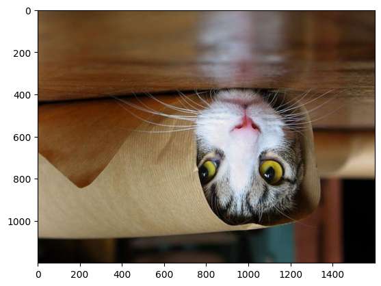
이미지 flip
plt.imshow(arr[:,::-1,:]) plt.imshow(arr[::-1,::-1,:])
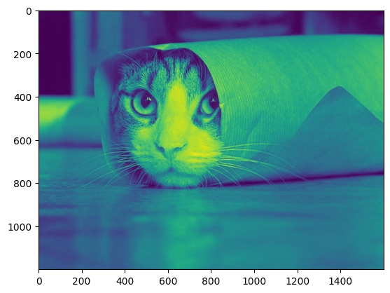
gray scale 변경
arr.shape
>(1200,1600,3)
#red 만 추출
# 2차원 데이터
r = arr[:,:,0]
r.shape
plt.imshow(r)
-
image_arr.shape == (1200,1600,3)
- r = image_arr[:, :, 0]
- g=image_arr[:, :, 1]
- b = image_arr[ :, :,2]
-
rgb 3개의 색값을 사용하여 한개의 색으로 변경하는 공식 예시
- r0.2999+g0.587+b*0.114
- 즉 (1200x1600x3)x(3x1)⇒1200x1600
def color_to_grayscale(image_arr):
	return np.dot(
				image_arr,
				np.array([0.299,0.587,0.114]) #(3x1)
			)
gray = color_to_grayscale(arr)
gray.shape
>(1200,1600)- plt 쓰기
plt.imshow(gray,cmap='gray')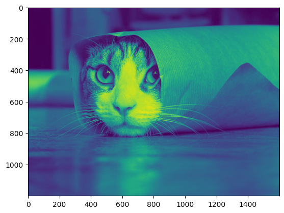
Interpolation
from PIL import Image

img=Image.open(img_path)

type(img)
PIL.JpegImagePlugin.JpegImageFile
def __init__(fp: StrOrBytesPath | IO[bytes], filename: str | bytes | None=None) -> None
Base class for image file format handlers.img=Image.open(img_path)
img.thumbnail((64,64))
imgplot=plt.imshow(img)
img=Image.open(img_path)
img.thumbnail((64,64))

imgplot=plt.imshow(img,interpolation='nearest')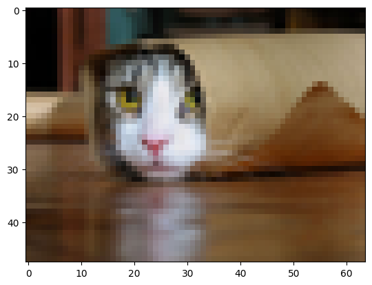

어리둥절 빙글빙글 돌아가는 코딩세상~