Color Psychology in Home Decor: Choosing the Perfect Palette
When it comes to designing a home that feels comfortable, stylish, and purposeful, one of the most powerful tools at your disposal is color. The colors you choose — from wall paint to textiles, furniture, and accents — don’t just influence aesthetics; they impact emotion, mood, and how a space feels and functions. This is where color psychology comes into play — the study of how colors affect thoughts, feelings, and behaviors.
In home decor, understanding color psychology helps you craft interiors that support your lifestyle, mood, and intentions for each room. Whether you’re decorating a calming bedroom, a stimulating living space, or a productive home office, the right palette can transform the experience of your home. Let’s explore how color psychology works in decor and how to choose the perfect palette for your space.
Understanding Color Psychology
Color psychology is based on the idea that colors have emotional and psychological effects on people, rooted in both cultural associations and biological responses. While interpretations can vary slightly across cultures and individuals, certain color associations are widely recognized:
- Warm colors (reds, oranges, yellows) tend to be energetic, cozy, and stimulating.
- Cool colors (blues, greens, purples) often evoke calm, relaxation, and serenity.
- Neutrals (whites, grays, beiges) provide balance, sophistication, and versatility.
It’s important to remember that color effects are influenced by intensity, saturation, lightness, and surrounding hues. A bright red accent wall feels very different from a muted terracotta one. Similarly, the same shade of blue can feel crisp and cool in a room with lots of natural light, but somber in a dim space.
How Colors Influence Mood and Behavior
Red — Passion, Energy, Appetite
Red is a high-impact color that stimulates energy and conversation. It’s a popular choice for dining rooms and accent walls, where it can encourage engagement and appetite. However, too much red can feel overwhelming or aggressive, so balance it with neutrals or use it as an accent rather than a dominant hue.
Orange — Warmth, Creativity, Sociability
Orange offers uplifting warmth and enthusiasm. It’s less intense than red but still vibrant and sociable. Great for creative spaces, playrooms, or entryways, orange can spark energy and friendliness. Pair with earthy tones to tone down its brightness.
Yellow — Happiness, Optimism, Focus
Yellow is bright and cheerful, linked with sunshine and positivity. It works well in kitchens, breakfasts nooks, and hallways. Softer, muted yellows can be calming, while bright, saturated yellows fuel energy and focus.
Blue — Calm, Trust, Productivity
Blue is one of the most versatile colors for interiors. Light blues evoke serenity and are ideal for bedrooms and bathrooms, while deeper blues add sophistication to living rooms. Blue is also associated with trust and productivity, making it a solid choice for home offices.
Green — Balance, Nature, Renewal
Green represents nature, balance, and harmony. It’s soothing and rejuvenating, making it perfect for living spaces, bedrooms, and even bathrooms. Mid-tone greens, like sage or eucalyptus, are particularly on trend and work beautifully with natural materials.
Purple — Luxury, Creativity, Mystery
Purple carries connotations of luxury and imagination. Lighter purples like lavender are calming and work well in bedrooms, while deeper purples like plum add drama and richness to formal spaces. Use purple thoughtfully, as too much can feel heavy.
Neutrals — Calm, Versatility, Cohesion
Neutrals like white, gray, beige, and taupe form the foundation of many palettes. They create breathing space, balance stronger hues, and make interiors feel cohesive. Pure white gives a crisp, modern feel, while warm neutrals feel cozy and timeless.
Choosing a Palette: Room by Room
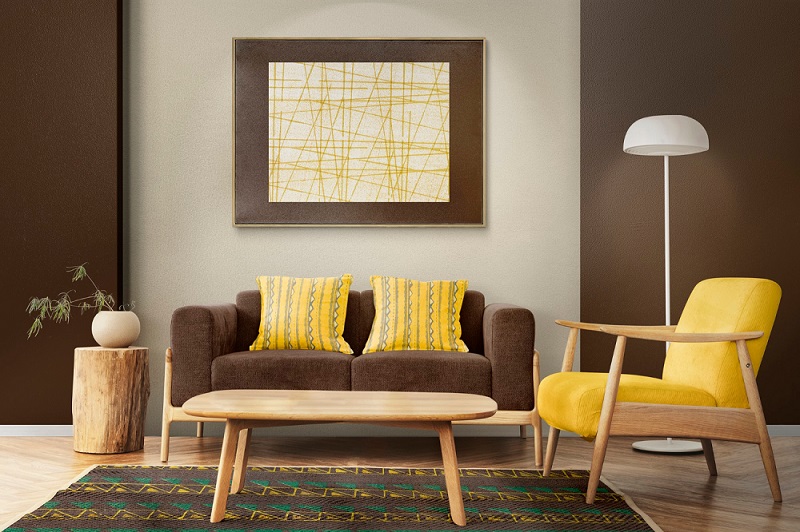
1. Living Room — Balance Warmth and Comfort
The living room is a social hub, so colors should feel inviting and flexible. Neutral bases like warm grays or beiges create a welcoming backdrop. Add accents in blues or greens to promote relaxation, or use warm reds/oranges in moderation for energy. Layer texture and pattern for depth.
Tips:
- Anchor with a neutral sofa.
- Add throw pillows or rugs in complementary accent colors.
- Use artwork to introduce pops of color without overwhelming the space.
2. Bedroom — Calm and Comfort
Bedrooms benefit from soothing hues that promote rest. Cool blues, soft greens, gentle lavenders, and warm neutrals help create a serene retreat. Avoid overly bright, intense shades that might be too energizing.
Tips:
- Choose bedding that echoes your wall tone for continuity.
- Use layered lighting (ambient + task) to soften the space.
- Incorporate natural materials to enhance calming vibes.
3. Kitchen — Energy and Function
Kitchens are spaces of activity. Yellows and warm neutrals boost energy and social interaction, while soft greens or blues add freshness. Avoid dark, overly cool tones that can make smaller kitchens feel confined.
Tips:
- Use splashy backsplash tiles in energetic hues.
- Combine functional stainless or wood finishes with warmer accents.
- Let countertops remain light to maximize brightness.
4. Home Office — Focus and Productivity
Your home office needs a color that supports focus and productivity. Blues and greens are ideal here, as they calm the mind without dulling energy. Consider accent walls to define the workspace without making the room feel enclosed.
Tips:
- Keep high-contrast colors away from your direct field of view to reduce distraction.
- Use plants or nature-inspired art to enhance stress relief.
- Bright accents in small doses (e.g., office accessories) can boost creativity.
Building a Cohesive Home Palette
While each room can have its own personality, aim for overall coherence:
- Start with a Base Color: Choose a neutral for floors, large furniture, or wall backgrounds.
- Add a Secondary Color: Use it for major rooms to unify spaces — e.g., a calming blue in bedrooms and a softer variant in adjoining hallways.
- Accent Colors: Limited to 2–3 choices used in accessories, art, fabrics, and small furniture pieces.
- Use Repetition: Echo colors across rooms — a similar shade of green in the living room and kitchen creates harmony.
- Flow with Purpose: Gradually transition color intensity through connected spaces to maintain rhythm.
Practical Tips for Testing Your Palette
- Sample First: Paint small swatches on the wall to see real light effects.
- Observe Throughout the Day: Colors look different in morning, afternoon, and evening light.
- Balance Warm and Cool: Even a primarily cool palette benefits from a warm accent to avoid feeling sterile.
- Texture Matters: Matte paint reads differently from glossy; textiles absorb light uniquely — factor this into decisions.
- Consider Architecture: High ceilings, small windows, or dark corners will affect how a color reads.
Final Thoughts
Choosing the perfect color palette is more than following trends — it’s about understanding how color affects emotion and function in your space. Thoughtful color choices can make your home feel bigger, calmer, more energized, or more cohesive, depending on the mood you want to create.
Remember: color is a tool — use it intentionally, and your home will not only look beautiful but also feel right.
You May Also Like
A Contemporary Wada in the Wild: Jungle Homes Tadoba Reimagines Maharashtrian Architecture
Indulge in the art of elegant dining at this modern Indian restaurant at The Oberoi, Gurugram
Savor the Grandeur of Indian Royalty in London’s Most Maximalist Dining Destination- Colonel Saab
Mumbai’s New Cocktail Bar Where Industrial Memory Meets Refined Glamour
Amina Bhatia Blends Heritage with Vintage Charm at Arjan Dugal’s Kala Ghoda Store
