레이아웃
inline vs block level
html의 태그는 태그의 성격에 따라 화면전체를 쓰는 태그 자신의 크기만큼 쓰는 태그로 나뉜다.
| - | inline | block level |
|---|---|---|
| 적용 | 자신의 크기 | 화면전체 |
| ex | a 태그 | h1 태그 |
| 속성 바꾸는 법 | a{display:block;} | h1{display:inline} |
box model
웹페이지에 표현될 때 여백, 위치, 크기 이런 것들을 결정하는 것이다.
- 테두리 생성
-border: 10px solid red;
-border: 10px dotted blue;
box-sizing
element의 크기를 지정할 때 사용한다.
- 기본값은 box-sizing:content-box
- 모든 elment가 width값이 달라져도 크기는 같을 수 있도록 하는 box-sizing:border-box
보통 *{box-sizing:border-box;}을 준다.
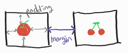
마진겹침
margin이 겹치는 경우가 생길 수 있다.
- 이때 겹치는 부분에서 더 큰 값을 가진 margin이 적용된다.
- 부모element아래에 자식element가 있을 때 border값을 따로 주지 않는 이상 마찬가지로 큰 값을 가진 margin이 적용된다.
- border값이 없다면, 두 margin이 겹쳐있다고 생각하기: 위/아래/좌/우 큰 값이 적용된다.
포지션
html의 element의 화면상 위치를 지정하는 것
- position:satic
- 기본값 포지션
- left/right/top/bottom의 값을 무시한다.
- position:relative
- 상대적인 포지션
- 부모를 기준으로 left/right/top/bottom으로 위치를 조정한다.
- position:absoult
- 절대 포지션
- 만약 부모들이 다 static이라면 html을 기준으로 위치가 정해진다.그리고 모든 부모의 스타일을 상속받지 않는다.
- 부모들 중 하나라도 relative값을 가진다면 absolute여도 그 부모에 대하여 상대적인 위치로 값이 정해진다.
- position:fixed
-
absoult처럼 부모와 링크가 끊기기 때문에 html을 기준으로 위치가 정해진다.
-
화면에 완전히 고정시켜서 스크롤이 내려가도 고정된UI를 만들때 사용한다.
FLEX
레이아웃을 잡을 때 사용하는 것.
ul ol처럼 카테고리 테그가 필요하다.(자식과 부모가 있어야 한다.)
<container>
  <item></item>
</container>
flex에서 사용되는 태그들
| container | item |
|---|---|
| display | order |
| flex-direction | flex-grow |
| flex-flow | flex-shrink |
| flex-wrap | flex-basis |
| justify-content | flex |
| align-items | align-self |
| align-content |
- flex를 시작하기위한 첫 번째 단계:
display:flex - container에서 flex-direction으로 item의 행열(세로로 쓰기/가로로 쓰기)설정 가능
- flex-direction: row 행
- flex-direction: row-reverse
- flex-direction: column 열
- flex-direction: column-reverse
- flex-basis
- 각 item의 크기를 결정
- 선택자를 .item:nth-child()로 하여 원하는 item을 선택가능
- flex-grow
- container크기가 item크기보다 클 때 여백을 채우기 위한 방법이다.
- ex) 비율에 따라 나눠진다.
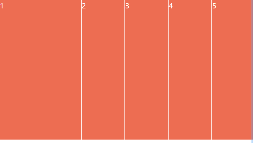
 .item{
	 flex-grow:1
 }
 .item:nth-child(1){
 	 flex-grow:2
  }
- flex-shrink
- 웹페이지의 크기를 줄일때(전체화면x)shrink값을 작게 설정할수록 줄어들지 않는다.
- 전체적으로 줄어들지 않게 하기 위해서는 shrink값 0으로 주기
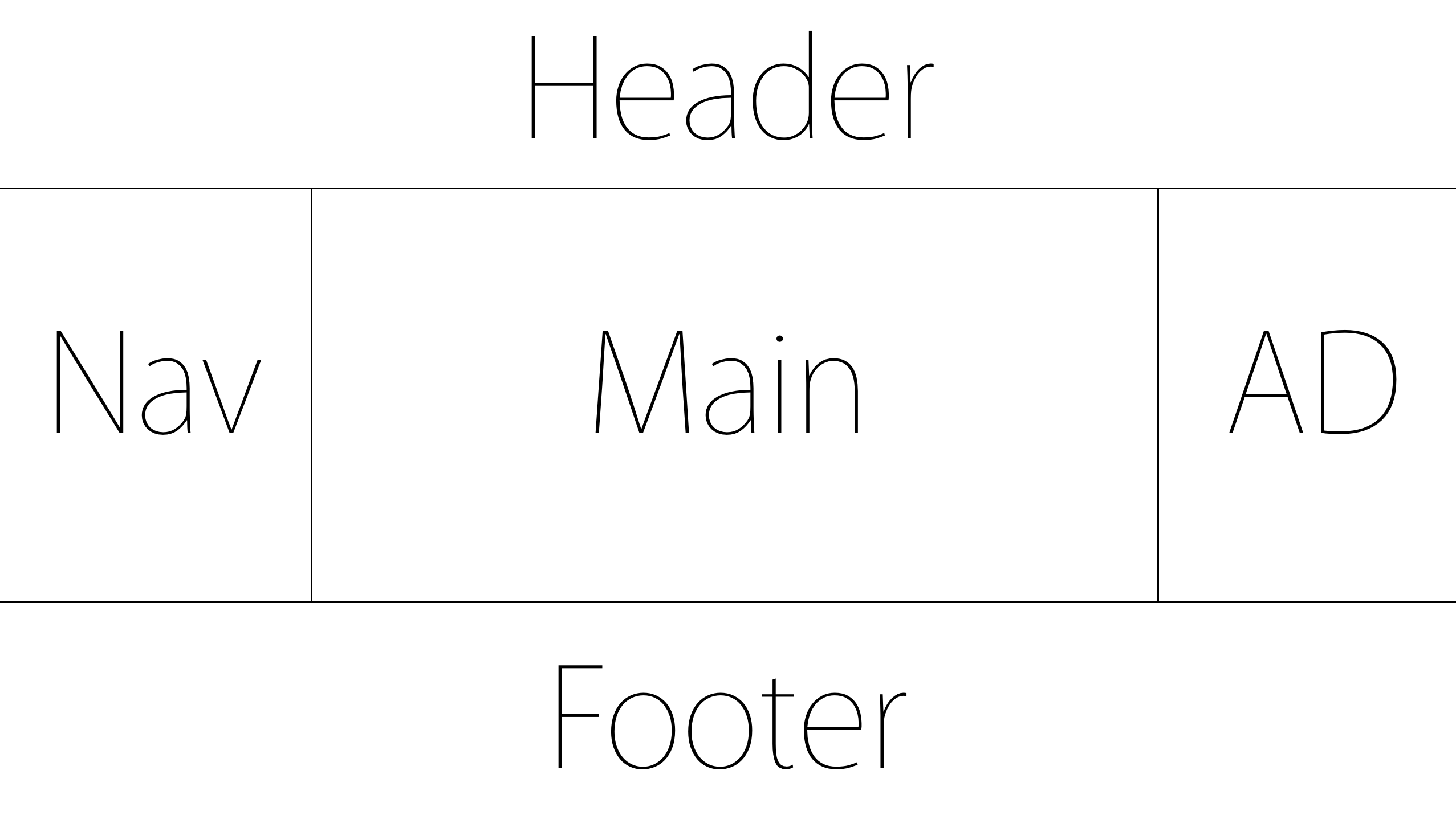
- holy grail layout

1월달에 공부한 css 임시저장해뒀길래 6월인 지금 출간