📝CSS 속성
📌수평,중앙,One True 레이아웃
✅ 수평정렬 레이아웃
자손에게 float속성을 지정하고, 부모의 overflow속성에는 hidden 키워드 적용
<head>
<meta charset="UTF-8">
    <title>Float with Overflow</title>
    <style>
        div.container{
            overflow: hidden;
        }
        div.item{
            float: left;

            margin : 0 3px;
            padding : 10px;
            border : 1px solid black;

        }
    </style>
</head>
<body>
    <div class ="container">
        <div class="item">메뉴 - 1</div>
        <div class="item">메뉴 - 2</div>
        <div class="item">메뉴 - 3</div>
        <div class="item">메뉴 - 4</div>
    </div>
    <p>nullam neque quam, blandit aget venenatis at, viverra</p>
</body>
👉🏻결과
자손에게 float속성을 지정하고, 부모의 overflow속성에는 hidden 키워드 적용 전/후
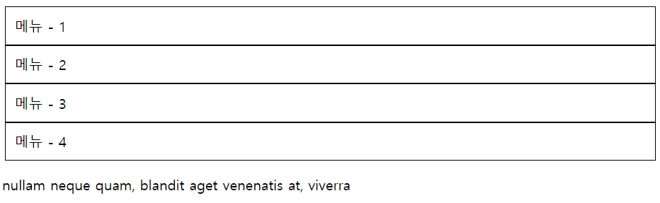
부모의 overflow속성에 hidden을 안해주면
👉🏻결과
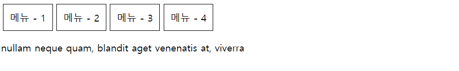
✅ clear: both사용한 수평 정렬 레이아웃
    <style>
        div.item{
            float:left;
            margin:0 3px;
            padding: 10px;
            border: 1px solid black;
        }
        div.clear{
            clear:both;
        }

    </style>
</head>
<body>
<p>Lorem, ipsum dolor sit amet consectetur adipisicing elit. Architecto corrupti repudiandae voluptatibus ex voluptas, dicta laudantium aut, alias unde, molestias magni maiores praesentium. Nam illo vitae a natus nihil nemo.</p>
<div class="clear"></div>
<div>
    <div class="item">메뉴 - 1</div>
    <div class="item">메뉴 - 1</div>
    <div class="item">메뉴 - 1</div>
    <div class="item">메뉴 - 1</div>
</div>
<div class="clear"></div>
<p>Lorem ipsum dolor sit amet consectetur adipisicing elit. Quis perferendis magni accusamus distinctio ad ipsam, consequuntur, aliquid fugiat veritatis, nisi deserunt? Id, vel. Soluta similique provident, dolore dolorum sint id?</p>
</body>
이렇게 해도 결과 똑같음
✅ 중앙 정렬 레이아웃
중앙 정렬 하고 싶은 태그에 width속성 부여,
margin 속성을 '0 auto'로 입력
<head>
<meta charset="UTF-8">
<title>Margin Width</title>
<style>
* {margin : 0; padding:0;}
body{
margin : 0 auto;
width: 960px;
}
</style>
</head>
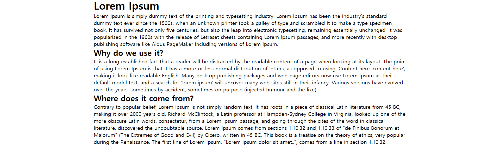
<body>
<h1>Lorem Ipsum</h1>
Lorem Ipsum is simply dummy text of the printing and typesetting industry.
...
<h2>Why do we use it?</h2>
<p>It is a long established fact that a reader will be distracted by the readable content of a page when looking at its layout.
...
</p>
<h2>Where does it come from?</h2>
<p>Contrary to popular belief, Lorem Ipsum is not simply random text.
...</p>
</body>
</html>👉🏻결과
글씨가 단순히 가운데 정렬되는 것이 아니라 글자가 쓰여지는 공간이 가운데 정렬됨
🔆 그리드 시스템
너비는 일반적으로 880px, 960px, 980px를 많이 사용
그중 특히 960px는 1,2,3,4,5,6,8,10,12로 나누어 떨어지므로 레이아웃 구성하기 쉽다
✅ one-true 레이아웃
행을 독립적으로 생각해서 공간을 나눈다는 원리
공간분할 후
1. 부모 태그에 고정된 너비 입력
2. 수평 정렬하는 부모 태그의 overflow속성에 hidden을 적용
3. 자손 태그에 적당한 너비를 입력하고 float속성을 적용
자손 태그의 너비 총합이 부모 태그의 너비가 될 때 좋음
<head>
<meta charset="UTF-8">
    <title>One True Layout</title>
    <style>
        body{
            margin : 10px auto;
            width: 500px;
        }
        #middle{ overflow : hidden;}
        #left{float:left; width:150px; background:red;}
        #right{float:right;width:350px; background: blue;}
        #top{background:green;}
        #bottom{background:purple;}
    </style>
</head>
<body>
    <div id ="top">Lorem, ipsum dolor sit amet consectetur adipisicing elit.
    ...
    </div>
    <div id ="middle">
        <div id ="left">Lorem ipsum dolor sit amet consectetur adipisicing elit.
        ...
        </div>
        <div id ="right">Lorem ipsum dolor sit amet consectetur adipisicing elit.
        ...
        </div>
    </div>
    <div id ="bottom">Lorem ipsum dolor sit amet consectetur adipisicing elit.
    ...
    </div>
</body>
👉🏻결과
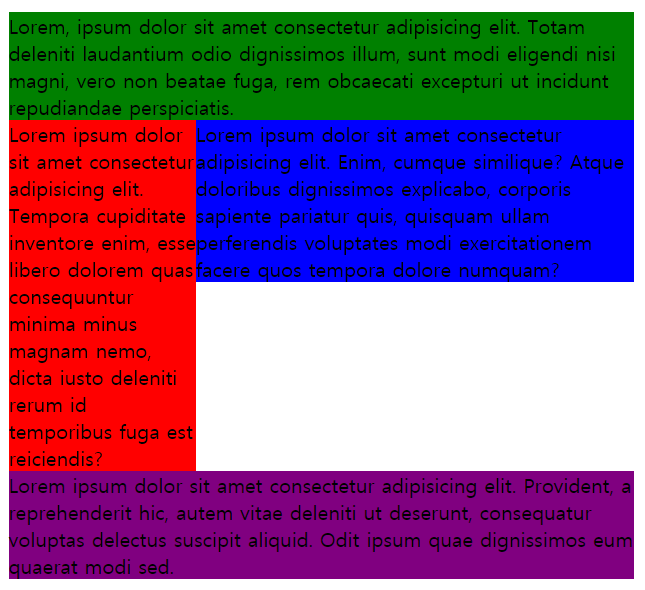
height 속성으로 높이도 지정해주면 더 깔끔하게 레이아웃 지정가능!!
width, height속성을 지정하지 않고 overflow속성에 hidden을 적용하면 유동영역을 감싼다.
overflow속성을 지정하지 않으면 float속성을 적용한 자손이 있는 행을 다른 행이 감쌈.
📌요소 배치
✅ 절대 위치를 사용한 요소 배치 (⭐)
자손의 position 속성에 absolute를 적용하려면 부모의 position속성에 relative를 적용합니다.
자손의 position 속성에 absolute를 적용하려면 부모에 height 속성을 입력합니다.
<head>
    <style>
        #container{
            width: 500px; height:300px;
            border: 3px solid black;
            overflow: hidden;
            position: relative;
        }
        .circle{
            position: absolute;
            width:100px; height:100px;
            border-radius: 50% 50%;
        }
        #red{
            background : red;
            left:20px; top:20px;/*부모 container안에서의 절대 위치*/
        }
        #green{
            background : green;
            right:20px; top:20px;/*부모 container안에서의 절대 위치*/
        }
        #blue{
            background: blue;
            right:20px; bottom: 20px;/*부모 container안에서의 절대 위치*/
        }
        #yellow{
            background: yellow;
            left: 20px; bottom: 20px;/*부모 container안에서의 절대 위치*/
        }
    </style>
</head>
<body>
    <h1>Dummy Text</h1>
    <div id="container">
        <div id="red" class="circle"></div>
        <div id="green" class="circle"></div>
        <div id="blue" class="circle"></div>
        <div id="yellow" class="circle"></div>
    </div>
    <h1>Dummy Text</h1>
</body>
</html>
👉🏻결과
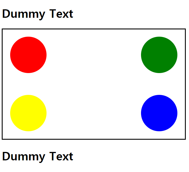
(⭐) 정리하자면 자손에 position: absolute;해주고 절대위치 지정해주기 위해서는 보모에 position:relative;해주고 height값을 지정해준다.
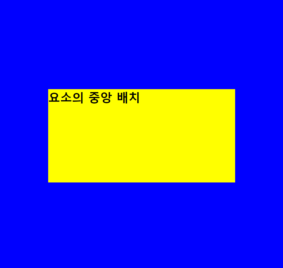
✅ 요소 중앙 배치 (⭐암기)
- 중앙 정렬하려는 div태그의 position속성을 absolute로 지정
- left 속성과 top속성을 모두 50%로 지정
- 중앙에 정렬하련느 div태그의 margin-left속성과 margin-top속성에 음수입력(입력하는 값의 절대값은 div태그 너비와 높이의 정확히 반!)
=>왜냐면 태그의 크기를 고려해야 정중앙에 배치 가능
<head>
<meta charset="UTF-8">
    <title>Absolute Position</title>
    <style>
    	/*초기화*/
        *{margin: 0px; padding:0;}
        /*초기화*/
        body{ background : blue;}
        #container{
        	/*색상 및 크기 적용*/
            width: 500px; height: 250px;
            background: yellow;

			/*위치 설정*/
            position: absolute;
            left: 50%; top: 50%;
            margin-left: -250px;
            margin-top: -125px;
        }
    </style>
</head>
<body>
    <div id ="container">
        <h1>요소의 중앙 배치</h1>
    </div>
</body>
👉🏻결과
✅ 요소 고정 위치에 배치
웹페이지 상하좌우에 붙어서 사용자를 따라다니는 요소
1. position스타일 속성에 fixed를적용
2. left속성, top속성, right속성, bottom속성에 값을 입력해 위치를 설정
3. width 속성과 height속성으로 크기를 결정
<head>
<style>
.container{
margin-top:50px;
margin-left:50px;
}
.top-bar{
background : red;
position: fixed;
left:0;top:0;right:0;
height: 50px;
}
.left-bar{
background : blue;
position: fixed;
left:0; top:50px; bottom:0;
width: 50px;
}
</style>
</head>
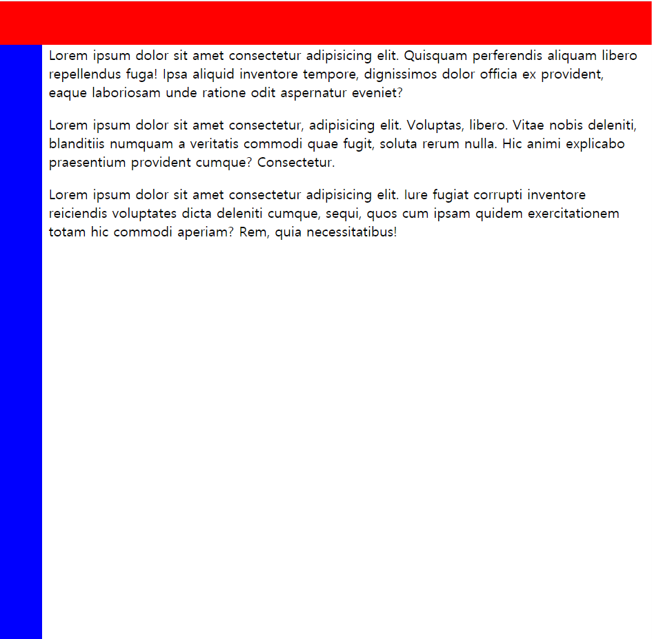
<body>
<div class="top-bar"></div>
<div class="left-bar"></div>
<div class="container">
<p>Lorem ipsum dolor sit amet consectetur adipisicing elit.
...
</p>
<p>Lorem ipsum dolor sit amet consectetur, adipisicing elit.
...
</p>
<p>Lorem ipsum dolor sit amet consectetur adipisicing elit.
...
</p>
</div>
</body>👉🏻결과
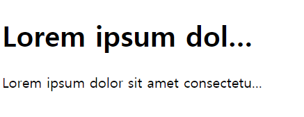
📌글자 생략
<!DOCTYPE html>
<html lang="ko">
<head>
<meta charset="UTF-8">
    <title>Ellipsis</title>
    <style>
        h1, p{
            width: 300px;
        }
        .ellipsis{
            white-space : nowrap;
            overflow:hidden;
            text-overflow:ellipsis;
        }
    </style>
</head>
<body>
<h1 class ="ellipsis">Lorem ipsum dolar sit amet, consectetur</h1>
<p class="ellipsis">Lorem ipsum dolor sit amet consectetur adipisicing elit. Fugit, a ipsam quo vel culpa quis nulla? Quos qui, exercitationem eaque eligendi placeat a harum perferendis. Ratione ex dolore provident quo.</p>
</body>
</html>
👉🏻결과
너비가 300px 넘어가는 글자는 ...으로 처리되어 생략됨