- flex box란?
- flex의 axis(축)
- flex의 관련 속성
🥝 flex box란?
flex box는 아이템들을 행(수평)이나 열(수직)로 정렬하기 위한 1차원 레이아웃 방법이다. 아이템은 추가 공간을 채우거나 더 작은 공간에 맞게 축소된다.
그동안 CSS 레이아웃을 만드는 데 사용할 수 있는 적당한 브라우저 호환 도구는 float이나 position, table 등과 같은 것들이었는데 복잡하고 시간이 오래걸렸다고 한다. 또한 이 도구들은 어떤 특정한 기능을 수행하기에는 한계가 있었고 그래서 나타난 것이 flex box이다.
- float 프로퍼티(속성) 에 대하여!
float의 원래 목적은 이미지와 텍스트들을 어떻게 배치할 것인지에 대해 정의하기 위해 나온 프로퍼티(속성)이다. 텍스트들이 이미지를 감싸면서 배치될 수 있도록 해주는 것이 float 이었다. 예전에는 CSS의 마땅한 레이아웃 기능이 없어서 float을 원래 목적에 어긋나는 방식으로 사용해오다가 flex box 프로퍼티가 나타나면서 줄어들었다고 한다.
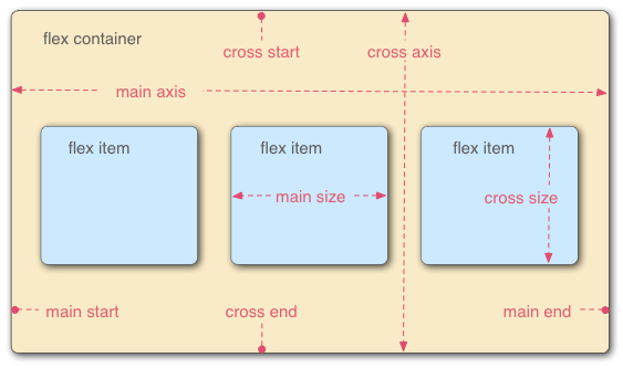
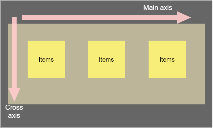
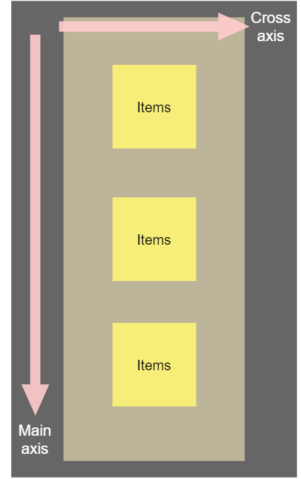
🥝 flex의 axis(축)
아이템들이 정렬된 방향에 따라서 중심축(Main axis)과 반대축(Cross axis)이 바뀌게 된다.
🥝 flex의 관련 속성
flex box의 속성들은
-
container에 적용하는 속성
-
아이템에 적용하는 속성
이렇게 두 가지로 나뉜다.
🥕 container에 적용하는 속성
- display
display: flex;
- flex-direction (flex의 수평, 수직 방향을 결정)
flex-direction: row		// 수평 (left to right)
flex-direction: row-reverse	// 수평 (right to left)
flex-direction: column		// 수직 (top to bottom)
flex-direction: column-reverse	// 수직 (bottom to top)
- flex-wrap (한 줄에 가득찼을 때 다음 줄로 넘어가는 지의 여부 결정)
flex-wrap: nowrap // 아무리 작아져도 아이템들이 한 줄에 붙어있음 (default)
flex-wrap: wrap	// 한 줄에 차면 다음 줄로 넘어감 (top to bottom line)
flex-wrap: wrap-reverse	// 한 줄에 차면 다음 줄로 넘어감 (bottom to top line)
- flex-flow (flex-direction 과 flex-wrap 속성을 한 줄로 정리)
flex-flow: column nowrap; // 예시
- justify-content (중심축에서 아이템을 어떻게 배치할 것인지의 여부 결정)
justify-content: flex-start; // 아이템 순서 유지하며 left to right or top to bottom
justify-content: flex-end; // 아이템 순서 유지하며 right to left or bottom to top
justify-content: center; // 아이템을 중심으로 유지
justify-content: space-around; // 아이템을 각각 둘러싸는 공백 생성
justify-content: space-evenly; // 아이템 사이 똑같은 간격 생성
justify-content: space-between;	// 양 끝 아이템만 화면에 붙이고 그 사이에 아이템에 간격 생성
- align-items (반대축에서 아이템을 어떻게 배치할 것인지의 여부 결정, 아이템 기준)
align-items: center; // 아이템 순서 유지하며 수직(반대축) 중앙 배치
align-items: baseline; // 특정 아이템의 padding값에 맞추어 나머지 아이템을 균등하게 배치
- align-content (반대축에서 아이템을 어떻게 배치할 것인지의 여부 결정, 컨테이너 기준)
align-content: space-between; // top and bottom 아이템 줄만 화면에 붙이고 그 사이 아이템에 간격 생성
align-content: center; // 아이템 순서 유지하며 수직(반대축) 컨테이너 중앙 배치
🥕 아이템에 적용하는 속성
- order (아이템의 순서 변경)
.item1 {
  background: #ef9a9a;
  order: 2;
}
.item2 {
  background: #f48fb1;
  order: 1;
}
.item3 {
  background: #ce93d8;
  order: 3;
}	// 아이템 순서 변경 2-1-3 (but 현업에서 잘 쓰이지는 않는다고 한다)
- flex-grow (컨테이너가 커질 때 컨테이너를 채우기 위해 아이템이 늘어나는 비율)
flex-grow: 0; // default
//
.item1 {
  background: #ef9a9a;
  flex-grow: 2;
}
.item2 {
  background: #f48fb1;
  flex-grow: 1;
}
.item3 {
  background: #ce93d8;
  flex-grow: 1;
}	// (컨테이너가 늘어나면) 아이템 1은 아이템2와 3에 비해 2배로 커지려고 함
- flex-shrink (컨테이너가 작아질 때 아이템이 줄어드는 비율)
flex-shrink: 0; // default
//
.item1 {
  background: #ef9a9a;
  flex-grow: 2;
  flex-shrink: 2;
}
.item2 {
  background: #f48fb1;
  flex-grow: 1;
  flex-shrink: 1;
}
.item3 {
  background: #ce93d8;
  flex-grow: 1;
  flex-shrink: 1;
}	// (컨테이너가 줄어들면) 아이템1은 아이템2와 3에 비해 2배로 줄어드려고 함
- flex-basis (아이템이 공간을 차지하는 수치를 세부적으로 명시)
flex-basis: auto; // default, flex-grow, shrink를 따라감
//
.item1 {
  background: #ef9a9a;
  flex-basis: 60%
}
.item2 {
  background: #f48fb1;
  flex-basis: 30%
}
.item3 {
  background: #ce93d8;
  flex-basis: 10%
}	// (컨테이너가 늘거나 줄어들어도) 아이템의 크기 비율이 설정한 수치만큼 유지됨
- flex (flex-grow, shrink, basis 속성을 한 줄로 정리)
.item1 {
  background: #ef9a9a;
  flex: 2 2 auto;
}
.item2 {
  background: #f48fb1;
  flex: 1 1 auto;
}
.item3 {
  background: #ce93d8;
  flex: 1 1 auto;
}
- align-self (아이템 별로 아이템 정렬, 컨테이너의 지정된 것을 벗어나 특정 아이템만 따로 배치 가능)
.item1 {
  background: #ef9a9a;
  align-self: center;
}
.item2 {
  background: #f48fb1;
}
.item3 {
  background: #ce93d8;
} // 아이템1만 수직 중앙으로 배치
그 외
유용한 html shortcut
div.container>div.item.item${$}*10+Tab<div class="container"> <div class="item item1">1</div> <div class="item item2">2</div> <div class="item item3">3</div> <div class="item item4">4</div> <div class="item item5">5</div> <div class="item item6">6</div> <div class="item item7">7</div> <div class="item item8">8</div> <div class="item item9">9</div> <div class="item item10">10</div> </div>
height: 100vh vs height: 100%
부모 태그에 상관없이 보이는 부분을 활용하려면 100vh,
부모 태그에 맞추어 높이의 모두 활용하려면 100%
유용한 flex box 정보 사이트 (중요)(북마크!)
A Complete Guide to Flexbox
