📝 요소 정렬 스타일(float / clear)
💡 float(뜨다, 띄우다, 뜨는 물건)
요소를 띄워서 좌/우로 정렬하는 속성
💡 clear
float로 인해 띄워져 있는 상태를 해제하는 속성
(float 사용 시 겹침 문제가 발생하는데 이를 해결할 수 있음)
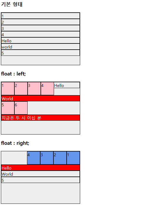
✏️ 예시
- html
    <h3>기본 형태</h3>
    <div class="test">
        <div>1</div>
        <div>2</div>
        <div>3</div>
        <div>4</div>
        <div>Hello</div>
        <div>world</div>
        <div>5</div>
    </div>

    <h3>float : left;</h3>
    <div class="test">
        <div class="float-left">1</div>
        <div class="float-left">2</div>
        <div class="float-left">3</div>
        <div class="float-left">4</div>

        <div>Hello</div>
        <div class="clear">World</div>
        <div class="float-left">5</div>
        <div class="float-left">6</div>

        <div class="clear">지금은 두 시 이십 분</div>
    </div>

    <h3>float : right;</h3>
    <div class="test">
        <div class="float-right">1</div>
        <div class="float-right">2</div>
        <div class="float-right">3</div>
        <div class="float-right">4</div>
        <div class="clear">Hello</div>
        <div>World</div>
        <div>5</div>
</div>- css
div{
    border: 1px solid black;
    box-sizing: border-box;
}

.test{
    width: 300px;
    height: 200px;
    background-color: #eee;
}

.float-left{
    width: 50px;
    height: 50px;
    background-color: pink;

    /* 요소를 왼쪽으로 흐름을 주어 왼쪽 정렬 */
    float: left;
    /* 띄워지면서 한 줄을 다 차지하려고 하던
       block 형식의 오른쪽 margin이 사라짐
       -> 오른쪽에 다른 요소가 붙게 됨(한 줄로 요소가 배치됨)
    */
}

.float-right{
    width: 50px;
    height: 50px;
    background-color: cornflowerblue;
    float : right;

    /* 오른쪽으로 먼저 작성된 요소가
       차곡차곡 쌓이기 때문에
       출력되는 순서가 반대로 보임
    */
}

.clear{
    background-color: red;
    color: white;

    /* 현재 요소부터 겹쳐지는 float 상태를 해제

        * clear의 방향성
        - float는 left/right가 나누어져 있는데
          지정된 float 흐름과 같은 방향을 해제해야
          겹칩 문제가 해결됨.


    */
    /* clear: left; */

    /* float : left, right를 모두 해제 */
    clear : both;
}
📌 float를 이용한 좌우 2분할
✏️ 예시
- html
    <div class="container">
        <div class="div-1 bg-1"></div>
        <div class="div-1 bg-3"></div>
    </div>
- css
/* 좌우 2분할 */
.container{
    width: 400px;
    height: 200px;
}

.div-1{
    width: 50%;
    height: 100%;
    float: left;
}

.bg-1{ background-color: red;}
.bg-2{ background-color: orange;}
.bg-3{ background-color: yellow;}
.bg-4{ background-color: green;}
.bg-5{ background-color: lightblue;}
.bg-6{ background-color: navy;}
.bg-7{ background-color: violet;}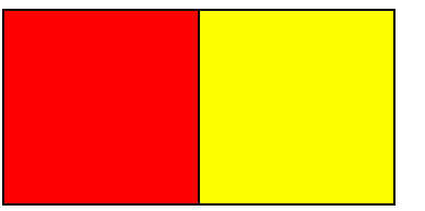
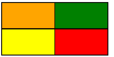
📌 float를 이용한 4분할
✏️ 예시
- html
    <div class="container">
        <!-- 1행 -->
        <div class="row-2">
            <div class="div-1 bg-2"></div> <!-- 1열 -->
            <div class="div-1 bg-4"></div> <!-- 2열 -->
        </div>

        <!-- 2행 -->
        <div class="row-2">
            <div class="div-1 bg-3"></div> <!-- 1열 -->
            <div class="div-1 bg-1"></div> <!-- 2열 -->
        </div>


</div>- css
/* 4분할 */
.row-2{
    height: 50%;
    /* width: 100%; */
}
- html
    <div class="container-3">
        <!-- 1행 -->
        <div class="row-2">
            <div class="div-1"><!-- 1열 -->
                <div class="row-2 bg-1"></div>
                <div class="row-2 bg-4"></div>
            </div>

            <div class="div-1 bg-6"></div><!-- 2열 -->
        </div>

        <!-- 2행 -->
        <div class="row-2 bg-3"></div>
    </div>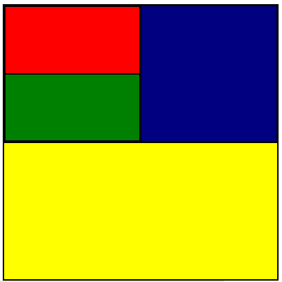
풀스택 개발자 기록집 📁